card_game
A declarative Flutter package for building card games with beautiful animations. Create card games with minimal code by defining the rules and letting the package handle the rest!
Table of Contents
Features
- 🎴 Support for standard playing cards and numeric cards out of the box
- 🎯 Drag and drop support with validation
- ✨ Smooth animations for card movements and flips
- 📏 Flexible layout options with rows, columns, and decks
- 📱 Responsive design that works across all screen sizes
- 🎨 Customizable card rendering
- 🎮 No controllers needed - fully declarative API
- 🎲 Example implementations of popular card games (Solitaire, War, Memory Match, etc.)
- 🎯 Built-in validation system for card movements
Examples
Each example demonstrates different features of the card_game package. Check out the example project for the complete source code.
| Game | Preview | Description | Key Concepts |
|---|---|---|---|
| Tower of Hanoi |  |
A puzzle game where you move a stack of numbered disks between three columns, following the rule that larger numbers can't be placed on smaller ones. | • Custom numeric cards with CardGame<int, int>• Basic drag-and-drop with validation • maxGrabStackSize to limit moves to one card• Simple state management |
| War | 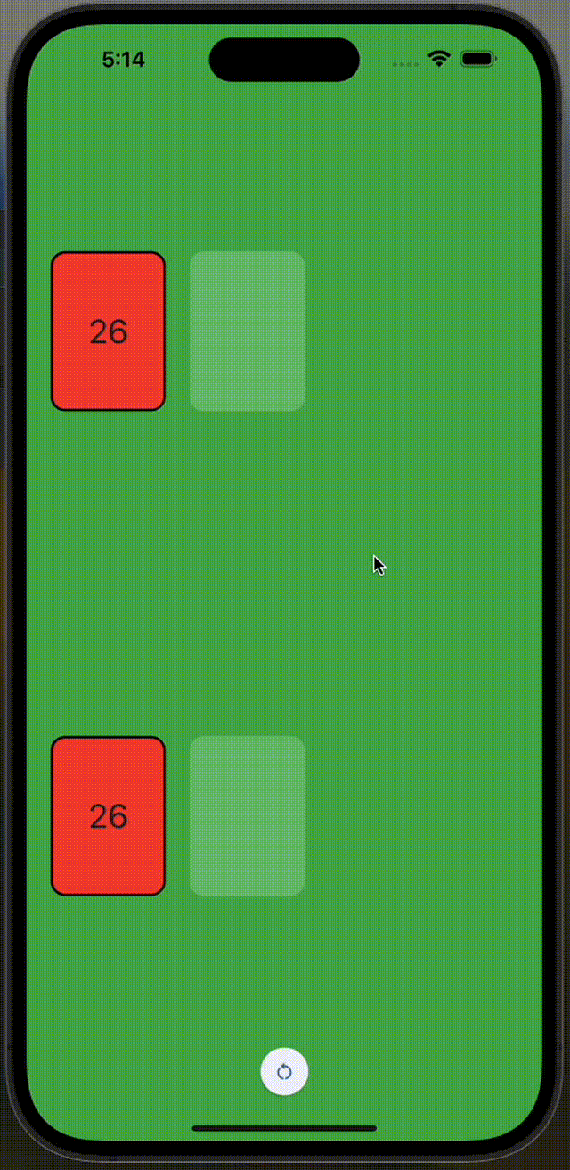 |
A two-player card game where each player draws from their deck, and the highest card wins both cards. | • SuitedCard with deckCardStyle()• Flipped cards with CardDeck.flipped• Card value comparison with SuitedCardValueMapper• Automatic card flip animations |
| Memory Match | 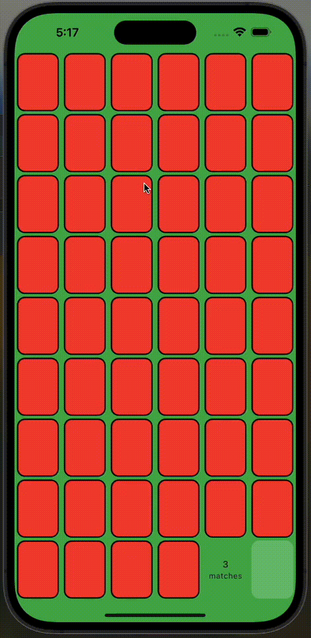 |
Find matching pairs of cards by flipping them over two at a time. Cards with matching ranks are removed from play. | • Grid layout with multiple CardDecks• Card flipping on press • Disabled card dragging |
| Golf Solitaire | 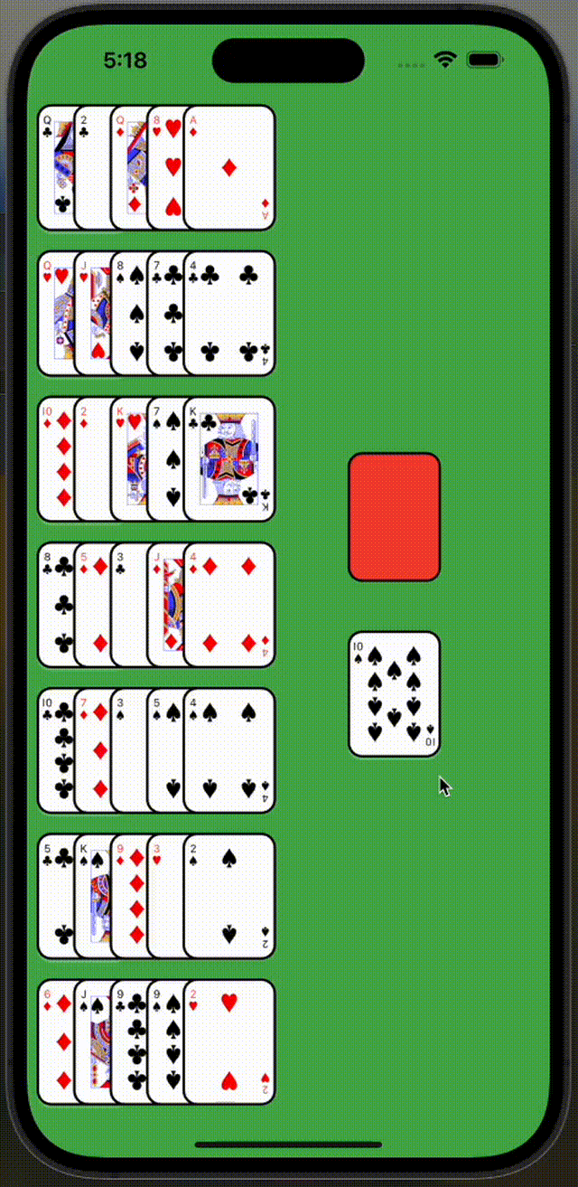 |
Remove cards that are one rank away from the top card of the waste pile. Kings and Aces are considered one apart. | • Complex card comparison with SuitedCardDistanceMapper |
| Solitaire | 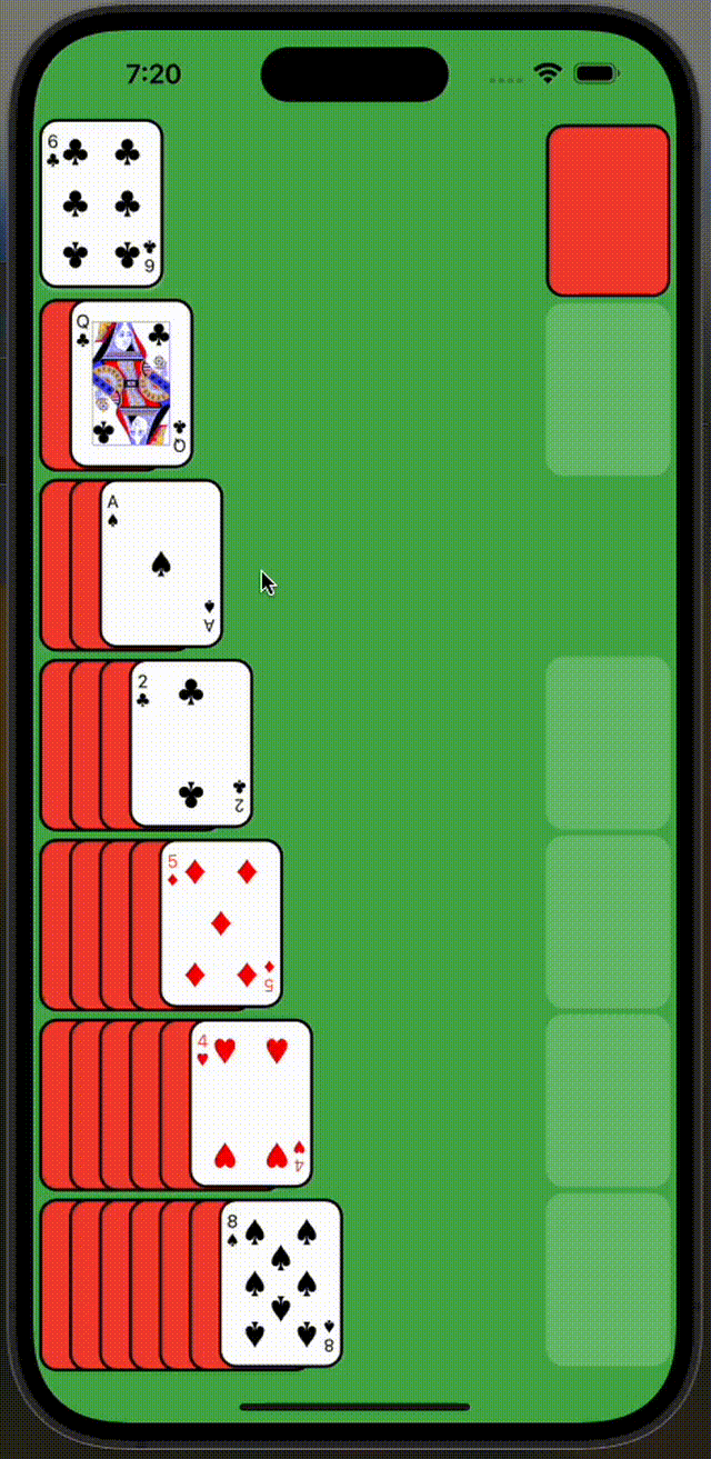 |
The classic solitaire game. Build foundation piles by suit from Ace to King, and move cards between columns following standard rules. | • Advanced card movement rules • Multiple card dragging • Complex state management • Card stacking with flipped and unflipped cards |
Implementing Your First Game
Let's walk through implementing the Tower of Hanoi example, as it's the simplest game that demonstrates the core concepts:
class TowerOfHanoi extends HookWidget {
  // Number of disks to include in the game
  final int amount;

  const TowerOfHanoi({super.key, this.amount = 4});

  // Initialize the game state with all disks in the first column
  // Each disk is represented by a number, where larger numbers represent larger disks
  List<List<int>> get initialCards => [
    // First column contains all disks, largest (amount) to smallest (1)
    List.generate(amount, (i) => amount - i),
    // Second and third columns start empty
    <int>[],
    <int>[],
  ];

  @override
  Widget build(BuildContext context) {
    // Use Flutter Hooks to manage the state of our columns
    // Each column is a list of integers representing the disks
    final cardsState = useState(initialCards);

    return CardGame<int, int>(
      // Use the built-in numeric card style to render our disks as numbers
      style: numericCardStyle(),
      children: [
        SafeArea(
          child: Column(
            children: [
              Row(
                mainAxisAlignment: MainAxisAlignment.spaceEvenly,
                children: cardsState.value
                    .mapIndexed((i, states) => CardColumn<int, int>(
                  // Each column needs a unique identifier
                  value: i,
                  // The cards (disks) currently in this column
                  values: states,
                  // Only allow moving one disk at a time
                  maxGrabStackSize: 1,
                  // Define the rules for when a disk can be placed here
                  canMoveCardHere: (move) {
                    final movingCard = move.cardValues.last;
                    final movingOnto = states.lastOrNull;
                    // Allow moves if:
                    // 1. Column is empty (movingOnto == null)
                    // 2. Moving disk is smaller than the top disk
                    return movingOnto == null || movingCard < movingOnto;
                  },
                  // Handle the actual movement of cards between columns
                  onCardMovedHere: (move) {
                    // Create a copy of the current state
                    final newCards = [...cardsState.value];
                    // Remove the moving card from its original column
                    // Since maxGrabStackSize is 1, we know we're only removing one card
                    newCards[move.fromGroupValue].removeLast();
                    // Add the moved card to its new column
                    // We use move.cardValues.first because maxGrabStackSize: 1 ensures
                    // there's exactly one card being moved at a time
                    newCards[i].add(move.cardValues.first);
                    // Update the state, triggering a rebuild
                    cardsState.value = newCards;
                  },
                ))
                    .toList(),
              ),
              Spacer(),
              // Reset button to start the game over
              ElevatedButton(
                onPressed: () => cardsState.value = initialCards,
                style: ButtonStyle(
                    shape: WidgetStatePropertyAll(CircleBorder())),
                child: Icon(Icons.restart_alt),
              ),
            ],
          ),
        ),
      ],
    );
  }
}
This implementation shows:
- Using numeric cards with the built-in
numericCardStyle() - Setting up three columns using
CardColumn - Implementing drag-and-drop rules with
canMoveCardHere - Managing state with Flutter Hooks
- Animating card movements automatically
For more complex examples, check out the implementations of the other games in the example folder.
Running the Examples
To try out the examples:
- Clone the repository
- Navigate to the example directory
- Run
flutter pub get - Run
flutter runand select the example you want to try
Getting Started
Add the package to your pubspec.yaml:
dependencies:
  card_game: ^1.0.0
Core Concepts
Card Types
The package uses two generic types:
T: The type of your cards (e.g.,SuitedCardfor playing cards orintfor numeric cards)G: The type for group identifiers (can be any type, oftendynamic,String, orint)
Card Groups
Three types of card groups are available:
CardDeck: Shows only the top card, useful for draw pilesCardRow: Displays cards horizontally with customizable spacingCardColumn: Displays cards vertically with customizable spacing
Card Styles
Built-in styles:
deckCardStyle(): Renders standard playing cards with a red backnumericCardStyle(): Renders numeric cards
Custom styles can be created by implementing CardGameStyle<T>.
Customization
Card Movement Rules
Control card movement with the following parameters:
CardColumn<T, G>(
  // ... other params
  canCardBeGrabbed: (index, card) => true, // Control which cards can be grabbed
  maxGrabStackSize: 1, // Limit how many cards can be grabbed at once
  canMoveCardHere: (moveDetails) => true, // Define rules for accepting cards
  onCardMovedHere: (moveDetails) {}, // Handle successful moves
)
Card Interaction and Appearance
Control card interaction and visual state:
CardColumn<T, G>(
  // ... other params
  onCardPressed: (card) {
    // Handle card press events
    // Useful for flipping cards, selecting cards, or triggering game actions
  },
  isCardFlipped: (index, card) {
    // Control whether specific cards are shown face-down
    // Return true to show the card's back, false to show its face
    return shouldCardBeFlipped(index, card);
  },
)
Common use cases:
- Memory Match: Use
onCardPressedto flip cards when clicked - Solitaire: Use
isCardFlippedto hide cards in the tableau - War: Use
isCardFlippedwithCardDeck.flippedfor face-down draw piles
Custom Card Styles
Create your own card style:
CardGameStyle<MyCard>(
  cardSize: Size(64, 89),
  cardBuilder: (card, isFlipped, state) => MyCustomCard(
    card: card,
    isFlipped: isFlipped,
    state: state,
  ),
  emptyGroupBuilder: (state) => MyCustomEmptySpace(state: state),
)
Tips
- Each card value (
T) must be unique within the game - Each group value (
G) must be unique within the game - Always explicitly specify type parameters for CardGroups to match the parent CardGame. For example, if you have
CardGame<SuitedCard, String>, your groups should beCardColumn<SuitedCard, String>,CardRow<SuitedCard, String>, orCardDeck<SuitedCard, String>. This helps prevent type errors and makes the code more maintainable - Use flutter_hooks or your preferred state management solution
- Changes to card positions and flips are automatically animated
- Card states (regular, highlighted, error) are handled automatically during drag and drop by default