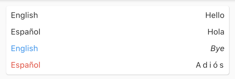
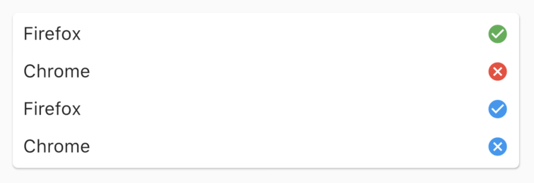
Row Item
This package allows developers to display compat information inside a row widget.


As a highly customizable widget, you can place as a title and description whatever you want. But the preferred way to use this package is using a Text widget as the 'title', and another Text or Icon widget as the 'description' portion of the view.
You can check the of these examples down below.
Example
If you want to take a deeper look at the example, take a look at the example folder provided with the project.
RowItem
This is the vanilla widget. You can place whatever widget you want inside both titleand descriptionparameters.
RowItem(
    title: Text('title'),
    description: Text('description'),
)
RowItem.text
The text variant simplifies the action of display text information inside the widget. It also has styles for both title and description text labels.
RowItem.text(
  'title',
  'description',
)
RowItem.boolean
You can show a boolean state (true, false or null) using this variant of the widget. Color and size of the icon placed inside the description place are both customizable.
Use the outline parameter to use the outlined version of each icon, instead of the default one.
RowItem.boolean(
  'Displays a checked icon',
  true,
)
RowItem.tap
This last variant makes the description text clickable, using the onTap parameter. If this parameters is not null, the description text will be underlined.
RowItem.tap(
  'This item is clickable',
  'Tap me!',
  onTap: () => print("Hello world!"),
)
Getting Started
This project is a starting point for a Dart package, a library module containing code that can be shared easily across multiple Flutter or Dart projects.
For help getting started with Flutter, view our online documentation, which offers tutorials, samples, guidance on mobile development, and a full API reference.
Built with
- Flutter - Beautiful native apps in record time.
- Android Studio - Tools for building apps on every type of Android device.
- Visual Studio Code - Code editing. Redefined.
Authors
License
This project is licensed under the GNU GPL v3 License - see the LICENSE file for details.


