advance_water_drop_nav_bar 1.0.1  advance_water_drop_nav_bar: ^1.0.1 copied to clipboard
 studykiya.in
It is advance flutter plugin for navigation which is inherit from water_drop_nav_bar
advance_water_drop_nav_bar #

It is advance flutter plugin for navigation which is inherit from water_drop_nav_bar
Installation #
To use Material Text Field in your Dart project, add the following dependency to your "pubspec.yaml" file
dependencies:
advance_water_drop_nav_bar: ^<latest-version>
Then run flutter pub get to install the package.
In your library add the following import
import 'package:advance_water_drop_nav_bar/advance_water_drop_nav_bar.dart';
Design Credit #
Video Credit #
API Reference #
barItems → List<BarItem>
- List of bar items that shows horizontally, Minimum 2 and maximum 4 items.
required
onItemSelected → OnButtonPressCallback
- Callback When individual barItem is pressed.
required
selectedIndex → int
- Current selected index of the bar item.
required
backgroundColor → Color
- Background Color of the bar.
optional [Colors.white]
waterDropColor → Color
- Color of water drop which is also the active icon color.
optional [Color(0xFF5B75F0)]
inactiveIconColor → Color
- Inactive icon color by default it will use water drop color.
optional [waterDropColor]
iconSize → double
- Each active & inactive icon size, default value is 28 don't make it too big or small.
optional [28]
bottomPadding → double
- Additional padding at the bottom of the bar. If nothing is provided the it will use
[MediaQuery.of(context).padding.bottom] value.
optional
Usage #
BarItem with default textStyle
  BarItem(
      filledIcon: Icons.account_balance_wallet,
      outlinedIcon: Icons.account_balance_wallet_outlined,
      text: 'Wallet'),
Advance Usage #
BarItem with custom textStyle
     BarItem(
  filledIcon: Icons.account_balance_wallet,
  outlinedIcon: Icons.account_balance_wallet_outlined,
  text: 'Wallet', textStyle:TextStyle(color: Colors.red,fontWeight: FontWeight.bold,fontStyle: FontStyle.italic),
  ),
Example
int _selectedIndex = 0;
Widget buildPages() {
switch (_selectedIndex) {
case 1:
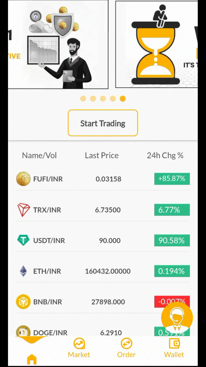
return MarketScreen();
case 2:
return Orders();
case 3:
return WalletPage();
case 0:
default:
return HomePage();
}
}
@override
Widget build(BuildContext context) {
return Scaffold(
body: buildPages(),
bottomNavigationBar: WaterDropNavBar(
backgroundColor: Colors.white,
inactiveIconColor:Colors.blue,
waterDropColor: Colors.blue,
onItemSelected: (int index) {
setState(() {
_selectedIndex = index;
});
},
selectedIndex: _selectedIndex,
barItems: <BarItem>[
BarItem(
filledIcon: Icons.home_filled,
outlinedIcon: Icons.home_outlined,
text: 'Home'),
BarItem(
filledIcon: Icons.data_exploration,
outlinedIcon: Icons.data_exploration_outlined,
text: 'Market'),
BarItem(
filledIcon: Icons.swap_horizontal_circle,
outlinedIcon: Icons.swap_horizontal_circle_outlined,
text: 'Order'),
BarItem(
filledIcon: Icons.account_balance_wallet,
outlinedIcon: Icons.account_balance_wallet_outlined,
text: 'Wallet'),
],
),
);
}
FAQ #
-
How do I change the height?
The height must be constant because the animation is in vertical direction. According to me 60 is perfect. But if you think needs to be reduced then please create an issue with a screenshot. I will see if I can do something.
-
How do I add drop shadow?
Wrap WaterDropNavBar with DecoratedBox or Container and pass BoxDecoration to decoration property. BoxDecoration takes list of boxShadow there you can pass your drop shadow.
DecoratedBox(
    decoration: BoxDecoration(
      boxShadow: [
        BoxShadow(
            color: Colors.black.withOpacity(0.2),
            offset: Offset(0, 4),
            blurRadius: 8.0)
      ],
    ),
    child: WaterDropNavBar()
)
-
How do I change the corner radius of the navigation bar?
Wrap WaterDropNavBar with ClipRRect and pass BorderRadius to borderRadius property.
  ClipRRect(
      borderRadius: const BorderRadius.vertical(
        top: Radius.circular(16),
      ),
      child: WaterDropNavBar(
    )
Metadata
Publisher
Weekly Downloads
Metadata
It is advance flutter plugin for navigation which is inherit from water_drop_nav_bar
Documentation
License
 MIT (license)
Dependencies
flutter, flutter_web_plugins, plugin_platform_interface