animated_cards_carousel 1.0.2  animated_cards_carousel: ^1.0.2 copied to clipboard
 visionflutter.com
Create dynamic and customizable animated carousels for Flutter apps. Ideal for displaying portfolios, galleries, or widget collections with smooth transitions and visual appeal.
animated_cards_carousel #
animated_cards_carousel is a Flutter package that provides a customizable carousel of animated cards. It allows for smooth scrolling and visually appealing animations as cards transition into and out of the viewport.
Features #
- Smooth scrolling with animation effects.
- Customizable card aspect ratio and margins.
- Easy integration with any list of widgets.
- Animated properties include translation, scaling, and opacity.
Installation #
Add animated_cards_carousel to your pubspec.yaml file:
dependencies:
  animated_cards_carousel: ^1.0.2
Then, run the following command in your terminal to fetch the package:
flutter pub get
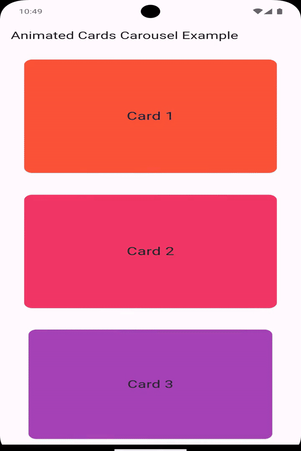
Preview #
Usage #
To use the AnimatedCardsCarousel, import the package and include it in your widget tree. Below is an example of how to set it up:
Important Note #
- Do Not Wrap in
SingleChildScrollView: Wrapping theAnimatedCardsCarouselin aSingleChildScrollViewcan cause rendering issues. Instead, consider using aSizedBoxorContainerwith a fixed height in between those.
import 'package:flutter/material.dart';
import 'package:animated_cards_carousel/animated_cards_carousel.dart';

void main() {
  runApp(const MyApp());
}

class MyApp extends StatelessWidget {
  const MyApp({super.key});

  @override
  Widget build(BuildContext context) {
    return MaterialApp(
      home: Scaffold(
        appBar: AppBar(
          title: const Text('Animated Cards Carousel Example'),
        ),
        body: Padding(
          padding: const EdgeInsets.symmetric(horizontal: 32),
          child: AnimatedCardsCarousel(
            cardsList: List.generate(
              10,
                  (index) => Card(
                color: Colors.primaries[index % Colors.primaries.length],
                child: Center(
                  child: Text(
                    'Card ${index + 1}',
                    style: const TextStyle(fontSize: 24),
                  ),
                ),
              ),
            ),
          ),
        ),
      ),
    );
  }
}
Properties #
cardAspectRatio: (Optional) The aspect ratio of the cards. Defaults to the golden ratio (1.61803399) in portrait mode and (10) in landscape mode.cardMargin: (Optional) The margin around each card. Defaults to16.0in portrait mode and (8.0) in landscape mode.cardsList: The list of widgets to be displayed as cards.
Customization #
You can customize the appearance and behavior of the carousel by tweaking the properties provided:
- Aspect Ratio: Control the height-to-width ratio of the cards.
- Margins: Adjust the vertical spacing between the cards.
For example, to create a carousel with a square aspect ratio and no margins:
AnimatedCardsCarousel
(
cardAspectRatio: 1.0, // Square cards
cardMargin: 0.0, // No margin between cards
cardsList: yourListOfCards,
);
Contributing #
Contributions are welcome! If you find any issues or have suggestions for improvements, please open an issue or submit a pull request on GitHub.
License #
This project is licensed under the MIT License - see the LICENSE file for details.
Metadata
Publisher
Weekly Downloads
Metadata
Create dynamic and customizable animated carousels for Flutter apps. Ideal for displaying portfolios, galleries, or widget collections with smooth transitions and visual appeal.
Documentation
License
 MIT (license)