animated_tree_view 0.1.2  animated_tree_view: ^0.1.2 copied to clipboard
 cubivue.com
Animated TreeView based on AnimatedList that allows building fully customizable Nodes that can be nested to infinite levels and children.
animated_tree_view #
A flutter package that provides a heirarchial Tree like data structure that can be visualized as a linear list view.
The widget is based on the Flutter’s AnimatedList widget and can even be used as a replacement to the AnimatedList. The widget data is completely customizable and provides an LeveledItemWidgetBuilder to build the tree items.

Variants #
There are two variants available in the package: the simple TreeView and the more comprehensive IndexedTreeView.
TreeView #
The TreeView uses a Map data-structure to handle the Nodes and their children, using a Map makes the TreeView more performant with a complexity on traversing the Nodes being O(n), where n is the level of the node. However the simple TreeView lacks the indexed based operations like insertAt and removeAt operations.
IndexedTreeView #
The IndexedTreeView uses a List data-structure to handle the Nodes and their children. This allows it to perform all the list based operations that require indices, like insertAt or removeAt. The drawback of using an IndexedTreeView instead of TreeView is that the Node traversal operations on the IndexedTreeView are more expensive with a complexity of O(n^m), where n is the number of children in a node, and m is the node level.
Features #
- Infinite levels and child nodes.
- Animations for Node expansion and collapse.
- Familiar API due to inspiration from AnimatedList.
- Provides plenty of utility methods for adding, inserting and removing child nodes.
- Easily traverse the tree laterally or vertically from the root to the leaf and back.
- Implementation of ValueListenable makes it easy to listen to changes in the data.
How to use #
TreeView #
You can simply use the provided SimpleNode or extend your data object from ListenableNode<T> like this
class CustomNode extends ListenableNode<CustomNode> {
  CustomNode([String? key]) : super(key: key);
}
Note: If the key is omitted, then a unique key will be automatically assigned to the Node.
You can provide an optional TreeListViewController<T> and initialItems to the TreeListView if required.
If no initialItems are provided to the TreeView, then the TreeView will only contain a Root-Node until some children are added to it.
Finally, initialize the TreeView by providing it a builder.
TreeListView<SimpleNode>(
builder: (context, level, node) {
// build your node item here
// return any widget that you need
return ListTile(
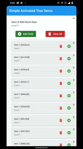
title: Text("Item ${node.level}-${node.key}"),
subtitle: Text('Level $level'),
);
}
IndexedTreeView #
The usage of IndexedTreeView is exactly the same as a simple TreeView. You only need to replace SimpleNode with SimpleIndexedNode or extend you CustomNode from ListenableIndexedNode like this
class CustomIndexedNode extends ListenableIndexedNode<CustomIndexedNode> {
  CustomIndexedNode([String? key]) : super(key: key);
}
Finally initialize the widget like this:
IndexedTreeListView<CustomIndexedNode>(
    builder: (context, level, node) {
        // build your node item here
        // return any widget that you need
        return ListTile(
          title: Text("Item ${node.level}-${node.key}"),
          subtitle: Text('Level $level'),
        );
    }
Please see this example for a more comprehsive code sample.
Configuration and Behavior #
| Attributes | Description |
|---|---|
| builder | The builder function that is provided to the item builder. Called, as needed, to build list item widgets. The built widget is passed to the AnimatedList's itemBuilder. |
| controller | Allows controlling the [TreeView] programmatically using utility methods. Use TreeViewController for the TreeView, and IndexedTreeViewController for the IndexedTreeView. |
| initialItems | Node that is used to populate the TreeView initially. If no initialItems are provided, then the Tree will only contain the RootNode. |
| scrollController | Provide a scrollController for more granular control over scrolling behavior. |
| expansionIndicator | Provide an ExpansionIndicator to set the expand widget and collapse widget. Typically these are Icon widgets. You can pass in null if you do not want to show any expansion indicator. |
| indentPadding | This is the padding is applied to the start of an item. IndentPadding will be multiplied by Node-Level before being applied. |
| onItemTap | callback that can be used to handle any action when an item is tapped or clicked. |
| showRootNode | Flag to show the Root Node in the TreeView. |
| expansionBehavior | The ExpansionBehavior provides control over the behavior of the node when it is expanded. See ExpansionBehavior for available behaviors. |
| padding | The amount of space by which to inset the children. |
| primary | Whether this is the primary scroll view associated with the parent PrimaryScrollController. |
| physics | An object that can be used to control the position to which this scroll view is scrolled. |
| shrinkWrap | Whether the extent of the scroll view in the scrollDirection should be determined by the contents being viewed. |
ExpansionBehavior #
The 'ExpansionBehavior' provides control over the behavior of the node when it is expanded. There are five available ExpansionBehaviors to choose from.
ExpansionBehavior.none #
No additional action will be taken on node expansion.
ExpansionBehavior.scrollToLastChild #
The list will be scrolled to the last child of the node if it is not already visible on screen. This ensures that the last child is always visible.

ExpansionBehavior.snapToTop #
The expanded node will be snapped to the top of the list. This ensures that the expanded node is always visible with maximum number of children.

ExpansionBehavior.collapseOthers #
Collapse all other nodes, only the current node will remain expanded. This ensures that only one node is expanded at one time.

ExpansionBehavior.collapseOthersAndSnapToTop #
Collapse all other nodes, only the current node will remain expanded, also snap the node to the top of the list. This ensures that only one node is expanded at one time.

Available APIs #
Node #
| Method | TreeView | IndexedTreeView | Description |
|---|---|---|---|
isRoot |
✅ | ✅ | Getter to check if the node is a root |
isLeaf |
✅ | ✅ | Getter to check if the node is a Leaf |
root (getter) |
✅ | ✅ | Getter to get the root node. If the current node is not a root, then the getter will traverse up the path to get the root. |
level |
✅ | ✅ | Getter to get the level i.e. how many iterations it will take to get to the root. |
elementAt |
✅ | ✅ | Utility method to get a child any child node at the path. The path contains the keys of the node separated by period . e.g. #grandparent_key.#parent_key.#node |
add |
✅ | ✅ | Add a child to the node |
addAll |
✅ | ✅ | Add a collection of nodes to the node |
remove |
✅ | ✅ | Remove a child from the node |
removeAll |
✅ | ✅ | Remove a collection of nodes from the node |
removeWhere |
✅ | ✅ | Remove children from the node that meet the criterion in the provided test |
delete |
✅ | ✅ | Delete the current node |
clear |
✅ | ✅ | Remove all the child nodes: after this operation the children are empty |
first |
⭕ | ✅ | Get/Set first child in the node |
last |
⭕ | ✅ | Get/Set last child in the node |
insert |
⭕ | ✅ | Insert a child at an index in the node |
insertAll |
⭕ | ✅ | Insert a list of children at an index in the node |
insertAfter |
⭕ | ✅ | Insert a child after the node |
insertBefore |
⭕ | ✅ | Insert a child before the node |
removeAt |
⭕ | ✅ | Remove a child at the index |
firstWhere |
⭕ | ✅ | Get the first child node that matches the criterion in the test. |
lastWhere |
⭕ | ✅ | Get the last child node that matches the criterion in the test. |
indexWhere |
⭕ | ✅ | Get the index of the first child node that matches the criterion in the test. |
TreeViewController #
The TreeViewController provides utility methods that allow controlling the [TreeView] programmatically.
There are two different TreeViewControllers for the two variants of TreeView. Namely the TreeViewController for TreeView, and the IndexedTreeViewController for IndexedTreeView
| Method | Description |
|---|---|
| elementAt | Get any item at path from the root. The keys of the items to be traversed should be provided in the path |
| root | Root node of the TreeView |
| scrollToIndex | Allows to scroll to any item with index in the list. If you do not have the index of the item, then use the alternate scrollToItem method item instead. |
| scrollToItem | Utility method to scroll to any visible item in the tree. |
| toggleNodeExpandCollapse | Utility method to expand or collapse an item. |
Future Goals #
- ✅ Improve documentation
- ✅ Add more ExpansionBehaviors
- ❌ Add more examples
- ❌ Add more utility functions for Node
- ❌ Add a
DiffUtilto the controller to update the whole tree data more easily
Development Status #
This library is under development. We are trying to provide you a performant and easy to use library, however at this stage we cannot guarantee a bug free experience. Please feel free to equest any feature or report any issues that you may face.
Metadata
Publisher
Weekly Downloads
Metadata
Animated TreeView based on AnimatedList that allows building fully customizable Nodes that can be nested to infinite levels and children.
Repository (GitHub)
View/report issues
Documentation
License
 MIT (license)