auto_input_box 0.0.2  auto_input_box: ^0.0.2 copied to clipboard
 mypackeges.tk
A Flutter package for dynamic input boxes with auto-suggestions and overlay-based UI components.
AutoInputBox Plugin #
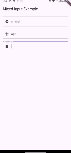
The AutoInputBox Plugin is a Flutter widget that provides an enhanced text input experience with auto-completion functionality. It dynamically filters suggestions as users type and displays them in a dropdown list, making it ideal for search fields, forms, or any text input where suggestions improve the user experience.
Features #
-
Debounced Input Filtering: Ensures efficient suggestion filtering with customizable debounce time.
-
Dynamic Dropdown: Displays suggestions in an overlay that updates in real time.
-
Customizable: Fully customizable styles, input decorations, and callback options.
-
Type-Safe: Supports any object type with a display string conversion function.
Installation #
Add the following dependency to your pubspec.yaml file:
dependencies:
  auto_input_box: ^1.0.0
Then, run:
flutter pub get
Usage #
Here is an example of how to use the AutoInputBox in your Flutter app:
import 'package:flutter/material.dart';
import 'package:auto_input_box/auto_input_box.dart';

void main() => runApp(MyApp());

class MyApp extends StatelessWidget {
  @override
  Widget build(BuildContext context) {
    return MaterialApp(
      home: Scaffold(
        appBar: AppBar(title: Text('AutoInputBox Example')),
        body: AutoInputBoxExample(),
      ),
    );
  }
}

class AutoInputBoxExample extends StatelessWidget {
  final TextEditingController _controller = TextEditingController();

  @override
  Widget build(BuildContext context) {
    return Padding(
      padding: const EdgeInsets.all(16.0),
      child: AutoInputBox<String>(
        textEditingController: _controller,
        suggestions: [
          'Apple',
          'Banana',
          'Cherry',
          'Date',
          'Elderberry',
          'Fig',
          'Grapes',
        ],
        toDisplayString: (item) => item,
        debounceTime: 300,
        inputDecoration: InputDecoration(
          labelText: 'Enter a fruit',
          border: OutlineInputBorder(),
        ),
        onItemSelected: (item) {
          print('Selected: $item');
        },
      ),
    );
  }
}
Parameters #
-
textEditingController:TextEditingController- Controller for managing the input field text. -
inputDecoration:InputDecoration- Styling and decoration for the input field. -
textStyle:TextStyle- Style for the input text. -
debounceTime:int- Debounce time (in milliseconds) for filtering suggestions. Default is300. -
suggestions:List<T>- The list of suggestions to be displayed. -
toDisplayString:String Function(T)- Function to convert suggestion objects into displayable strings. -
onItemSelected:ValueChanged<T>- Callback triggered when a suggestion is selected.
Key Features #
-
Debounce Time: Prevents rapid firing of the filter logic for better performance.
-
Custom Suggestions: Supports any object type with a
toDisplayStringfunction. -
Callback on Selection: Allows integration of custom logic when a suggestion is chosen.
Customization #
The plugin is highly customizable, allowing you to:
-
Change the appearance of the input field via
InputDecoration. -
Modify text style using the
textStyleparameter. -
Adjust filtering behavior with the
debounceTimeparameter. -
Use any object type for suggestions by defining how they are displayed with
toDisplayString.
License #
This project is licensed under the MIT License. See the LICENSE file for details.
Contributions #
Contributions are welcome! Feel free to fork the repository, create a feature branch, and submit a pull request.
Support #
For issues and feature requests, please open an issue in the GitHub repository.
Enjoy seamless auto-completion with AutoInputBox Plugin! 🎉
Metadata
Publisher
Weekly Downloads
Metadata
A Flutter package for dynamic input boxes with auto-suggestions and overlay-based UI components.
Topics
#flutter #widget #autocomplete #input #overlay
Documentation
License
 MIT (license)