bootstrap_grid 1.0.2  bootstrap_grid: ^1.0.2 copied to clipboard
 concerti.io
Bootstrap Grid Implementation
bootstrap_grid #
Responsive Grid Layout and List for Flutter - Forked and improved
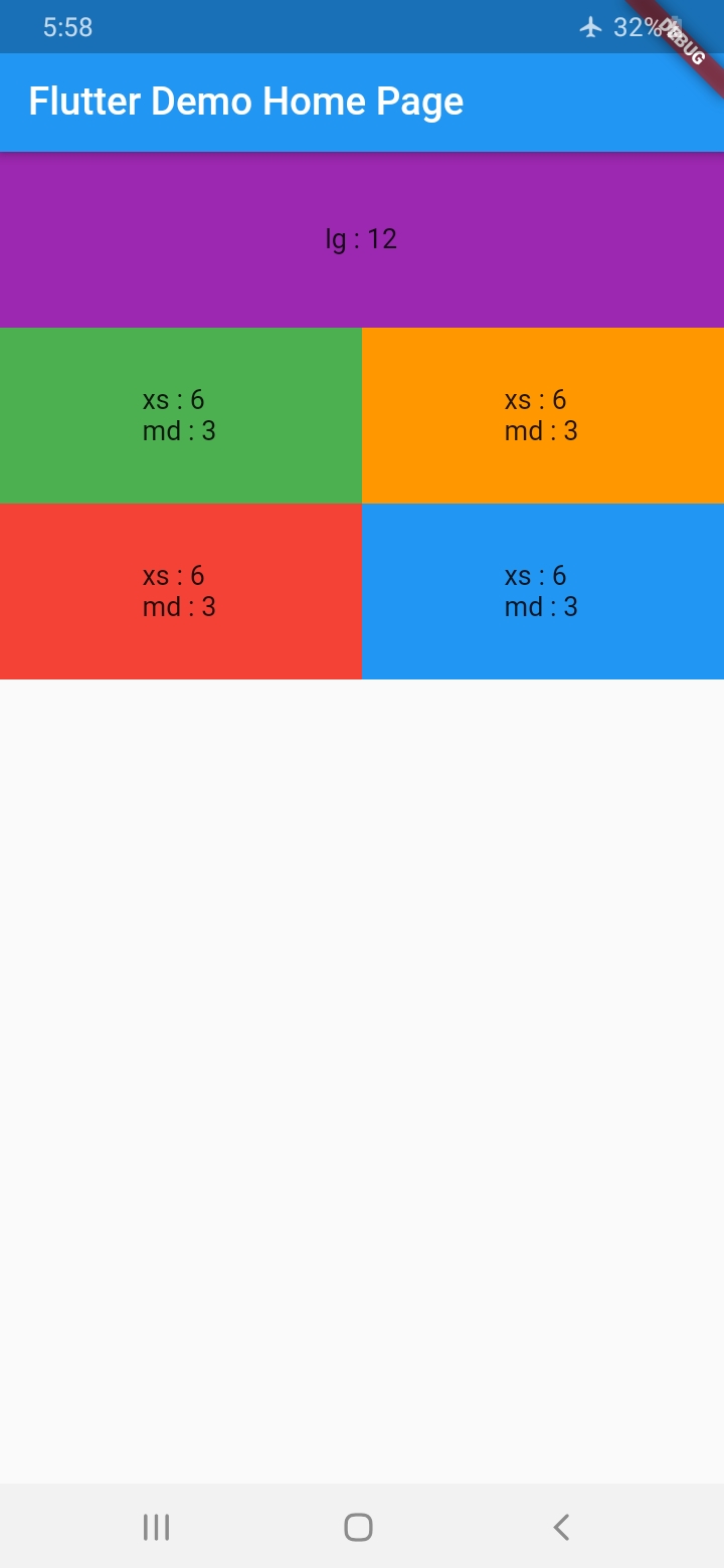
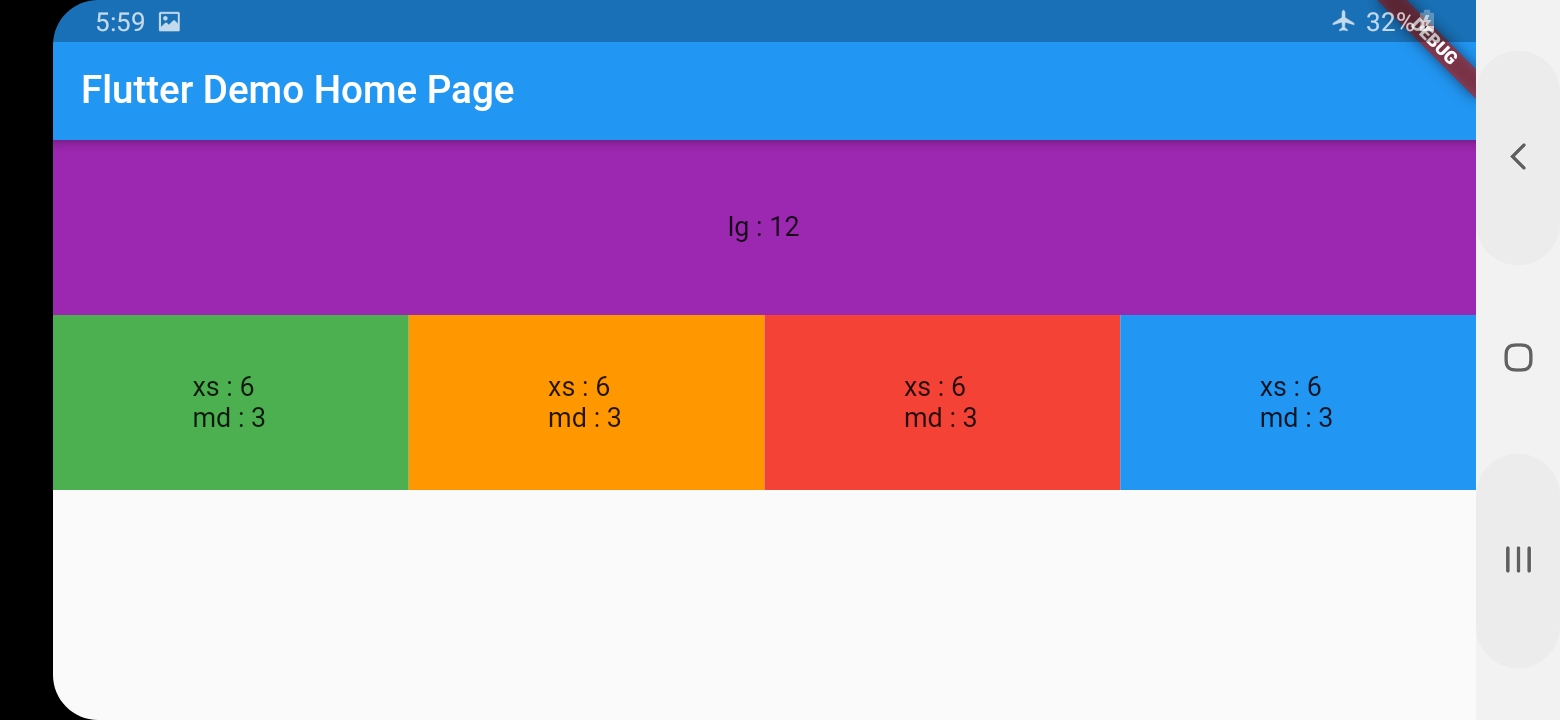
Responsive Grid Layout #
With BootstrapRow and BootstrapCol you can get the same behavior of bootstrap Grid System
Give every col the width it shall occupy at every size category assuming the total width is 12
        BootstrapRow(
          children: [
            BootstrapCol(
              lg: 12,
              child: Container(
                height: 100,
                alignment: Alignment(0, 0),
                color: Colors.purple,
                child: Text("lg : 12"),
              ),
            ),
            BootstrapCol(
              xs: 6,
              md: 3,
              child: Container(
                height: 100,
                alignment: Alignment(0, 0),
                color: Colors.green,
                child: Text("xs : 6 \r\nmd : 3"),
              ),
            ),
            BootstrapCol(
              xs: 6,
              md: 3,
              child: Container(
                height: 100,
                alignment: Alignment(0, 0),
                color: Colors.orange,
                child: Text("xs : 6 \r\nmd : 3"),
              ),
            ),
            BootstrapCol(
              xs: 6,
              md: 3,
              child: Container(
                height: 100,
                alignment: Alignment(0, 0),
                color: Colors.red,
                child: Text("xs : 6 \r\nmd : 3"),
              ),
            ),
            BootstrapCol(
              xs: 6,
              md: 3,
              child: Container(
                height: 100,
                alignment: Alignment(0, 0),
                color: Colors.blue,
                child: Text("xs : 6 \r\nmd : 3"),
              ),
            ),
        )
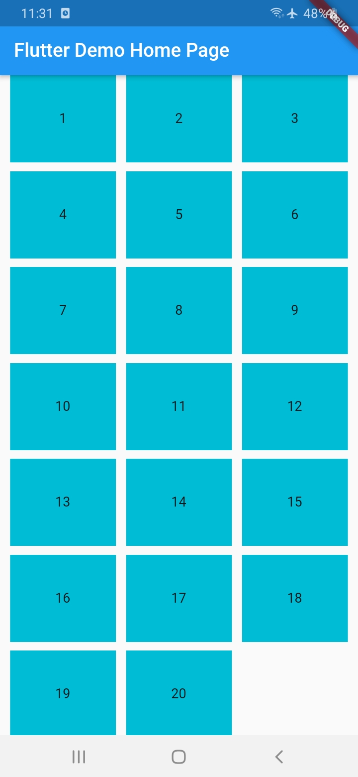
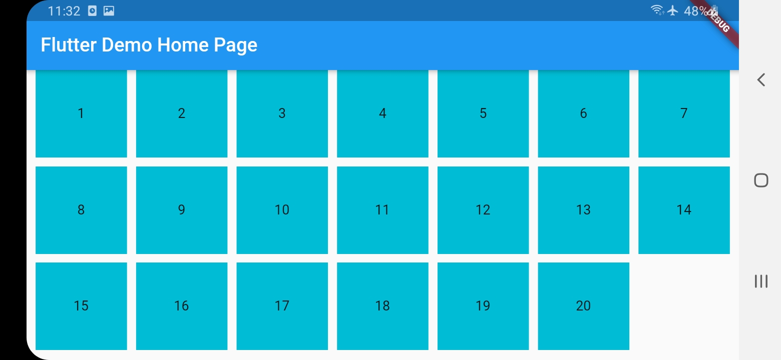
Responsive Grid List #
ResponsiveGridList works differently in that you only specify a desired width for the items and spacing, and it will decide how many items shall fit in a line, and the width of the item and spacing will change (only small change) to fill the entire width
    ResponsiveGridList(
        desiredItemWidth: 100,
        minSpacing: 10,
        children: [
          1,
          2,
          3,
          4,
          5,
          6,
          7,
          8,
          9,
          10,
          11,
          12,
          13,
          14,
          15,
          16,
          17,
          18,
          19,
          20
        ].map((i) {
          return Container(
            height: 100,
            alignment: Alignment(0, 0),
            color: Colors.cyan,
            child: Text(i.toString()),
          );
        }).toList()
    )
Metadata
8
likes
0
points
116
downloads
Publisher
Weekly Downloads
Metadata
Bootstrap Grid Implementation
Repository (GitHub)
View/report issues
License
 unknown (license)