buttons_tabbar 1.3.7  buttons_tabbar: ^1.3.7 copied to clipboard
 afonsoraposo.com
A Flutter package that implements a TabBar where each label is a toggle button.
Buttons TabBar #

Open source Flutter package, tabbar where each tab indicator is a toggle button.
Made by Afonso Raposo.
See the full example here
Install and import the package. Then just customize its parameters.
Installation #
dependencies:
  flutter:
    sdk: flutter
  buttons_tabbar: ^1.3.6
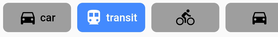
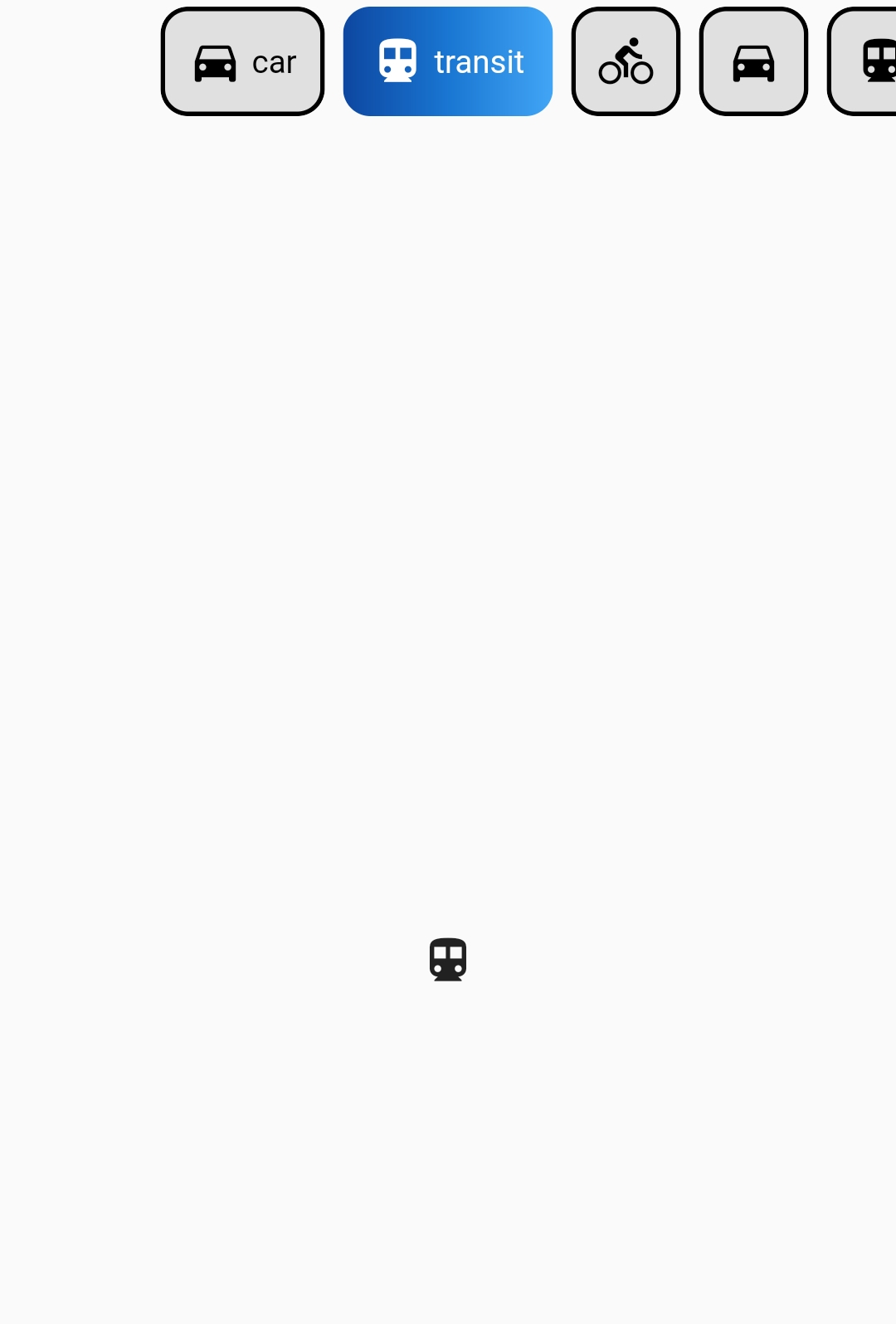
Screenshots #
Default
ButtonsTabBar - Examples #
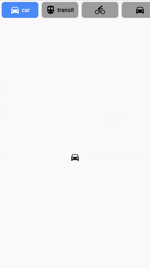
Example #1
DefaultTabController(
          length: ...,
          child: Column(
            children: <Widget>[
              ButtonsTabBar(
                backgroundColor: Colors.red,
                tabs: ...,
              ),
              Expanded(
                child: TabBarView(
                  children: ...,
                ),
              ),
            ],
          ),
        )
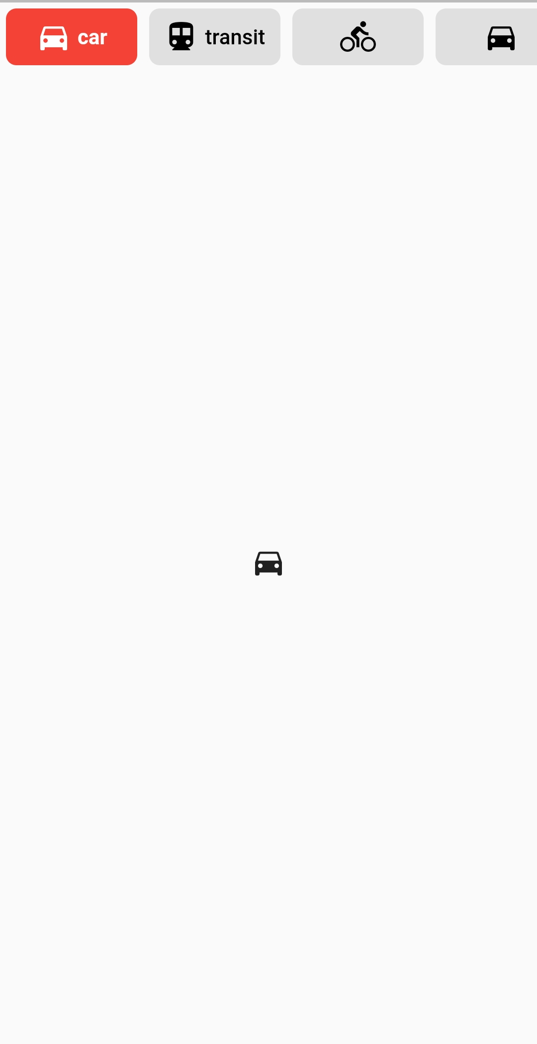
Example #2
DefaultTabController(
          length: ...,
          child: Column(
            children: <Widget>[
              ButtonsTabBar(
                backgroundColor: Colors.blue[600],
                unselectedBackgroundColor: Colors.white,
                labelStyle:
                    TextStyle(color: Colors.white, fontWeight: FontWeight.bold),
		unselectedLabelStyle: TextStyle(
                    color: Colors.blue[600], fontWeight: FontWeight.bold),
                borderWidth: 1,
                unselectedBorderColor: Colors.blue[600],
                radius: 100,
                tabs: ...,
              ),
              Expanded(
                child: TabBarView(
                  children: ...,
                ),
              ),
            ],
          ),
        )
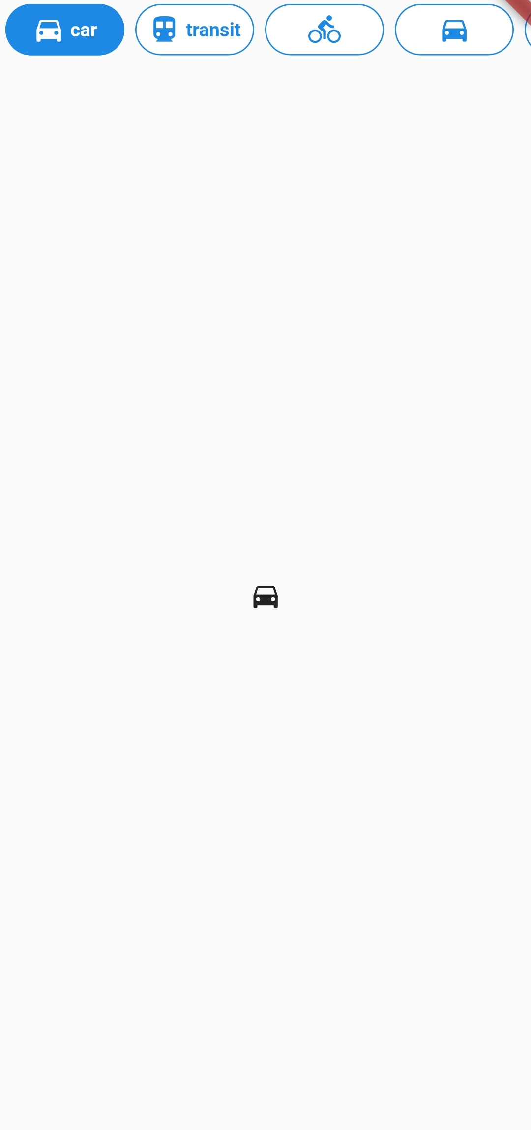
Example #3
DefaultTabController(
  length: 6,
  child: Column(
    children: <Widget>[
      ButtonsTabBar(
        radius: 12,
        contentPadding: EdgeInsets.symmetric(horizontal: 12),
        borderWidth: 2,
        borderColor: Colors.transparent,
        center: true,
        decoration: BoxDecoration(
          gradient: LinearGradient(
            colors: <Color>[
              Color(0xFF0D47A1),
              Color(0xFF1976D2),
              Color(0xFF42A5F5),
            ],
          ),
        ),
        unselectedLabelStyle: TextStyle(color: Colors.black),
        labelStyle: TextStyle(color: Colors.white),
        height: 56,
        tabs: ...,
      ),
      Expanded(
        child: TabBarView(
          children: ...,
        ),
      ),
    ],
  ),
)
ButtonsTabBar Parameters #
| Parameter | Type | Description | Default |
|---|---|---|---|
| tabs | List<Widget> |
The tabs to display. Typically a list of two or more Tab widgets. |
@required |
| controller | TabController |
This widget's selection and animation state. | DefaultTabController.of |
| duration | int |
The duration in milliseconds of the transition animation. | 250 |
| backgroundColor | Color |
The background color of the button on its selected state. | Theme.of(context).accentColor |
| unselectedBackgroundColor | Color |
The background color of the button on its unselected state. | Colors.grey[300] |
| decoration | BoxDecoration |
The BoxDecoration of the button on its selected state. |
null |
| unselectedDecoration | BoxDecoration |
The BoxDecoration of the button on its unselected state. |
null |
| splashColor | Color |
The splash color of the button | null |
| borderWidth | double |
The with of solid Border for each button. |
0 |
| borderColor | Color |
The border color of the button on its selected state. | Colors.black |
| unselectedBorderColor | Color |
The border color of the button on its unselected state. If it's value is null, the Color of borderColor is used. |
null |
| labelStyle | TextStyle |
The TextStyle of the button's Text on its selected state. The color provided on the TextStyle will be used for the Icon's color. |
TextStyle(color: Colors.white) |
| unselectedLabelStyle | TextStyle |
The TextStyle of the button's Text on its unselected state. The color provided on the TextStyle will be used for the Icon's color. |
TextStyle(color: Colors.black) |
| physics | ScrollPhysics |
The physics used for the ScrollControllerof the tabs list. |
BouncingScrollPhysics |
| contentPadding | EdgeInsets |
The EdgeInsets used for the Padding of the buttons' content. |
EdgeInsets.symmetric(horizontal: 4.0) |
| buttonMargin | EdgeInsets |
The EdgeInsets used for the Margin of the buttons. |
EdgeInsets.all(4.0) |
| labelSpacing | double |
The spacing between the Icon and the Text. If only one of those is provided, no spacing is applied. |
4.0 |
| radius | double |
The value of the BorderRadius.circular applied to each button. |
7.0 |
| height | double |
Override the material TabBar height value. | 46.0 |
| center | bool |
Center the tab buttons. | false |
| elevation | double |
The value of elevation applied to each button. |
0 |
Future #
If you have any suggestion or problem, let me know and I'll try to improve or fix it.
License #
GNU General Public License v3.0, see the LICENSE.md file for details.
Metadata
424
likes
0
points
17.6k
downloads
Publisher
Weekly Downloads
Metadata
A Flutter package that implements a TabBar where each label is a toggle button.
Homepage
Repository (GitHub)
View/report issues
License
 unknown (license)