chiclet 1.2.0  chiclet: ^1.2.0 copied to clipboard
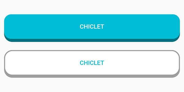
Chiclet provides you with highly customizable island-style buttons similar to those found in the popular language learning app Duolingo and Figma courses.
Highly customizable island-style buttons known as Chiclet.
Features #
Chiclet provides you with highly customizable island-style buttons similar to those found in the popular language learning app Duolingo and Figma courses.
Getting started #
In the dependencies: section of your pubspec.yaml, add the following line:
dependencies:
  chiclet: <latest_version>
Usage #
- Import
Chicletin your main.dart.
import 'package:chiclet/chiclet.dart';
- Basic implementation:
ChicletOutlinedAnimatedButton(
onPressed: () {},
child: const Icon(Icons.download_rounded),
),

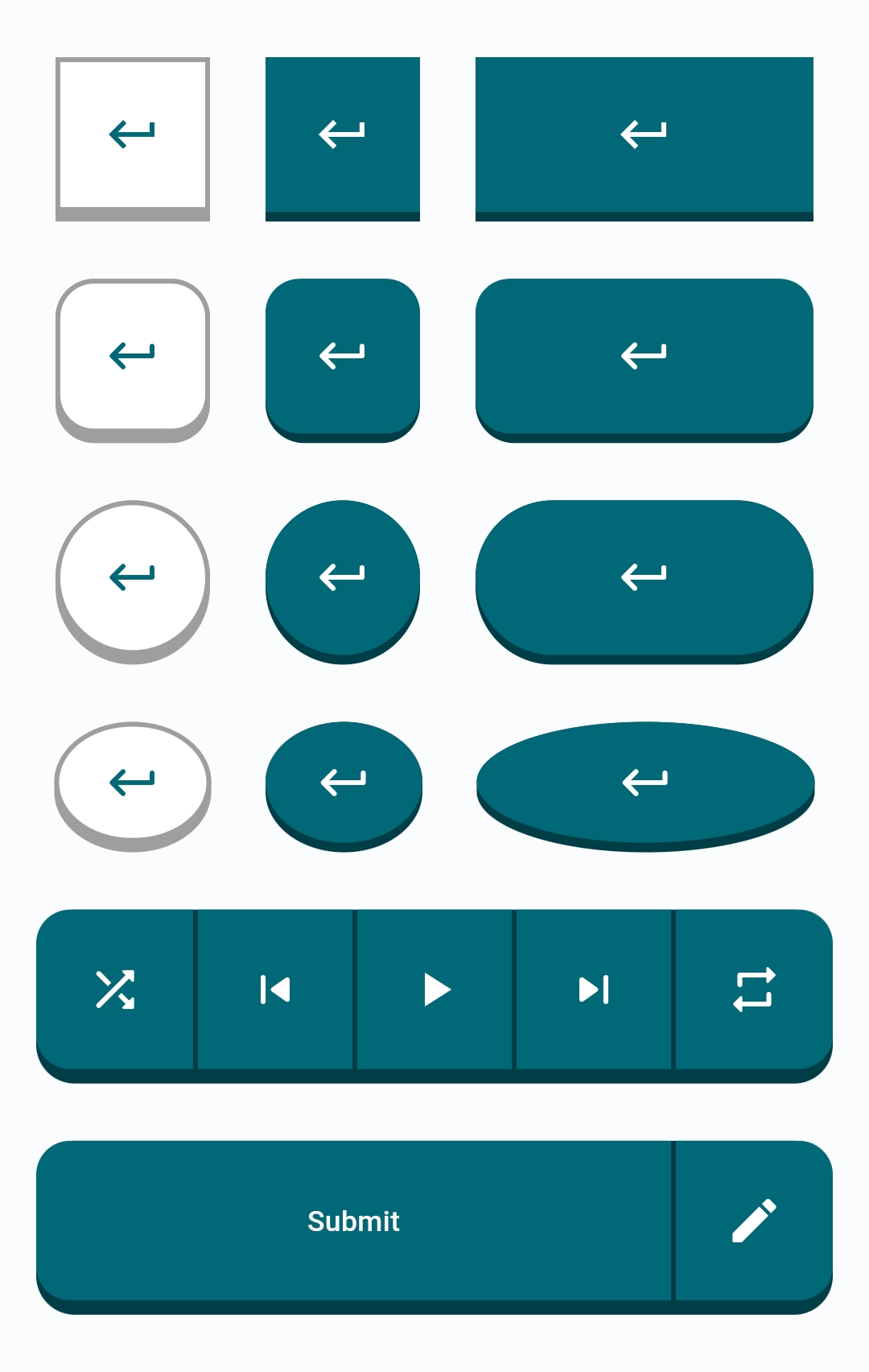
Buttons List #
- ChicletButton
- ChicletAnimatedButton
- ChicletOutlinedButton
- ChicletAnimatedOutlinedButton
- ChicletSegmentedButton
Button Types #
1. RoundedRectangle (default type): #
- You can either not specify it, or write
ChicletButtonTypes.roundedRectanglein front of thebuttonTypeproperty. In either case, the result will be the same. Example:ChicletOutlinedAnimatedButton( onPressed: () {}, child: const Icon(Icons.download_rounded), ),ChicletOutlinedAnimatedButton( onPressed: () {}, buttonType: ChicletButtonTypes.roundedRectangle, child: const Icon(Icons.download_rounded), ),
2. Circle: #
- You can create a circle shaped button by writing
ChicletButtonTypes.circlein front of thebuttonTypeproperty. Example:ChicletOutlinedAnimatedButton( onPressed: () {}, buttonType: ChicletButtonTypes.circle, child: const Icon(Icons.download_rounded), ),

3. Oval: #
- You can create an oval shaped button by writing
ChicletButtonTypes.circlein front of thebuttonTypeproperty. Example:ChicletOutlinedAnimatedButton( onPressed: () {}, width: 65, buttonType: ChicletButtonTypes.oval, child: const Icon(Icons.download_rounded), ),

You can find more examples in the /example/lib/main.dart directory.
Customizable Properties #
ChicletButton and ChicletAnimatedButton: #
- padding,
- width (If not provided, it will be the same as
height), - height (default is 50),
- minimumSize,
- maximumSize,
- isPressed (default is false),
- buttonHeight (default is 4, and it applies in addition to the
height), - borderRadius (default is 16),
- buttonColor (default is
shade.900ofThemeData'sprimarySwatch, unless you provide thebackgroundColorproperty, then it will beshade.900of thebackgroundColorproperty), - foregroundColor (default is
Colors.white), - backgroundColor (default is
ThemeData'sprimarySwatch), - disabledforegroundColor,
- disabledbackgroundColor,
- splashFactory (default is
NoSplash.splashFactory), - buttonType (default is
ChicletButtonTypes.roundedRectangle),
ChicletOutlinedButton and ChicletOutlinedAnimatedButton: #
- padding,
- width (If not provided, it will be the same as
height), - height (default is 50),
- minimumSize,
- maximumSize,
- isPressed (default is false),
- buttonHeight (default is 4, and it applies in addition to the
height), - borderWidth (default is 2),
- borderRadius (default is 16),
- borderColor (default is
Colors.grey), - buttonColor (default is
Colors.grey), - foregroundColor (default is
ThemeData'sprimarySwatch), - backgroundColor (default is
Colors.white), - disabledborderColor (default is
Theme.colorScheme.onSurface(0.12)), - disabledforegroundColor,
- disabledbackgroundColor,
- splashFactory (default is
NoSplash.splashFactory), - buttonType (default is
ChicletButtonTypes.roundedRectangle),
ChicletSegmentedButton: #
- padding
- width
- height
- minimumSize,
- maximumSize,
- isPressed (default is false),
- buttonHeight (default is 4, and it applies in addition to the
height), - borderRadius (default is 16),
- buttonColor (default is
Colors.grey), - foregroundColor (default is
ThemeData'sprimarySwatch), - backgroundColor (default is
Colors.white), - disabledforegroundColor,
- disabledbackgroundColor,
- splashFactory (default is
NoSplash.splashFactory), - buttonType (default is
ChicletButtonTypes.roundedRectangle),
ChicletButtonSegment (Intended to be used only as ChicletSegmentedButton's child): #
- padding
- width
- isPressed (default is false),
- buttonColor (default is
Colors.grey), - foregroundColor (default is
ThemeData'sprimarySwatch), - backgroundColor (default is
Colors.white), - disabledforegroundColor,
- disabledbackgroundColor,
Note
When using Material 3, providing the primarySwatch doesn't affect the color properties. You should consider providing either colorScheme or ColorSchemeSeed.
Additional information #
Suggestions, recommendations, bug reports, and issues: DevRedStone
Metadata

Publisher
unverified uploader
Weekly Downloads
Metadata
Chiclet provides you with highly customizable island-style buttons similar to those found in the popular language learning app Duolingo and Figma courses.
Documentation
License
 MIT (license)