chips_input_autocomplete 1.1.1+1  chips_input_autocomplete: ^1.1.1+1 copied to clipboard
 bruckcode.de
A chips input with autocomplete. Ideal for tagging or categorizing user input. Many options to customize the behavior and appearance.
Chips Input Autocomplete #


📚 Table of Contents #
🚀 Features #
- Dynamic Chip Creation: Users can type to create chips dynamically. Ideal for tags, contacts, or any categorization.
- Autocomplete Suggestions: Offers suggestions as the user types, based on predefined options.
- Customizable Appearance: Full control over the chip's appearance, including background, border, and text colors.
- Form Integration: Easily integrates with forms, allowing for validation and submission of chip data.
- Extensive Customization: Beyond styling, customize behavior like adding chips on selection, limiting selections, and more.
🏁 Getting Started #
To get started with chips_input_autocomplete, check out the Installation and Usage. Detailed documentation under API reference.
🛠️ Usage #
To use chips_input_autocomplete in your Flutter project, follow these steps:
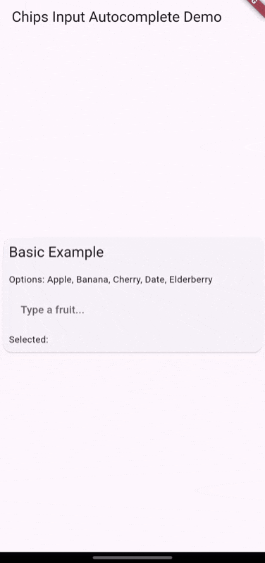
Basic Chip Input #
This example demonstrates how to create a basic chip input field where users can type to create chips dynamically.
const List<String> yourOptionsList = ['Option 1', 'Option 2', 'Option 3'];

ChipsInputAutocomplete(
  options: yourOptionsList,
)
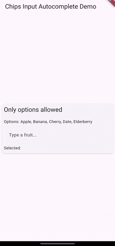
Validate Input #
Only allow chips that match predefined options. This example uses a validation method to ensure only valid options are added as chips.
ChipsInputAutocomplete(
  options: yourOptionsList,
  validateInputMethod: (String? input) {
    if (yourOptionsList.contains(input)) {
      return null; // Input is valid
    } else {
      return 'Only predefined options are allowed'; // Input is invalid
    }
  },
)
Get chips data #
Use a controller to get the selected chips data.
final ChipsAutocompleteController controller = ChipsAutocompleteController();

ChipsInputAutocomplete(
  controller: controller,
)

// Get selected chips data
List<String> selectedChips = controller.chips; // selectedChips = ['Chiptext 1', 'Chiptext 2']
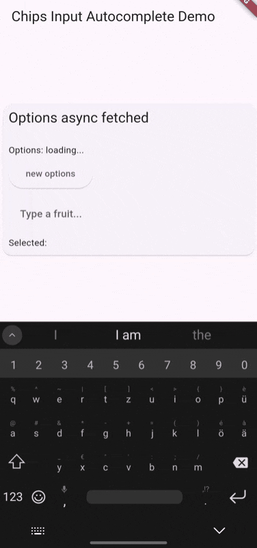
Async fetched options #
Use a controller to manage the options asynchronously. This example fetches options from an API and sets them in the controller.
final ChipsAutocompleteController controller = ChipsAutocompleteController();

@override
void initState() {
  getTagsOptions();
  super.initState();
}

Future<void> getTagsOptions() async {
  controller.options = await fetchTags();
}

ChipsInputAutocomplete(
  controller: controller,
)
For more detailed examples and usage, refer to the pub.dev example.
⚙️ Usage Examples #
The appearance may differ from the current default theme. The following examples demonstrate the various configurations and behaviors of the chips_input_autocomplete widget. For current appearance, refer to the pub.dev example.
🧷 Parameters #
Basic Configuration #
controller: Manages chips, autocomplete options, and the textfield.options: A list of strings for autocomplete options. Can also be set via the controller.createCharacter: Character that triggers chip creation. (default:,)separatorCharacter: Character used to separate output chips. (default:,)placeChipsSectionAbove: Determines if the chips section is above / left or below / right the textfield.
Chip Appearance #
secondaryTheme: When true, uses a secondary theme for the chips. Based on the selected chip theme of material design 3.chipTheme: Theme for the chips. Defaults to material design 3. More Details under ChipThemeData.deleteIcon: Icon for deleting a chip. Defaults to a close icon. Can be null to remove.chipClipBehavior: Clip behavior for the chips. (default:Clip.none)deleteButtonTooltipMessage: Tooltip message for the delete button. (default:Delete)
Text Field Appearance and Configuration #
focusNode: FocusNode for the textfield.decorationTextField: Style of the textfield.keyboardType: Keyboard type for the textfield.enableSuggestions: Whether to show suggestions.showCursor: Whether to show the cursor.cursorWidth: Width of the cursor.cursorColor: Color used for the cursor.cursorRadius: Radius of the cursor.cursorHeight: Height of the cursor.
Container Appearance #
widgetContainerDecoration: Decoration for the main widget container.paddingInsideWidgetContainer: Padding inside the main widget container.spacing: Spacing between chips. (default:5.0)runSpacing: Spacing between lines of chips. If unset, defaults to spacing.optionsMaxWidth: Maximum width of the options view. Defaults to textfield width if unset.
Additional Configuration #
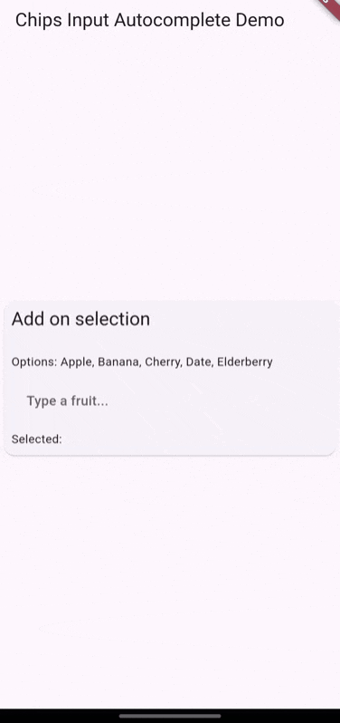
autoFocus: Whether the widget should autofocus.formKey: Form key for accessing or validating the form outside the widget.validateInputMethod: Validation method returning a string if input is invalid. Null means always valid.addChipOnSelection: Adds a chip when an option is selected. If false, adds the option to the text field.showClearButton: Whether to show the clear IconButton.clearWithConfirm: Whether to show a confirmation dialog when clearing all chips.eraseKeyLabel: Key label used for erasing a chip. Defaults to Backspace.
Callbacks and Event Handling #
onChanged: Callback when the text field changes.onEditingComplete: Callback when editing is complete.onSaved: Callback when the form is saved.onChipDeleted: Callback when a chip is deleted, with chip content and index.onChipAdded: Callback when a chip is added, with chip content.onChipsCleared: Callback when all chips are cleared.useDefaultOnChipDeleted: Whether to use the default onChipDeleted method. Maybe set to false for a different logic. For example, when chips are updated from a different source.useDefaultOnChipAdded: Whether to use the default onChipAdded method. Maybe set to false for a different logic. For example, when chips are updated from a different source.useDefaultOnChipsCleared: Whether to use the default onChipsCleared method. Maybe set to false for a different logic. For example, when chips are updated from a different source.
🧑💻 Author #
Metadata
Publisher
Weekly Downloads
Metadata
A chips input with autocomplete. Ideal for tagging or categorizing user input. Many options to customize the behavior and appearance.
Repository (GitHub)
View/report issues
License
 unknown (license)