circular_indicator 1.0.3  circular_indicator: ^1.0.3 copied to clipboard
A new Flutter project.
circular_indicator #
Demo #
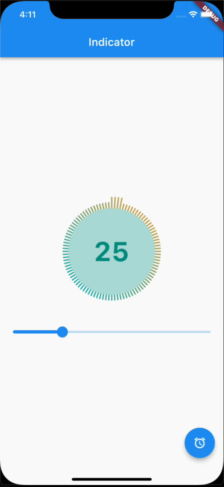
| Parameter | Type | Description | Default |
|---|---|---|---|
| maxStep | double | Total number of step of the complete indicator. | 100 |
| current | double | Number of steps to underline, all the steps with index <= currentStep will have Color equal to selectedColor. | 0 |
| widthLine | double | Thickness of the brick line. | 3 |
| heightLine | double | Height of selected tile line. The height of the unselected line is equal to heightLine/2 | 20 |
| height | double | Height of the indicator's container. | - |
| width | double | Width of the indicator's container. | - |
| selectedColor | Color | Color of the selected steps. | Colors |
| unselectedColor | Color | Color of the unselected steps. | Colors |
| gradientColor | Gradient | Apply a gradient color to the indicator. | - |
| child | Widget | Widget child contained inside the indicator. | - |
| duration | Duration | Animation duration to change state | 2 seconds |
| curve | Curves | Status change animation | Curves.easeInOutQuint |
Metadata
9
likes
0
points
35
downloads
Publisher
unverified uploader
Weekly Downloads
Metadata
A new Flutter project.
Repository (GitHub)
View/report issues
License
 unknown (license)