contained_tab_bar_view 0.4.0  contained_tab_bar_view: ^0.4.0 copied to clipboard
 scipack.dev
ContainedTabBarView encapsulates TabController, TabBar and TabBarView into a single, easy to use Widget.
ContainedTabBarView #
ContainedTabBarView encapsulates TabController, TabBar and TabBarView into a single, easy to use, constrainable Widget.
Usage #
To use this package, add contained_tab_bar_view as a dependency in your pubspec.yaml file.
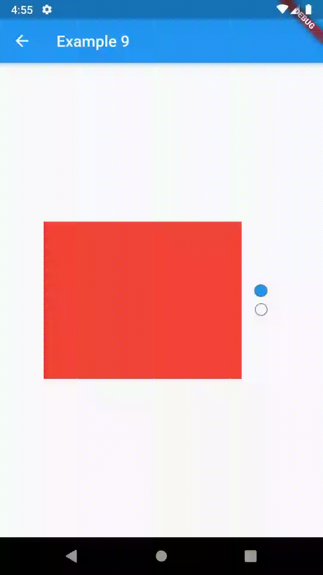
Examples #
All of the below examples can be found under "Examples", each written as a simple StatelessWidget.
Basic #
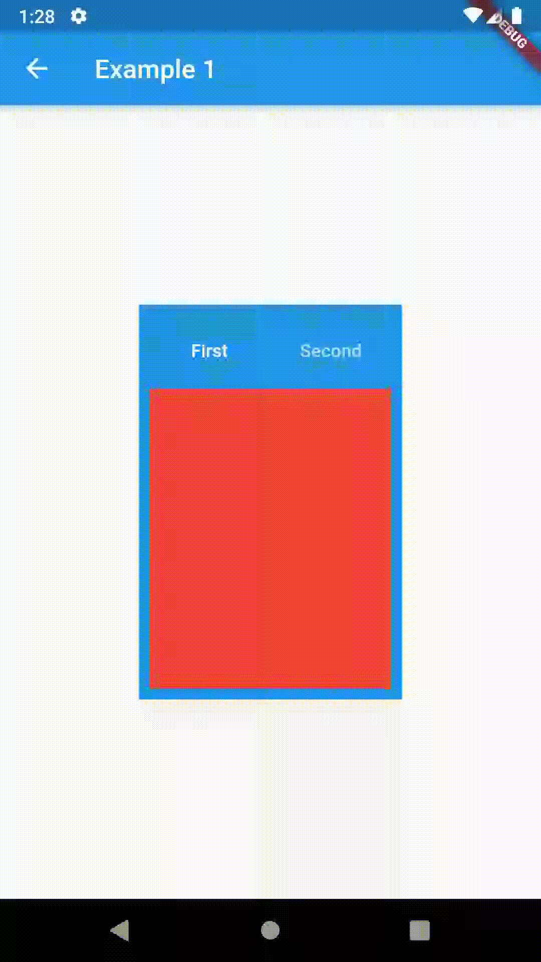
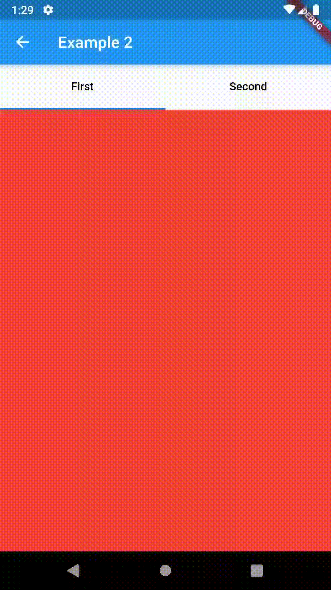
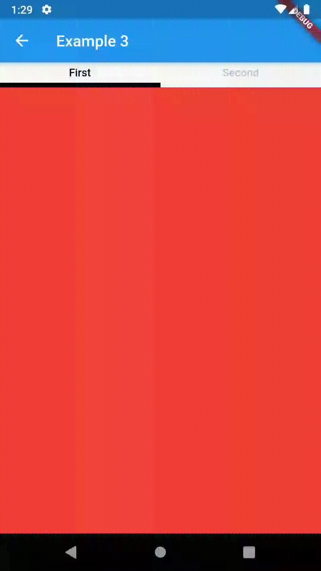
Basic examples include putting a ContainedTabBarView into a Container whose constraints will it obey. Putting a ContainedTabBarView directly into a body of a Scaffold will, expectedly, draw it full-screen.
// Example 1
import 'package:contained_tab_bar_view/contained_tab_bar_view.dart';

...

Container(
    padding: const EdgeInsets.all(8.0),
    color: Colors.blue,
    width: 200,
    height: 300,
    child: ContainedTabBarView(
        tabs: [
            Text('First'),
            Text('Second')
        ],
        views: [
            Container(color: Colors.red),
            Container(color: Colors.green)
        ],
        onChange: (index) => print(index),
    ),
)
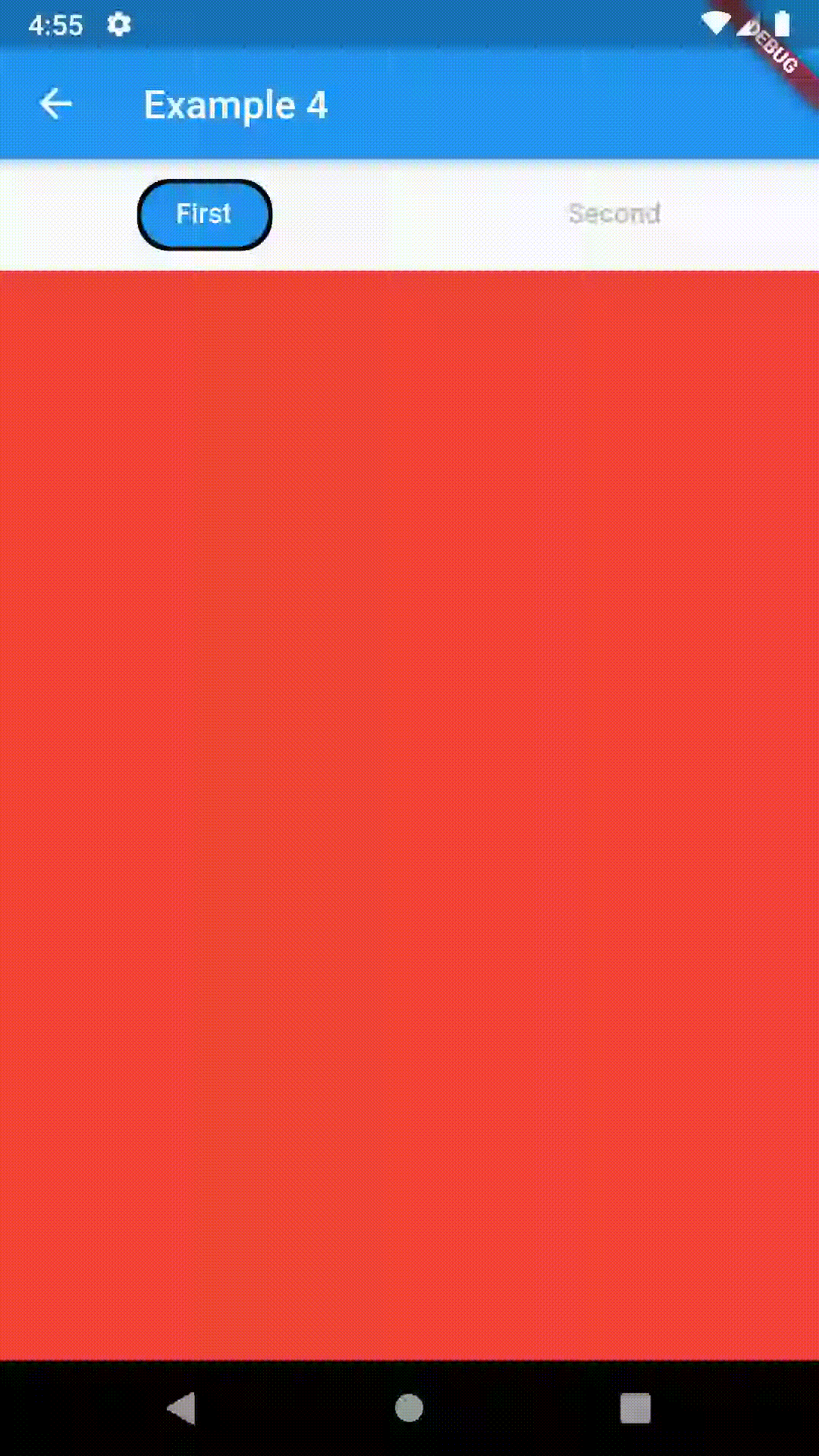
Intermediate #
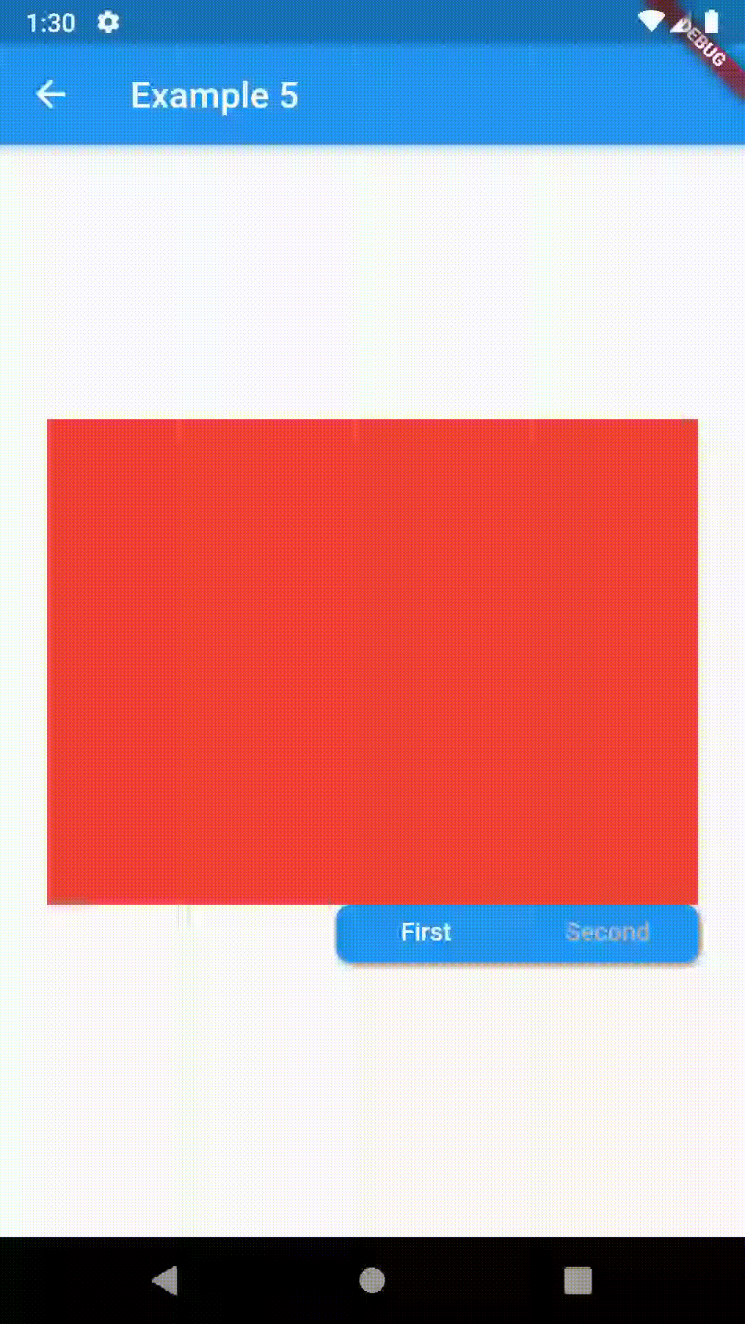
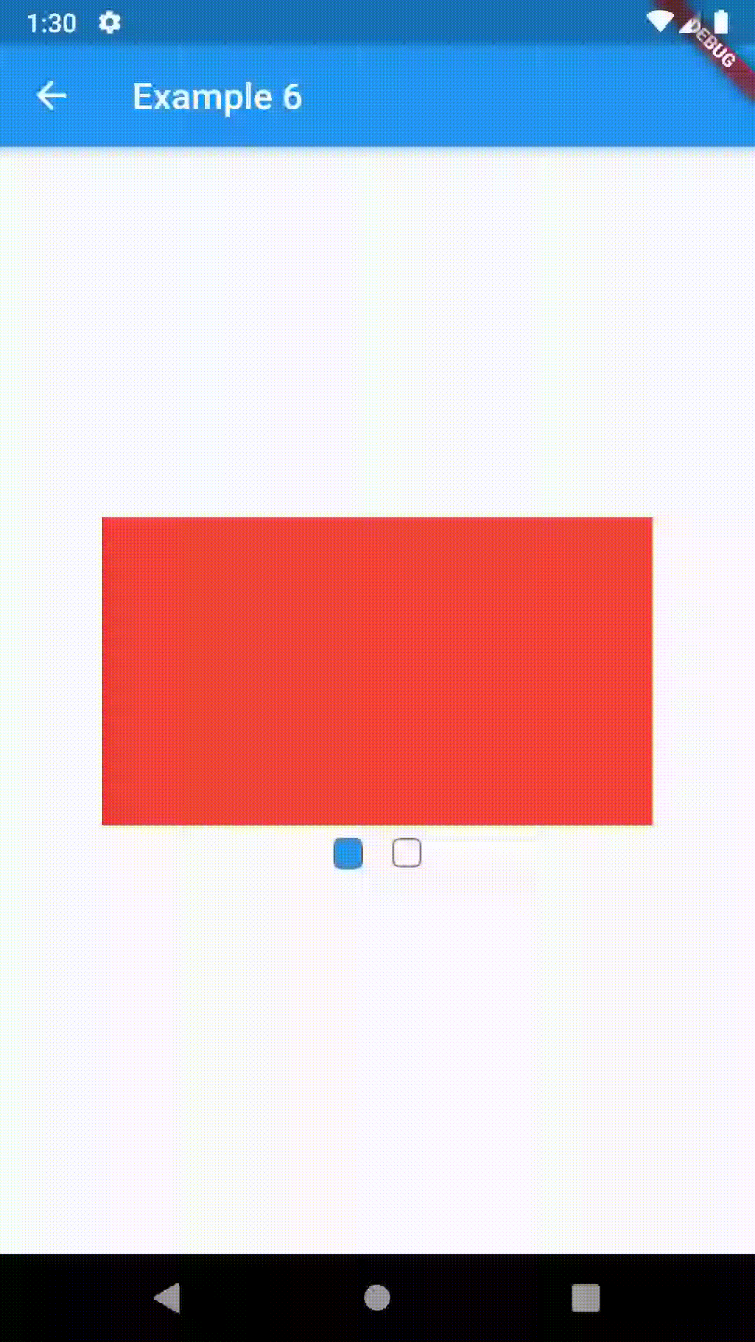
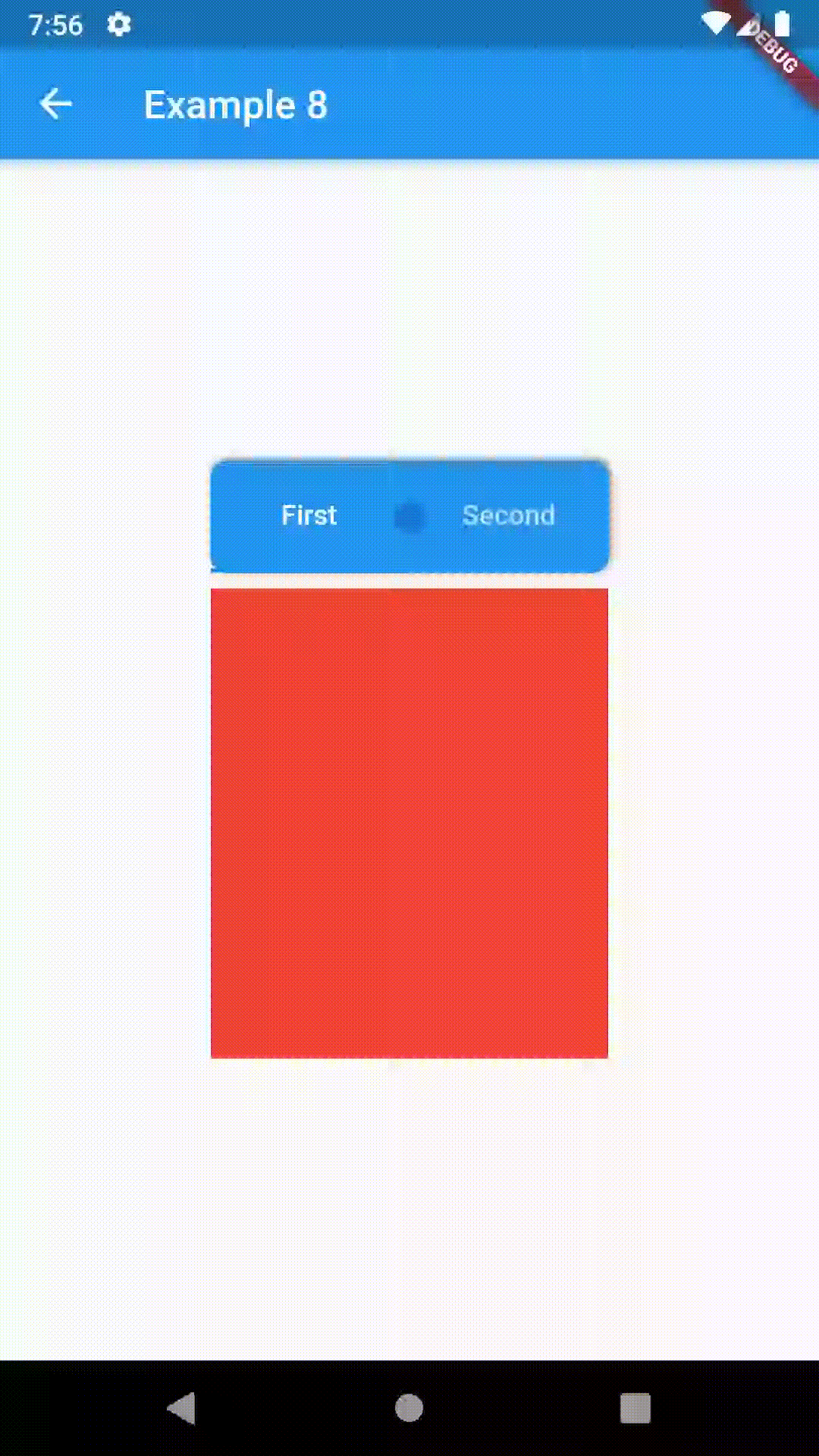
All the properties that can be set for a TabBar are accessible for setting via tabBarProperties. Also, there are many more for the customization of TabBar's appearance. To create your own ("container-based") indicator, you can use ContainerIndicator decoration (see examples 4 and 6).
// Example 5
ContainedTabBarView(
    tabs: [Text('First'), Text('Second')],
    tabBarProperties: TabBarProperties(
        width: 200,
        height: 32,
        position: TabBarPosition.bottom,
        alignment: TabBarAlignment.end,
        backgroundStack: Stack(
            children: [
                Container(
                    decoration: BoxDecoration(
                        color: Colors.blue,
                        borderRadius: BorderRadius.all(
                            Radius.circular(8.0)
                        ),
                        boxShadow: [
                            BoxShadow(
                                color: Colors.black.withOpacity(0.4),
                                spreadRadius: 0.5,
                                blurRadius: 2,
                                offset: Offset(1, -1),
                            ),
                        ],
                    ),
                ),
            ],
        ),
        indicatorColor: Colors.transparent,
        labelColor: Colors.white,
        unselectedLabelColor: Colors.grey[400],
    ),
    views: [
        Container(color: Colors.red),
        Container(color: Colors.green)
    ],
Advanced #
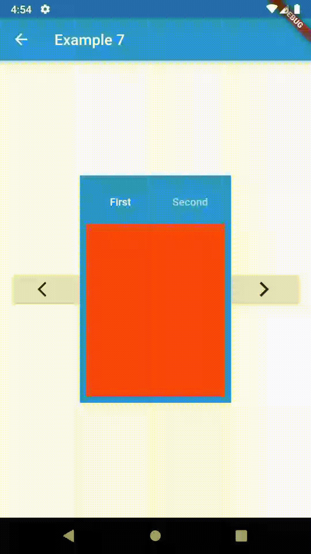
To control the state, i.e. move to another tab, from outside of ContainedTabBarView create it with a GlobalKey and then use methods exposed from state; animateTo(), next() and previous().
// Example 7
class Example7 extends StatelessWidget {
    @override
    Widget build(BuildContext context) {
        GlobalKey<ContainedTabBarViewState> _key = GlobalKey();
        ContainedTabBarView containedTabBarView = ContainedTabBarView(
            key: _key,
            tabs: [
                Text('First'),
                Text('Second')
            ],
            views: [
                Container(color: Colors.red),
                Container(color: Colors.green)
            ],
        );

        return Scaffold(
            appBar: AppBar(
                title: Text('Example 7'),
            ),
            body: Row(
                mainAxisAlignment: MainAxisAlignment.center,
                children: [
                    RaisedButton(
                        child: Icon(Icons.arrow_back_ios),
                        onPressed: () => _key.currentState.previous(),
                    ),
                    Center(
                        child: Container(
                        padding: const EdgeInsets.all(8.0),
                        color: Colors.blue,
                        width: 200,
                        height: 300,
                        child: containedTabBarView,
                    )),
                    RaisedButton(
                        child: Icon(Icons.arrow_forward_ios),
                        onPressed: () => _key.currentState.next(),
                    ),
                ]
            ),
        );
    }
}
Metadata
Publisher
Weekly Downloads
Metadata
ContainedTabBarView encapsulates TabController, TabBar and TabBarView into a single, easy to use Widget.
Repository (GitHub)
View/report issues
License
 unknown (license)