custom_sliding_segmented_control 1.3.0  custom_sliding_segmented_control: ^1.3.0 copied to clipboard
Allows you to flexibly configure the widget for displaying controls. You can add color, speed, size, initial value, animation and more.
CustomSlidingSegmentedControl #
Allows you to flexibly configure the widget for displaying controls. You can add color, speed, size, initial value, animation and more.
Example
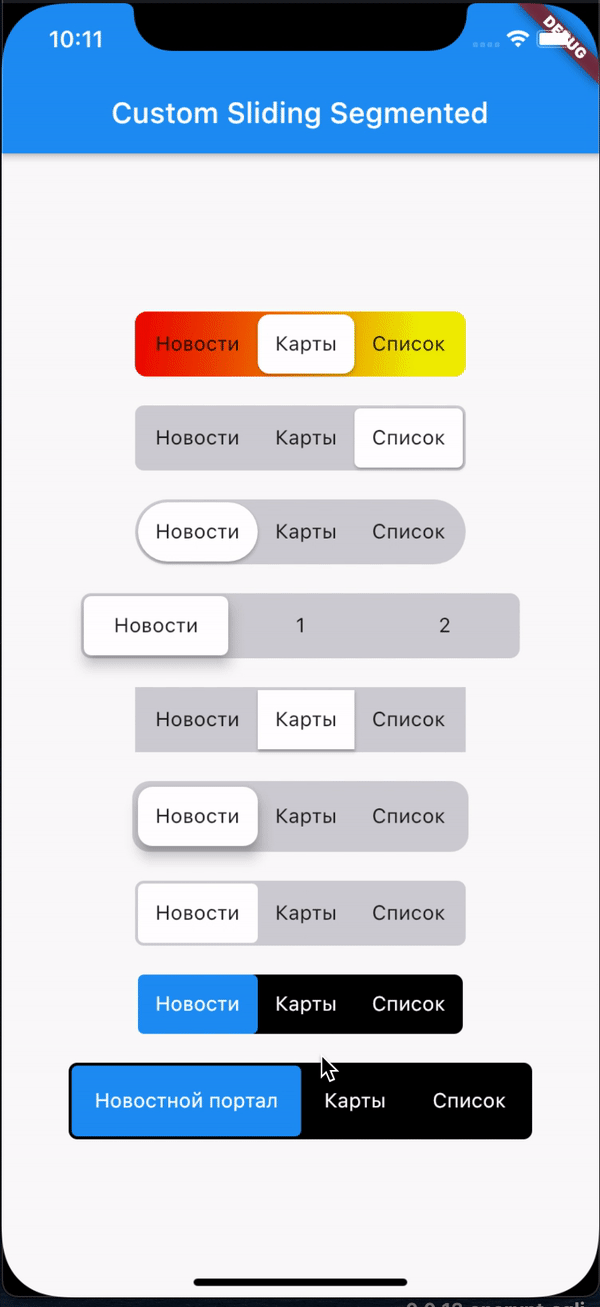
import 'package:flutter/cupertino.dart';
import 'package:flutter/material.dart';
import 'package:custom_sliding_segmented_control/custom_sliding_segmented_control.dart';

void main() {
  runApp(MyApp());
}

enum SegmentType { news, map, paper }

class MyApp extends StatelessWidget {
  @override
  Widget build(BuildContext context) {
    return MaterialApp(
      title: 'Flutter Demo',
      theme: ThemeData(
        primarySwatch: Colors.blue,
        visualDensity: VisualDensity.adaptivePlatformDensity,
      ),
      home: MyHomePage(),
    );
  }
}

class MyHomePage extends StatefulWidget {
  MyHomePage({Key key}) : super(key: key);

  @override
  _MyHomePageState createState() => _MyHomePageState();
}

class _MyHomePageState extends State<MyHomePage> {
  @override
  Widget build(BuildContext context) {
    return Scaffold(
      appBar: AppBar(
        title: Text('Custom Sliding Segmented'),
      ),
      body: Center(
        child: Column(
          mainAxisAlignment: MainAxisAlignment.center,
          crossAxisAlignment: CrossAxisAlignment.center,
          mainAxisSize: MainAxisSize.min,
          children: [
            CustomSlidingSegmentedControl<SegmentType>(
              elevation: 2,
              children: {
                SegmentType.news: Text('Новости'),
                SegmentType.map: Text('Карты'),
                SegmentType.paper: Text('Список'),
              },
              radius: 8,
              decoration: BoxDecoration(
                borderRadius: BorderRadius.circular(8),
                gradient: LinearGradient(
                  begin: Alignment.topLeft,
                  end: Alignment(0.7, 0.0),
                  colors: [
                    const Color(0xffee0000),
                    const Color(0xffeeee00)
                  ], // red to yellow
                ),
              ),
              onValueChanged: (SegmentType v) {
                print(v);
              },
            ),
            const SizedBox(height: 20),
            CustomSlidingSegmentedControl<SegmentType>(
              elevation: 2,
              children: {
                SegmentType.news: Text('Новости'),
                SegmentType.map: Text('Карты'),
                SegmentType.paper: Text('Список'),
              },
              onValueChanged: (SegmentType v) {
                print(v);
              },
            ),
            const SizedBox(height: 20),
            CustomSlidingSegmentedControl<int>(
              children: {
                0: Text('Новости'),
                1: Text('Карты'),
                2: Text('Список'),
              },
              duration: Duration(milliseconds: 200),
              radius: 30.0,
              onValueChanged: (index) {
                print(index);
              },
            ),
            const SizedBox(height: 20),
            CustomSlidingSegmentedControl<SegmentType>(
              fixedWidth: 100,
              children: {
                SegmentType.news: Text('Новости', textAlign: TextAlign.center),
                SegmentType.map: Text('1', textAlign: TextAlign.center),
                SegmentType.paper: Text('2', textAlign: TextAlign.center),
              },
              radius: 5,
              elevation: 8,
              onValueChanged: (v) {
                print(v);
              },
            ),
            const SizedBox(height: 20),
            CustomSlidingSegmentedControl<String>(
              children: {
                'Новости': Text('Новости'),
                'Карты': Text('Карты'),
                'Список': Text('Список'),
              },
              duration: Duration(milliseconds: 200),
              radius: 0.0,
              onValueChanged: (v) {
                print(v);
              },
            ),
            const SizedBox(height: 20),
            CustomSlidingSegmentedControl<SegmentType>(
              innerPadding: 4,
              children: {
                SegmentType.news: Text('Новости'),
                SegmentType.map: Text('Карты'),
                SegmentType.paper: Text('Список'),
              },
              radius: 10,
              elevation: 8,
              onValueChanged: (v) {
                print(v);
              },
            ),
            const SizedBox(height: 20),
            CustomSlidingSegmentedControl<SegmentType>(
              children: {
                SegmentType.news: Text('Новости'),
                SegmentType.map: Text('Карты'),
                SegmentType.paper: Text('Список'),
              },
              elevation: 0,
              onValueChanged: (v) {
                print(v);
              },
            ),
            const SizedBox(height: 20),
            CustomSlidingSegmentedControl<SegmentType>(
              children: {
                SegmentType.news: Text(
                  'Новости',
                  style: TextStyle(color: Colors.white),
                ),
                SegmentType.map: Text(
                  'Карты',
                  style: TextStyle(color: Colors.white),
                ),
                SegmentType.paper: Text(
                  'Список',
                  style: TextStyle(color: Colors.white),
                ),
              },
              elevation: 0,
              innerPadding: 0,
              backgroundColor: Colors.black,
              thumbColor: Colors.blue,
              textColor: Colors.white,
              duration: Duration(milliseconds: 300),
              curve: Curves.easeInToLinear,
              onValueChanged: (v) {
                print(v);
              },
            ),
            const SizedBox(height: 20),
            CustomSlidingSegmentedControl<SegmentType>(
              children: {
                SegmentType.news: Text(
                  'Новостной портал',
                  style: TextStyle(color: Colors.white),
                ),
                SegmentType.map: Text(
                  'Карты',
                  style: TextStyle(color: Colors.white),
                ),
                SegmentType.paper: Text(
                  'Список',
                  style: TextStyle(color: Colors.white),
                ),
              },
              elevation: 0,
              innerPadding: 2,
              padding: 16,
              backgroundColor: Colors.black,
              thumbColor: Colors.blue,
              textColor: Colors.white,
              duration: Duration(milliseconds: 300),
              curve: Curves.easeInToLinear,
              onValueChanged: (v) {
                print(v);
              },
            ),
          ],
        ),
      ),
    );
  }
}
Metadata
197
likes
0
points
50.5k
downloads
Publisher
unverified uploader
Weekly Downloads
Metadata
Allows you to flexibly configure the widget for displaying controls. You can add color, speed, size, initial value, animation and more.
Repository (GitHub)
View/report issues
License
 unknown (license)