customizable_datetime_picker 0.0.2  customizable_datetime_picker: ^0.0.2 copied to clipboard
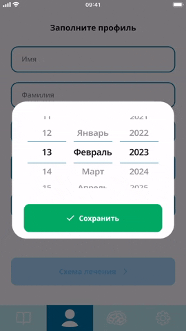
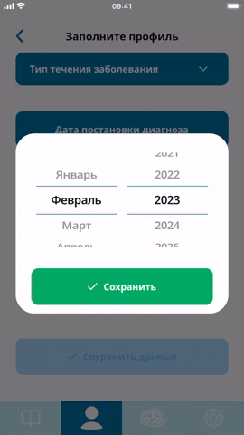
Customizable Datetime Picker for Flutter projects. You can customize different parts of the picker like format locale divider color and many others.
customizable_datetime_picker #
Customizable DateTime (or only Time) Picker for Flutter projects. You can customize different parts of the picker like format locale divider color and many others.

Features #
Use this plugin in your Flutter app to:
- Display Cupertino style DatePicker with customizable parts.
- You need to change even small parts of the pciker, like color and thickness of the dividers. Picker item height and background color.
- You need to select Locale and date format.
Usage #
DatePickerWidget #
You can use this widget with deafult parameters just like this:
CustomizableDatePickerWidget()
Or you can use DateTimePickerTheme and DatePickerDividerTheme to define design of the picker. And provide needed parameters to customize logic of the picker (datetime format, range of dates and so on):
CustomizableDatePickerWidget(
  locale: DateTimePickerLocale.jp,
  looping: true,
  initialDate: _dateTime,
  dateFormat: "dd-MMMM-yyyy",
  pickerTheme: const DateTimePickerTheme(
    itemTextStyle: TextStyle(
      color: Color(0xFF101010),
      fontSize: 20,
      fontWeight: FontWeight.w600
    ),
    backgroundColor: Color(0xFFEBEBEB),
    itemHeight: 80,
    pickerHeight: 300,
    dividerTheme: DatePickerDividerTheme(
     dividerColor: Color(0xFF00A962),
     thickness: 3,
     height: 2
    )
  ),
  onChange: (dateTime, selectedIndex) => _dateTime = dateTime
)
Also you can provide separatorWidget parameter to add custom separator betwee picker rows.
CustomizableDatePickerWidget(
  separatorWidget: const Padding(
    padding: EdgeInsets.symmetric(horizontal: 32),
    child: Text(
      ":",
      style: pickerTextStyle,
    ),
   ),
  locale: DateTimePickerLocale.jp,
  looping: true,
  initialDate: _dateTime,
  dateFormat: "dd-MMMM-yyyy",
  pickerTheme: const DateTimePickerTheme(
    itemTextStyle: TextStyle(
      color: Color(0xFF101010),
      fontSize: 20,
      fontWeight: FontWeight.w600
    ),
    backgroundColor: Color(0xFFEBEBEB),
    itemHeight: 80,
    pickerHeight: 300,
    dividerTheme: DatePickerDividerTheme(
     dividerColor: Color(0xFF00A962),
     thickness: 3,
     height: 2
    )
  ),
  onChange: (dateTime, selectedIndex) => _dateTime = dateTime
)
TimePickerWidget #
Same as DateTime picker. You can use this widget with deafult parameters just like this:
CustomizableTimePickerWidget()
Or you can use DateTimePickerTheme and DatePickerDividerTheme to define design of the picker. And provide needed parameters to customize logic of the picker (time format):
CustomizableTimePickerWidget(
  locale: DateTimePickerLocale.jp,
  looping: true,
  initialDate: _dateTime,
  dateFormat: "HH:mm",
  pickerTheme: const DateTimePickerTheme(
    itemTextStyle: TextStyle(
      color: Color(0xFF101010),
      fontSize: 20,
      fontWeight: FontWeight.w600
    ),
    backgroundColor: Color(0xFFEBEBEB),
    itemHeight: 80,
    pickerHeight: 300,
    dividerTheme: DatePickerDividerTheme(
     dividerColor: Color(0xFF00A962),
     thickness: 3,
     height: 2
    )
  ),
  onChange: (dateTime, selectedIndex) => _dateTime = dateTime
)
More details in example.
TODO #
- Add 12/24 hours support
- Add DateTimePicker Widget
Metadata
Publisher
unverified uploader
Weekly Downloads
Metadata
Customizable Datetime Picker for Flutter projects. You can customize different parts of the picker like format locale divider color and many others.
Repository (GitHub)
View/report issues
Documentation
License
 MIT (license)
Dependencies
auto_size_text, flutter, plugin_platform_interface