df_dropdown 1.2.5  df_dropdown: ^1.2.5 copied to clipboard
 dartforce.dev
This Flutter package providing versatile and customizable dropdown components with different selection modes and search functionality.
#df_dropdown
df_dropdown is a Flutter package providing versatile and customizable dropdown components with different selection modes and search functionality.
Features: #
- Simple dropdown
- Searchable dropdown
- Single select with search
- Multi select with search
Installation #
Add the package to your pubspec.yaml file
dependencies:
  df_dropdown: latest_version
Then, run: flutter pub get
Usage #
Note #
- Setting
dropdownTypetoDropdownType.overlaydisplays the dropdown options on top of the existing widgets, without repositioning them. - By default,
dropdownTypeis set toDropdownType.expandable, which expands the dropdown by shifting the widgets below it to make space for the options.
1. Simple Dropdown #
This provides a basic dropdown menu with customizable styles such as rounded borders, border color, and more.
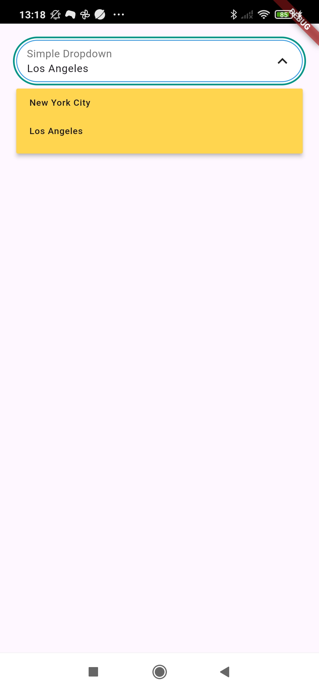
Example #
  DfSimpleDropdown<String>(
  decoration: DropdownDecoration(
    borderRadius: BorderRadius.circular(999),
    borderColor: Colors.blue,
  ),
  hintText: "Select an option...",
  labelText: "Simple Dropdown",
  selectedValue: DropDownModel<String>(key: "2", value: "2", text: "Los Angeles"),
  onOptionSelected: (value) {
    log("SELECTED VALUE ${value.value}");
  },
  initData: [
    DropDownModel<String>(key: "1", value: "1", text: "New York City"),
    DropDownModel<String>(key: "2", value: "2", text: "Los Angeles"),
  ],
)
2. Simple Searchable Dropdown #
This dropdown includes a search option for filtering through a large set of options, helping users quickly find what they’re looking for.
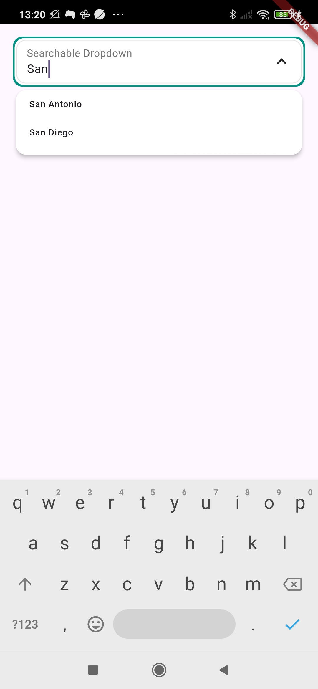
Example #
  DfSearchableDropdown<String>(
    hintText: "Start typing..",
    labelText: "Searchable Dropdown",
    onOptionSelected: (value) {
      log("SELECTED VALUE ${value.value}");
    },
    onSearch: (context) async {
      return [DropDownModel<String>(key: "4", value: "4", text: "Houston")];
    },
    initData: [
      DropDownModel<String>(key: "1", value: "1", text: "New York City"),
      DropDownModel<String>(key: "2", value: "2", text: "Los Angeles"),
      DropDownModel<String>(key: "3", value: "3", text: "Chicago"),
    ],
  )
3. Searchable Single Select Dropdown #
A dropdown that allows users to search for and select only one option from the list, ideal for forms where only one selection is required.
Similar to the DfSearchableDropdown, but with several UI differences.
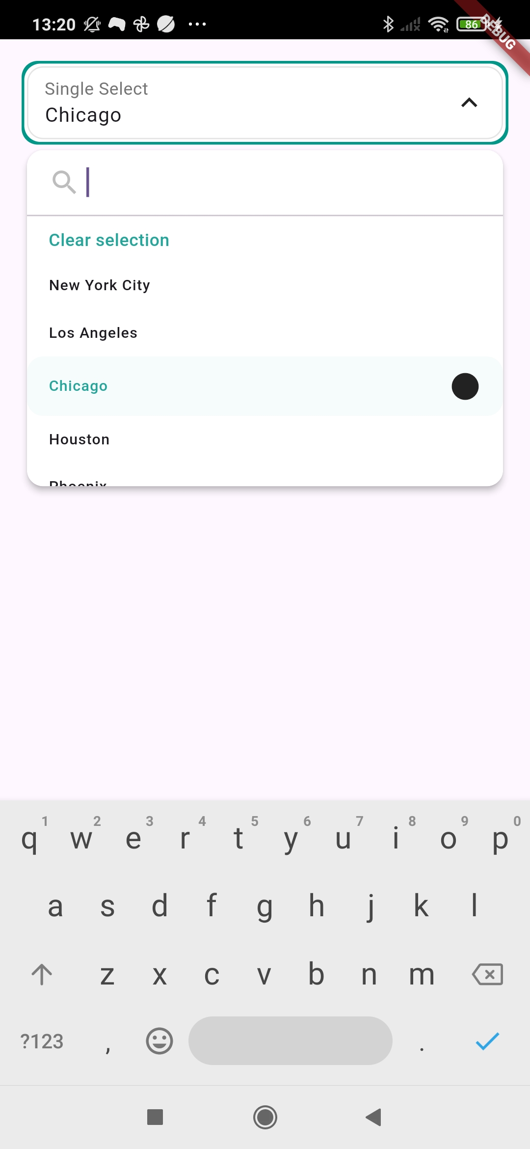
Example #
  DfSearchableSingleSelectDropdown<int>(
    hintText: "Select...",
    labelText: "Single Select",
    selectorDecoration: const SingleSelectorDecoration(
      selectedItemIcon: Icon(Icons.circle),
    ),
    onOptionSelected: (value) {
      log("SELECTED VALUE ${value?.value}");
    },
    initData: [
      DropDownModel<String>(key: "1", value: 1, text: "New York City"),
      DropDownModel<String>(key: "2", value: 2, text: "Los Angeles"),
      DropDownModel<String>(key: "3", value: 3, text: "Chicago"),
    ],
  )
4. Searchable Multi Select Dropdown #
This allows users to search and select multiple options from the list, perfect for scenarios where more than one selection is necessary.
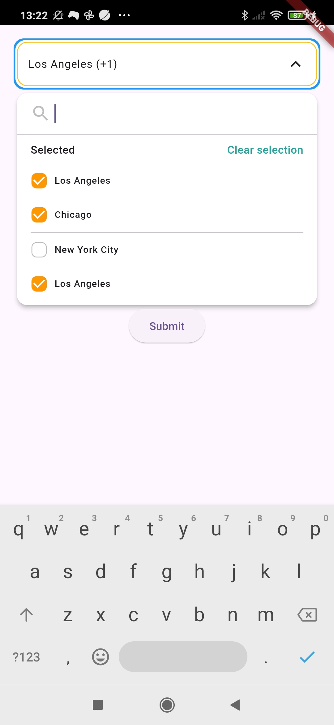
Example #
  DfSearchableMultiSelectDropdown<String>(
    hintText: "Select options...",
    decoration: const DropdownDecoration(borderColor: Colors.amber),
    selectorDecoration: const MultiSelectorDecoration(
      showSelectedItems: false,
    ),
    onSearch: (context) async {
      return [DropDownModel<String>(key: "4", value: "4", text: "Houston")];
    },
    onOptionSelected: (value) {
      log("SELECTED VALUE ${value.length}");
    },
    selectedValues: [
      DropDownModel<String>(key: "1", value: "1", text: "New York City"),
      DropDownModel<String>(key: "2", value: "2", text: "Los Angeles"),
    ],
    initData: [
      DropDownModel<String>(key: "1", value: "1", text: "New York City"),
      DropDownModel<String>(key: "2", value: "2", text: "Los Angeles"),
      DropDownModel<String>(key: "3", value: "3", text: "Chicago"),
    ],
  )
5. DfDropdownWrapper a widget container #
DfDropdownWrapper is a versatile widget that acts as a container for any custom widget while providing an integrated dropdown functionality. You can wrap any widget inside the DfDropdownWrapper, and it will allow you to show dropdown options with customizable design and behavior.
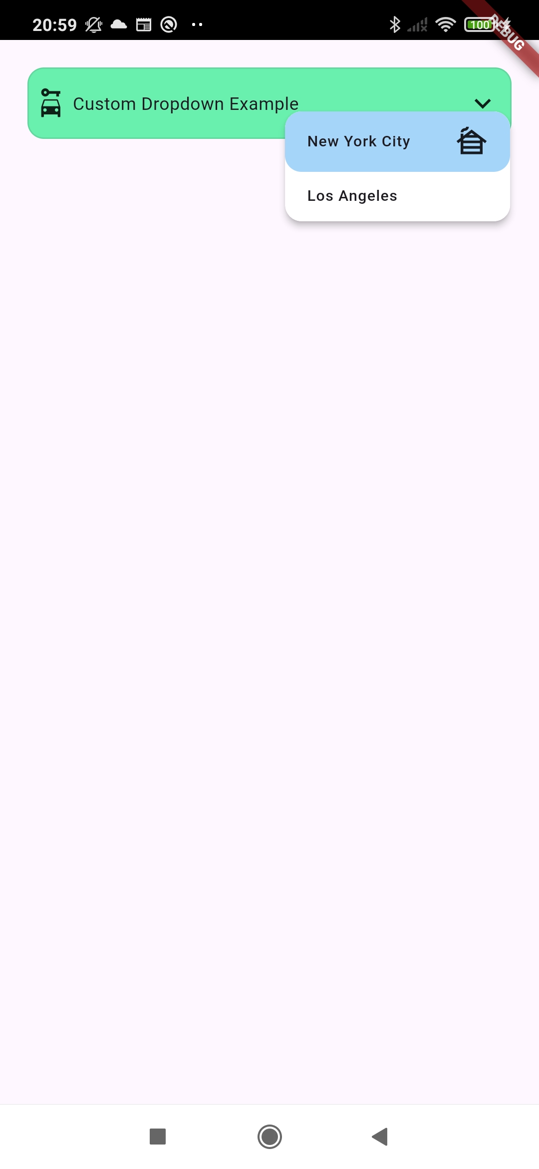
With DfDropdownWrapper, you can create custom dropdowns while maintaining flexibility for the content you display inside the dropdown selector.
Example #
    DfDropdownWrapper(
        child: Row(
          children: [
            SizedBox(width: 4),
            Icon(Icons.car_rental),
            SizedBox(width: 4),
            Text("Custom Dropdown Example"),
          ],
        ),
        decoration: DropdownDecoration(
          backgroundColor: Colors.greenAccent,
        ),
        selectorDecoration: SimpleSelectorDecoration(
          selectedItemIcon: Icon(Icons.cabin),
          selectedItemColor: Colors.blue.withValues(alpha: 0.4),
        ),
        onOptionSelected: (option) {
          log("Option selected $option");
        },
        selectedValue: DropDownModel<String>(
          key: "1",
          value: "1",
          text: "New York City",
        ),
        initData: [
          DropDownModel<String>(key: "1", value: "1", text: "New York City"),
          DropDownModel<String>(key: "2", value: "2", text: "Los Angeles"),
        ],
      )
Metadata

Publisher
Weekly Downloads
Metadata
This Flutter package providing versatile and customizable dropdown components with different selection modes and search functionality.
Documentation
License
 BSD-3-Clause (license)