dots_indicator 0.0.4  dots_indicator: ^0.0.4 copied to clipboard
Dots indicator to show progression of a pageview for example
dots_indicator #
Widget to display dots indicator to show a position (for a pageview for example).
Installation #
You just need to add dots_indicator as a dependency in your pubspec.yaml file.
This package is not upload to Pub yet. So you need to add it from Git repository:
dependencies:
  dots_indicator: ^0.0.3
Example #
In these example, pageLength is the total of dots to display and currentIndexPage is the position to hightlight (the active dot).
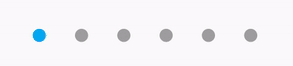
A simple dots indicator #
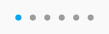
new DotsIndicator(
  numberOfDot: pageLength,
  position: currentIndexPage
)
Custom colors #
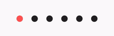
new DotsIndicator(
  numberOfDot: pageLength,
  position: currentIndexPage,
  dotColor: Colors.black87,
  dotActiveColor: Colors.redAccent
)
Custom size #
You can change the default size of dots.
So you can choose to have dots for no active positions and a rounded rectangle for active position for example.
By default, the shape of dots is CircleBorder, so to have a rounded rectangle for active, you need to change dotActiveShape
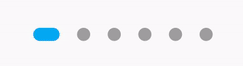
new DotsIndicator(
  numberOfDot: pageLength,
  position: currentIndexPage,
  dotSize: const Size.square(9.0),
  dotActiveSize: const Size(18.0, 9.0),
  dotActiveShape: RoundedRectangleBorder(borderRadius: BorderRadius.circular(5.0))
)
Custom shape #
You can change the default shape of dots. By default it's a CircleBorder.
You can change the no active and active dot shape.
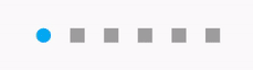
new DotsIndicator(
  numberOfDot: pageLength,
  position: currentIndexPage,
  dotShape: const Border(),
  dotActiveShape: RoundedRectangleBorder(borderRadius: BorderRadius.circular(5.0))
)
Change the space between dots #
By default a dot have a margin of 6 pixels on his left and right. It's EdgeInsets.symmetric(horizontal: 6.0).
But if you want you can change it, for example to increase the space between dots or to add top margin.
new DotsIndicator(
  numberOfDot: pageLength,
  position: currentIndexPage,
  dotSpacing: const EdgeInsets.all(10.0)
)
Metadata
Publisher
unverified uploader
Weekly Downloads
Metadata
Dots indicator to show progression of a pageview for example
Repository (GitHub)
View/report issues
License
 unknown (license)