


flex_color_scheme 4.0.0-dev.1  flex_color_scheme: ^4.0.0-dev.1 copied to clipboard
 rydmike.com
A Flutter package to make and use beautiful color scheme based MaterialApp themes.


FlexColorScheme #
Use FlexColorScheme to make beautiful color scheme based Flutter themes, with optional primary color surface blends. The themes are based on the same concept as Flutter's ColorScheme based themes, but with many additional features.
When you color theme a Flutter application, all built in
widgets use the colors of your color scheme in your theme. At least in theory,
and it is almost so if you defined your Flutter ThemeData by using the
ThemeData.from factory, but even it misses some details.
FlexColorScheme goes the extra mile to ensure that all Flutter SDK widgets gets
themed completely by its built-in color schemes, or custom colors you provide.
You can also opt in on using pre-made opinionated widget sub-themes. By opting in, you can for example adjust the border radius on all widgets with a single property to set the same themed border radius on them. Current Flutter SDK widgets are based on the Material 2 guide and use 4dp corner radius as default on most corners.
When you opt in on the sub themes, the border radius on widgets default to the new rounded corners as specified by the Material 3 guide, where the rounding varies by widget type. You can stick with this, or set global radius to a value you prefer. You can also easily set the themed border radius per widget, to override the global value in just a few cases. Use simple property values per widget, no need for verbose custom sub theme Shape definitions.
Version 4 Notice #
This readme is still mainly the version 3 documentation. Depending on when and where you read it, e.g. on GitHub or as a dev release v4.0.0-dev.x on pub.dev, it may contain updated elements while others are still at version 3. The current hold point for going stable is the completion of the updated documentation. It is unlikely that there will be any major API changes from the dev releases to stable version, unless some major issues are discovered before the stable V4 release.
What is new in version 4? #
For a detailed list of what is new in version 4, please refer to the change log.
There are two major new new features. The first one is that FlexColorScheme now comes with opinionated widget sub themes that you can opt in on. By default, the sub theme mimic Material 3 (You) styled widgets. This is done as far as reasonably possible when using standard Material 2 theming features available in Flutter 2.5. There is a Material 3 TextTheme as well, and by default this text theme is also slightly tinted using the selected color scheme's primary color. You can turn these styles on and off, based on your your own preferences when you opt in on the sub themes.
The second main new feature is that FlexColorScheme now offers 9 different surface color blend modes, with 40 different blend levels each. Version 3 only had one blend style with 5 levels, including no blend. The version 3 blend style and its API is still available. Despite the major version bump, all APIs from version 3 are fully compatible with version 4. The version was mostly bumped because it contains so many new features that it made sense.
New Color Schemes #
There are of course new built-in color schemes. Four of them seems to be the standard for new releases. The new color schemes are:
- Blue whale - Blue whale, jungle green and outrageous tango orange
- San Juan - San Juan blue and pink salmon theme
- Rosewood - Rosewood red, with horses neck and driftwood theme
- Blumine - Blumine, easter blue and saffron mango theme
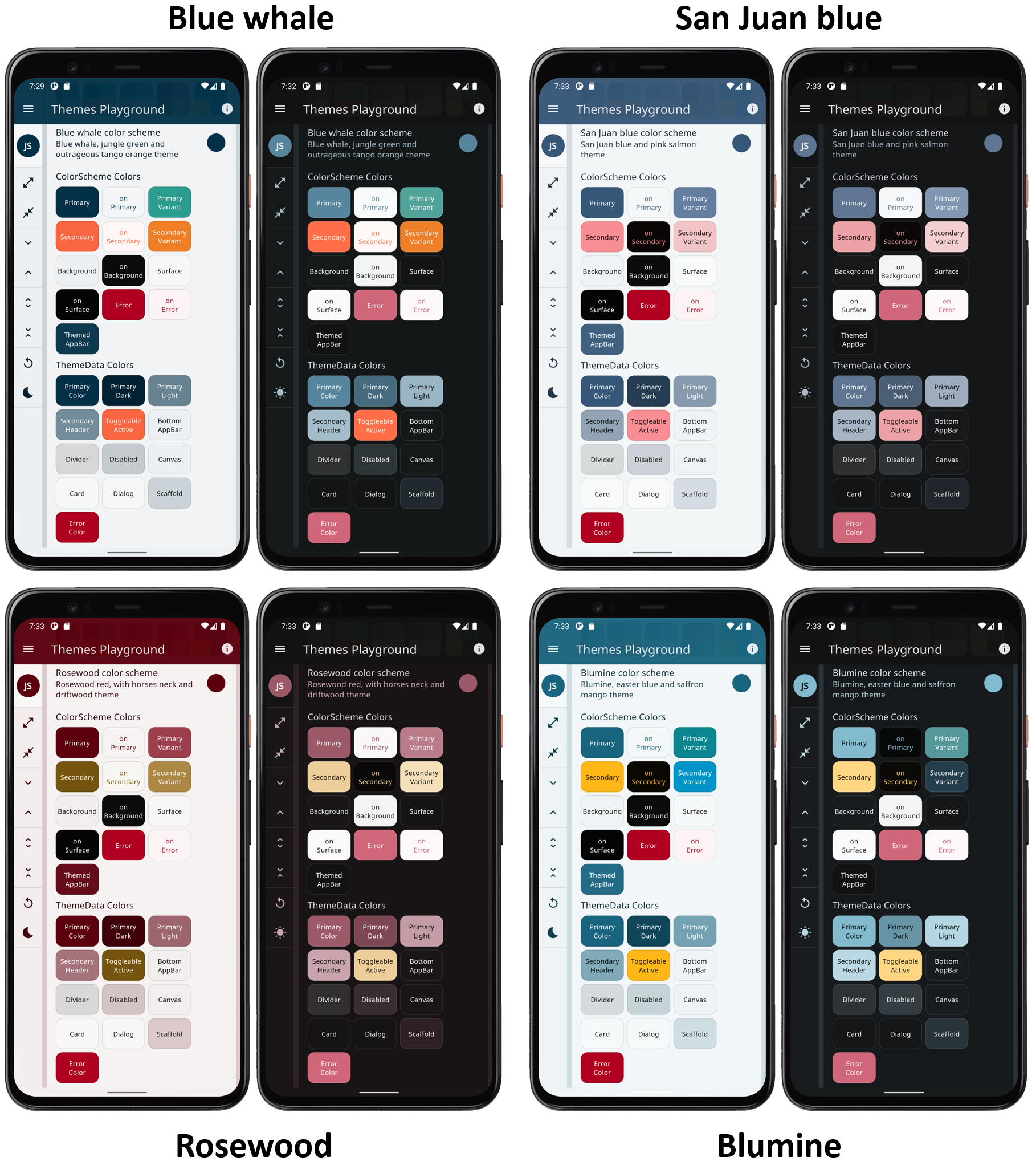
Total number of offered built-in color schemes is now 36 matched light and dark pairs. By using the swap primary and secondary colors, you can double the amount of variations with just a boolean toggle. Not all the color schemes are so attractive when you swap the colors, but some were designed to support it and look well with the colors reversed too. You can for example use this to present the dark mode with primary and secondary colors swapped compared to the light mode.
Quick Start Guide #
The quickest way to try FlexColorScheme V4 is to build the default example application and use it as a hot reload playground to get to know it.
Default example - Hot Reload Playground #
To try the default example on a device or simulator, clone the repository and run the example:
cd example/
flutter run --release
The result is a demo app that uses a custom defined color scheme. It has a theme mode switch, includes theme colors presentation and Material widget samples. With these you can see the active color scheme's colors and the created theme's impact on common Material UI widgets.
The default sample app, the "Hot Reload Playground", looks like this:
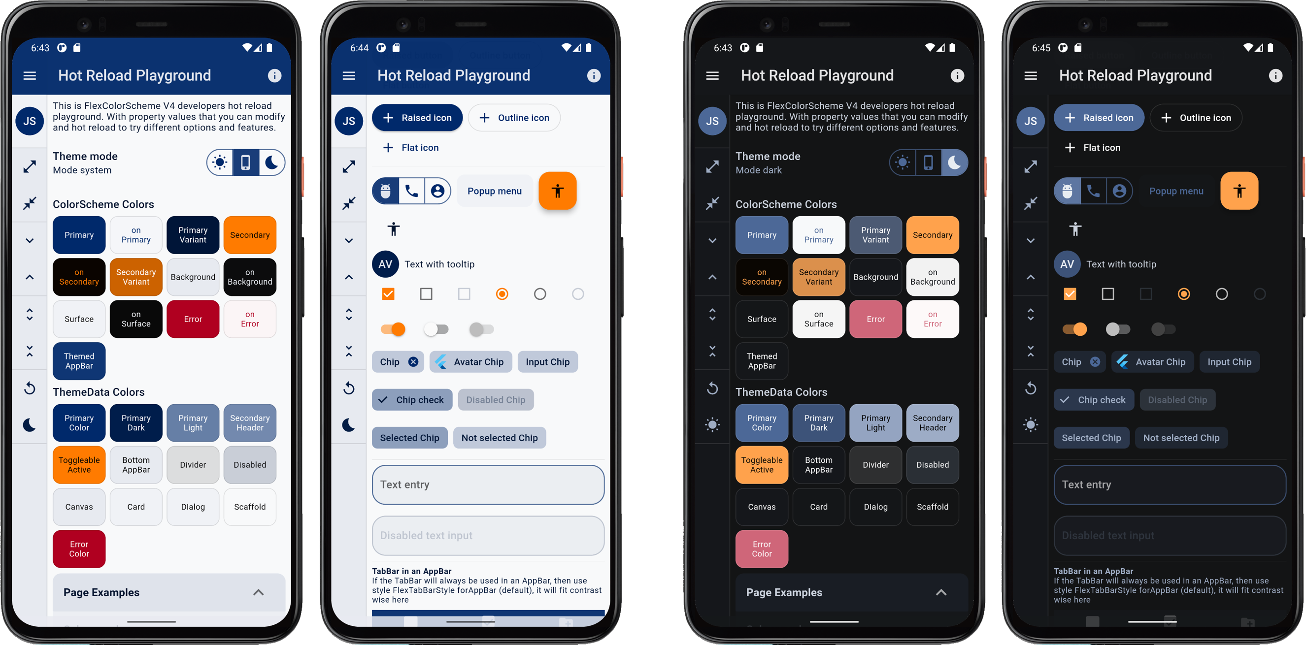
It comes fully loaded with template settings and thorough
comments that explain what to change to produce different results. You
could for example change the _useScheme to true, as shown below and hot
reload it, to use and the new FlexScheme.blueWhale theme.
// To use a pre-defined color scheme, don't assign any FlexSchemeColor to
// `colors`, instead pick a FlexScheme and assign it to the `scheme`.
// Try eg the new "Blue Whale" color scheme.
const FlexScheme _scheme = FlexScheme.blueWhale;

// To make it easy to toggle between using the above custom colors, or the
// selected predefined scheme in this example, set _useScheme to true to use the
// selected predefined scheme above, change to false to use the custom colors.
const bool _useScheme = true;
There are a large amount of other settings you can play with in the default example application. The above selected blue whale theme is the first one shown in the image below.
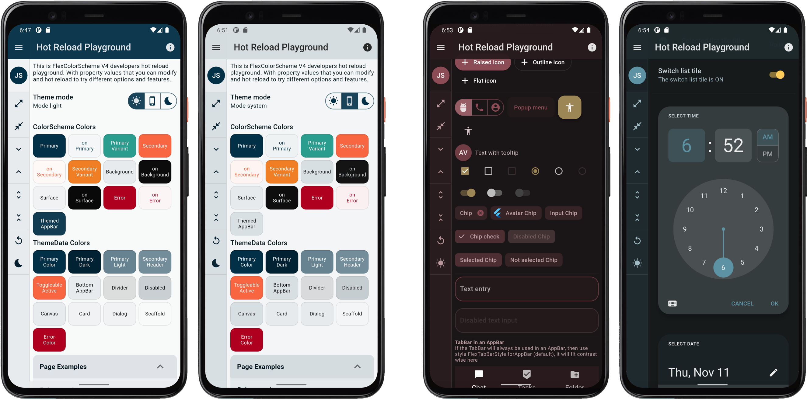
The other results shown above were also produced by editing a few properties in this hot reload playground.
In the hot reload playground the side menu has no real functionality, it is mainly there to present more surface area using the theme colorscheme background color. The theme toggle in the menu does work though.
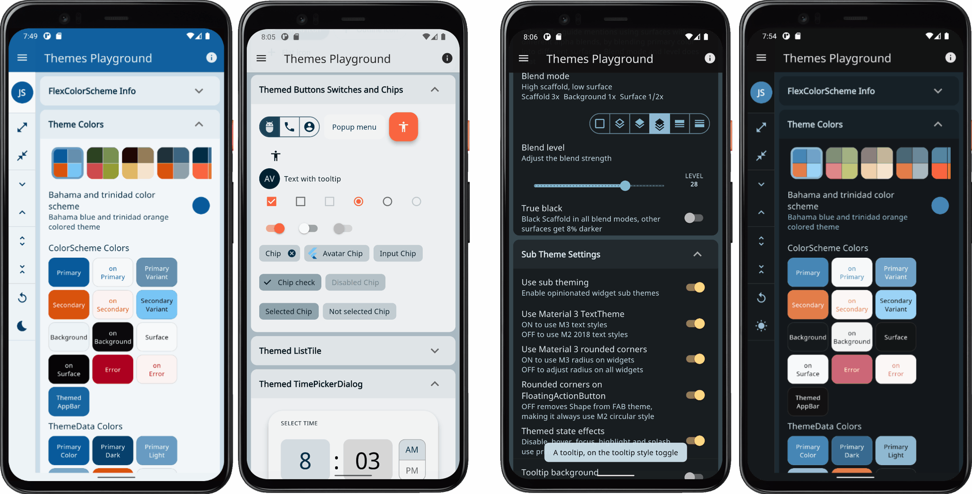
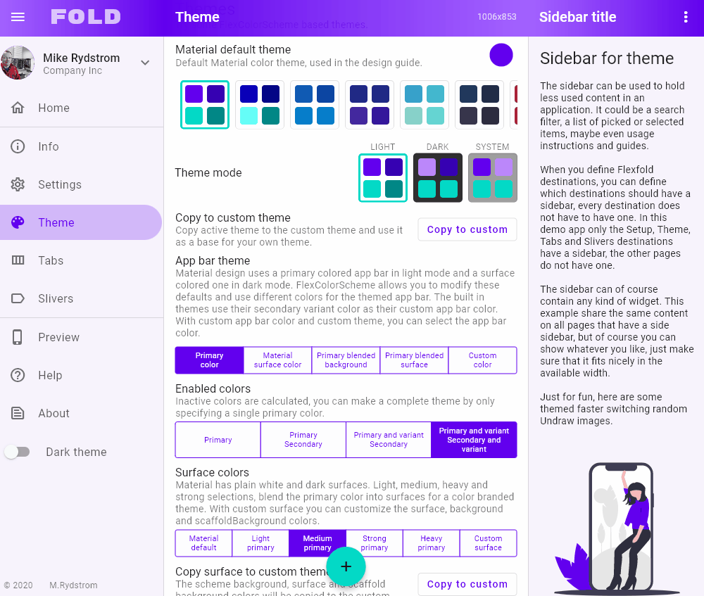
Themes Playground #
The side menu in the default example is actually made for and used in the last step and example in the tutorial. The final example, number 5, doubles as a complete interactive Themes Playground application. There the menu options actually have their indicated functionality.
The Themes Playground is useful as a tool to find themes and settings you prefer, or just use it to figure out everything you can do with FlexColorScheme. The playground persists all its settings, and you can also reset them all back to their default values.
The Themes Playground can be used as a web app here. Its source code is also available in the example sub folder in folder /example5.
It is recommended to go through the tutorial further below to get introduced to all features step by step. However, feel free to go straight for example 5 if your really like to dive into the deep end. It is a bit more advanced example than those generally bundled with packages, but not that complicated.
The Themes Playground is best experienced at as high resolution as possible, even 4k. It is responsive and works splendidly down to phone sizes too. It is however easier to see and experience what each configuration option in FlexColorScheme does, when you use a large screen with high resolution, then you can see the result of all settings at one glance.
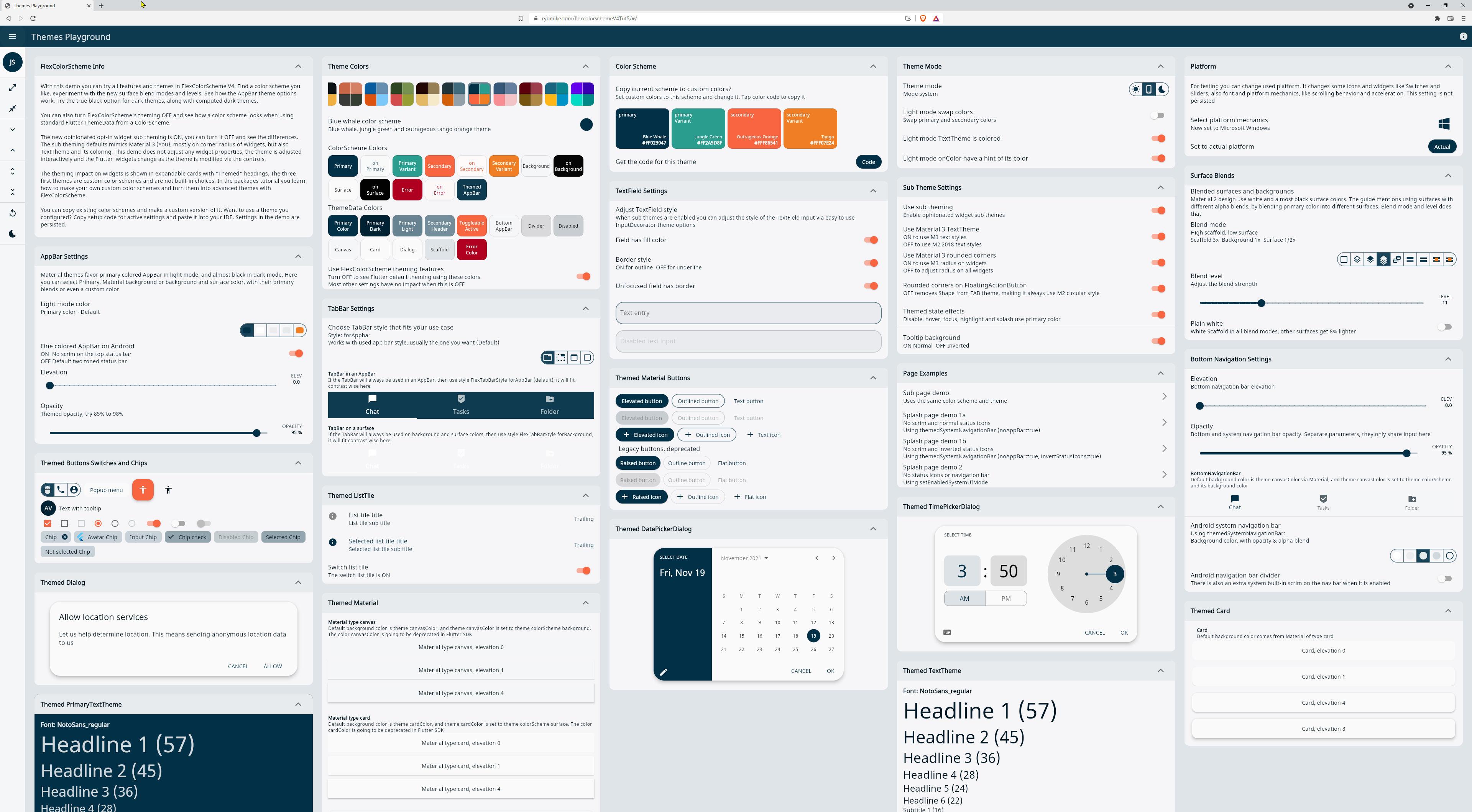 FlexColorSchemeThemes Playground app at 4k resolution
Installing and Using #
In the pubspec.yaml of your Flutter project, add the following dependency:
dependencies:
  flex_color_scheme: ^4.0.0-dev.1
In your library file add the following import:
import 'package:flex_color_scheme/flex_color_scheme.dart';
You can now start using FlexColorScheme V4 based color schemes and theming
in your application. A quick way to do so is to try one of the 36 built-in
color schemes. The schemes have enums that you can use to refer to them.
Please see the default example for a thorough, quick guide on how to use all the properties in FlexColorScheme. To try it on your own from scratch, create a default Flutter counter app. Add the FlexColorScheme import and modify one line of code and add two lines as shown below.
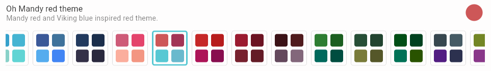
Here we use the "Oh Mandy red" color scheme that is represented by enum
value FlexScheme.mandyRed. We set the MaterialApp.themeMode to
ThemeMode.system, so that the device can control if the app uses its light
or dark theme mode, based on the device theme system setting, you can toggle
theme mode by changing theme mode on the device.
Assign FlexThemeData.light to the app's theme, which is the application's
light theme definition property, and FlexThemeData.dark to darkTheme.
For both FlexThemeData dark and light we set the scheme property to
FlexScheme.mandyRed to use the "Oh Mandy red" predefined scheme colors and
get matching light and dark themes based on the scheme's color definitions.
The three line modified MaterialApp of the Flutter default counter app
becomes:
  class MyApp extends StatelessWidget {
    @override
    Widget build(BuildContext context) {
    return MaterialApp(
      title: 'Flutter Demo',
      // The Mandy red, light theme.
      theme: FlexThemeData.light(scheme: FlexScheme.mandyRed),
      // The Mandy red, dark theme.
      darkTheme: FlexThemeData.dark(scheme: FlexScheme.mandyRed),
      // Use dark or light theme based on system setting.
      themeMode: ThemeMode.system,
      home: MyHomePage(title: 'Flutter Demo Home Page'),
    );
New in version 4:
TheFlexThemeData.lightandFlexThemeData.darkAPIs are new in version 4. They are extensions onThemeDatathat createFlexColorScheme.lightandFlexColorScheme.darkobjects and call theirtoThememethods in one step. The new syntax is shorter and also look very similar toThemeData.lightandThemeData.darkfactories.The old APIs work as before and will not be deprecated, they implement the functionality and are also needed in more advanced theming use cases. They can for example be useful and preferred when you add your own custom widget sub-themes to FlexColorScheme themes. With FlexColorScheme you can extract the color scheme it will use for its ThemeData. You often need the colors in this scheme when you create widget sub-themes.
The above additions gives us the following look on the familiar counter app:
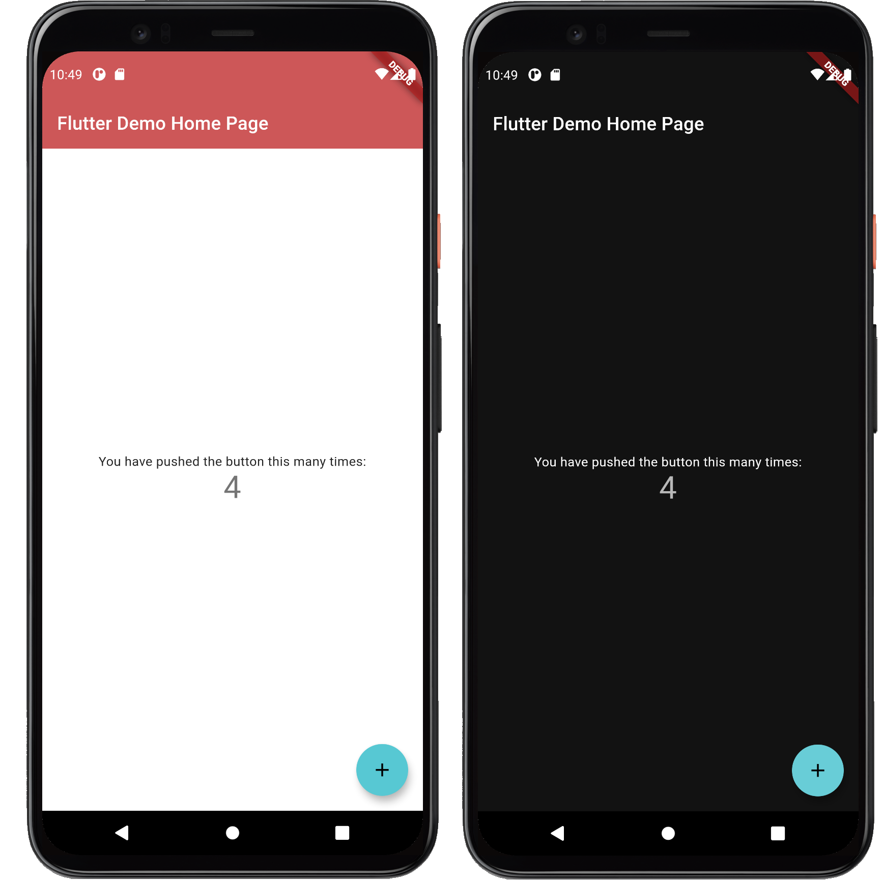
Not as exciting as the images above. That is because the basic counter app uses very few features and widgets, so it cannot really illustrate the result very well. This is why the included examples contain demo UI, that is not really at all relevant to using FlexColorScheme and only there to better show the results.
Updates for V4 ends here! #
Documentation below is still WIP and partially from V3.
Contents #
- FlexColorScheme
- Version 4 Notice
- Quick Start Guide
- Introduction
- Tutorial
- Feature Details
- Scheme Reference
- Inside FlexColorScheme (external link)
Introduction #
When you make themed Flutter applications, you base the colors of your
application on a light theme mode suitable ColorScheme and a dark theme mode
ColorScheme. Then create your light and dark ThemeData using these color
schemes, by assigning the ColorScheme for each mode to the colorScheme
property in ThemeData. In your MaterialApp you assign the ThemeData for
your light, and dark theme respectively to the theme
and darkTheme properties in the MaterialApp.
This gives you an application that uses the defined color schemes on all the
Flutter SDK built-in Material UI widgets. Well, on most of them anyway.
Flutter's ThemeData.from a ColorScheme has a few gaps. The used color scheme
is not consistently applied on all standard Material UI Widgets. To get it
right you also have to assign the colors from your ColorScheme to a number
of color properties that still only exist in ThemeData.
Flutter ThemeData #
At its core, FlexColorScheme creates a ThemeData object, it helps you make a color scheme based, consistent and a more refined Flutter ThemeData object.
The Flutter ThemeData object is a very large data and behaviour controlling class. It can change the look and feel of Flutter applications completely. It is not really that difficult to use, but it has many quirks and oddities, especially when it comes to color schemes. This is mostly due to legacy design, and things that were not considered early on. Things were done differently first, then things moved on, but those earlier ways are still supported to not break past behavior, together with some newer ways to define and setup colors. It is all further complicated by that under the hood many Flutter SDK widgets still use the original color properties from ThemeData.
This can all be very confusing and frustrating, and also if not used properly, result in themes with color schemes that are not entirely consistent or logical across all standard SDK widgets in your application.
One of the fundamental things FlexColorScheme does, is that it fixes these minor
inconsistencies and gaps that exist with Flutter's ThemeData.from factory
and handles the complexity of using the ThemeData factory directly. It
releases you from the burden of knowing what colors in it affects which widgets.
FlexColorScheme makes a few opinionated, but subtle theme modifications compared
to the ThemeData.from themes created from a ColorScheme. By default,
FlexColorScheme theming refrains from touching theme properties not related
to making the colors more consistent. Some minor adjustments were however
needed. These differences are covered in detail in the external
inside FlexColorScheme link.
There is a Flutter development plan to deprecate most, if not all, the direct
color properties in the ThemeData class, and only use ColorSceheme based
colors that are in the ThemeData colorScheme property, as default colors on
SDK UI widgets. This design
document
describes the plan and reasoning. There is also deprecation check list
issue 91772 to mirror the
plan. For FlexColorScheme the progress of these actions are monitored closely.
Needed changes and updates in FlexColorScheme will be implemented when any
related changes in ThemeData reach the Flutter stable channel.
Color Blended Surfaces #
The Material 2 Guide briefly mentions
color branded and blended surfaces.
In the new version of Material Design called Material You and also known as
Material 3, color branded and blended, and
just colored surfaces are used extensively. It is done in more flexible ways
than can be done with theming alone in current version of Flutter. We look
forward to seeing these features soon in Flutter too.
With FlexColorScheme you can already with current version (2.5) of Flutter SDK easily create fancy looking primary color branded and alpha blended themes. That work natively with the Material 2 design based themes and UI widgets in current version of Flutter.
This is done by using different blend modes and blend level strengths
for blending in primary color into surface and background colors. This can bring
different and new nuances to your application theme. Below some example of the
same theme, but using different blend modes and levels. The effect can be kept
very subtle or made very bold and impactful.
Below the first light and dark image pair show the theme using blend level 0. At level 0 there are no alpha blends in any surfaces, so all modes look the same. The next six image use the same blend level strength 18, but show 6 different blend modes. Next, one of the modes is repeated, but at blend level 33. Last the theme that was used to generate all these different nuances of the same color scheme based theme is shown.
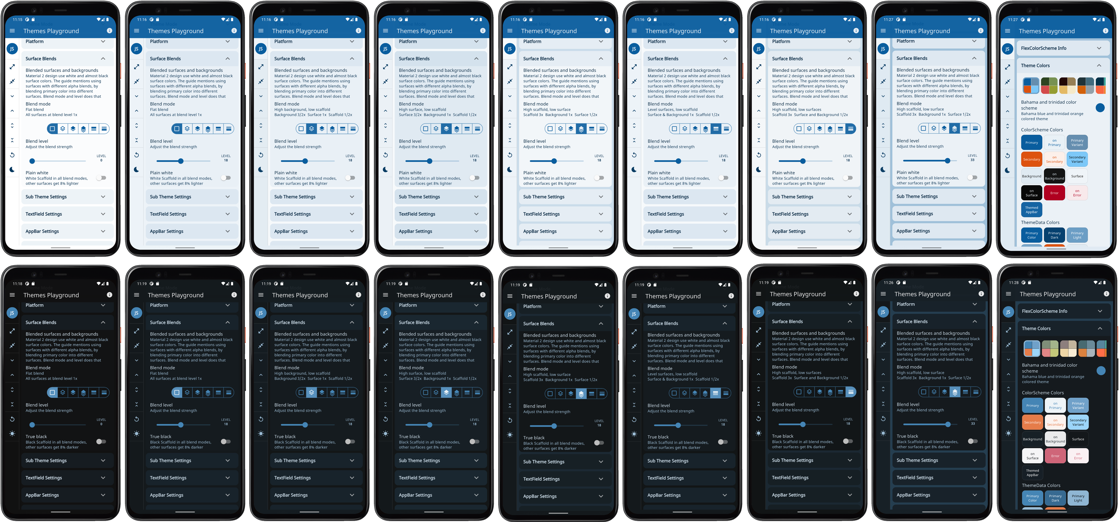 FlexColorScheme using the same theme, but with
different blend modes and levels (click for hires version)
FlexColorScheme using the same theme, but with
different blend modes and levels (click for hires version)
There are 9 different blend modes at 40 different levels each, that you can choose from to tune your themes to your liking. You don't have to use the same mode or level for your light and dark theme mode, the included examples only does so to keep the examples simpler.
The above images were made with the "Themes Playground" (example 5) app running as a phone app, instead of using the web demo. The application source is included as the last example in the pub.dev bundled examples and on GitHub. The Themes Playground is an interesting and useful tool when you want to find fitting themes, blend modes and levels to use for your application's FlexColorScheme based theme.
Custom Color Schemes #
A FlexColorScheme can like Flutter's standard ColorScheme be created by
specifying all the required color scheme colors. However, with FlexColorScheme
you can also specify only the primary color and get all other colors needed
for a complete color scheme computed based the given primary color.
There is a helper class FlexSchemeColor, with a factory called
FlexSchemeColor.from that can create complete color schemes from
incomplete color schemes. Additionally, its toDark method can create a
computed matching dark scheme from a defined light scheme. This works regardless
of if you created a fully specified custom light scheme, or one from just a
single or a few more colors.
These features are useful when you quickly want to test a single color, or maybe only a primary and secondary color for a light theme, and get all other scheme colors computed. When you figured out the colors you want, you can use exactly tuned color defintioned and make your custom color schemes from const values instead.
Using different ways to create custom color schemes is presented in detail in the tutorial examples 2, 3, 4 and 5.
What About Custom Sub Themes? #
When you make a theme with FlexThemeData.light or dark, it returns a
ThemeData object that you can use like any other ThemeData object.
You can then override this returned ThemeData and add
additional custom sub theming to it with ThemeData and its copyWith method,
before passing it on to your application's theme or darkTheme properties.
If you need color values that FlexColorScheme has created, maybe some auto
created main colors, but more typically the blended surface and on surface
colors, for your sub themes, you can get them too. For this advanced use case,
it is recommended to use FlexColorScheme with the factory constructor
FlexColorScheme.light and FlexColorScheme.light and create
these objects first. Then get the ColorScheme they define with its toScheme
method, and use this ColorScheme data as input to you sub themes creation.
When you make sub themes you often need access to the colors their main
ThemeData is using and storing in its colorScheme property. This step
gives you that before even creating the ThemeData object from your
FlexColorScheme object.
Pass the ColorScheme you got from toScheme or just one or some of its
colors, along to your methods that define your sub theme data. Turn your
FlexColorScheme to ThemeData with its toTheme method, and then add your sub
themes with copyWith to this object in the same go. They now uses the
same ColorScheme colors, that the ThemeData created with toTheme will get
as as well.
You can of course also create the FlexColorScheme ThemeData with the
extensions FlexThemeData.light and dark, and then get its ColorScheme
object from the ThemeData colorScheme property you get. Then use that color
scheme to create your sub-themes that need access to those color values. Then
finally use copyWith to create a new ThemeData with your custom sub-themes
included. This is however one extra step and additional ThemeData object
compared to the approach.
Built-in Color Schemes #
Color schemes are no fun without some built-in example schemes to use and play with. FlexColorScheme comes bundled with 36 ready to go matching light and dark color schemes. You you can use them in your applications if you like. Here is a composite image showing them all.
TODO: Update this image
 All available color schemes (click
for hires version)
All available color schemes (click
for hires version)
The above image is a low resolution image of all the color schemes.
In the scheme reference you can find a table listing
all the built-in color schemes, their FlexScheme enum values, names and
descriptions. Plus a thumbnail of each color scheme, with a link to a
high-resolution image of it.
Another convenient and recommended way to see and try all the predefined color schemes is by using the Web versions of the package example 4 "All Themes" and of course example 5 "Themes Playground". Using these examples you can try all the built-in color schemes and see the impact they have on often used Flutter UI widgets.
Color Scheme Designs #
The built-in color schemes are all tuned matching light and dark scheme pairs. Most of them are pretty conservative, but some are intentionally a bit more playful and bold. The first two color schemes are actually the Flutter and Material 2 Design Guide examples of light and dark color schemes, and the Flutter high contrast light and dark color versions as well. So OK, there are actually "only" 34 new and different from standard Flutter ready-made light and dark color scheme pairs. The color scheme "Amber blue" is also a high-contrast theme. An alternative to the built-in Material high contrast theme.
The built-in schemes do not claim to be a "this selection" fits all needs collection. Nor do they claim to be more correct than any other color scheme. What fits your needs and looks good to you, is the right choice for your application and use case.
You can make your own custom scheme totally from scratch, or use these as
a starting point and inspiration. You can copy colors from existing schemes,
even via their const FlexColor name. All the color values in the color schemes
are available as const values too, so you can easily make new custom
combinations using existing color schemes and add a few custom ones to the mix.
Design Your Custom Schemes for FlexColorScheme #
The package examples show how you can easily make and use your own custom color schemes with FlexColorScheme. Maybe the built-in examples will inspire your creative side to define your own schemes. The tutorial walks you through how to define your own color schemes and make themes based on them.
You can create your own custom list of schemes, then use this list with only your own custom color schemes selection. You may also append some, or even all of the built-in schemes after your custom schemes, and thus give your users a lot of theme options. How to do this is demonstrated in the tutorial in examples 4 and 5.
While building, testing and using this package over a period of time, a number of color schemes were born as a side product. I decided to include them in FlexColorscheme and offer them for re-use and inspiration as they are. It is however not necessary to use them to reap the benefits of FlexColorScheme.
The color and scheme definitions for the built-in color schemes are in their own class. They will not be included in the release compiled version of your application if you do not use (reference) them in your application, and instead only use your own custom color schemes for the themes.
If I don't Use the Predefined Schemes, Why Should I Use FlexColorScheme? #
The purposes with the FlexColorScheme package is to:
- Fixes some odd things in Flutter's standard ThemeData definitions and make all SDK Widgets, old, new and even deprecated ones, use the specified color scheme in the expected way.
- Enable easy switching among multiple color schemes in an app.
- Provide an easy way to make themes with primary color branded and blended backgrounds and surfaces. Be able to to easily vary the blend level and mode for different surfaces.
- Provide a quick toggle for different AppBar styles, without the need to manually make a custom theme for it every time, including matching TabBar.
- Provide optional support for a true black mode for dark themes.
- Quickly swap the primary and secondary color definitions, if you want to try your theme the other way around.
- Theme the Android System navigation bar to match your app theme, and make it partially or totally transparent.
- With default settings FlexColorScheme avoids touching the Widget sub-theme definitions, but in a few cases it is needed to fix things and to make some minor design changes. In the default produced ThemeData there are as few as possible of them, leaving the task of Widget sub theming to you. However, you can also opt in on widget sub themes to get a more refined and opinionated look on widgets and used text theme. The defaults for the new opt in sub themes are inspired by the new Material 3 guide. Following it when it can easily be accomplished by using the Material 2 based theming in Flutter. Full support for Material 3 widgets and themes is coming to Flutter too.
- FlexColorScheme also provides a way to make "lazy" quick toned
ColorSchemelike themes from just a single light scheme color. Even its dark scheme counterpart can be made from this single color definition.
If you like the above features, then FlexColorScheme may fit your theming requirements, even if you do not use any of its built-in color schemes.
Can We Change this Predefined Scheme's Colors? #
No, current predefined schemes will not be changed. Changing them would be a breaking change to the package version promise. The scheme colors could in theory be changed by releasing a new major version that break past scheme color definitions. At the moment, there are no plans to ever add breaking releases to just change a predefined scheme's color(s). All current color definition values are also included in the package tests, and a failed color value test is considered a breaking change.
Can We Add This Scheme? #
To keep things interesting, there will from time to time be new color schemes added to package. If you have a beautiful color scheme with matching light and dark theme mode colors, that you think would be perfect to include, then please post a suggestion as a GitHub issue.
No promise is made about its eventual inclusion, but if it is a nice, unique and overall a pretty color scheme, it will likely be included. Coming up with nice color schemes is trickier than it seems, suggestions and contributions to new ones are welcome.
Can I use different built-in color schemes for my light and dark themes? #
Yes this is possible. Use different FlexScheme enum values for the light
and dark FlexThemeData.light and FlexThemeData.dark factories' scheme
property. If the colors used by the selected schemes are a bit related, this
can be used to create nice and unique light and dark combinations of
the predefined schemes.
By using the colors property you could even apply a FlexSchemeColor that
has data that was designed for a light theme to the FlexThemeData.dark factory,
and wise versa. For example, using the FlexThemeData.dark factory, you could
to its colors property assign the FlexSchemeColors from
FlexColor.schemes[FlexScheme.mandyRed].light that are designed and intended
to be used with the light mode factory.
The results will typically not be very useful or pretty. The rationale for the slightly involved data structure, is to keep it flexible, but at the same time provide self documenting API guidance on how the data was designed to be used and consumed.
The scheme property prevents using the light scheme colors for the dark
factory and wise versa. It can however be done if so desired by using the
colors property as shown above. The colors property is always needed and
used when you make custom color schemes with the FlexThemeData.light and
FlexThemeData.dark factories.
Sample Applications #
FlexColorScheme comes bundled with six different examples. Earlier we already saw how you can build the default example, and use it as a "Hot Reload Playground". You can use it to experiment and learn on your own a bout FlexColorSchemes features and how to use them.
The default example is a template that is heavily commented to guide you and encourage you to play around with different options in code, then use Flutter's hot reload feature and see the results at once.
The other 5 examples are a part of a tutorial path, with increasing complexity, that we will walk through in the tutorial. It ends with the complete Themes Playground demo app included as example 5.
Building the Examples
You can build the examples by using preconfigured build config files for VS-Code and Android Studio/IntelliJ. Clone the package repo and open the project in VS-Code or Android Studio/IntelliJ.
In Android Studio you can use:
TODO: Add to repo and info on how to use it, screenshot example.
In VS-Code you can use:
TODO: Add to repo and info on how to use it, screenshot example.
Live WEB Demos of the Examples #
If you want to take a quick look at all the examples, you can try live web versions of them.
Example 1 represents the simplest use case. To use one of the built-in color schemes as your application theme. You can toggle between its light and dark variant, or allow device system theme mode setting to control if the dark or light theme is used.
Example 1) Using a built-in FlexColorScheme color scheme as application theme.
Example 2 is like example 1,
but we use custom colors to make a custom color scheme and turn it into a theme.
The architecture is also more advanced, it uses the approach introduced with
Flutter skeleton template, using a theme service and theme controller,
keeping settings only in memory using the in memory ThemeServiceMem.
Example 2) Using custom colors with FlexColorScheme color scheme as application theme.
In example 3 we can toggle the
active theme between 3 different predefined color schemes, plus the custom one
we defined in example 2. We can opt in and out of using the new sub theming.
The settings are now also persisted to the device, using a theme service
called ThemeServiceHive to persist the settings with package
Hive.

Example 3) Using three built-in schemes, plus a custom color scheme as application theme options.
In example 4 we can select any of the different built-in color schemes plus three custom ones, and use them as the application theme. As in example 3, we persist the theme settings.

Example 4) Using custom schemes, plus all the built-in ones as application theme options.
Example 5 is the last, and most complex of the examples. It presents all configuration and settings available in FlexColorScheme. You can modify them interactively and the application changes theme as you modify any setting.
All the settings are persisted locally, but in this case with another theme
service, called ThemeServicePrefs. This service uses the package
SharedPreferences to persist
the theme settings, instead of Hive. The settings can also be reset back to
its default values.
This example is best seen and tested on a tablet, desktop or desktop web browser, rather than on a phone. The app certainly works well on a phone sized canvas too, it is using a very responsive design. It is just difficult to get a nice overview of all the settings possibilities and their impact on different, widgets while changing the settings on the phone UI, since you cannot see everything at the same time.
Example 5) The Themes Playground
Another classic example of FlexColorScheme usage can be seen in the Flutter web Flexfold demo app.
Flexfold Demo uses FlexColorScheme for its themes.
The live version of the Flexfold demo is still using FlexColorScheme version 3. So example 5 above, the "Themes Playground" actually now has even more theming features than the Flexfold demo does.
The FlexFold demo has it beat in one case. You can use the Flexfold demo to make custom themes with colors selected interactively with FlexColorPicker and watch the theme update and animate as you change and modify selected color properties in the theme.
In a later update to Example 5, this might be added to it as well. Adding color picking and the capability to get a code snippet that produces the currently defined theme, be it one using a standard scheme and used settings or even one using custom colors, would make example 5 a very handy theme definition companion app for setting up FlexColorScheme based themes.
Tutorial #
In this tutorial we go through all the bundled examples and explain the
used FlexColorScheme features in each example.
The key part for each example is always in the used MaterialApp, where all the
FlexColorScheme setup for the themes are made. The rest of the content in the
examples is just there to make a visual presentation of the resulting theme from
the used color scheme, and to allow users to control the theme settings.
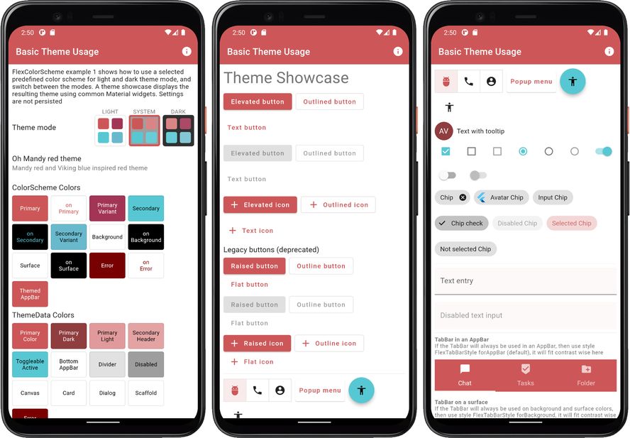
Example 1 - Basic Theme Usage #
The first and simplest example shows how you can use a predefined color scheme
in FlexColorScheme to define light and dark themes using the selected scheme.
How to turn it into a theme used by your application, and then switch between
its light and dark mode themes. A theme showcase widget shows the theme's effect
on several common Material UI widgets.
The full code is not shown below, only highlights. Please find the complete example code here.
void main() => runApp(const DemoApp());

class DemoApp extends StatefulWidget {
 const DemoApp({Key? key}) : super(key: key);

 @override
 _DemoAppState createState() => _DemoAppState();
}

class _DemoAppState extends State<DemoApp> {
 // Used to select if we use the dark or light theme, start with system mode.
 ThemeMode themeMode = ThemeMode.system;

 @override
 Widget build(BuildContext context) {
   // Select the predefined FlexScheme color scheme to use. Modify the
   // used FlexScheme enum value below to try other pre-made color schemes.
   const FlexScheme usedScheme = FlexScheme.mandyRed;

   return MaterialApp(
     debugShowCheckedModeBanner: false,
     scrollBehavior: AppScrollBehavior(),
     title: 'Basic Theme Usage',
     // Use a predefined FlexThemeData.light() theme for the light theme.
     theme: FlexThemeData.light(
       scheme: usedScheme,
       // Use very subtly themed app bar elevation in light mode.
       appBarElevation: 0.5,
     ),
     // Same definition for the dark theme, but using FlexThemeData.dark().
     darkTheme: FlexThemeData.dark(
       scheme: usedScheme,
       // Use stronger themed app bar elevation in dark mode.
       appBarElevation: 2,
     ),
     // Use the above dark or light theme based on active themeMode.
     themeMode: themeMode,
     home: HomePage(
       // We pass it the current theme mode.
       themeMode: themeMode,
       // On the home page we can toggle theme mode between light and dark.
       onThemeModeChanged: (ThemeMode mode) {
         setState(() {
           themeMode = mode;
         });
       },
       // Pass in the FlexSchemeData we used for the active theme.
       flexSchemeData: FlexColor.schemes[usedScheme]!,
     ),
   );
 }
}
To the HomePage we pass in the current value of the themeMode and use a
callback to get back its changed value, we use it to update
themeMode in a standard setState to make the app rebuild using
the new value.
We also pass in the FlexSchemeData we defined for our custom theme to the
HomePage. Not really needed, but we use it there to show the active theme's
name, description and colors in the theme mode switch.
When you build and run example 1 you get an application that looks like this in light and dark mode:
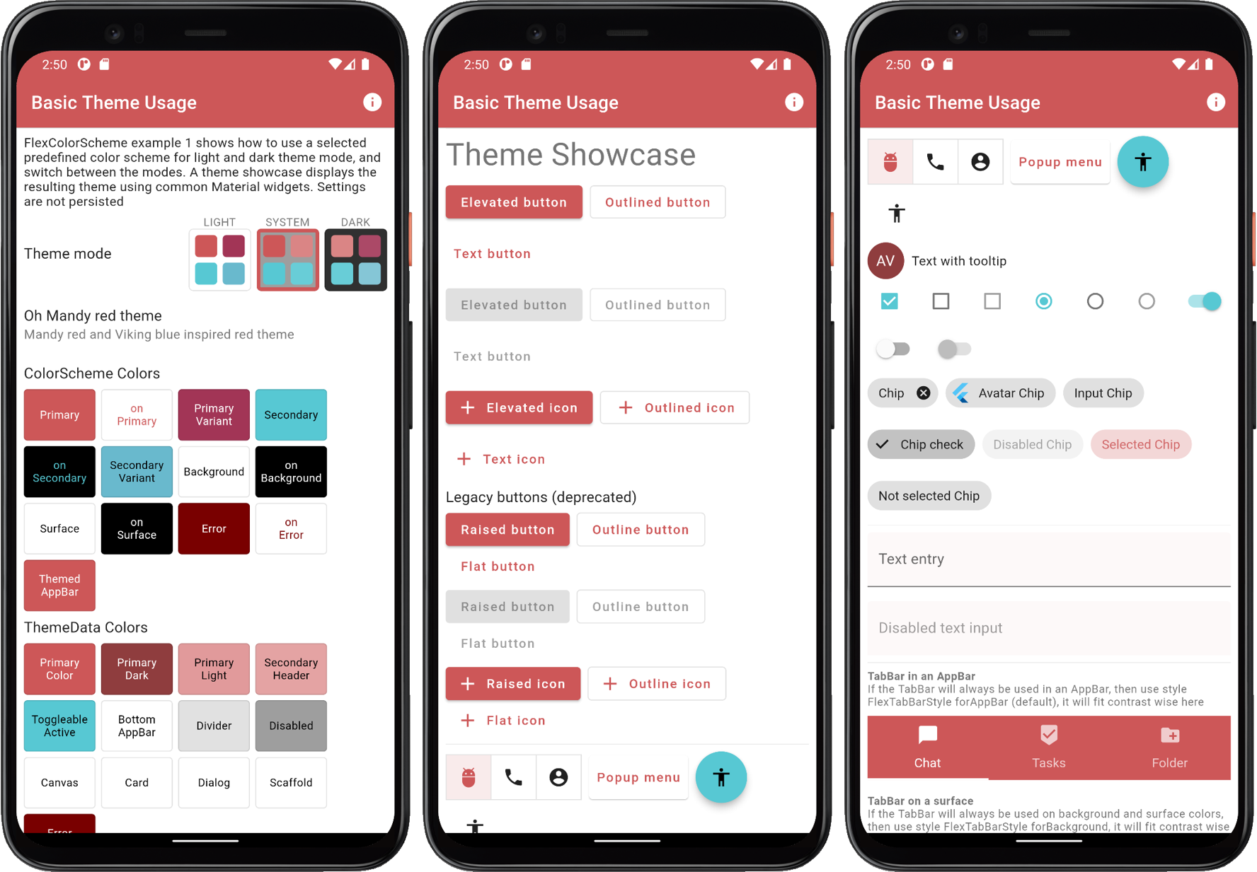
Example 1) Using a built-in FlexColorScheme color scheme as application theme.
Scroll down in the app to see the theme showcase further below. It presents the theme with common Material UI widgets. You can try this example as a Flutter web app here.
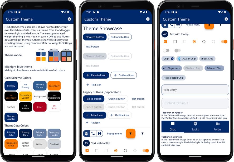
Example 2 - Custom Theme #
This example shows how you can define your own color schemes using
FlexSchemeColor and FlexSchemeData, to create FlexColorScheme based
application themes from them.
The full code is not shown below, only highlights. Please find the complete example code here.
In this example, and the ones after it, we use a ThemeService and
ThemeController to manage our theme settings. This follows the example
architecture you get when you create a Flutter template application
architecture with:
> flutter create -t skeleton my_flutter_app
This example uses a theme service with only memory storage and no persistence. In later examples we use locally persisting theme services. In this example we use the theme controller to change the theme mode and to toggle opting in and out of FlexColorScheme's opinionated sub-themes.
Future<void> main() async {
  WidgetsFlutterBinding.ensureInitialized();
  // This used theme service.
  final ThemeService themeService = ThemeServiceMem();
  // Initialize the theme service.
  await themeService.init();
  // Create a ThemeController that uses the ThemeService.
  final ThemeController themeController = ThemeController(themeService);
  // Load all the preferred theme settings, while the app is loading, before
  // MaterialApp is created. This prevents a sudden theme change when the app
  // is first displayed.
  await themeController.loadAll();
  // Run the app and pass in the ThemeController. The app listens to the
  // ThemeController for changes.
  runApp(DemoApp(themeController: themeController));
}
To make a custom color scheme, we for simplicity define it as a local
constant in this example. We make a FlexSchemeData object with a name,
description and FlexSchemeColor scheme colors defined for the light and
matching dark scheme.
const FlexSchemeData _myFlexScheme = FlexSchemeData(
  name: 'Midnight blue',
  description: 'Midnight blue theme, custom definition of all colors',
  light: FlexSchemeColor(
    primary: Color(0xFF00296B),
    primaryVariant: Color(0xFF2F5C91),
    secondary: Color(0xFFFF7B00),
    secondaryVariant: Color(0xFFFDB100),
  ),
  dark: FlexSchemeColor(
    primary: Color(0xFF6B8BC3),
    primaryVariant: Color(0xFF4874AA),
    secondary: Color(0xffff7155),
    secondaryVariant: Color(0xFFF1CB9D),
  ),
);
We could also have stored the light and dark scheme only in their own
FlexSchemeColor objects, and added them directly in their respective
colors property in FlexThemeData.light and FlexThemeData.dark.
However, we will also use this information on the HomePage for the
theme switch widget and to display the scheme name and description.
Putting them in a FlexSchemeData object that bundles the light and
dark scheme color FlexSchemeColor, plus a name and description, is a
convenient way to pass it along and re-use the information on the home page.
We use the FlexSchemeData instance _myFlexScheme instance light and dark
properties, as colors value for our FlexThemeData.light and
FlexThemeData.dark, that we then assign to the MaterialApp light theme
property theme and darkTheme property respectively.
The setup is similar to how we used one of the built-in predefined
FlexSchemeData objects in example 1 via its enum selection property,
but in this case we defined our own custom FlexSchemeData in _myFlexScheme
and used the colors property in FlexSchemeData to tell it to use those
colors instead of a built-in scheme.
We glue the ThemeController to the MaterialApp. The Flutter standard
AnimatedBuilder Widget listens to the ThemeController for changes.
The Flutter AnimatedBuilder is a bit oddly named for this use case. Here
it serves the purpose of functioning as a "ChangeNotifierBuilder",
that rebuilds its child when its Listenable, the animation changes.
Which it does whenever our ThemeController calls notifyListeners.
Which we do in the ThemeController class when we have new updated data
that requires the theme to update.
This results in that whenever you update any theme settings managed by
the ThemeController, the MaterialApp is rebuilt with the new setting
becoming effective. It rebuilds the entire app UI when any value in
the ThemeController trigger a change via a notifyListeners call.
This is fine though, since all property changes in it are of the
nature that the entire App UI needs to be redrawn, so this approach
works well for this use case.
class DemoApp extends StatelessWidget {
  const DemoApp({Key? key, required this.themeController}) : super(key: key);
  final ThemeController themeController;

  @override
  Widget build(BuildContext context) {

    return AnimatedBuilder(
      animation: themeController,
      builder: (BuildContext context, Widget? child) {
        return MaterialApp(
          debugShowCheckedModeBanner: false,
          scrollBehavior: AppScrollBehavior(),
          title: 'Custom Theme',
          // Define FlexThemeData.light() theme using above custom colors.
          theme: FlexThemeData.light(
            colors: _myFlexScheme.light,
            // Opt in/out on FlexColorScheme sub-themes with theme controller.
            useSubThemes: themeController.useSubThemes,
            // Use  very low elevation light theme mode. On light colored
            // AppBars this show up as a nice thin underline effect.
            appBarElevation: 0.5,
            // Here we want the large default visual density on all platforms.
            visualDensity: VisualDensity.standard,
            // Use a custom font, Noto Sans in this case.
            fontFamily: GoogleFonts.notoSans().fontFamily,
          ),
          // Same setup for the dark theme, but using FlexThemeData.dark().
          darkTheme: FlexThemeData.dark(
            colors: _myFlexScheme.dark,
            useSubThemes: themeController.useSubThemes,
            appBarElevation: 1,
            visualDensity: VisualDensity.standard,
            fontFamily: GoogleFonts.notoSans().fontFamily,
          ),
          // Use the dark or light theme, based on theme controller setting.
          themeMode: themeController.themeMode,
          home: HomePage(
            flexSchemeData: _myFlexScheme,
            // Pass in the theme controller to the home page.
            controller: themeController,
          ),
        );
      });
  }
}
As shown above, you can add a font via just a fontFamily from GoogleFonts.
For better and more fine controlled results, prefer defining complete
TextThemes, using a font and its different styles, you can then even use
more than one font for your text theme. Then assign the TextTheme to
the textTheme and primaryTextTheme properties in FlexThemeData.
This is how you would use do it with standard ThemeData too.
The themeController is also passed in to the HomePage where we use it in UI
widgets to change the theme mode, and to opt in and out of using the sub themes
feature in FlexColorScheme.
When you build and run example 2 you get a sample application that looks like this in light and dark mode:

Example 2) Using custom colors with FlexColorScheme color scheme as application theme._
Scroll down in the app to see the theme showcase further below. It presents the theme with common Material UI widgets. You can try this example as a Flutter web app here.
Example 3 - Four Themes #
This example shows how you can use three built-in color schemes, add a custom scheme and then use all four as
selectable FlexColorScheme based theme options in an application. The example also uses strong branded
surface colors.
The full code is not shown below, only highlights. Please find the complete example code here.
The customFlexScheme FlexSchemeData definition is the same as in example 2, it is not repeated below.
In the example below, if we select the FlexScheme.custom option, we use our customFlexScheme object, otherwise
the built-in scheme we select on the HomePage is used. We also set the surface style to
FlexSurface.strong, for a strong primary color branded blend in surface and background colors.
class _DemoAppState extends State<DemoApp> {
  ThemeMode themeMode = ThemeMode.light;
  // Used to store which FlexSchemeData option we selected
  FlexScheme flexScheme = FlexScheme.hippieBlue; // Default selected theme

  @override
  Widget build(BuildContext context) {
    return MaterialApp(
      debugShowCheckedModeBanner: false,
      title: 'FlexColorScheme',
      theme: FlexColorScheme.light(
        // When we select the custom FlexScheme on the home
        // page, we get the custom enum value back and use the custom
        // scheme we defined, otherwise we use the selected scheme
        // from the the built in map.
        colors: flexScheme == FlexScheme.custom
            ? customFlexScheme.light
            : FlexColor.schemesWithCustom[flexScheme].light,
        // This surface style gives a strong blend of primary
        // color on surfaces and background colors.
        surfaceStyle: FlexSurface.strong,
        visualDensity: FlexColorScheme.comfortablePlatformDensity,
      ).toTheme,
      // Just a repeat with equivalent setup for the dark theme.
      darkTheme: FlexColorScheme.dark(
        colors: flexScheme == FlexScheme.custom
            ? customFlexScheme.dark
            : FlexColor.schemesWithCustom[flexScheme].dark,
        surfaceStyle: FlexSurface.strong,
        visualDensity: FlexColorScheme.comfortablePlatformDensity,
      ).toTheme,
      themeMode: themeMode,

      home: HomePage(
        themeMode: themeMode,
        onThemeModeChanged: (ThemeMode mode) {
          setState(() { themeMode = mode; });
        },
        // We pass the enum value of the active scheme to the HomePage.
        flexScheme: flexScheme,
        // Where we can select a new scheme and get its enum value back.
        onFlexSchemeChanged: (FlexScheme selectedScheme) {
          setState(() { flexScheme = selectedScheme; });
        },
        // We take care to pass in selected built-in scheme data
        // or the custom one we made if it is selected.
        flexSchemeData: flexScheme == FlexScheme.custom
            ? customFlexScheme
            : FlexColor.schemesWithCustom[flexScheme],
      ),
    );
  }
}
In this example on the HomePage we removed the option to allow the theme
mode to depend on the system theme mode setting, by setting showSystemMode
to false, thus removing this option from the switch.
  FlexThemeModeSwitch(
    themeMode: themeMode,
    onThemeModeChanged: onThemeModeChanged,
    flexSchemeData: flexSchemeData,
    // We don't show the system mode option button
    showSystemMode: false,
  ),
These are the four resulting themes with their light and dark modes, that we can select and use in this example.
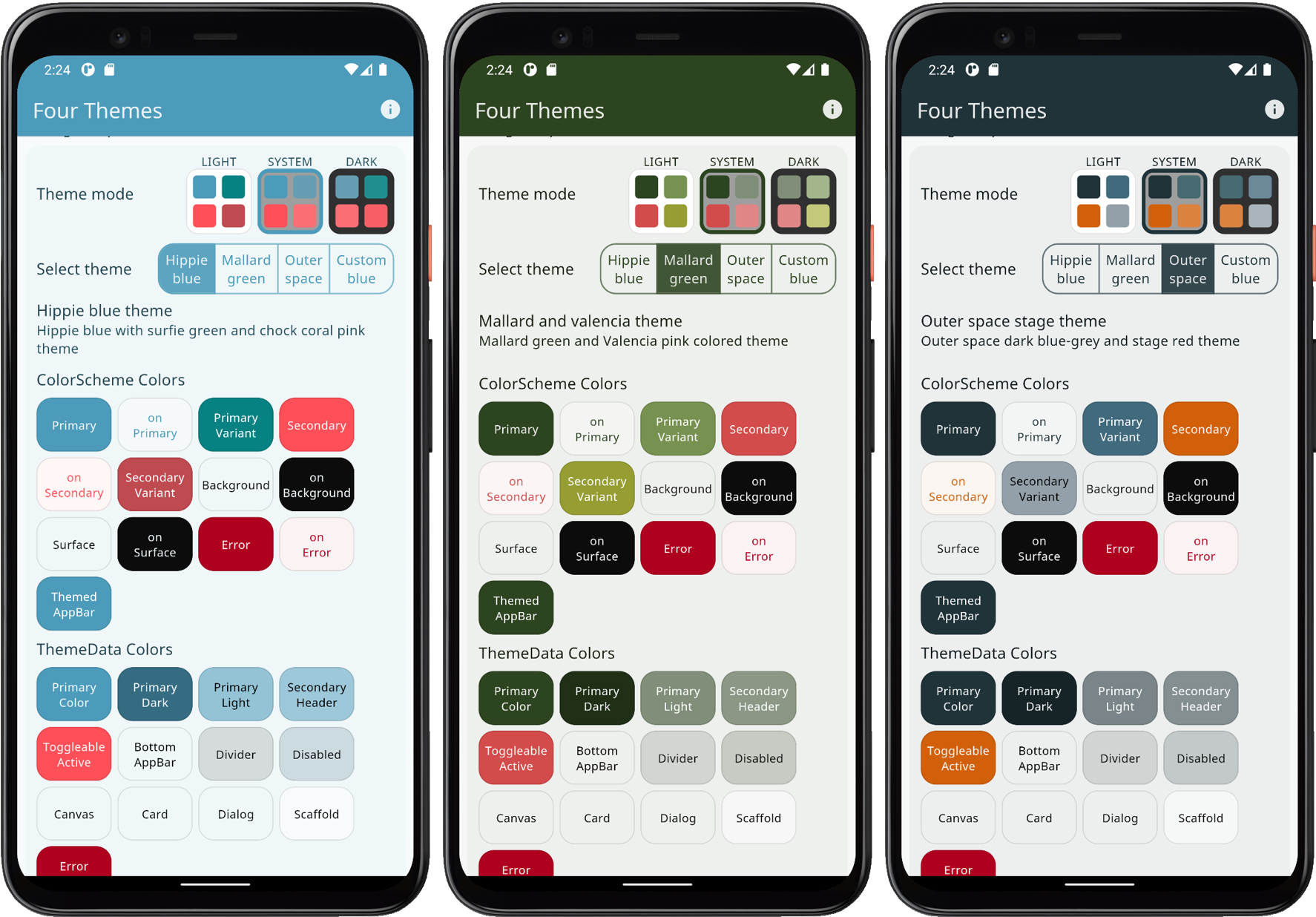
Example 3
Scroll down in the app to see the theme showcase further below. It presents the theme with common Material UI widgets. You can try this example as a Flutter web app here.
Example 4 - All Themes #
This example shows how you can use all the built-in color schemes, plus three custom schemes. How to interactively select which one of these schemes is used to define the active theme. The example also uses medium branded background and surface colors. A subpage is available that shows the same theme applied when opening another page, that in Flutter just inherits the same theme.
The full code is not shown below, only highlights. Please find the complete example code here.
In this example we set the surface style to FlexSurface.medium, for medium primary color branded surfaces.
This time we use the built in FlexColor.schemesList to access all
the pre-defined FlexSchemeData objects as a plain list with the predefined scheme data.
We unpack this list with the spread operator into a new custom myFlexSchemes list, and add our three custom schemes
as FlexSchemeData objects to the end of this new list. We then access the list's FlexSchemeData objects with
an index number, that we simply change with a popup menu on the HomePage.
That is the general principle, let's go through it step by step.
Begin by defining the same colors that we used in example 2 and 3 for our first custom color. In this
case we also assign the same color that we used for our secondaryVariant scheme color, to the optional appBarColor.
This is done because the built-in schemes use their secondary variant color as their custom app bar color. It could
be any color, but for consistency, we will do the same for our custom FlexSchemeColor data objects.
First we define the light and dark FlexSchemeColor data objects, that we will use as
light and dark matched pairs in the FlexSchemeData that we are going to add to our list.
 void main() => runApp(const DemoApp());
 // Create a custom flex color scheme for a light theme.
 const FlexSchemeColor myScheme1Light = FlexSchemeColor(
   primary: Color(0xFF4E0028),
   primaryVariant: Color(0xFF320019),
   secondary: Color(0xFF003419),
   secondaryVariant: Color(0xFF002411),
   appBarColor: Color(0xFF002411),
 );
 // Create a corresponding custom flex color scheme for a dark theme.
 const FlexSchemeColor myScheme1Dark = FlexSchemeColor(
   primary: Color(0xFF9E7389),
   primaryVariant: Color(0xFF775C69),
   secondary: Color(0xFF738F81),
   secondaryVariant: Color(0xFF5C7267),
   appBarColor: Color(0xFF5C7267),
 );
We can build a scheme the long way like above, by specifying all hand-picked scheme colors, or we can
build schemes from a single primary color using the FlexSchemeColor.from factory. With this factory the
only required color is the primary color, the other colors will be computed.
You can provide the primaryVariant, secondary and secondaryVariant colors with the factory as well,
any color that is not provided will always be computed for the full set of required colors in a FlexSchemeColor.
In this example we create our 2nd scheme from just a primary color for the light and dark schemes. The custom
appBarColor does in this case also receive the same color value as the one that is computed for secondaryVariant
color. This is its default with the FlexSchemeColor.from factory if the color is not specified.
 // Use olive green like colors.
 final FlexSchemeColor myScheme2Light =
   FlexSchemeColor.from(primary: const Color(0xFF4C4E06));

 final FlexSchemeColor myScheme2Dark =
   FlexSchemeColor.from(primary: const Color(0xFF9D9E76));
For our 3rd custom scheme we will define primary and secondary colors for the light color scheme, but no
variant colors. We will not make any dark scheme definitions at all either. The primary color is "Oregon" orange,
and the used secondary color is a complementary dark teal like color.
 final FlexSchemeColor myScheme3Light = FlexSchemeColor.from(
   primary: const Color(0xFF993200),
   secondary: const Color(0xFF1B5C62),
 );
Next we create a list with all the FlexSchemeData objects we will use as our schemes in this example,
starting with all the built-in ones and adding our three custom ones at the end.
A FlexSchemeData object stores
nameanddescriptionplus the matchingFlexSchemeColorforlightanddarkmode color schemes.
Next we unpack the predefined FlexSchemeData into the list myFlexSchemes with the spread operator, add our
own light and dark scheme definition pairs as FlexSchemeData to the end. For our last custom FlexSchemeColor
myScheme3Light that we did not make a matching dark scheme for, we use the .toDark() method on
the light scheme, to get one computed from the defined light scheme colors.
 final List<FlexSchemeData> myFlexSchemes = <FlexSchemeData>[
   // Add ALL the predefined FlexColor schemes
   ...FlexColor.schemesList,
   // Then add our first custom schemes to the FlexSchemeData list.
   const FlexSchemeData(
     name: 'Toledo purple',
     description: 'Purple theme, created from full custom defined color scheme.',
     light: myScheme1Light,
     dark: myScheme1Dark,
   ),
   // Do the same for our second custom scheme.
   FlexSchemeData(
     name: 'Olive green',
     description: 'Olive green theme, created from primary light and dark colors.',
     light: myScheme2Light,
     dark: myScheme2Dark,
   ),
   FlexSchemeData(
     name: 'Oregon orange',
     description: 'Custom orange and blue theme, from only light scheme colors.',
     light: myScheme3Light,
     // We create the dark desaturated colors from the light scheme.
     dark: myScheme3Light.toDark(),
   ),
 ];
The setup of the stateful MaterialApp is just as simple as in the previous examples.
 class _DemoAppState extends State<DemoApp> {
   ThemeMode themeMode = ThemeMode.light;
   // Used to select which FlexSchemeData we currently use in our list.
   int themeIndex = 6; // Start with index 6, the brand blue colors.

   @override
   Widget build(BuildContext context) {
     return MaterialApp(
       debugShowCheckedModeBanner: false,
       title: 'FlexColorScheme',
       // Light theme definition.
       theme: FlexColorScheme.light(
         // As scheme colors we use the one from our list
         // pointed to by the current themeIndex.
         colors: myFlexSchemes[themeIndex].light,
         // Medium strength surface branding used in this example.
         surfaceStyle: FlexSurface.medium,
         visualDensity: FlexColorScheme.comfortablePlatformDensity,
       ).toTheme,
       // Just a repeat with equivalent setup for the dark theme.
       darkTheme: FlexColorScheme.dark(
         colors: myFlexSchemes[themeIndex].dark,
         surfaceStyle: FlexSurface.medium,
        visualDensity: FlexColorScheme.comfortablePlatformDensity,
       ).toTheme,

       themeMode: themeMode,

       home: HomePage(
         themeMode: themeMode,
         onThemeModeChanged: (ThemeMode mode) {
           setState(() { themeMode = mode; });
         },
         // We pass the index of the active theme to the HomePage.
         schemeIndex: themeIndex,
         // Where we can select a new theme in a popup menu
         // and get its index back and update state.
         onSchemeChanged: (int index) {
           setState(() { themeIndex = index; });
         },
         // As FlexSchemeData is needed for info on the home
         // page, we just pass the used from out list
         // pointed to by our current themeIndex.
         flexSchemeData: myFlexSchemes[themeIndex],
       ),
     );
   }
 }
When you build Example 4, it starts with the Brand blues theme. It is based on a scheme that uses blue colors found in different well known web brands. The primary blue color in the light scheme might thus look very familiar.
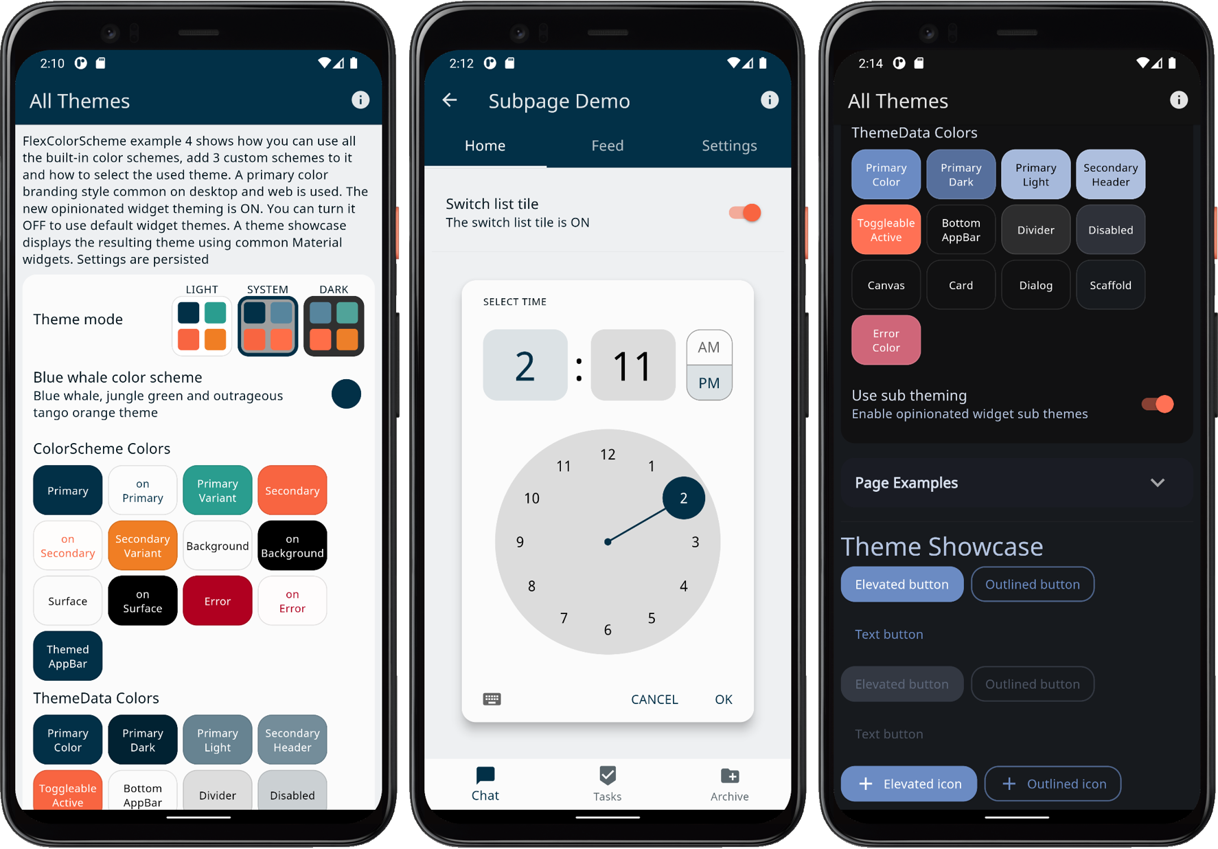
Example 4
You can use the popup menu available in the ListTile showing the current theme to change the active theme. You can choose any of the built-in 36 schemes, plus the three custom color schemes we added. When you change scheme, you will notice that the active theme color changes are animated by interpolating from the active theme colors, to the new theme colors. This is a very nice standard feature when you modify the theme used by a Flutter Material applications.
Scroll down in the app to see the theme showcase further below. It presents the theme with common Material UI widgets. You can try this example as a Flutter web app here.
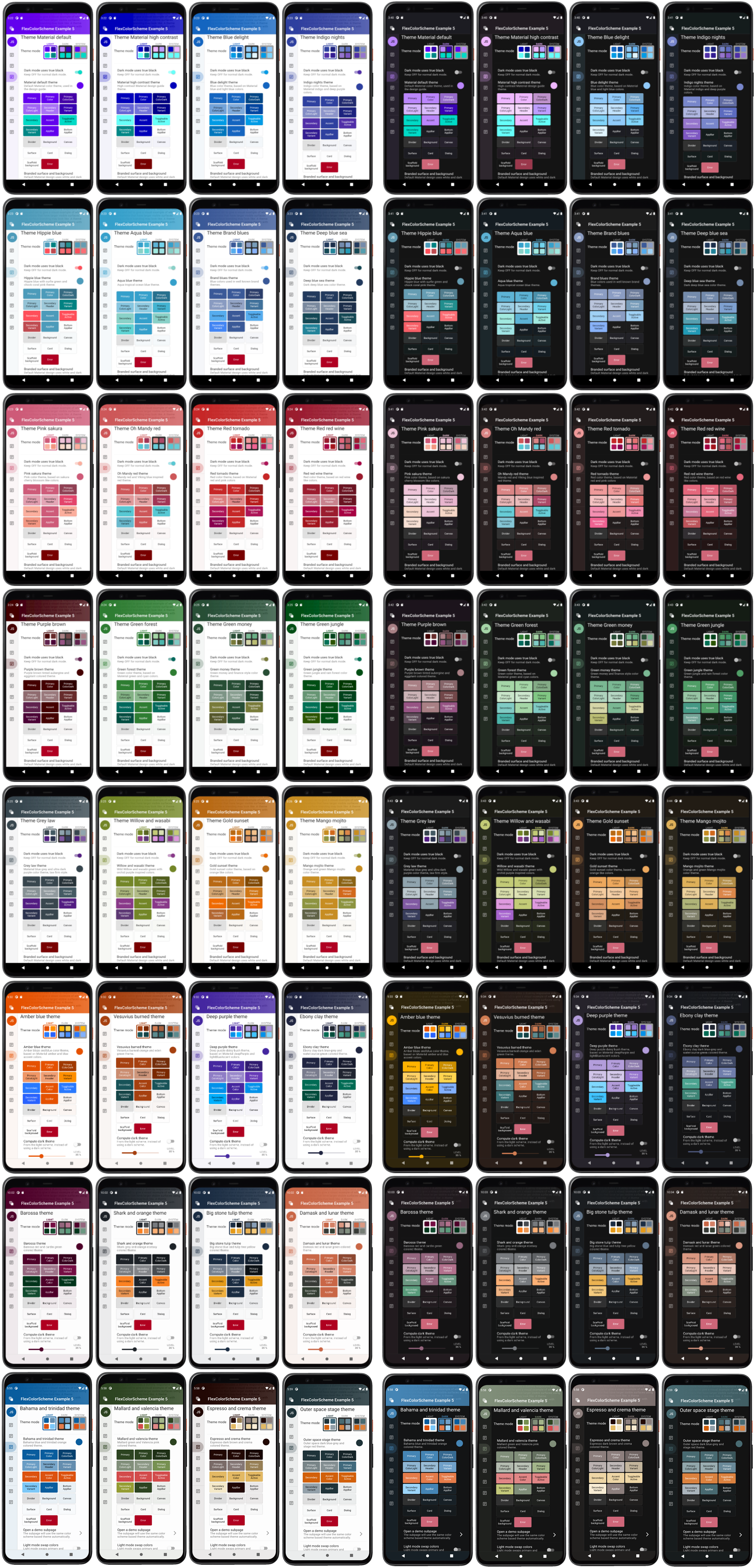
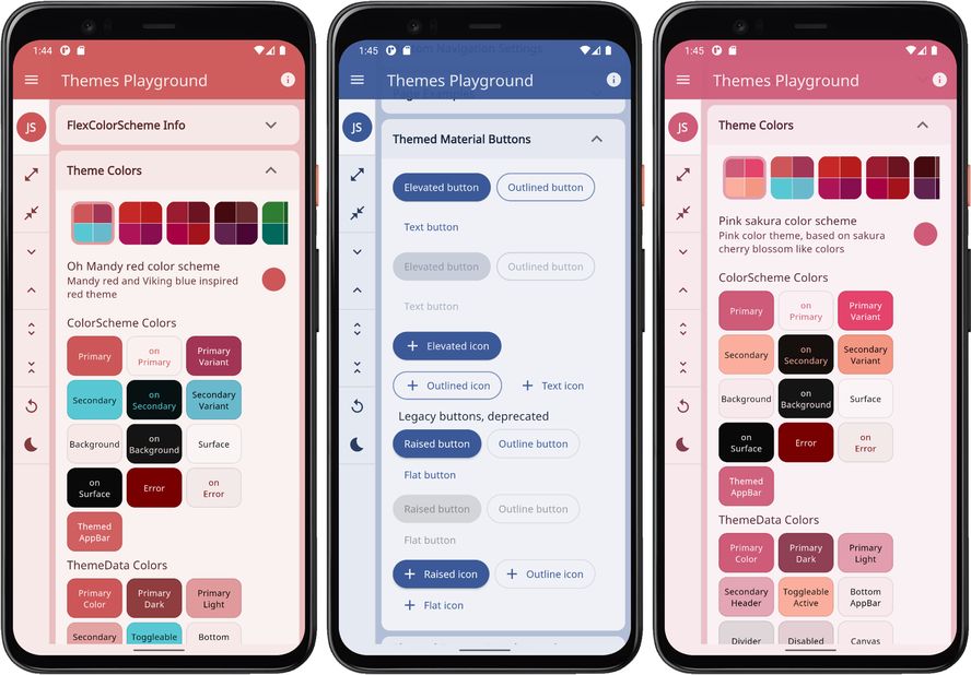
Example 5 - Themes Playground #
This example shows how you can use all the built-in color schemes in FlexColorScheme to define themes from them. How you can define your own custom scheme colors, and use them together with the predefined ones. Like the previous example, this can give you an idea of how you can create your own complete custom list of color schemes if you do not want to use the predefined ones.
This example also shows how you can use the surface branding feature, vary its strength and how to use the custom app bar theme features. The usage of the true black theme feature for dark themes is also demonstrated. Using the optional Windows desktop like tooltip theme is also shown.
The example includes a dummy responsive side menu and rail to give a visual presentation of what applications that have larger visible surfaces using the surface branding look like.
A subpage is also available that show that the same active theme is also applied when opening another page. This is because all the built-in widgets use the same inherited theme and use the colors in the theme in predefined ways by default. This is also a good example and explanation of why you should use the same theme colors for your custom re-usable widgets as their default color property values. Then theme your application to make it look the way you want, rather than defining constants that you apply directly to widget color properties.
If you tried the previous examples on a device, you might have noticed that the system navigation bar on Android devices does not always change. It is not themed to have matching background and theme mode that matches the active application theme as it changes. This example shows how this can be fixed and that the used method remain in effect when opening a subpage.
The same custom color schemes as in example 4, are also used in this example. They are not explained here again, please see example 4 for details.
The full code is not shown below, only highlights. Please find the complete example code here.
Example 5 - Local State and Setup #
In this example we can toggle the used app bar theme style, the surfaces branding strength, tooltip style and try the true black theme toggle for dark-mode. This is done so that you can interactively try the options and see what they do.
You can also use the example to toggle the tabBarStyle to use a tab bar theme that is designed
to fit in an app bar, regardless of which style you selected for the AppBar. This is the default style for
this sub theme. Alternatively you can choose a style that makes a TabBarTheme that fits well on
background colors. Use this
option if you intend to use the TabBar primarily in a Scaffold body, in dialog or Drawer or other surface and
background colored Material.
Starting with version 3.0.0 the swapColors property can be used to swap the primary and secondary colors
in a color scheme. All built-in colors schemes might not work so well when using this, but many do. One possible
theme variation that one can use, is to only swap the colors in dark theme and keep them as defined
for light theme mode. This can work quite well with many of the pre-defined color schemes.
This example has a toggle that allows you to for all the schemes use toDark computed dark schemes instead
of the hand tuned built-in ones. You can then compare this result to hand-made dark themes.
The toDark method does a pretty good job and can
even be tuned with a level property. If you use the toDark method on the last custom scheme, you will not see
any difference, because we already created its dark scheme in this example with this method.
Turning the toggle on for it, computes the same dark scheme from the same light scheme colors again.
There is a slider that you can use to adjust the white blend level
of the toDark method. From its default value of 35%, to be anything from 0...100 %, you can experiment
with it and see what it does.
Additionally, this example includes a toggle that allows you to instead of using the FlexColorScheme.toTheme method,
use the standard flutter ThemeData.from factory to create the theme from the same color scheme definitions.
We can use this toggle to see and study the differences that FlexColorScheme.toTheme brings.
 class _DemoAppState extends State<DemoApp> {
   // Used to select if we use the dark or light theme.
   ThemeMode themeMode = ThemeMode.light;
    // Used to select which FlexSchemeData we use in our list of schemes.
   int themeIndex = 7; // Start with deep blue see theme.
   // Enum used to control primary color branding on surface and background.
   FlexSurface flexSurface = FlexSurface.medium;
   // Enum used to select what app bar style we use.
   FlexAppBarStyle flexAppBarStyle = FlexAppBarStyle.primary;
   // Used to modify the themed app bar elevation.
   double appBarElevation = 0;
   // Used to control if we use one or two toned status bar.
   bool transparentStatusBar = false;
   // Enum used to select what tab bar style we use.
   FlexTabBarStyle flexTabBarStyle = FlexTabBarStyle.forAppBar;
   // If true, tooltip background will be light in light theme, and dark
   // in dark themes. The Flutter Material default and standard is the other
   // way, tooltip background color is inverted compared to app background.
   bool tooltipsMatchBackground = false;
   // Swap primary and secondary colors in light theme mode.
   bool swapLightColors = false;
   // Swap primary and secondary colors in dark theme mode.
   bool swapDarkColors = false;
   // Allow toggling between normal dark mode and true black dark mode.
   bool darkIsTrueBlack = false;
   // Allow toggling between using the actual defined dark color scheme or
   // try how it would look if we had not defined the dark colors, but had
   // been lazy and just created the dark scheme from the light scheme
   // with the toDark() method.
   bool useToDarkMethod = false;
   // The 'level' of white blend percentage used when computing dark scheme
   // colors from the light scheme colors with the toDark method.
   int level = 35;
   // Use the toTheme to create Themes from `FlexColorScheme`. This is
   // the preferred method when using `FlexColorScheme`. In the demo
   // you can use a toggle to see what a FlexColorScheme looks like if
   // you the color scheme and `ThemeData.from` to instead create the theme.
   bool useToThemeMethod = true;
Example 5 - The FlexColorScheme Properties and toTheme #
We define the light theme for the app, using current theme index, selected surface style and app bar style. With the built-in 36 themes, and the three custom ones we made, we can use 35 different app themes via the setup below.
If we consider the other style, options we have to multiply that with five different surface styles and five app bar variants, four times for the variations from swapping primary and secondary colors. That's a lot of styles and themes!
The factory FlexColorScheme.light is used to define a FlexColorScheme for a light theme, from the light
FlexSchemeColor in the myFlexSchemes list, plus some other properties. Those include among others,
the surface and app bar style, as well as the tooltip and true black setting for the dark theme.
   @override
   Widget build(BuildContext context) {
     return MaterialApp(
       debugShowCheckedModeBanner: false,
       title: 'FlexColorScheme',
       theme: useToThemeMethod
         ? FlexColorScheme.light(
             colors: myFlexSchemes[themeIndex].light,
             surfaceStyle: flexSurface,
             appBarStyle: flexAppBarStyle,
             appBarElevation: appBarElevation,
             transparentStatusBar: transparentStatusBar,
             tabBarStyle: flexTabBarStyle,
             tooltipsMatchBackground: tooltipsMatchBackground,
             swapColors: swapLightColors,
             visualDensity: FlexColorScheme.comfortablePlatformDensity,
             fontFamily: AppFonts.mainFont,
           ).toTheme
Example 5 - The FlexColorScheme Properties and toScheme #
We also demonstrate how to create the same theme with the standard from color scheme ThemeData factory
ThemeData.from. The surface style works, but will not be applied as elegantly, but it works fairly OK up
to medium branding. The app bar style has no effect, nor the tooltip or tab bar style.
When toggling between the standard ThemeData.from and the FlexColorScheme.toTheme made themes from the
same ColorScheme data, we can observe the differences. We can notice some theme colors that the standard
method does not adjust to match the used color scheme. The previously mentioned
article also includes
a visual presentation of the differences.
         : ThemeData.from(
             colorScheme: FlexColorScheme.light(
               colors: myFlexSchemes[themeIndex].light,
               surfaceStyle: flexSurface,
               appBarStyle: flexAppBarStyle,
               appBarElevation: appBarElevation,
               transparentStatusBar: transparentStatusBar,
               tabBarStyle: flexTabBarStyle,
               tooltipsMatchBackground: tooltipsMatchBackground,
               swapColors: swapLightColors,
               visualDensity: FlexColorScheme.comfortablePlatformDensity,
               fontFamily: AppFonts.mainFont,
             ).toScheme,
           ).copyWith(
             visualDensity: FlexColorScheme.comfortablePlatformDensity,
             typography: Typography.material2018(
               platform: defaultTargetPlatform,
             ),
           ),
IMPORTANT
When using FlexColorScheme and making themes with it, you would normally NOT USE THE ABOVE toScheme APPROACH.
It is ONLY included in this example to be able to demonstrate the theme adjustments provided by
FlexColorScheme.toTheme. That said, it is as shown totally possible to do so if you for some reasons prefer
the results with the toScheme approach. By using it, you do however loose most of the end results and features
offered by FlexColorScheme. You can see an example visual comparison and presentation of the
differences here.
The used FlexColorScheme.light properties appBarStyle, appBarElevation, tabBarStyle,
tooltipsMatchBackground and visualDensity in the example above, actually have
no impact at all on the returned ColorScheme by toScheme. It can only return colors in a ColorScheme,
that of course have no such theming concept. Definition of these values above could just as well be removed in the
above example. They were left in there to demonstrate that for this NOT recommended FlexColorScheme theme
definition method, they have no impact on the end result. Only properties that adjust scheme colors,
like colors, scheme, surfaceStyle and usedColors will have an impact on the toScheme
returned by FlexColorScheme.
AVOID
Using a light theme and dark theme that do no define and use the sameTypogrpahy!
To make the above demo work interactively we also have to make sure we use the same typography when we make the ThemeData object from the returned ColorScheme. If we do not, the animated theme will show an assertion error, because the Flutter SDK cannot animate between text themes using differentTypography. To fix this, we use the same nicer and newer typography that is used by default by FlexColorScheme based themes. We also add the visual density to theThemeDatawith the samecopyWith, so we get the same Widget spacing as the one used in ourFlexColorScheme.light().toThemesetup.
Example 5 - Equivalent Setup for the Dark Theme, but with More Options #
We do the equivalent definition for the dark theme, and we add
the true black option as well. We also use the useToDarkMethod boolean as switch for colors to pass it a
FlexSchemeColor that is either using the predefined ones or computes it from its light FlexSchemeColor.
For the toDark calculation we give it the level property that allows us to tune the dark conversion with
the slider in the UI. We also use the defaultError modifier. This ensures that the resulting computed
toDark scheme will ignore any existing light scheme error color definition, and use Material default dark mode
error color as its error color. Without this modifier, toDark will also compute the error color for the
dark scheme from the light scheme's error color. It will thus also change with the level adjustment.
This is certainly also a usable option, but in this example we do not want this behavior.
     darkTheme: useToThemeMethod
       ? FlexColorScheme.dark(
          colors: useToDarkMethod
             ? myFlexSchemes[themeIndex].light.defaultError.toDark(level)
             : myFlexSchemes[themeIndex].dark,
           surfaceStyle: flexSurface,
           appBarStyle: flexAppBarStyle,
           appBarElevation: appBarElevation,
           transparentStatusBar: transparentStatusBar,
           tabBarStyle: flexTabBarStyle,
           tooltipsMatchBackground: tooltipsMatchBackground,
           swapColors: swapDarkColors,
           darkIsTrueBlack: darkIsTrueBlack,
           visualDensity: FlexColorScheme.comfortablePlatformDensity,
           fontFamily: AppFonts.mainFont,
         ).toTheme

       : ThemeData.from(
           colorScheme: FlexColorScheme.dark(
             colors: useToDarkMethod
               ? myFlexSchemes[themeIndex].light.defaultError.toDark(level)
               : myFlexSchemes[themeIndex].dark,
             surfaceStyle: flexSurface,
             appBarStyle: flexAppBarStyle,
             appBarElevation: appBarElevation,
             transparentStatusBar: transparentStatusBar,
             tabBarStyle: flexTabBarStyle,
             tooltipsMatchBackground: tooltipsMatchBackground,
             swapColors: swapDarkColors,
             darkIsTrueBlack: darkIsTrueBlack,
             visualDensity: FlexColorScheme.comfortablePlatformDensity,
             fontFamily: AppFonts.mainFont,
           ).toScheme,
         ).copyWith(
             visualDensity: FlexColorScheme.comfortablePlatformDensity,
             typography: Typography.material2018(
             platform: defaultTargetPlatform,
           ),
         ),
What does defaultError actually do?
The
defaultErrormodifier creates a new copy of the object, whereerrorcolor is null. This causes thetoDarkmethod to skip it and keep it as null. It then gets the default Material error via thetoThememethod. For the customFlexSchemeColorobjects in example 4 and 5, we did not specify any error color, they are alreadynulland get the default fixed Material error in dark mode. However, the built-in schemes do specify their error color for both light and dark schemes. Since the light error color is defined, and we do not wanttoDarkto compute a dark scheme error color that changes with the level, we set it to null withdefaultError.
Example 5 - Building the Example #
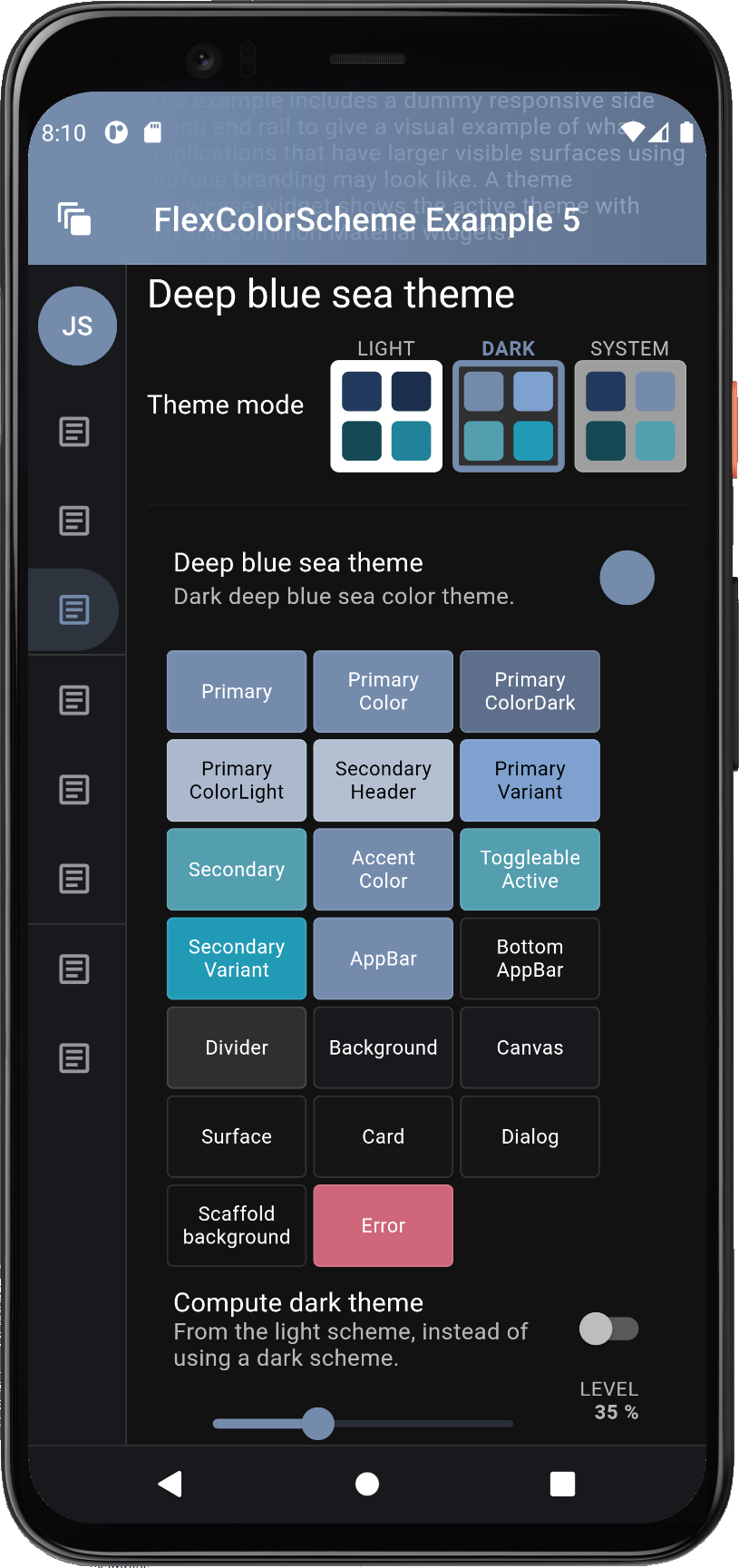
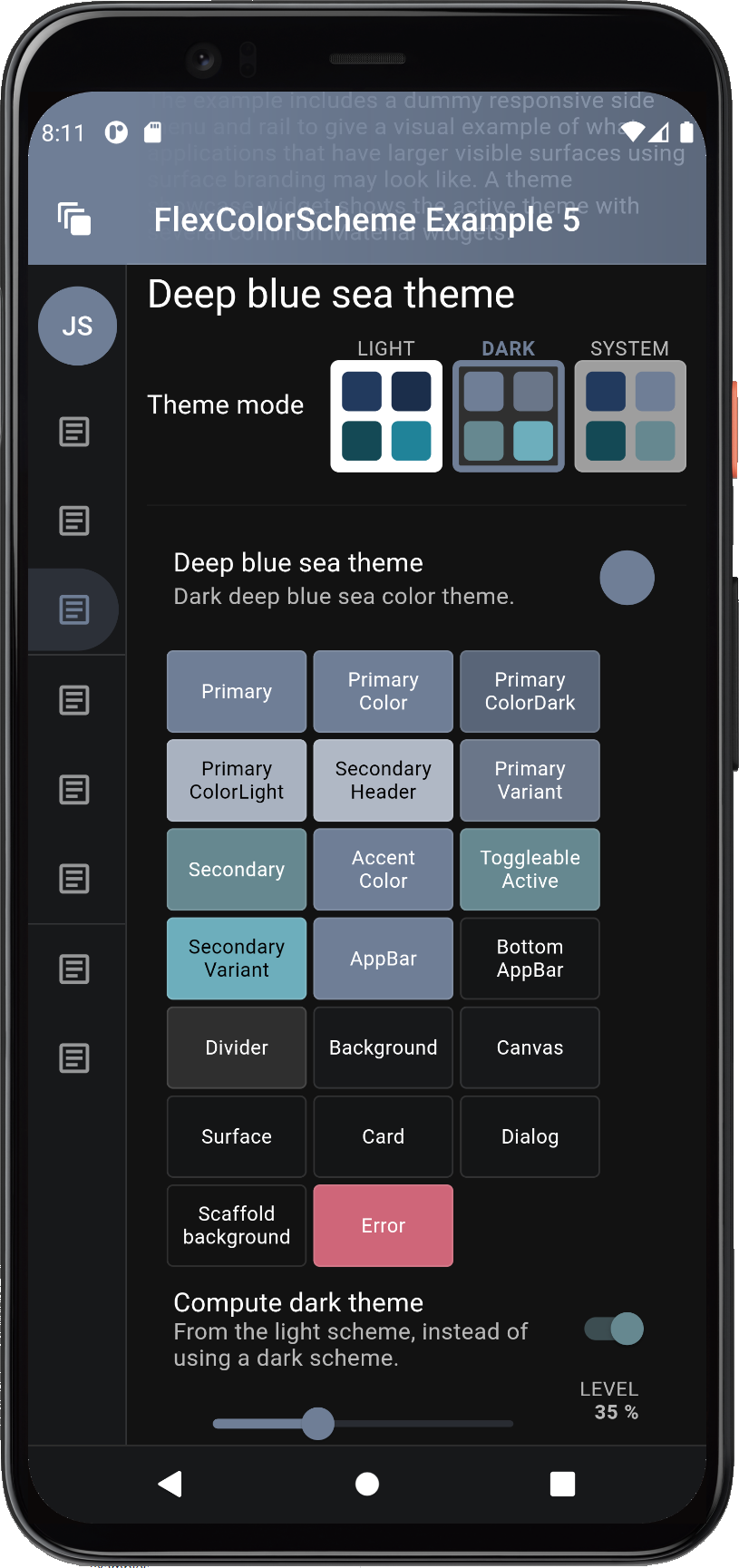
The above concludes the code walk through of example 5. When we build it, the example starts with the deep blue sea scheme. In the example below we can also see the correctly themed system navigation bar on the Android device.

Example 5) The Themes Playground
You can try the FlexColorScheme Themes Playground example as a Flutter web app here.
Feature Details #
Feature details from above examples are illustrated and explained further below. API reference links are provided when appropriate.
Visual Density #
Examples 3,4 and 5 in this package use comfortable adaptive platform visual
density via FlexColorScheme.comfortablePlatformDensity, instead of the
default counter application's VisualDensity.adaptivePlatformDensity.
This is an alternative visual density design that on desktop applications
results in the Flutter comfortable visual density being used, instead of
compact. On devices, they both result in the default large standard
visual density that is suitable for small touch devices.
This helper function was added to provide an easy option for using a bit larger UI elements on desktop and web apps, while keeping the correct size for devices.
If the desktop and web versions of the app is used on computers with touch
screens, the comfortable density provides a nice balance. It still looks
compact enough to be desktop like, while providing a bit more touch friendly
space, without looking like an overblown small device UI on a desktop.
FlexColorScheme can also use the VisualDensity.adaptivePlatformDensity value.
If you prefer it, just replace the line with it. If you do not specify any
visual density, the Flutter default density standard is used on
all platforms. This creates widgets with a lot of white space around and
inside them. It may not be what you want on web/desktop applications, but is
the correct choice for small touch devices. The visual density feature in
Flutter was created to address this difference in design requirement.
The Flutter SDK built-in function VisualDensity.adaptivePlatformDensity
was added to adapt the density according to used platform. The
FlexColorScheme.comfortablePlatformDensity does the same, but with a bit
more white space on desktops. Use the one you like and works best for
your use case.
Optional FlexThemeModeSwitch #
One feature on the HomePage of examples 1 to 4 is the FlexThemeModeSwitch.
It is the UI Widget used for the 3-way theme mode switch used in these
examples to change the active theme mode.
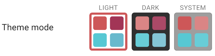
Using the switch is very simple, give it the currently selected and active theme
mode, the current FlexSchemeData scheme, so it can color its buttons correctly.
Then use the onThemeModeChanged callback for changes to its mode, and change
the themeMode property in the MaterialApp accordingly, to actually change
the used theme mode.
FlexThemeModeSwitch(
  themeMode: themeMode,
  onThemeModeChanged: onThemeModeChanged,
  flexSchemeData: flexSchemeData,
),
Using the FlexThemeModeSwitch 3-way theme mode switch is optional and not
required to use FlexColorScheme based themes. It is just a custom theme mode
switch design and was included as a bonus feature in the
FlexColorScheme package. It was added based on a request after it
had been observed in the wild in the Flexfold demo app.
In the Flexfold demo app the switch was originally a fairly fixed design.
This FlexThemeModeSwitch has many properties that allow you to customize
it extensively. You can find its API
reference here and its companion, the
FlexThemeModeOptionButton API reference here.
With the API you can customize the look of the FlexThemeModeSwitch,
here are some examples:
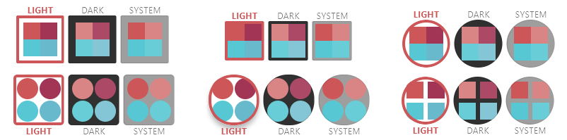
The FlexThemeModeOptionButton is typically used by the FlexThemeModeSwitch,
but it can also be used as a part of other theme related indicator widgets.
Like for example the scrolling horizontal list used in example 5, where it is
used as a theme indicator and selector in a horizontally scrolling list.
Computed Dark Theme #
Example 5 allows us to toggle the dark mode, from using its hand tuned predefined dark scheme colors, to the dark scheme colors computed from the light scheme colors. Let's use it to compare some examples.
When using the deep blue sea scheme, the computed dark theme colors ones are a bit more dull and muted in this example, the computed dark scheme is on the right.
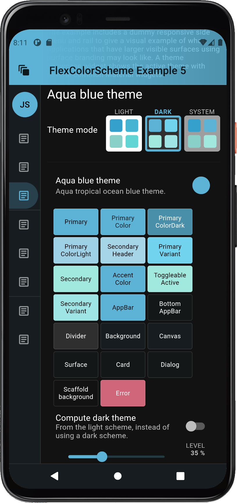
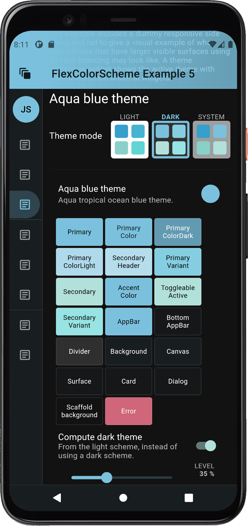
With some other color schemes, like the Aqua blue one, there is only a minor difference, the computed dark scheme is on the right.
The result of the toDark method varies depending on how saturated the used
light scheme colors are. It is possible to tune the calculated dark scheme by
modifying the whiteBlend property it uses to blend in white to make the
dark scheme. The default whiteBlend is 35%, this is normally a suitable
value. For more saturated light scheme colors try 40%, which is also used in
the Material 2 design guide to convert the default red error color for light
mode, to dark mode. For light scheme color with low saturation, a white
blend of 20...30% often produces nice results.
With the included level slider in the example 5 we can interactively change
the whiteBlend level for the computed dark mode scheme colors. Let's select
a color scheme, say the Brand blues one, then go dark.
By default, the built-in predefined hand-picked matching dark scheme colors for the dark theme mode are used. Turn on the "Compute dark theme" mode, the result is pretty close to the predefined one for this dark scheme with the default level of 35%. Then adjust the white level blend to tune how saturated the computed dark scheme colors are compared to their light scheme master. At 0% they are the same as the light scheme, at 100%, well then they are white, not so useful. A range of 10...50% can produce excellent results. What is best depends on how saturated your starting light scheme colors are, and of course what kind of matching dark theme look you like and want.
If you use the even darker dark-mode, true black, you may want to have a different saturation for your dark scheme colors compared to standard dark-mode surface. You could easily implement that adjustment with this feature.
This screen recording compares the computed toDark theme result, to the
built-in hand-picked one. It does this by toggling the mode a few times, so
you can compare the different results. It also uses the level slider
to adjust the toDark theme result. A sharp eye might notice that this
recording does not use the defaultError error color modifier, the changing
dark error color does not look so nice when tuning the computed scheme colors.
The bundled example 5 and live web version of it uses the modifier.

Surface Blends #
Let us now explore the effect of branded surface colors. Branded surfaces are often associated with dark mode, but it works well with light mode too when applied delicately. Below you can see how the primary color gets blended into Material surface and even stronger so, into Material background colors. The screenshots below are using the medium branding strength.
You can use the toggle in the example to change from standard no branded surfaces colors, to light, medium, strong and heavy.
The scaffold background does not receive any branding until the heavy mode.
You might think that this and all the other theming can be done by just
passing the same scheme colors to the ThemeData.from factory. That is why
this demo allows you to flip a switch to do just that, so you can see and
observe the difference between color scheme based themes created
by FlexColorScheme.toTheme and ThemeData.from.
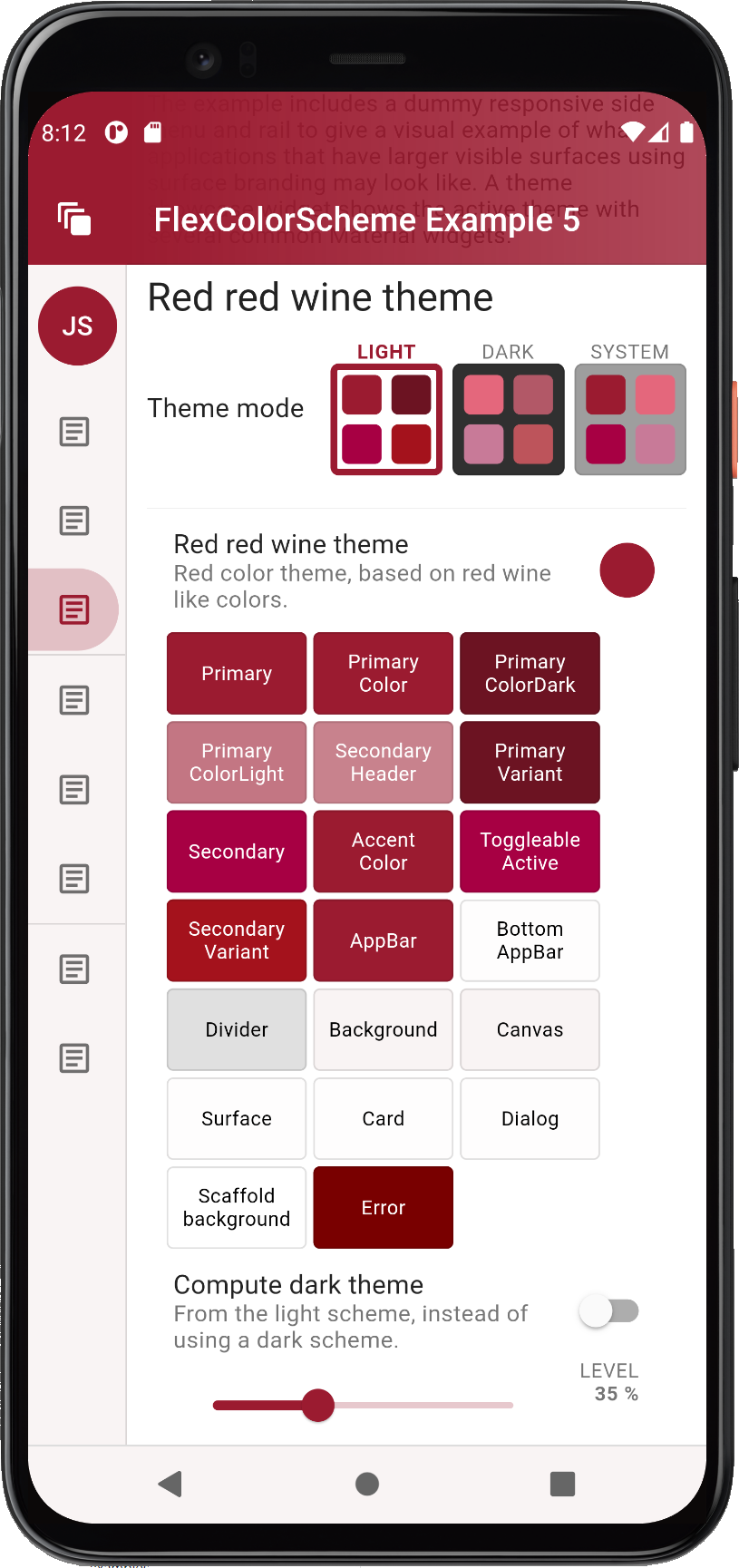
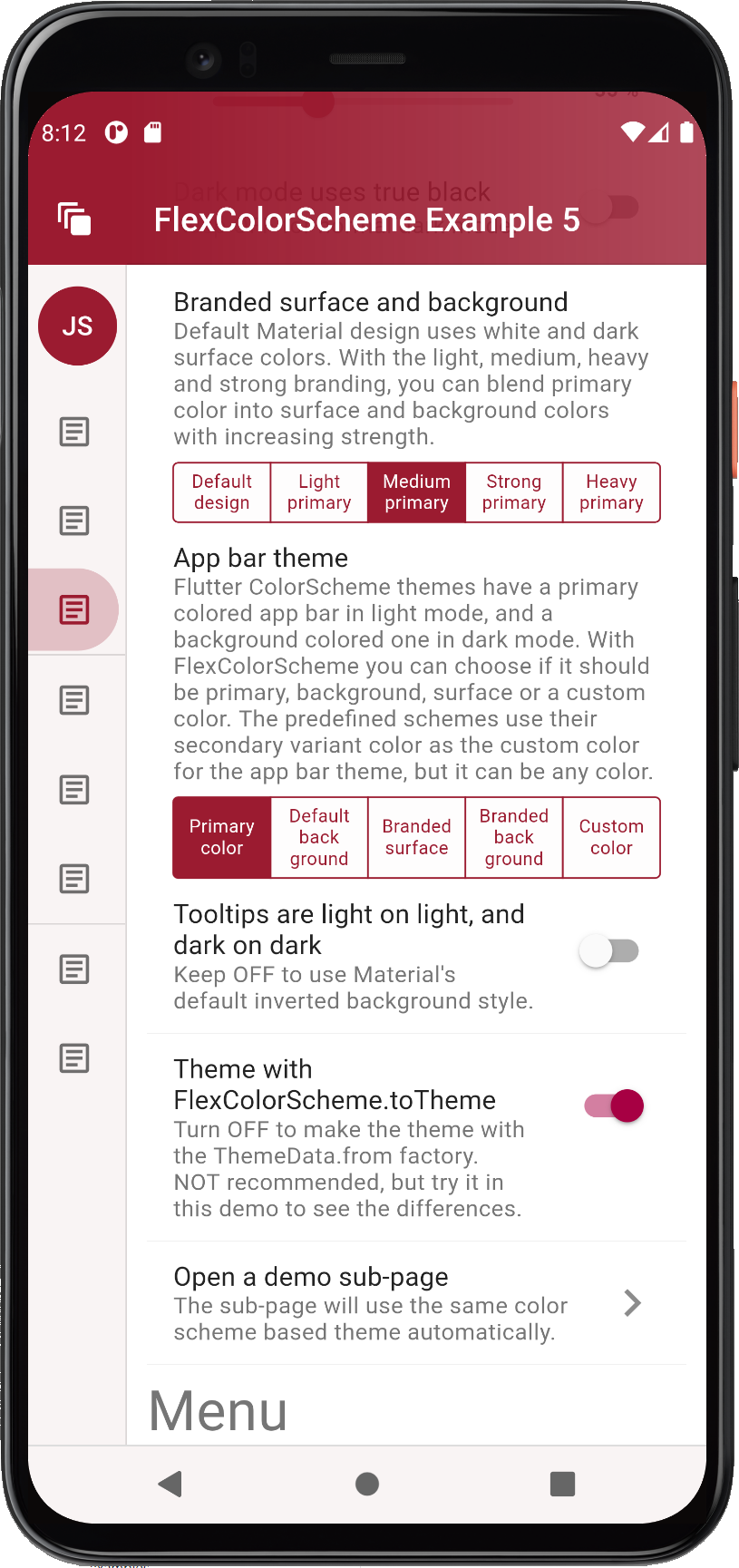
Feel free to experiment with the live web demo where the differences are even easier to observe since you can have both versions open side by side, in a large browser windows. A ready-made example comparison can be found here.
Convenient AppBar Theming #
Let's study what FlexColorScheme can do with the AppBarTheme and how you
can match it to your surface blending if you like.
You can easily toggle both dark and light mode AppBars to use differently
themed backgrounds. By default, Material design uses AppBars with
ColorScheme.primary color for light theme mode, and the dark background
color in dark theme mode. Without using a separately defined sub AppBarTheme,
FlexColorScheme AppBars can use different themed backgrounds based on
an enum value.
The themed AppBar background can use scheme primary color, default Material
plain white/dark background color, primary branded surface, primary branded
background color, or a custom AppBar color.
The FlexColorScheme scheme's appBarColor is a separate scheme color that
does not exist in Flutter's standard ColorScheme, so it does not have to be
any of the colors available in a ColorScheme.
The predefined schemes use the color defined in a ColorScheme
scheme's secondaryVariant color, as their value for the custom appBarColor.
When you make your own schemes you can do the same or use a totally
none ColorScheme related color as the AppBar's custom color option. This
color then becomes one of the FlexColorScheme's easy selectable AppBar theme
color options, via the appBarStyle property and the FlexAppBarStyle enum,
in this case via the custom choice.
Below you can see some different branding strengths with a background primary color branded app bar theme used. This example compares medium versus heavy branding. The medium choice is usually well-balanced, but light can be subtle and nice too. If you want to make a bold statement theme, go with heavy. Please note that the visual impact of the branding also depends on how saturated the primary color is.
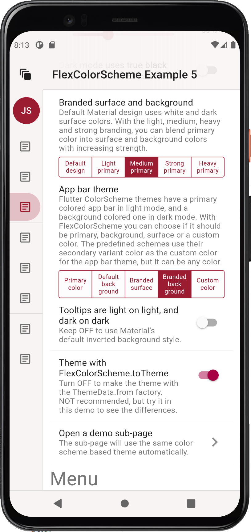
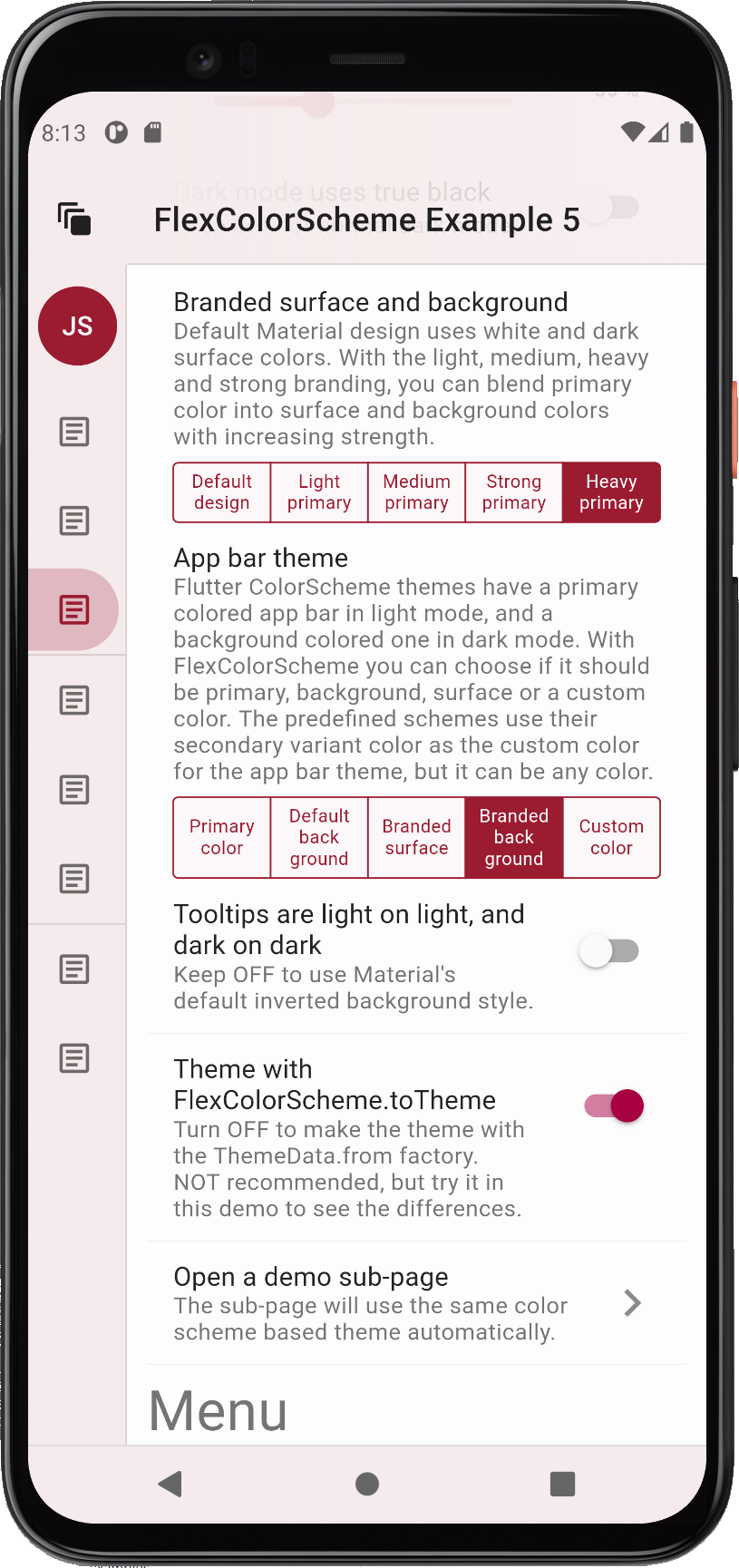
Here are few more images of the heavy primary color branded version, when looking at some widgets as well.
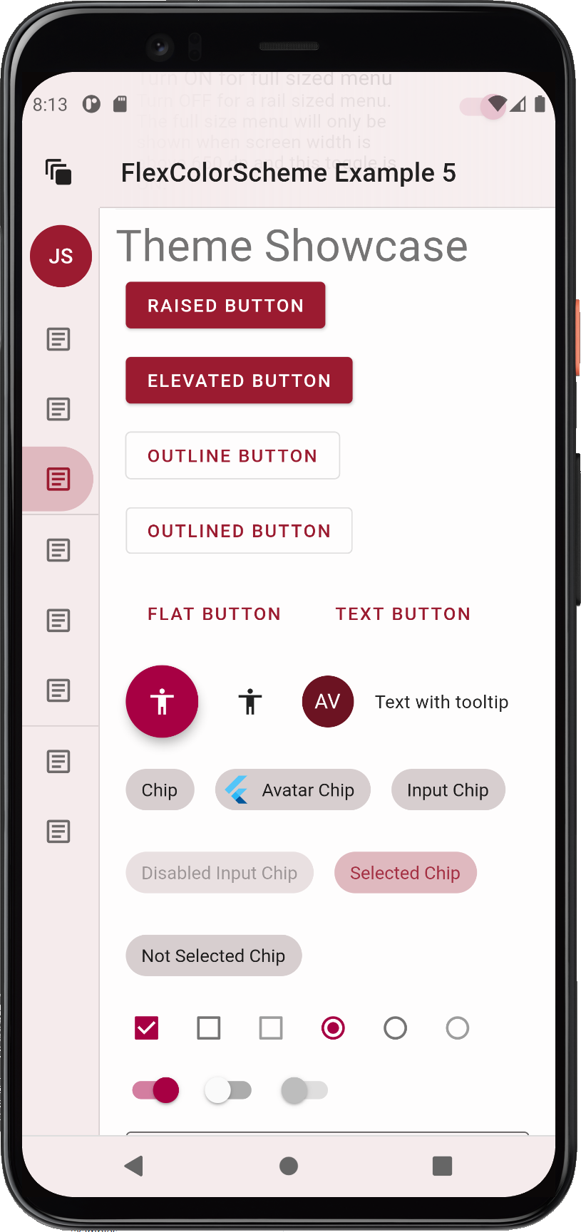

The TabBar Style #
The tabBarStyle property can be used to toggle the theme the TabBar
receives. By default, a theme that is designed to make it fit in an AppBar,
regardless of which style you have selected for it, is used. This is the
FlexTabBarStyle.forAppBar style. The typical usage of a TabBar is to have
it in an AppBar, and the default style works for this use case.
Alternatively you can choose a style that makes a TabBarTheme that fits well
on background colors. Use this option if you intend to use the TabBar in a
Scaffold body, in Dialogs, Drawers or other surface and
background colored Material. If you do so, you do not have re-theme it, or
style it separately for this purpose.
If you intend to use TabBar widgets in both AppBars and on surface and
backgrounds, you will have to choose the style that most often fits your
use case. Then theme it separately for the other use case. You would have to do
the same with Flutter standard themes and TabBarTheme as well when not
using FlexColorScheme, but the first theme your get without effort.
Which tabBarStyle style and resulting TabBarTheme actually works best,
depends on the background color. Here we see TabBars used on surfaces and in
an AppBar, when the AppBar is using primary color. As can be seen, the tab bar
theme that goes well in an app bar in such a case, does not fit on the surfaces
at all, and wise versa.
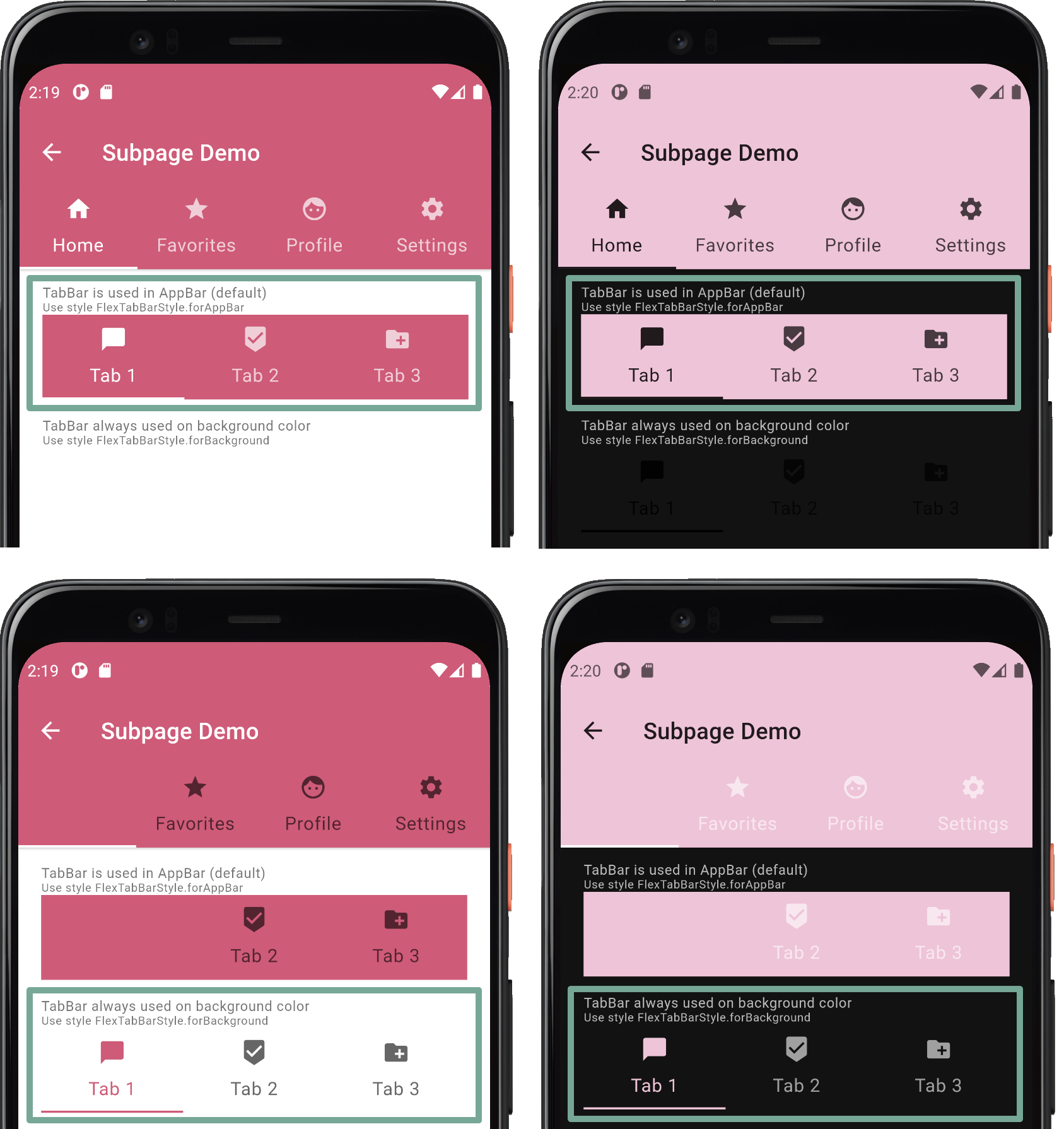
If you plan to use only surface or background (also the branded ones) colored AppBars, you can see that both tab bar styles, and their resulting themes work for both situations. The difference is minor, and it is a matter of opinion which one is preferable. Both style options can be used if you restrict your app bar color to background colors, or their primary branded variants. In such a use case you can get away with using just one of the built-in style options, even if you use tab bars in both app bars and on other surfaces.
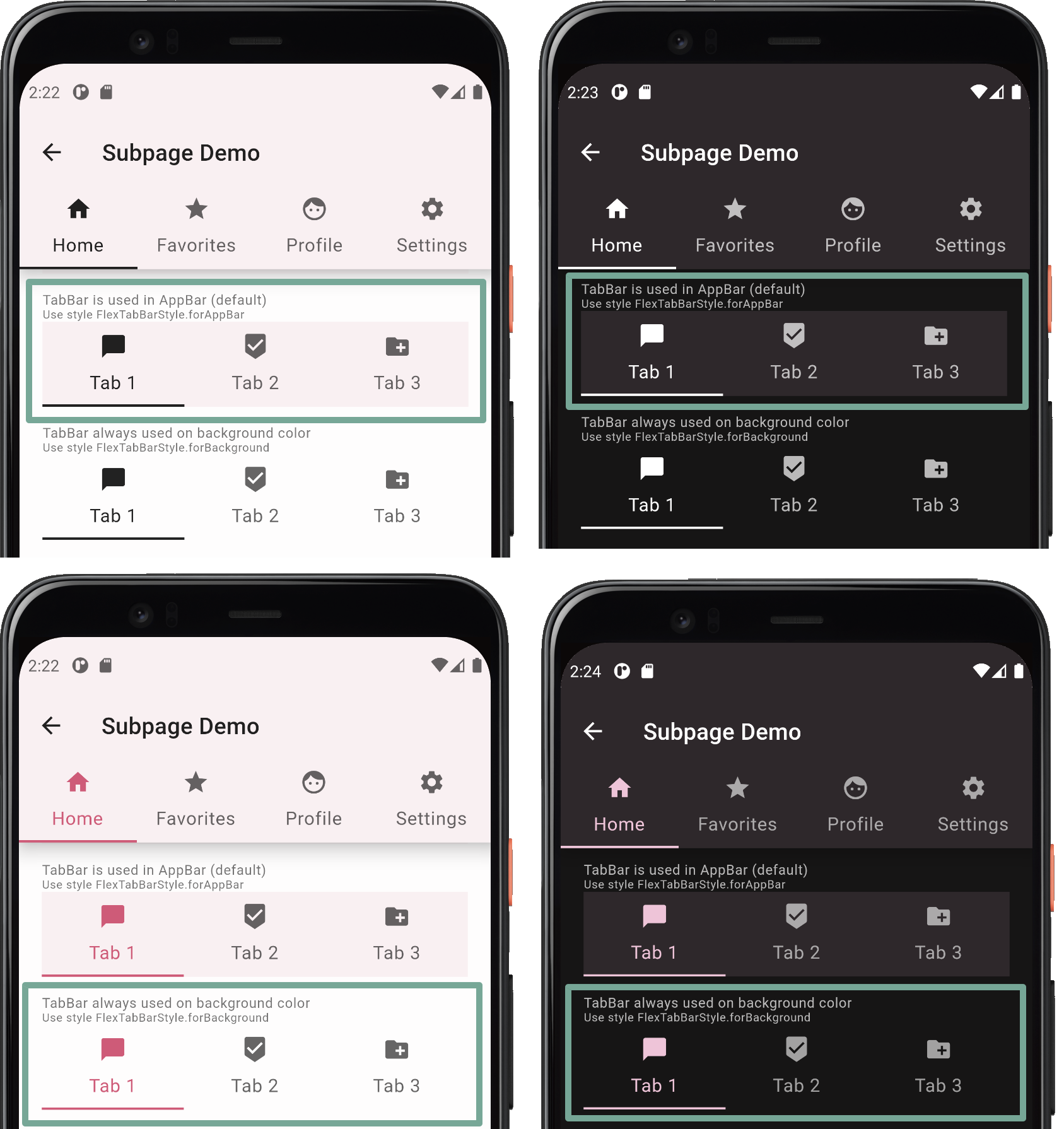
True Black #
Dark-mode is nice, but with FlexColorScheme you can go even darker, go true black with the flick of a
switch. When using the true black option for dark-mode, surface, background and scaffold background are set to
fully black. This can save power on OLED screens as the pixels are turned off, but it can also cause scrolling artefact
issues when pixels turn fully on and off rapidly as you scroll. You can read about this and see an example of it in
the Material design guide
as well. (Scroll back up one heading from the link to get to the mention of it.)
If you use branded surfaces with true black mode enabled, you will notice that the branding has a lower impact, only at strong and heavy levels does it have a visible effect. This is by design to keep most surfaces totally or very close to black when true black is combined with surface branding. If you really want complete black for all surfaces and backgrounds, then avoid combining true black mode with branded surfaces. On the other hand it still makes a darker theme than normal dark theme, which can look nice. It may also eliminate the scrolling issue, since all background colored pixels are not fully off in the strong and heavy branded true black modes.
Here is an example of a branded dark theme with true black OFF (default and standard) and true black ON, when using heavy branding with the Red red wine color scheme.
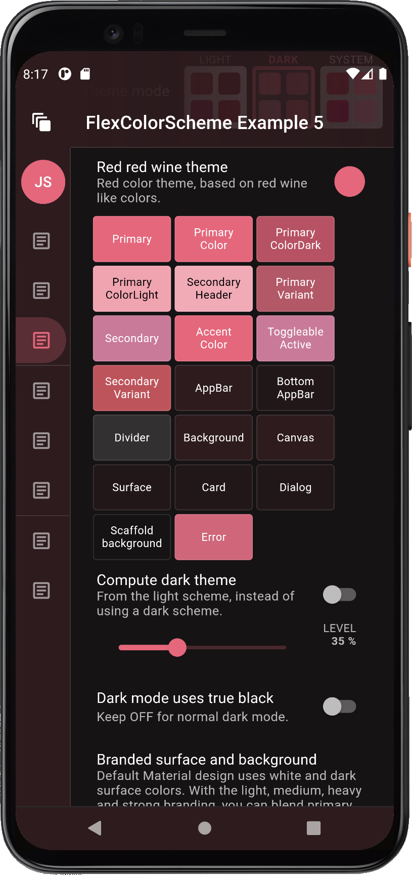
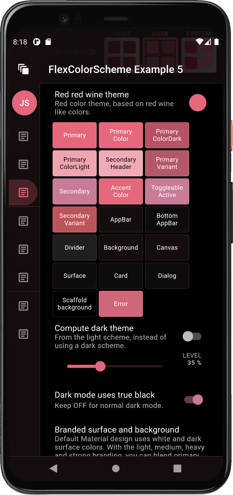
Here is another difference example with the Deep blue sea scheme, when using medium strength surface branding, and a primary colored app bar in dark-mode.
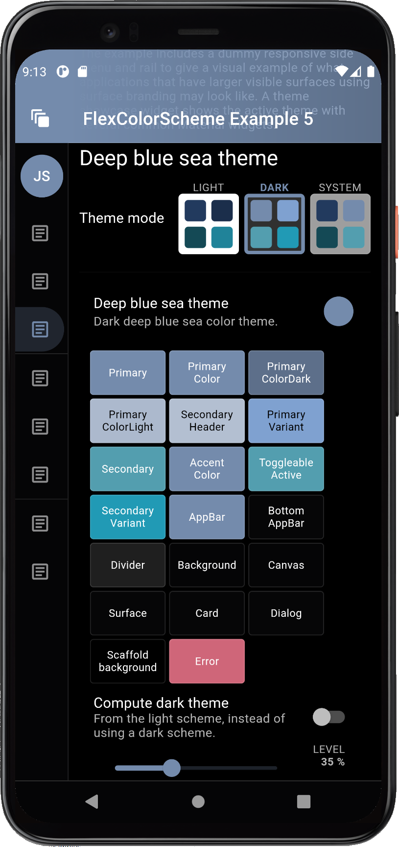
Themed System Navigation Bar in Android #
The HomePage's build method for this example starts by wrapping the entire page content in an AnnotatedRegion
with a SystemUiOverlayStyle value that we get from the static helper
FlexColorScheme.themedSystemNavigationBar(context, ...).
Using this we can get a system navigation bar, typically on older Android phones that still uses one, that follows the active theme's background color and theme mode. The system navigation bar will get updated as you select new themes, different background color branding style and strength, and toggle dark and light theme mode. Many Flutter applications neglect or forget to include this feature in their themes.
   return AnnotatedRegion<SystemUiOverlayStyle>(
     value: FlexColorScheme.themedSystemNavigationBar(
       context,
       systemNavBarStyle: systemNavBarStyle,
       useDivider: useSysNavDivider,
     ),
     child: ....
   );
Above the systemNavBarStyle is a local FlexSystemNavBarStyle state variable tied to the same UI choice in the demo
home screen and useSysNavDivider is local bool state variable. Together with the option to remove the status bar
scrim, you can have easy complete control of both the AppBar's status bar, and the system navigation bar look,
like shown below:
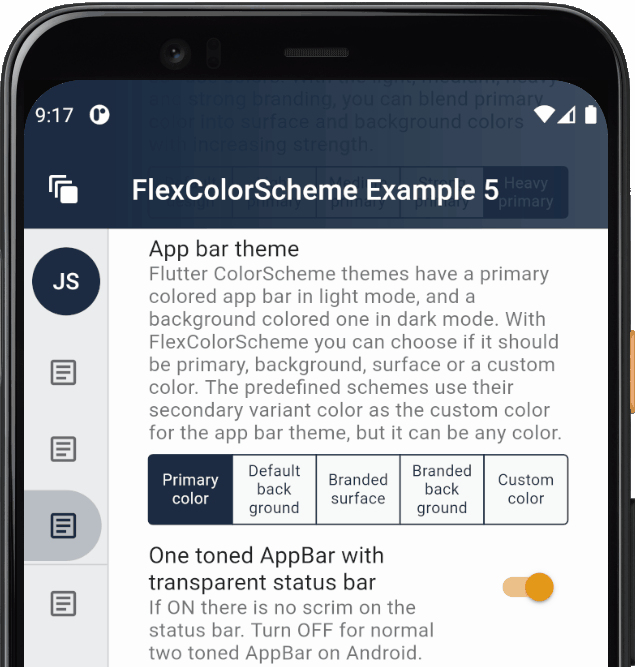
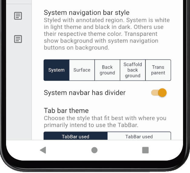
The top status bar scrim toggle, system navigation bar divider and style only have an impact on Android builds, they do not have any functionality on the live Web example.
NOTE:
The static helperFlexColorScheme.themedSystemNavigationBar(context, ...)is designed to provide a convenience wrapper for aSystemUiOverlayStylethat works for screens that use and adhere to current theme mode colors. If your application use screens that do not follow the current theme, then just useSystemUiOverlayStyledirectly in the annotated region for such screens to define their desired style. You can also make your own convenience wrapper function or even just a const value for it if you need to use a fixed style and design frequently.The system navigation bar icons do not seem to change color correctly until API30 (Android 11). On earlier API levels you may sometimes end up with light themed system navigation bar icons, even if you requested dark ones from the Android system. This has been observed at least with Pixel 4XL emulator on API29 (Android 10).
You can also use the FlexColorScheme.themedSystemNavigationBar to hide the top status icons if you are not
using an app bar at all. This can be useful on a splash or onboarding page. Example 5 contains three different
examples, each with their own limitations, read more in the example 5 source code comments on how it
can be used, here what they look like. The last Example SplashPage 2, would be the ideal version, and it
works well on some versions of Android, but seems to fail on newer ones, so you may prefer 1b instead.
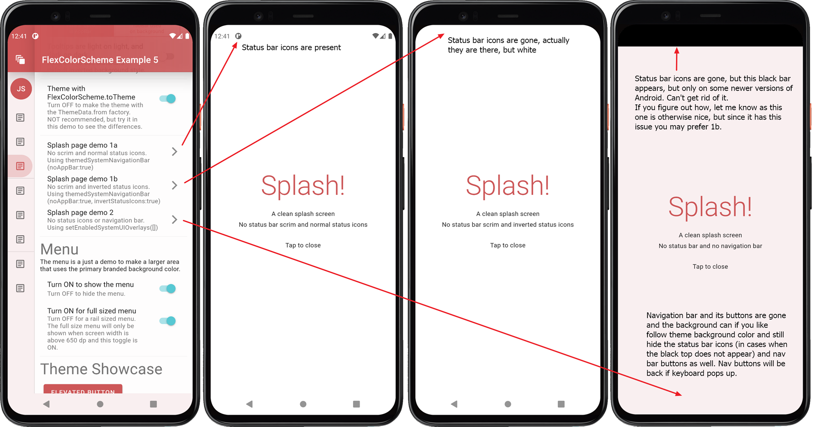
Android Transparent System Navigation Bar #
Version 1.4.0 adds experimental support for transparent system navigation bar for Android for SDK >= 30 (Android 11).
The support is added via the new opacity property in FlexColorScheme.themedSystemNavigationBar.
A separate example, that builds on example 5 for this more advanced use case, shows and explains how and when
transparent system navigation bar can be used in Android.
The example also shows how to set it up so that it always looks as nice as possible. This is done by using a primary color branded background color applied to the system navigation bar in Android, when transparency is not supported. While still using a transparent system navigation bar, when running on an API level that supports it.
Please see the separate small stand-alone example Android project called sysnavbar on GitHub for full details.
With this experimental feature you can make an Android system navigation that looks like the left one below when it is supported. It then falls back to just being theme color branded, like the right one, on API levels that do not support it.
The example below uses the classical system navigation bar with the navigation buttons. It also works when the phone settings is changed to use the much smaller gesture bar, or on phones that don't even have a visible gesture bar.
Please note that phones with API30 (Android 11) were when this was first written (Jan 16, 2021) still very rare, and at the time did not even register on stats counter. When this update was made (June 26, 2021) the share of Android 11 phones had risen to 15%.
Scheme Reference #
This table lists all current built-in schemes and provides a link to a high-resolution example phone image of each one.
| FlexScheme | Name | Description | Light___ | Dark___ |
|---|---|---|---|---|
| material | Material default | Default Material color theme, used in the design guide. | 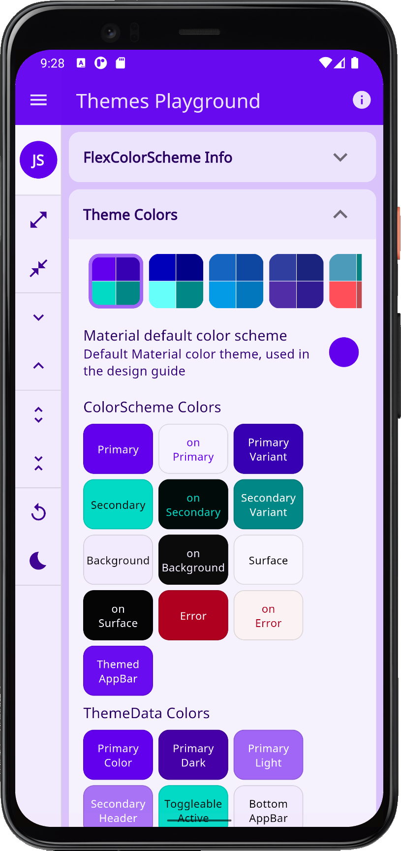 |
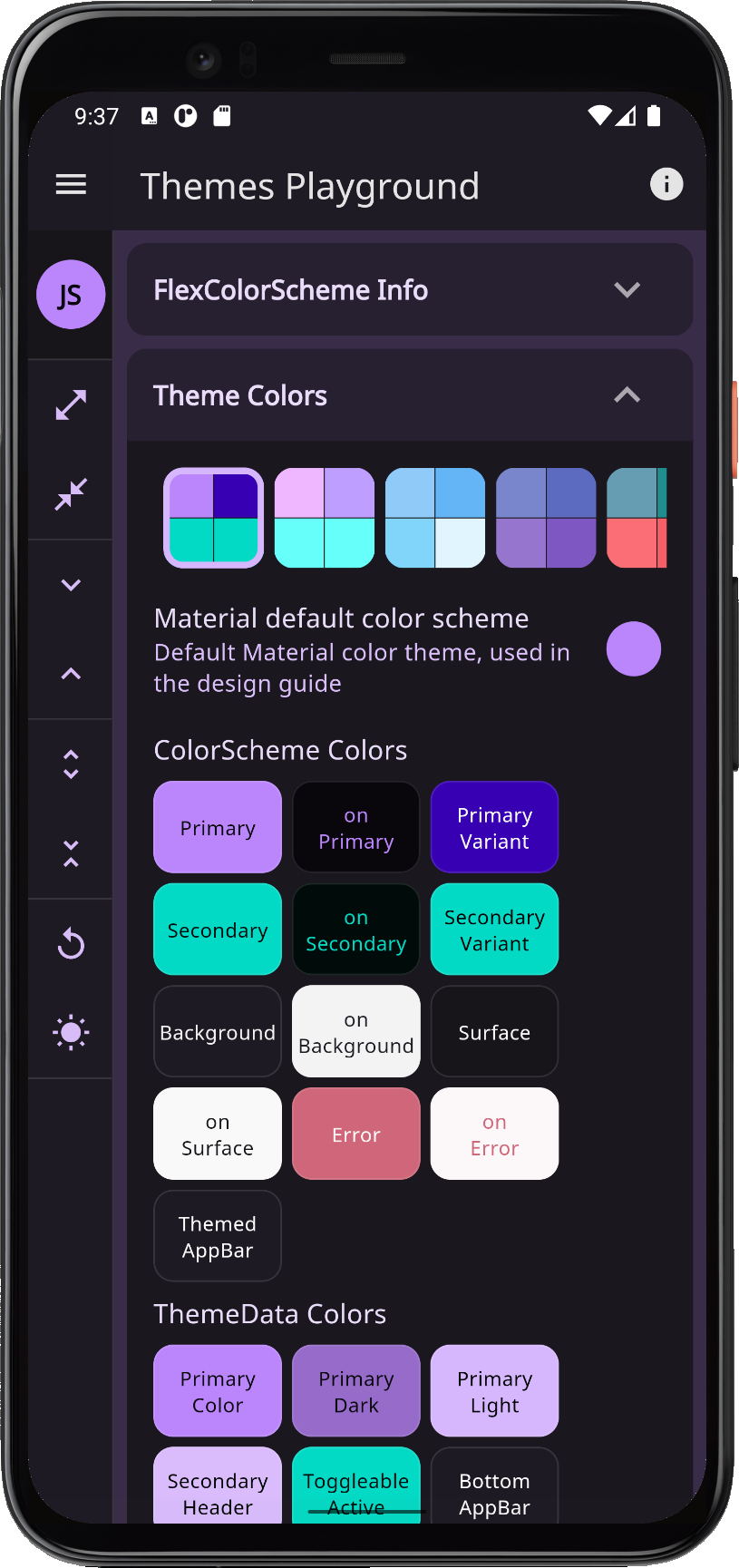 |
| materialHc | Material high contrast | High contrast Material design guide theme. | 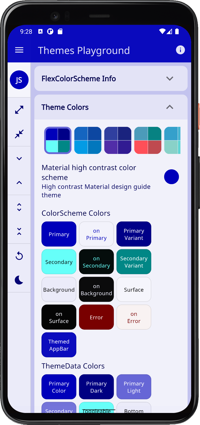 |
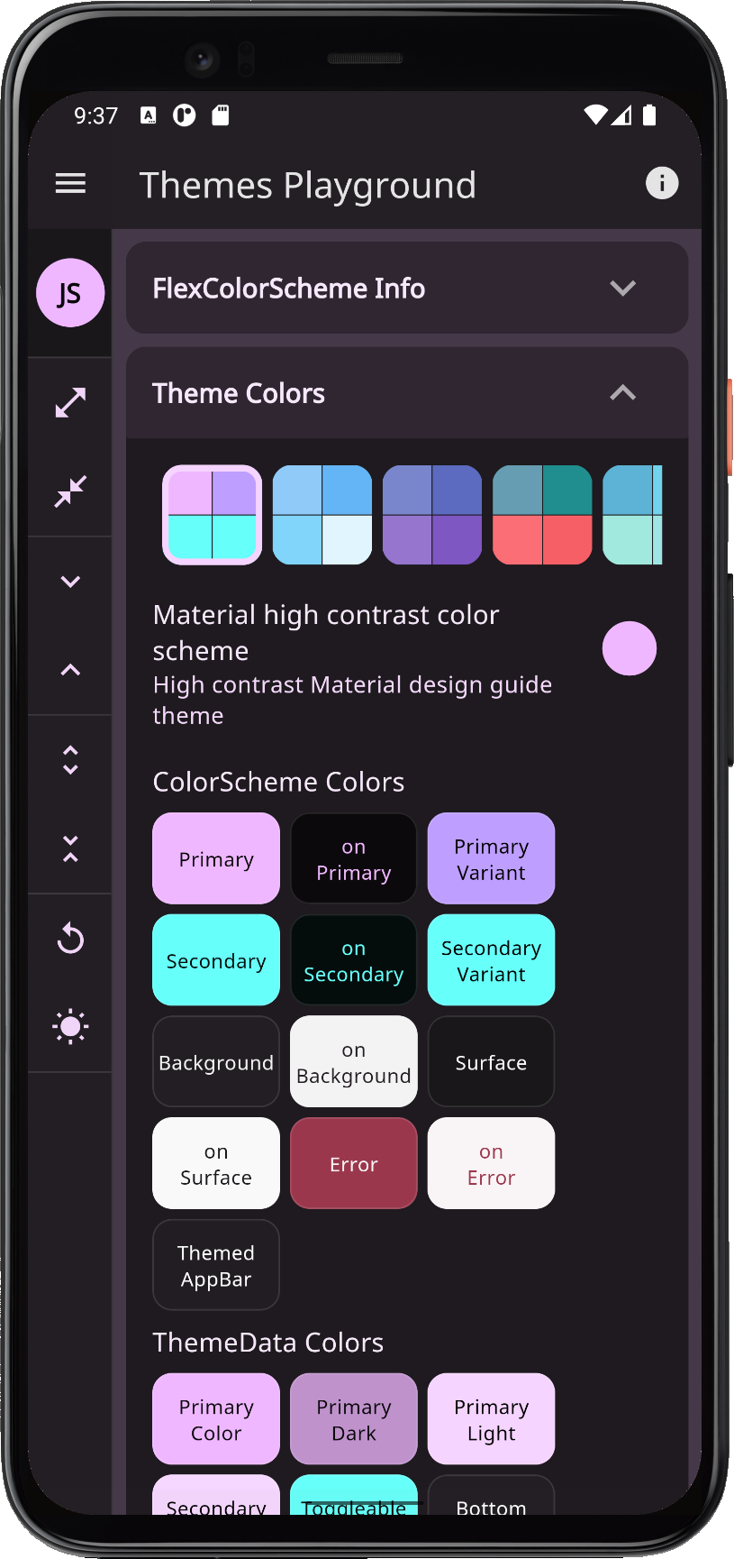 |
| blue | Blue delight | Blue color theme, based on Material blue and light blue colors. | 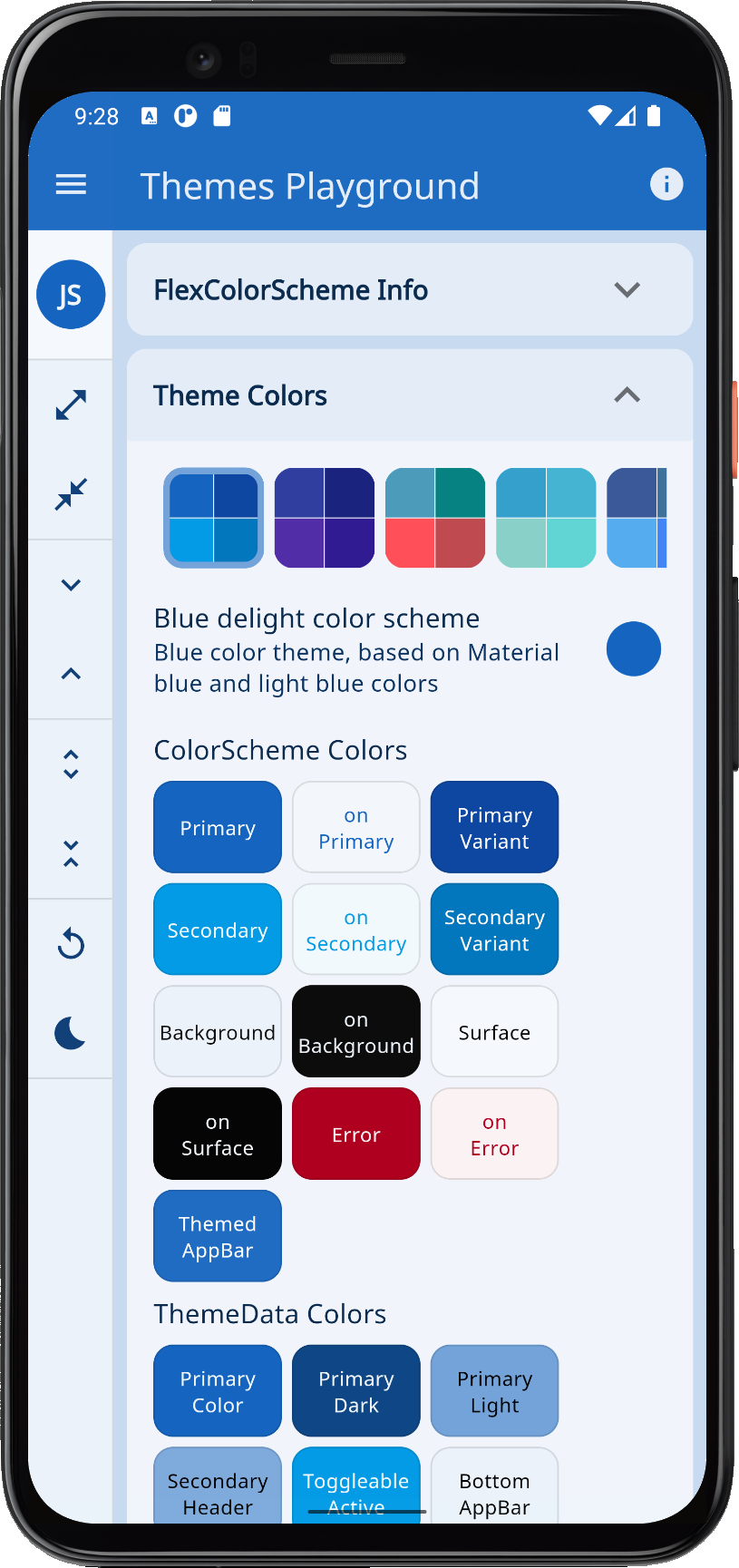 |
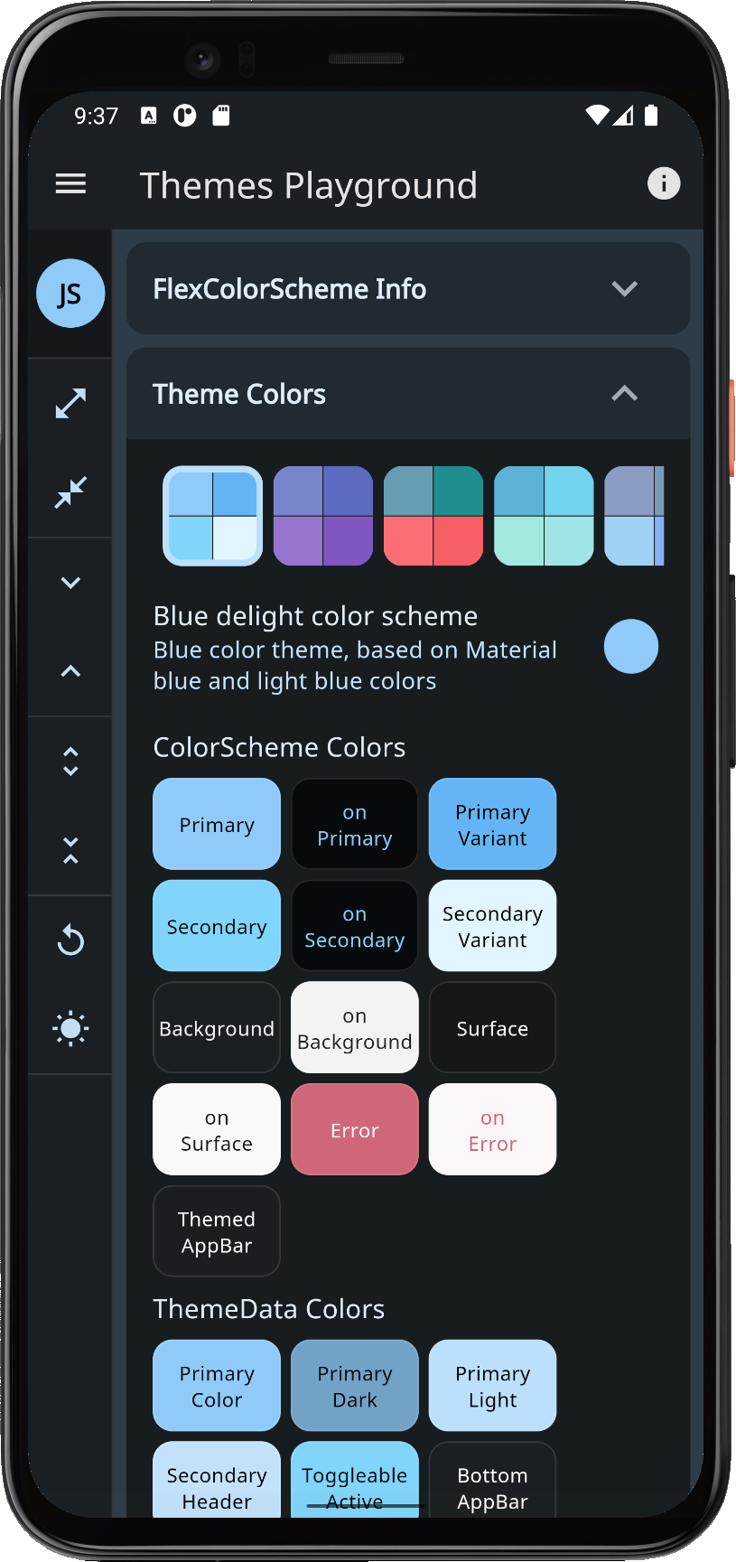 |
| indigo | Indigo nights | Indigo color theme, based on Material indigo and deep purple colors. | 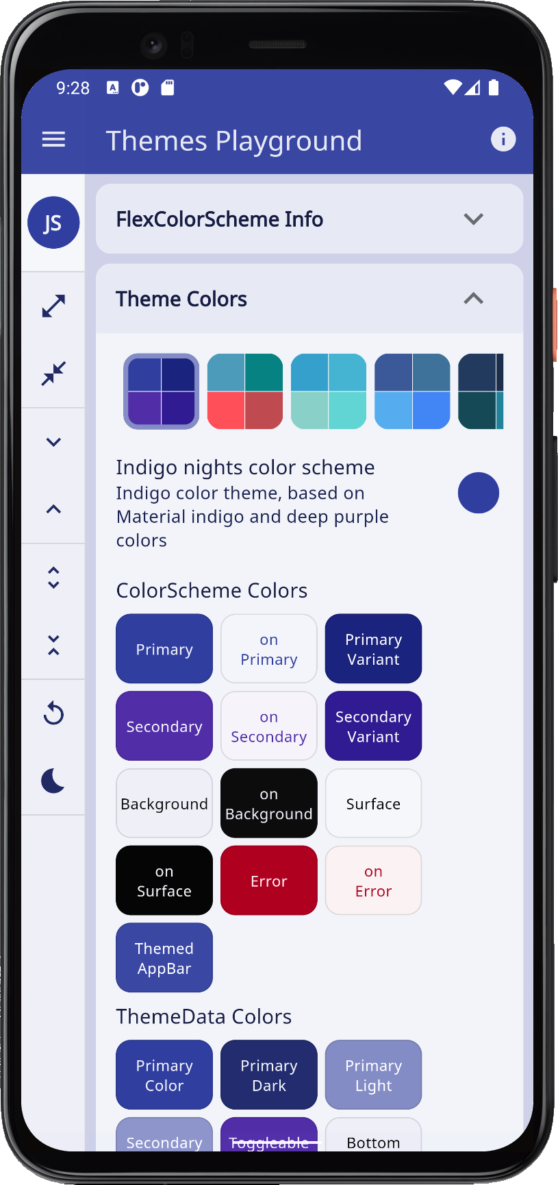 |
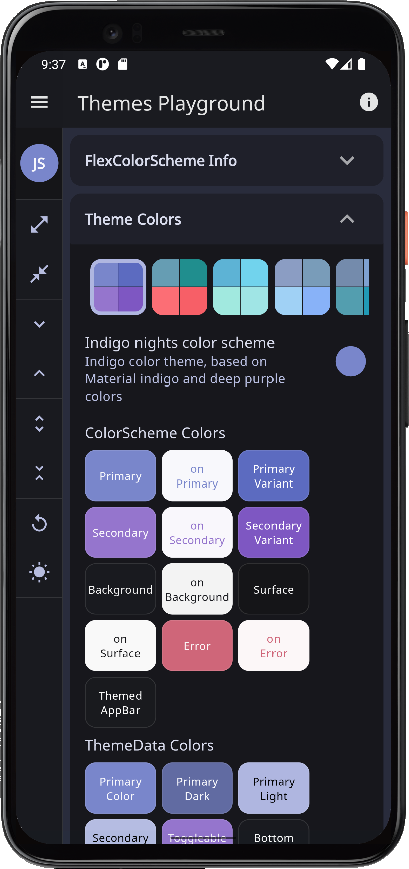 |
| hippieBlue | Hippie blue | Hippie blue with surfie green and chock coral pink theme. | 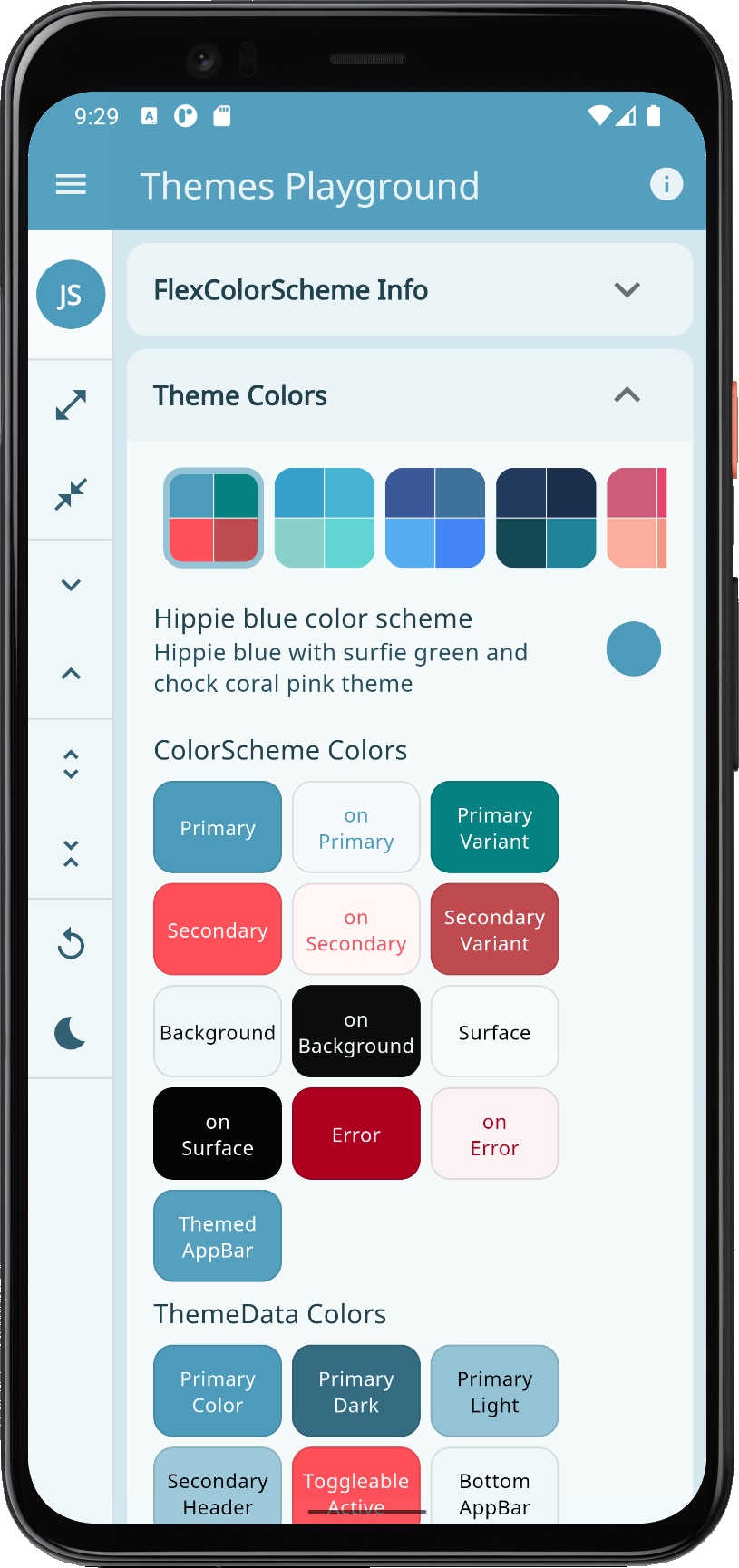 |
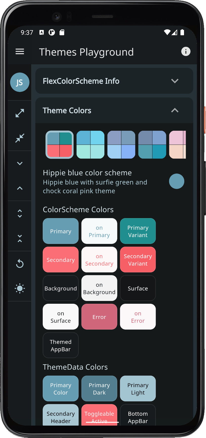 |
| aquaBlue | Aqua blue | Aqua tropical ocean blue theme. | 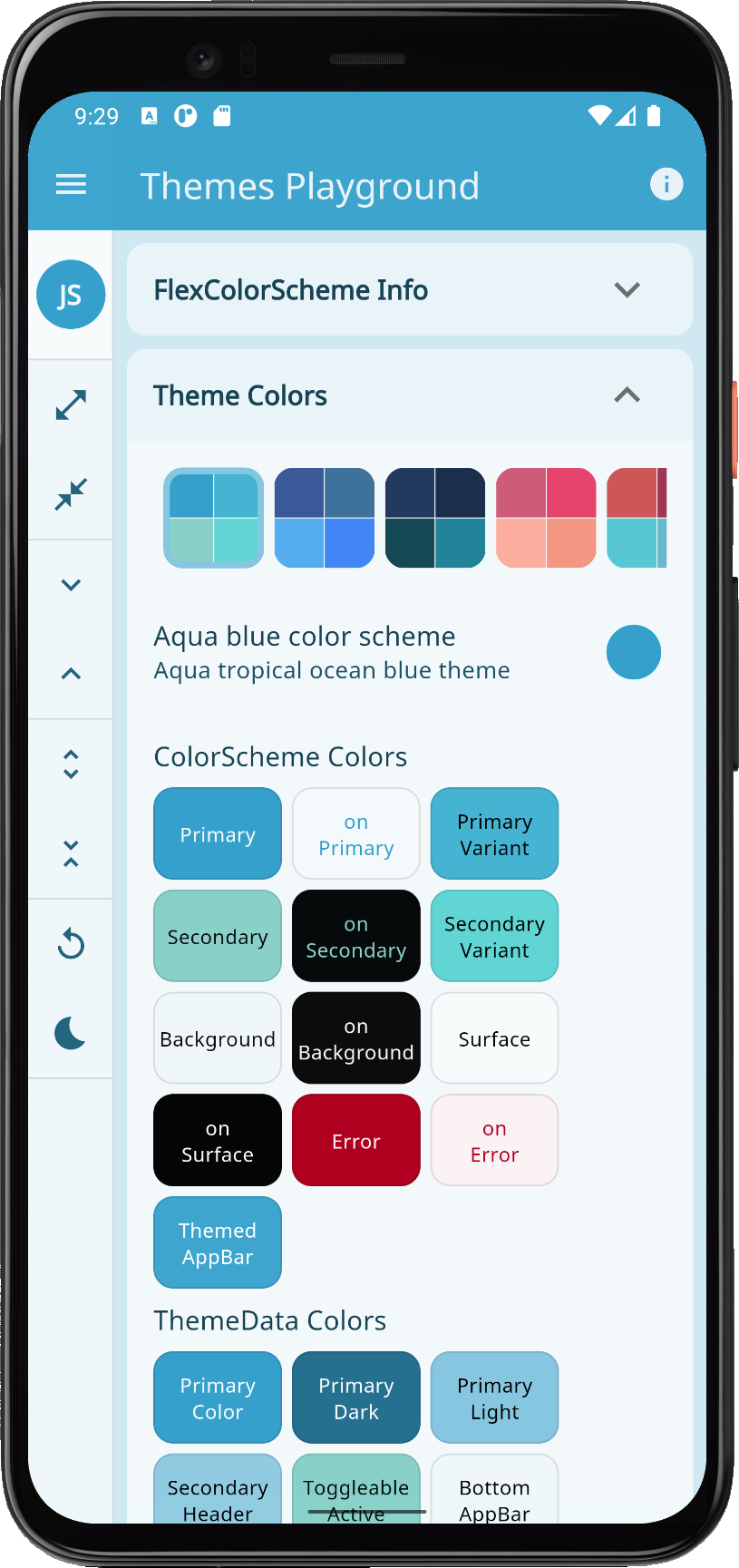 |
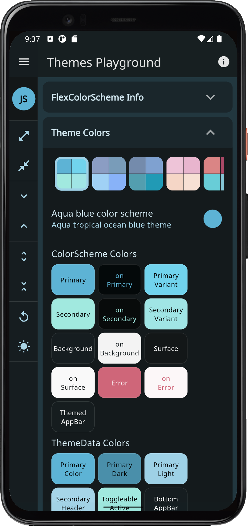 |
| brandBlue | Brand blues | A mixture of blue colors from well known web brands. | 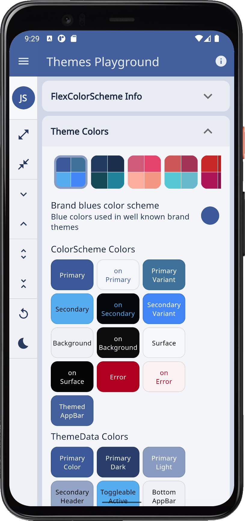 |
 |
| deepBlue | Deep blue sea | Dark deep blue sea color theme. | 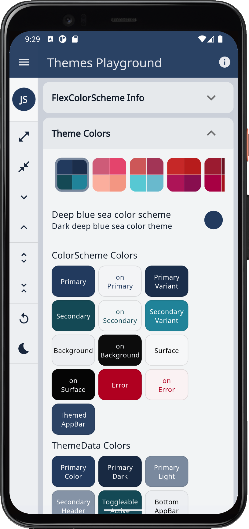 |
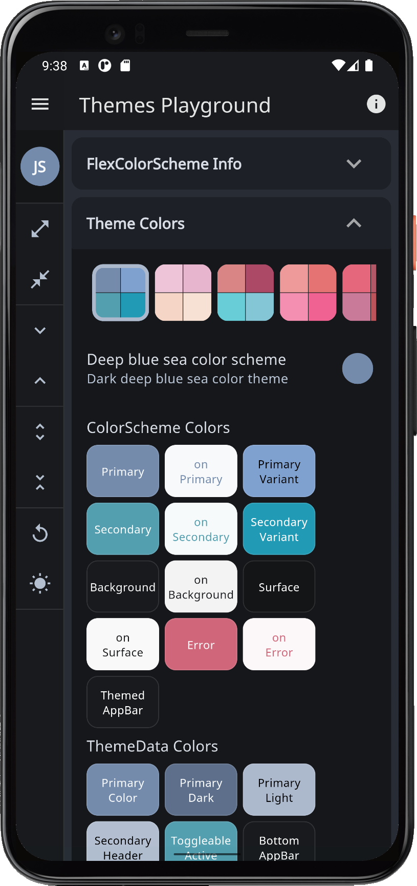 |
| sakura | Pink sakura | Pink color theme, based on sakura cherry blossom like colors. | 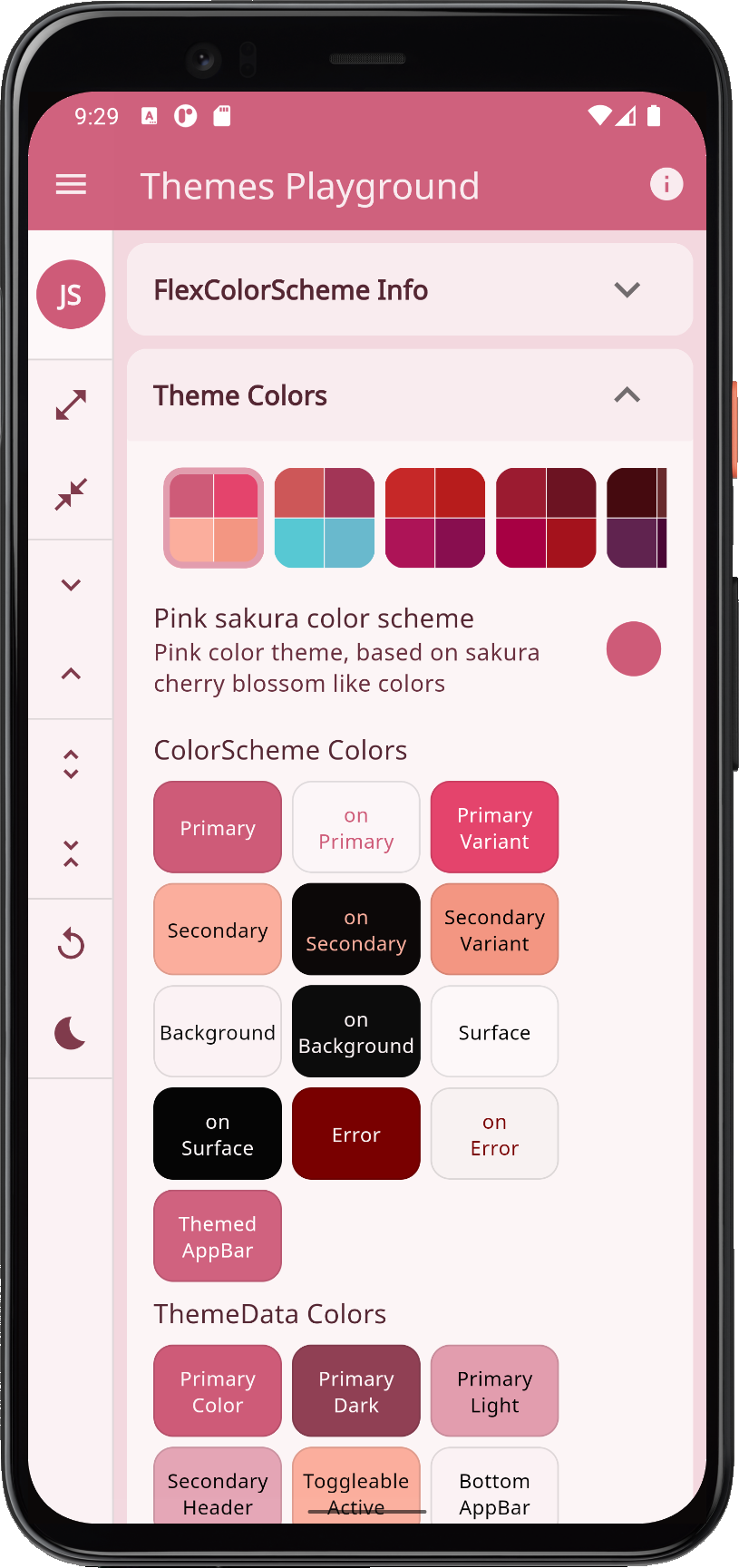 |
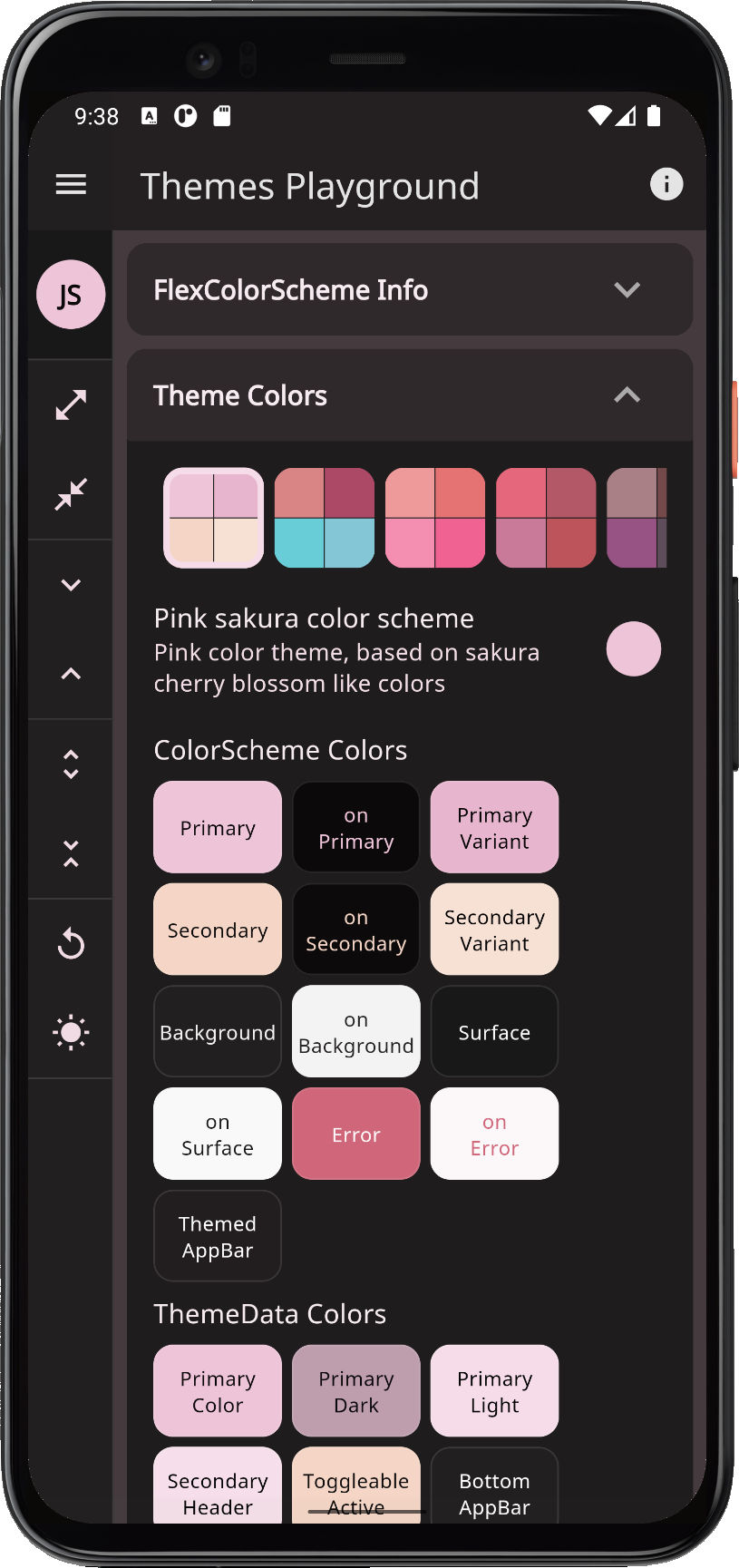 |
| mandyRed | Oh Mandy red | Mandy red and Viking blue colored theme. |  |
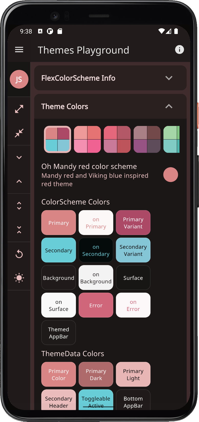 |
| red | Red tornado | Red color theme, based on Material red and pink colors. | 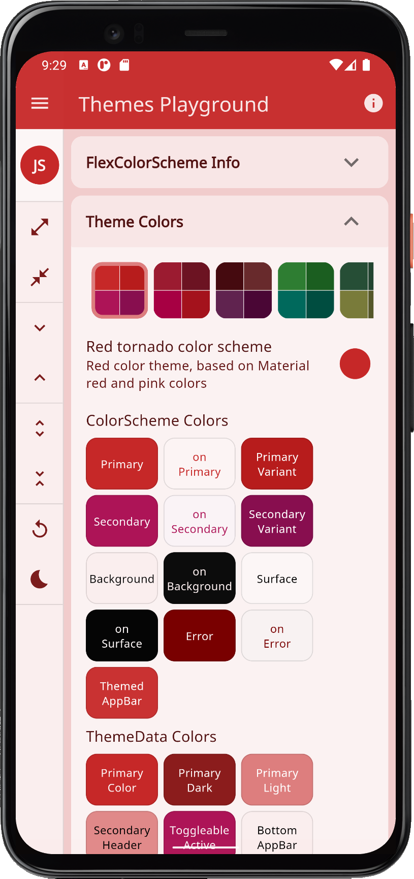 |
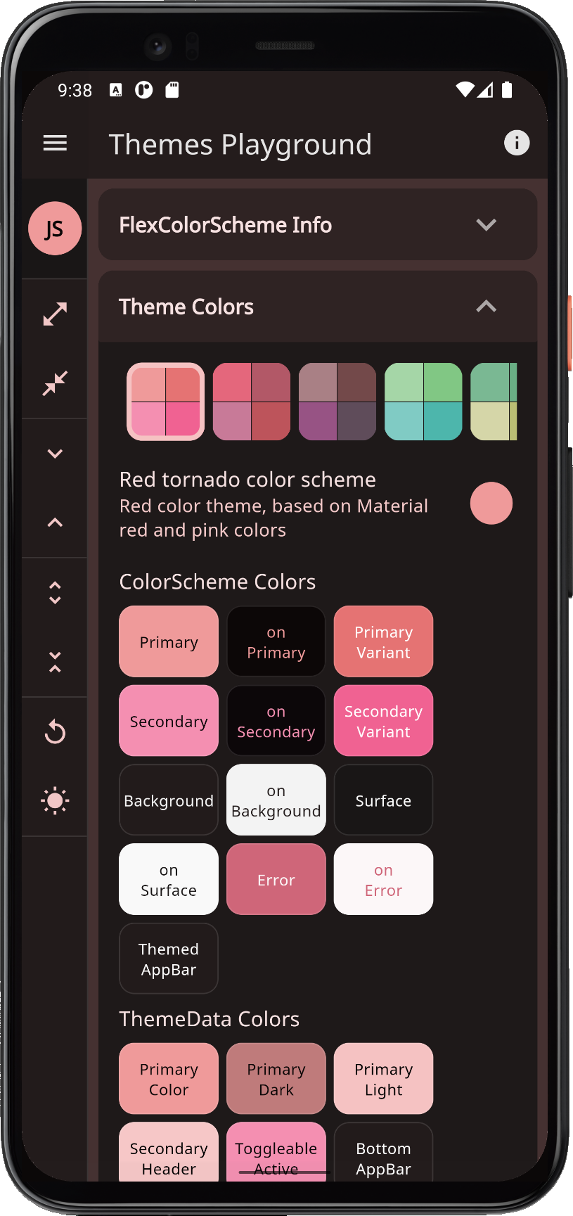 |
| redWine | Red red wine | Red color theme, based on red wine like colors. | 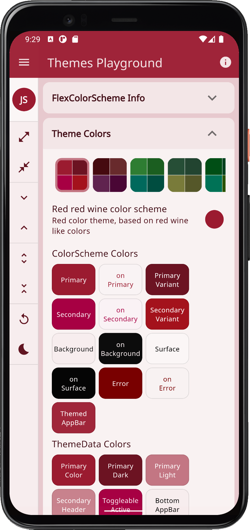 |
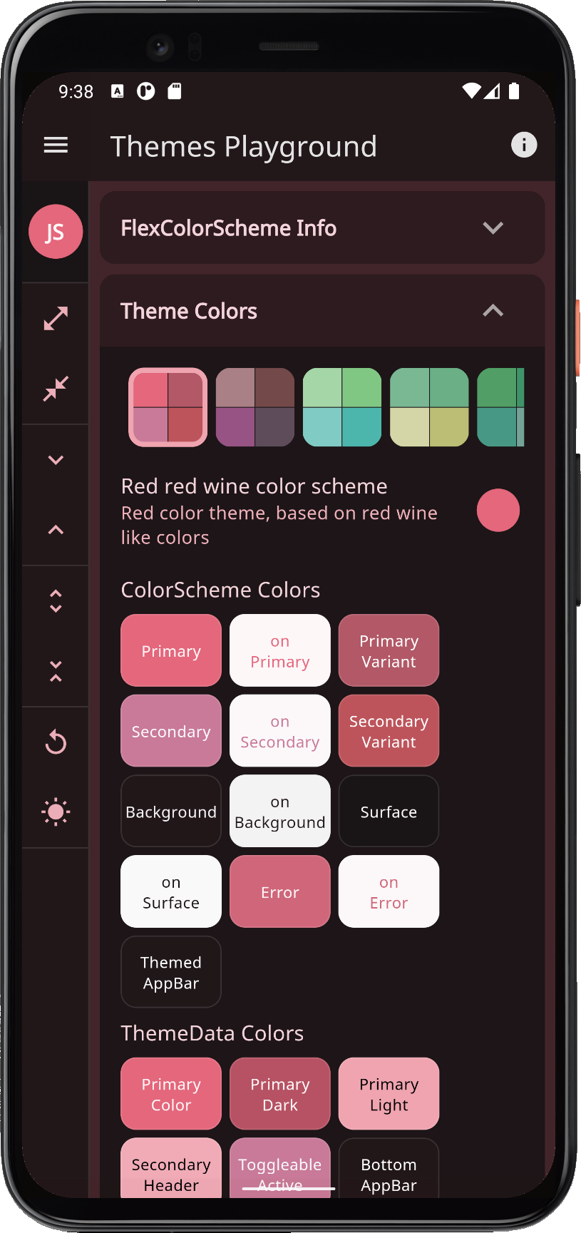 |
| purpleBrown | Purple brown | Purple brown tinted aubergine and eggplant colored theme. | 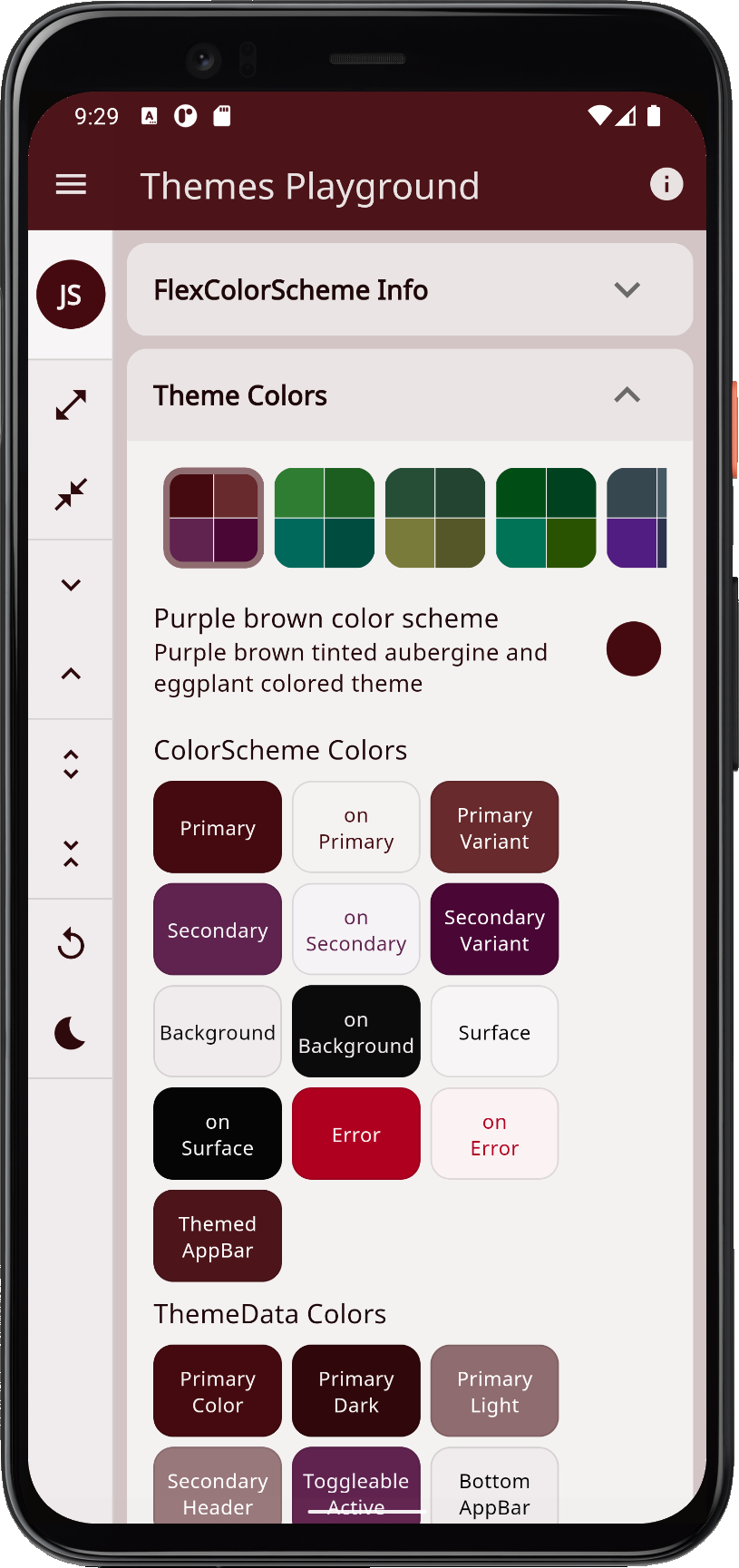 |
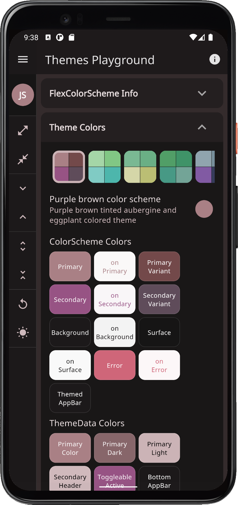 |
| green | Green forest | Green color theme, based on Material green and cyan colors. | 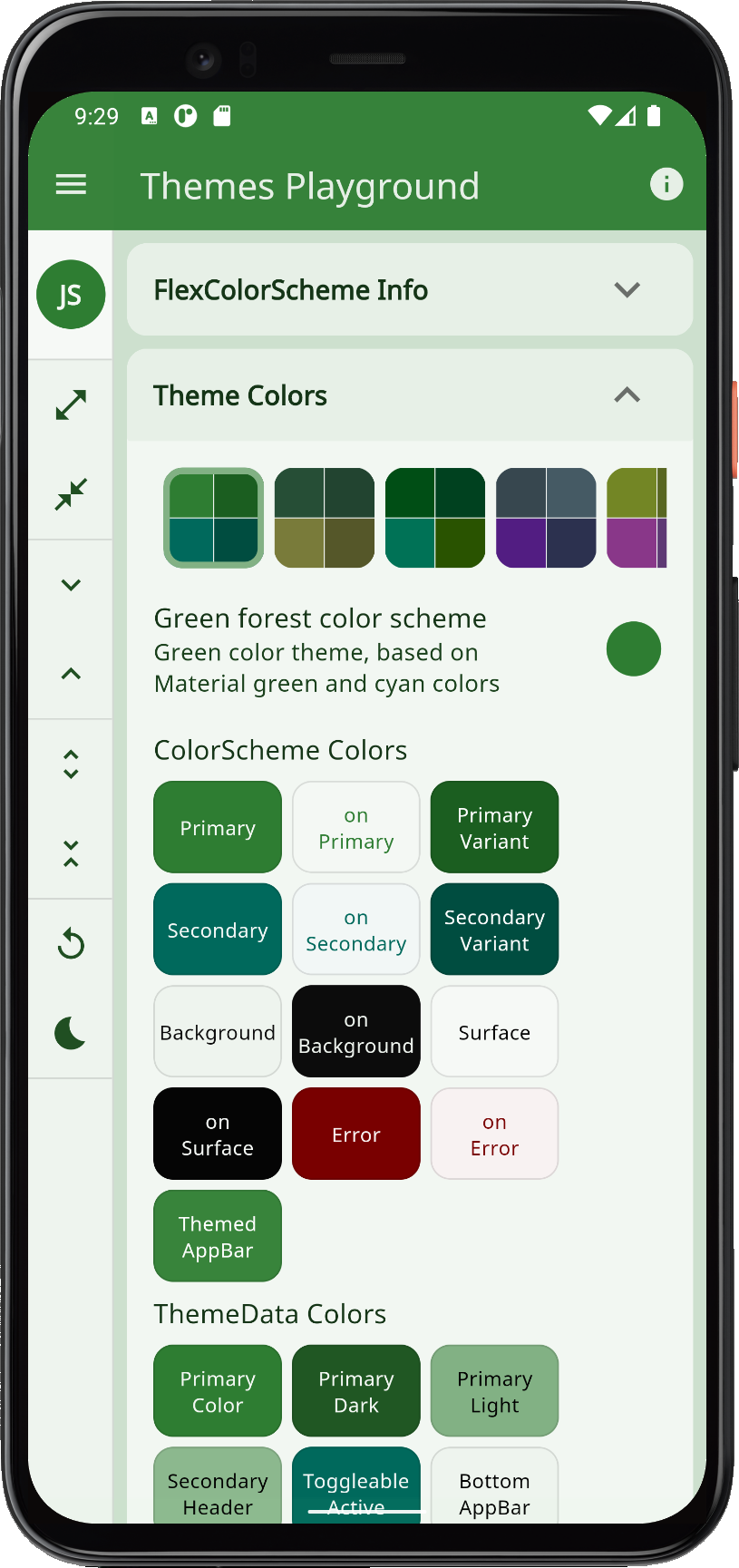 |
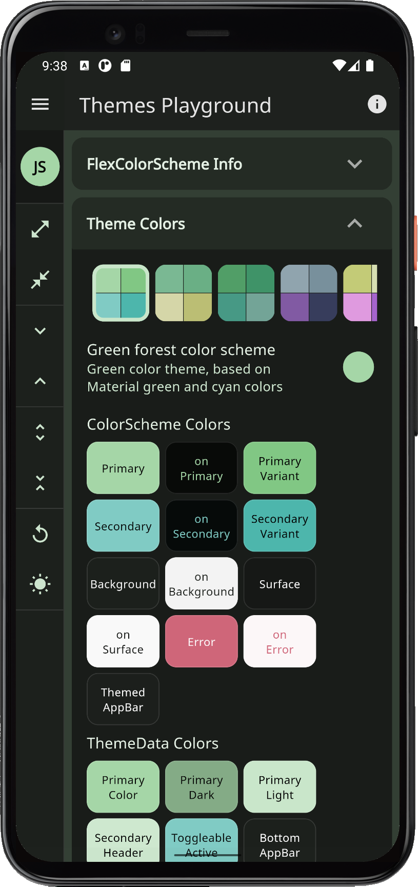 |
| money | Green money | Green money and finance style color theme. | 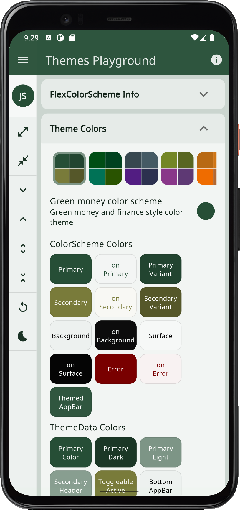 |
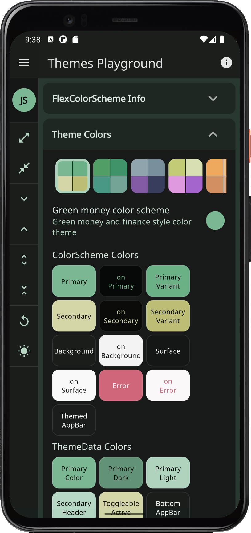 |
| jungle | Green jungle | Green jungle and rain forest color theme. | 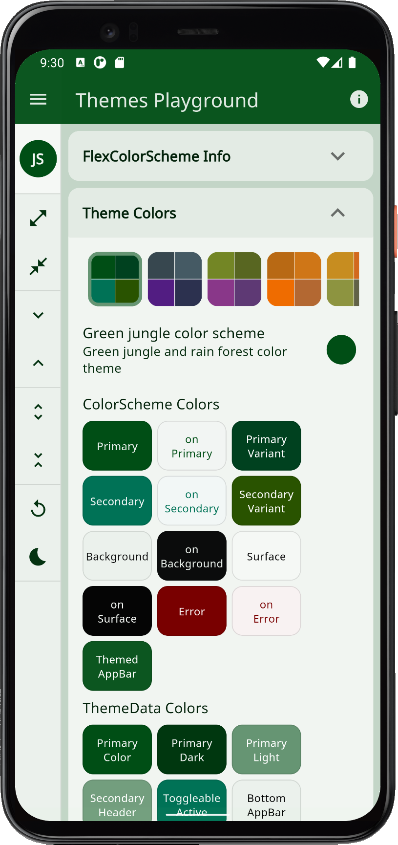 |
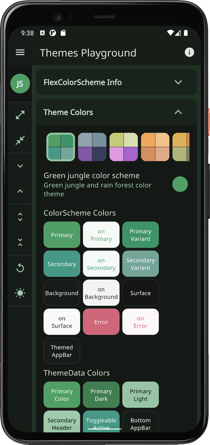 |
| greyLaw | Grey law | Material blue grey and ultra dark purple color theme. Colors suitable for law firms. | 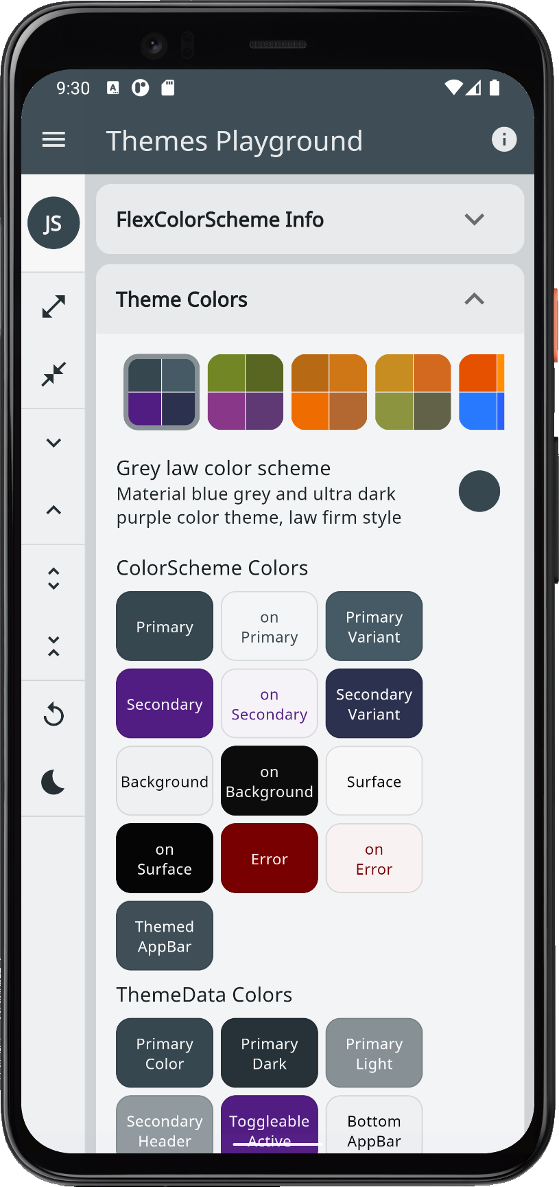 |
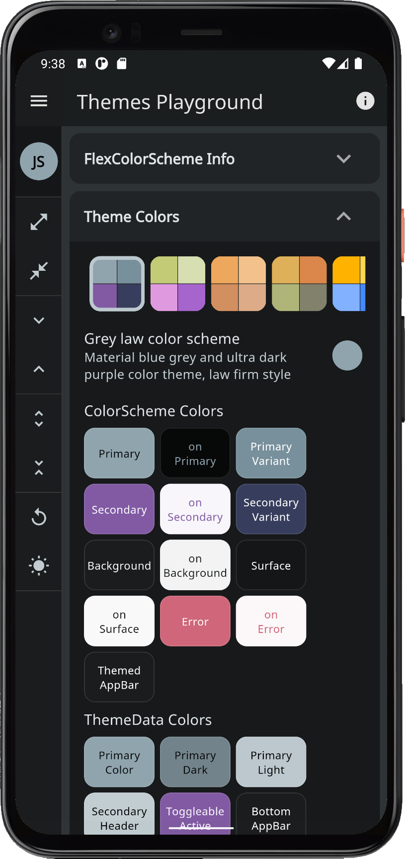 |
| wasabi | Willow and wasabi | Wild Willow and wasabi green with orchid purple inspired colors. | 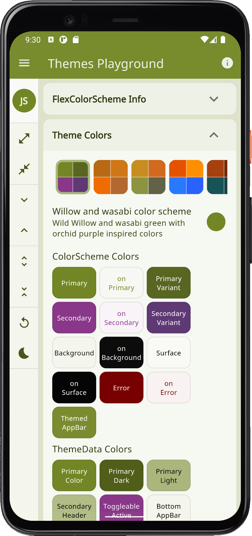 |
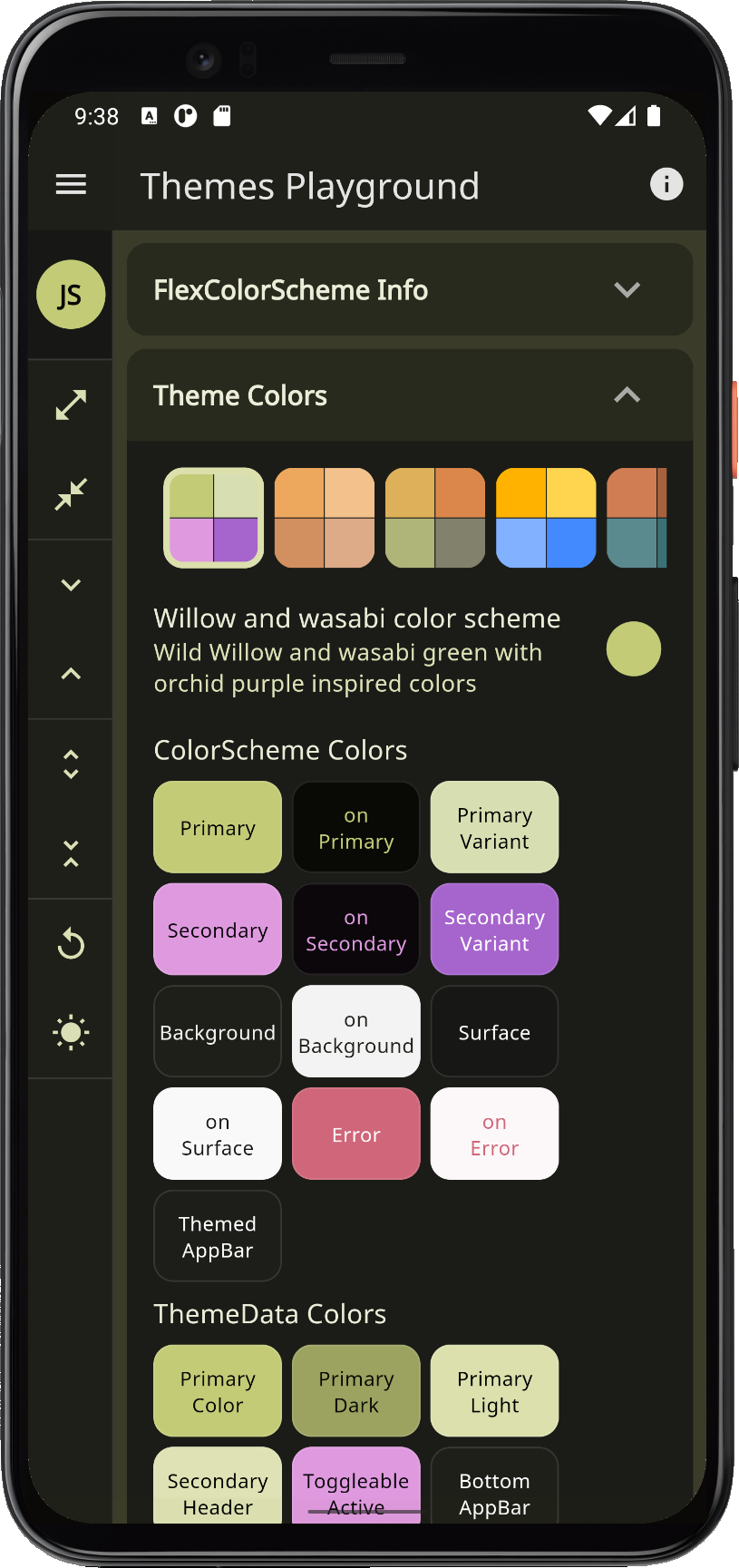 |
| gold | Gold sunset | Gold sunset color theme, based on orange like colors. | 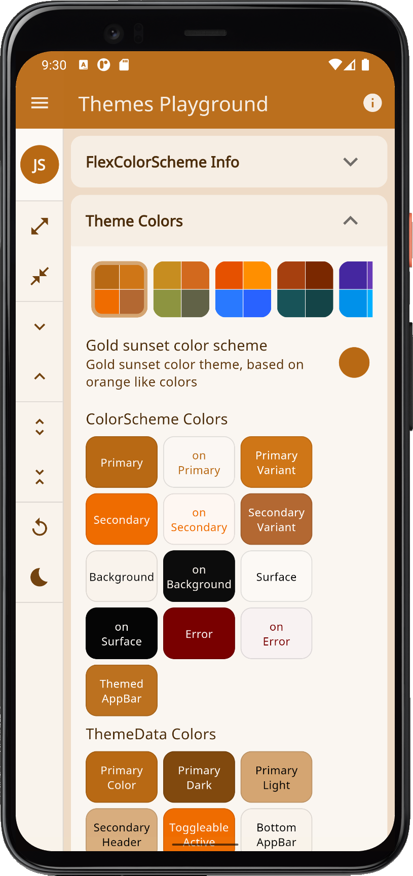 |
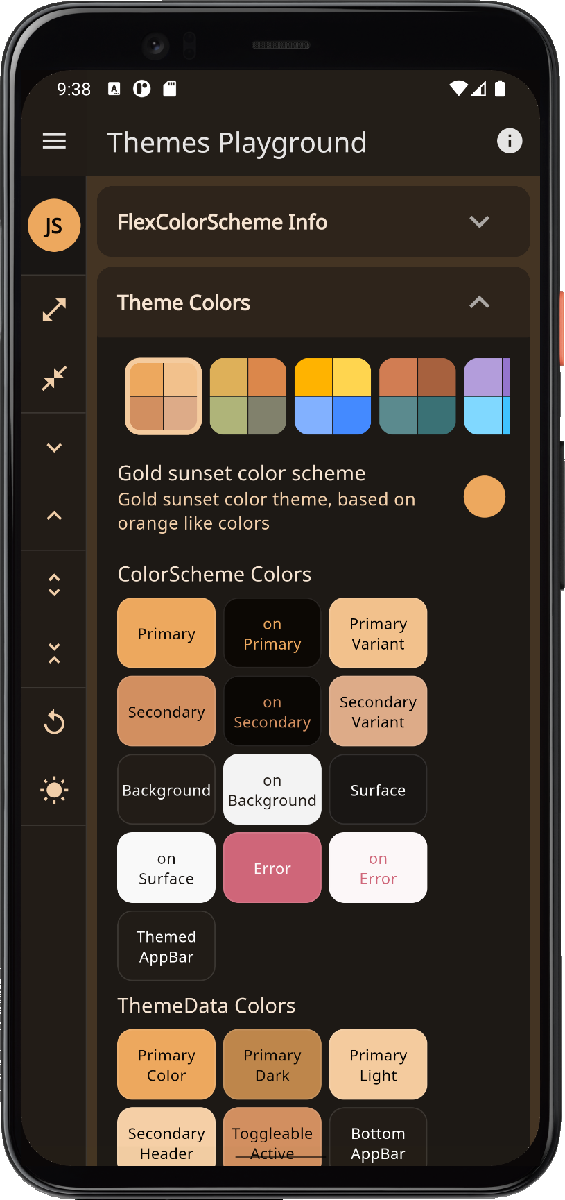 |
| mango | Mango mojito | Orange and green Mango mojito color theme. | 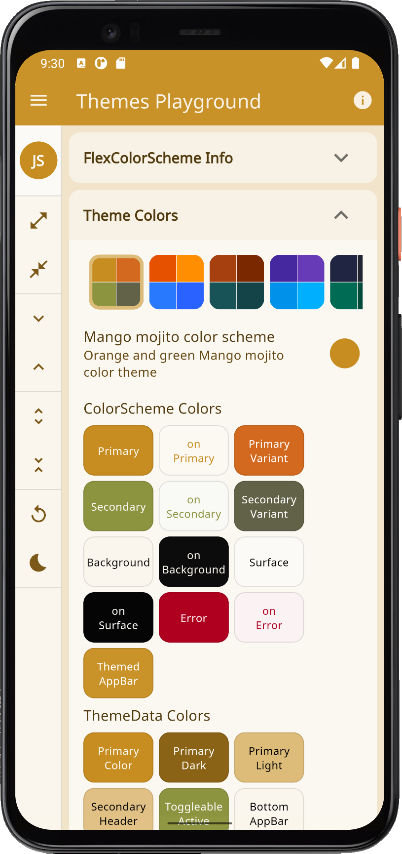 |
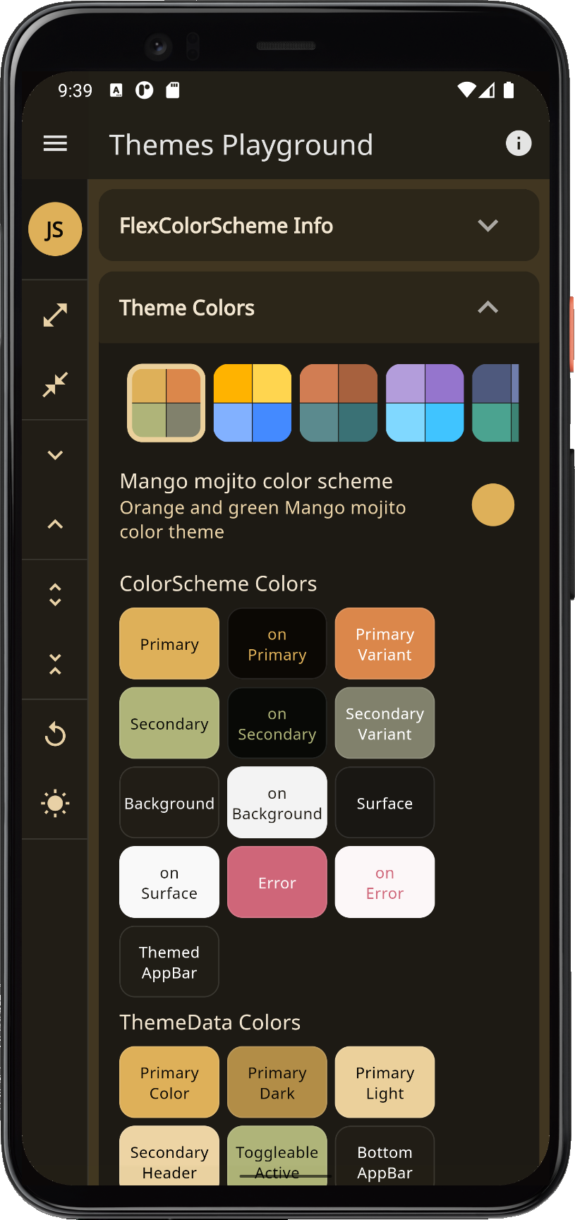 |
| amber | Amber blue | Amber blaze and blue color theme, based on Material amber and blue accent colors, a high-contrast theme. An alternative to the default Material high contrast theme. | 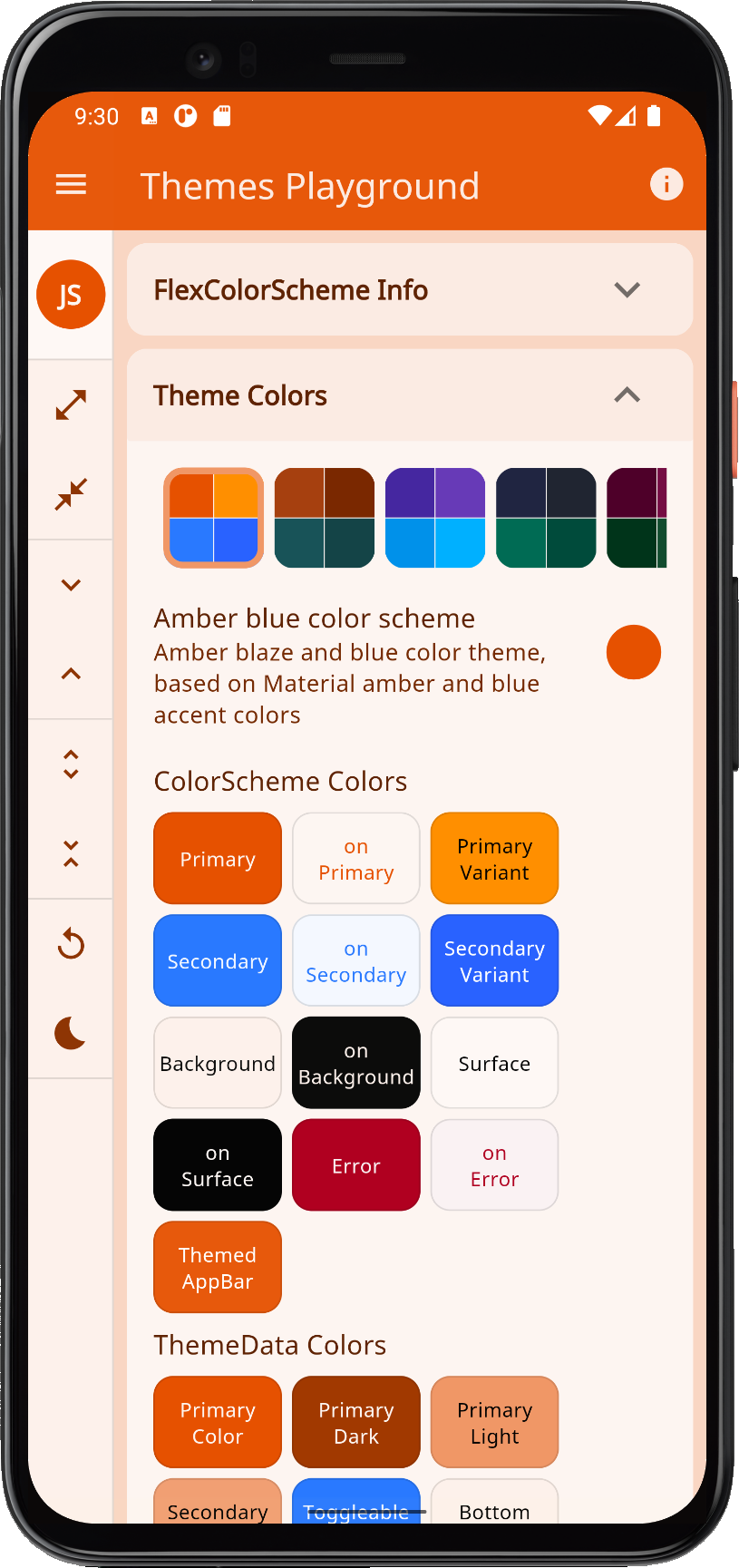 |
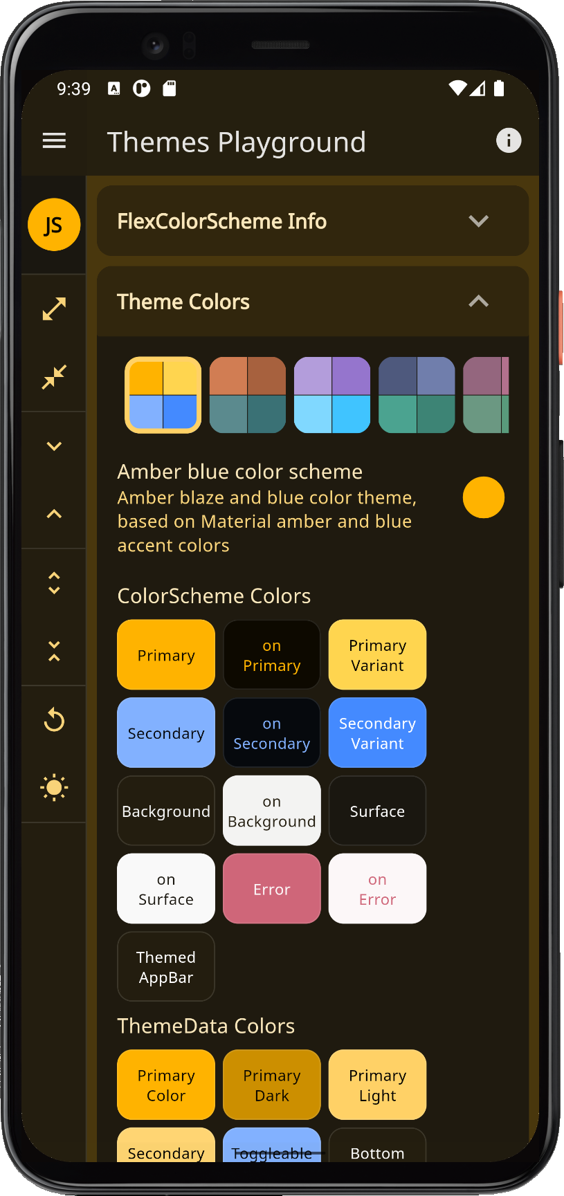 |
| vesuviusBurn | Vesuvius burned | Vesuvius burned orange and eden green theme. | 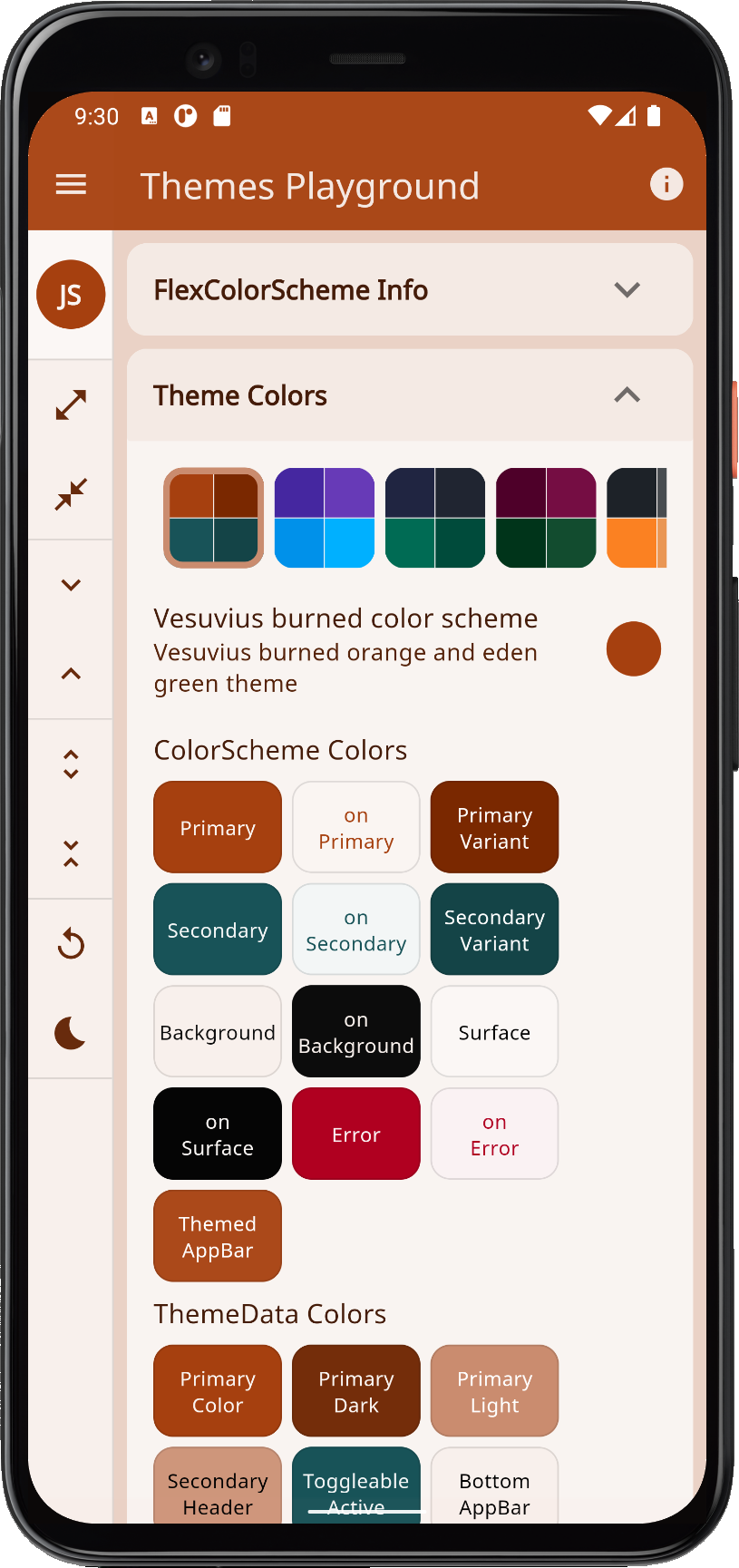 |
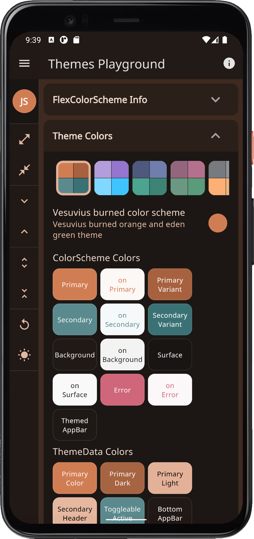 |
| deepPurple | Deep purple | Deep purple daisy bush theme, based on Material deepPurple and lightBlueAccent colors. | 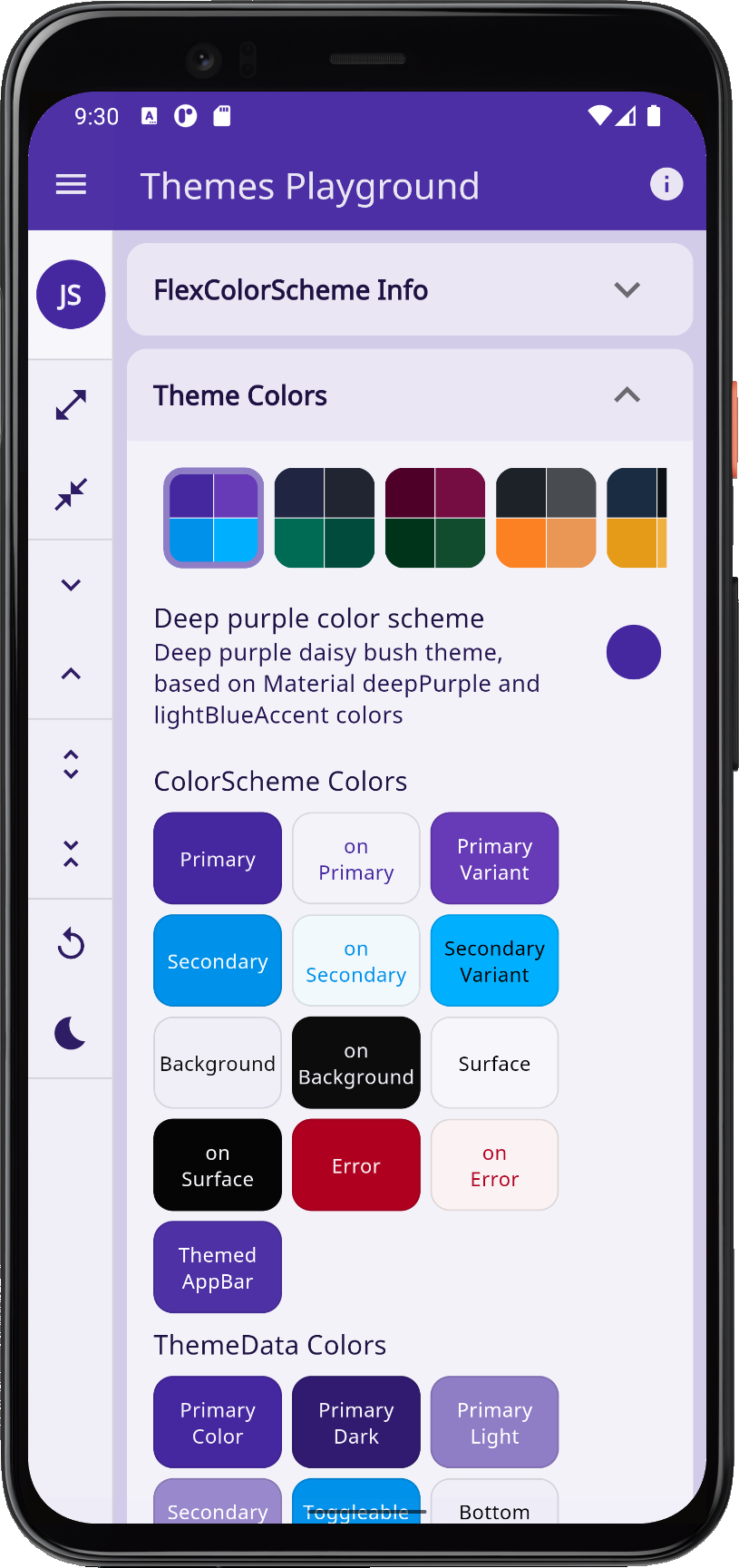 |
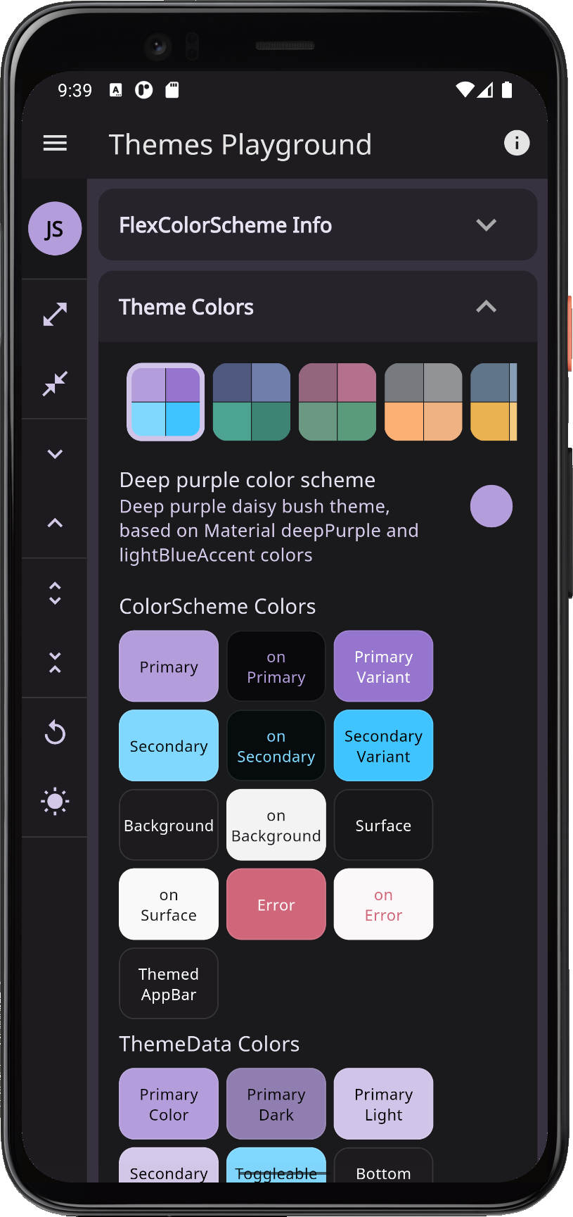 |
| ebonyClay | Ebony clay | Ebony clay dark blue-grey and watercourse green colored theme. | 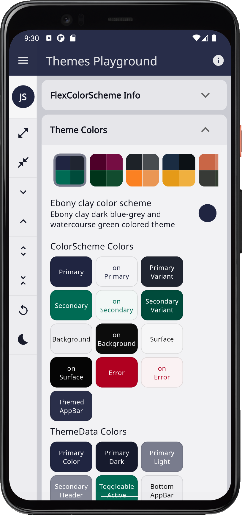 |
 |
| barossa | Barossa | Barossa red and cardin green colored theme. A somber color set suited for courts and law firms. | 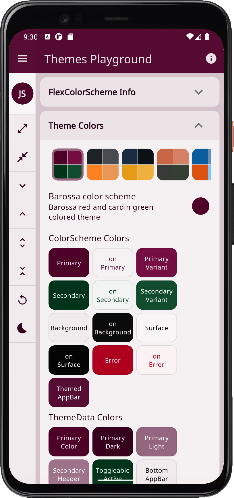 |
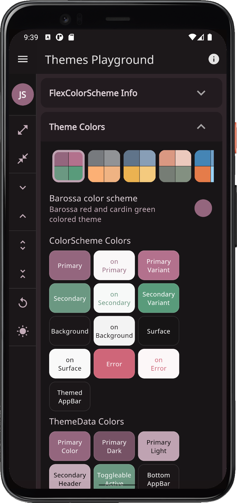 |
| shark | Shark and orange | Shark grey and orange ecstasy colored theme. | 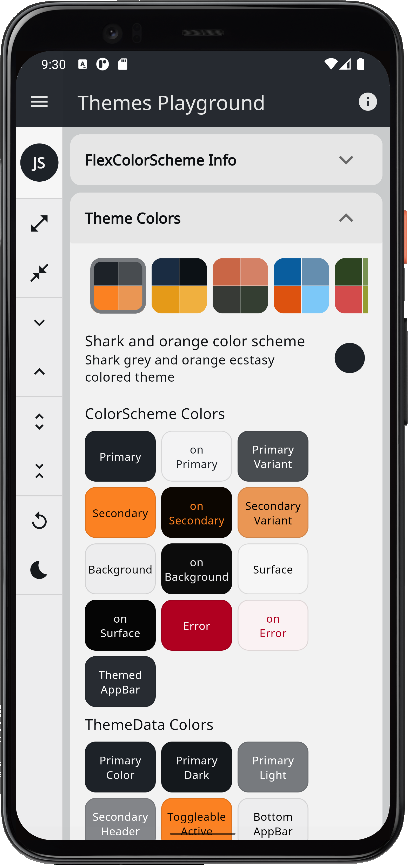 |
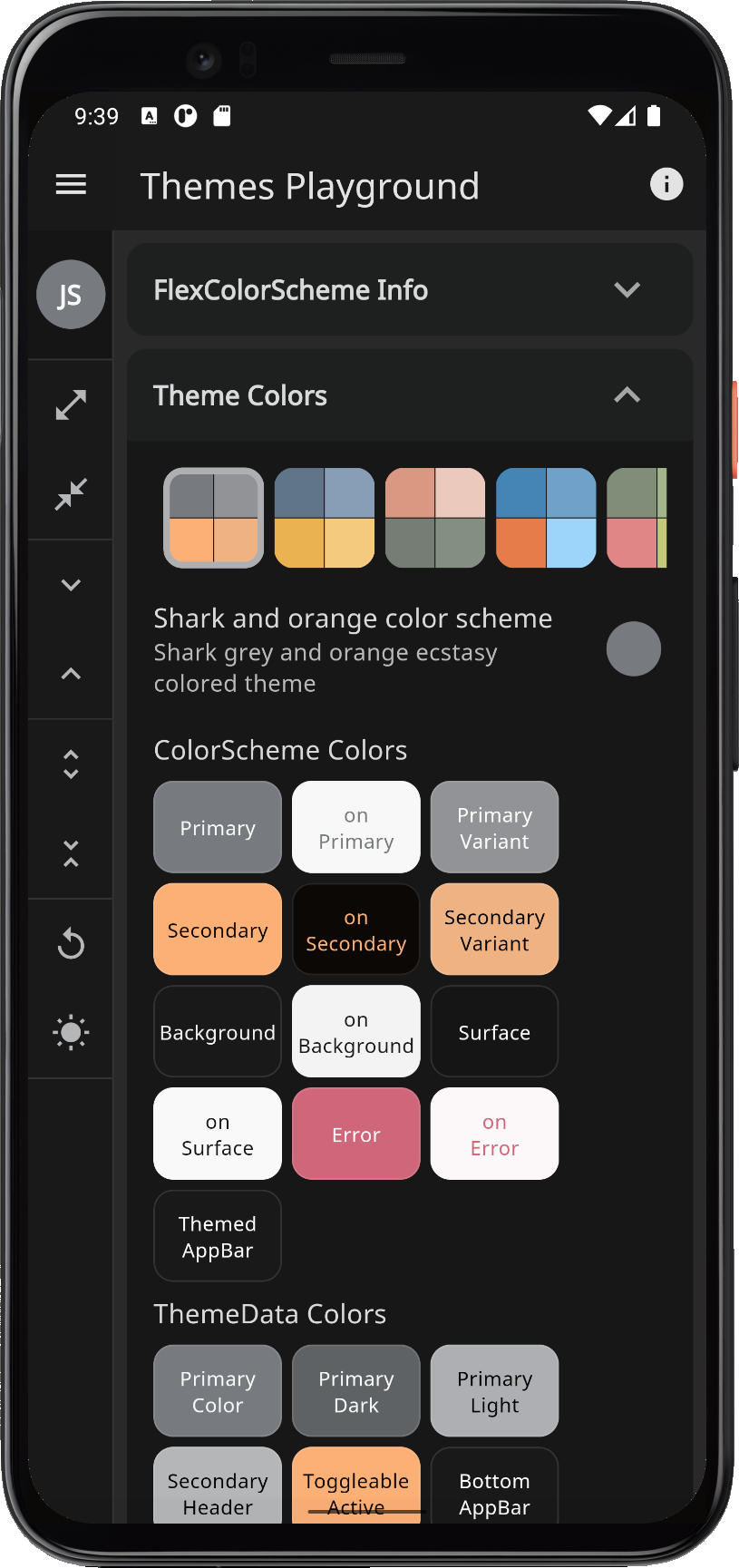 |
| bigStone | Big stone tulip | Big stone blue and tulip tree yellow colored theme. | 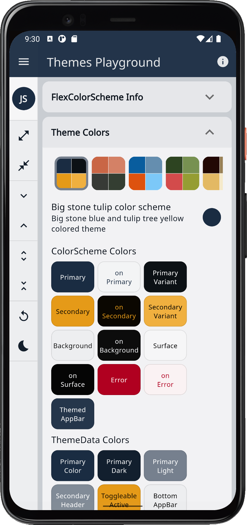 |
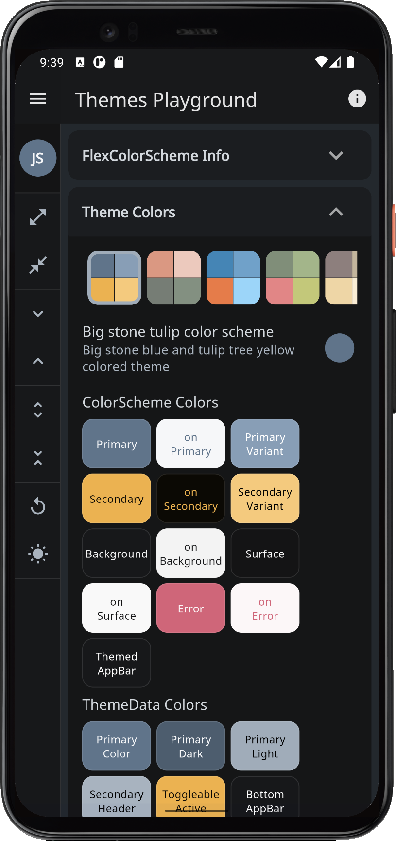 |
| damask | Damask and lunar | Damask red and lunar green colored theme. | 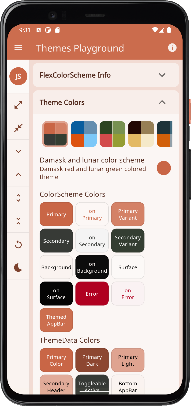 |
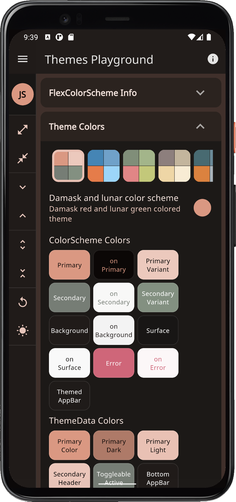 |
| bahamaBlue | Bahama and trinidad | Bahama blue and trinidad orange colored theme. | 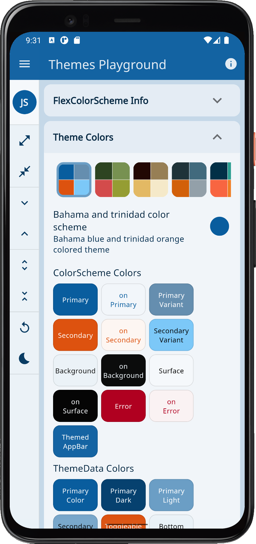 |
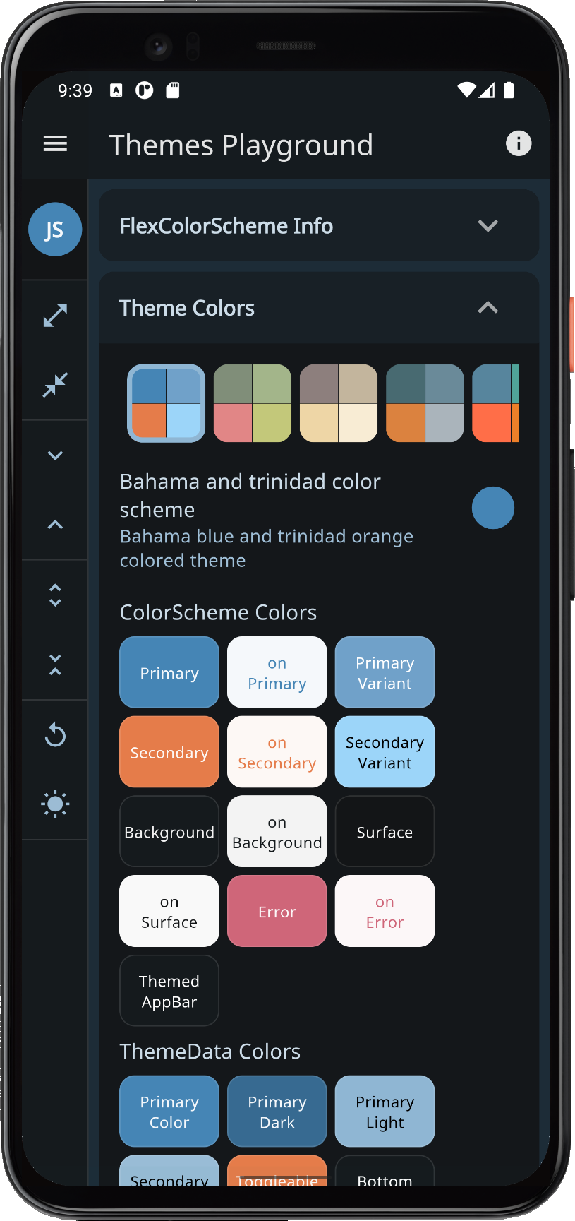 |
| mallardGreen | Mallard and valencia | Mallard green and Valencia pink colored theme. | 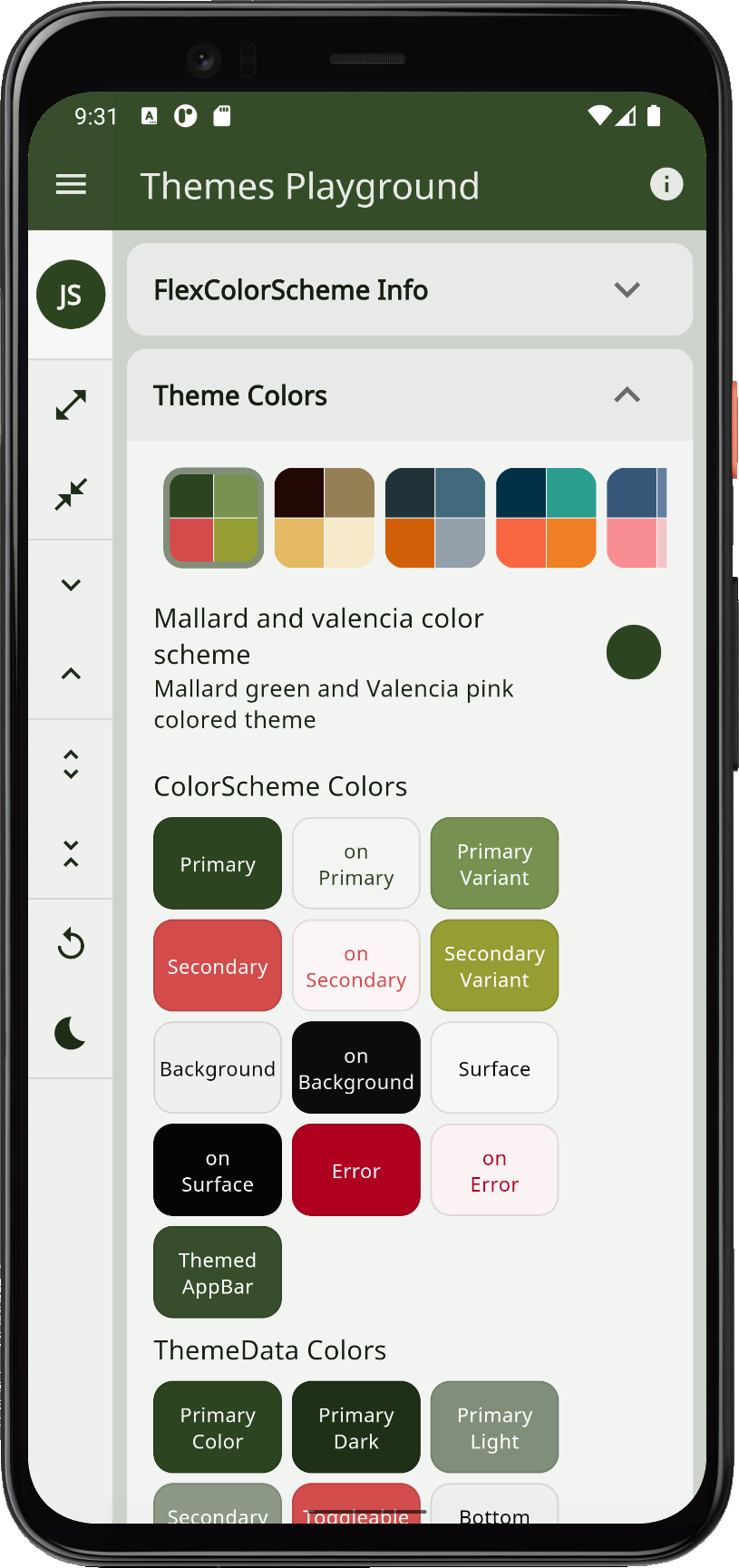 |
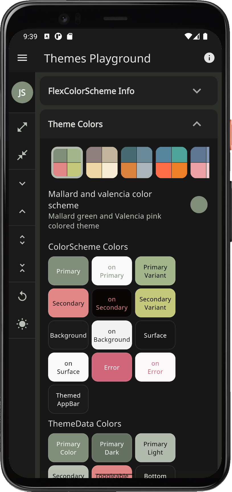 |
| espresso | Espresso and crema | Espresso dark brown and crema colored theme. |  |
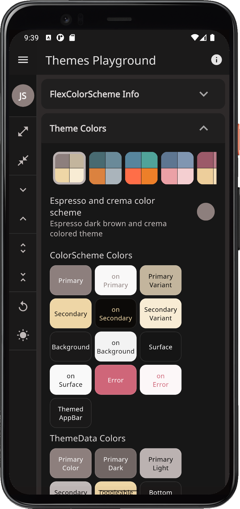 |
| outerSpace | Outer space stage | Outer space dark blue-grey and stage red theme. | 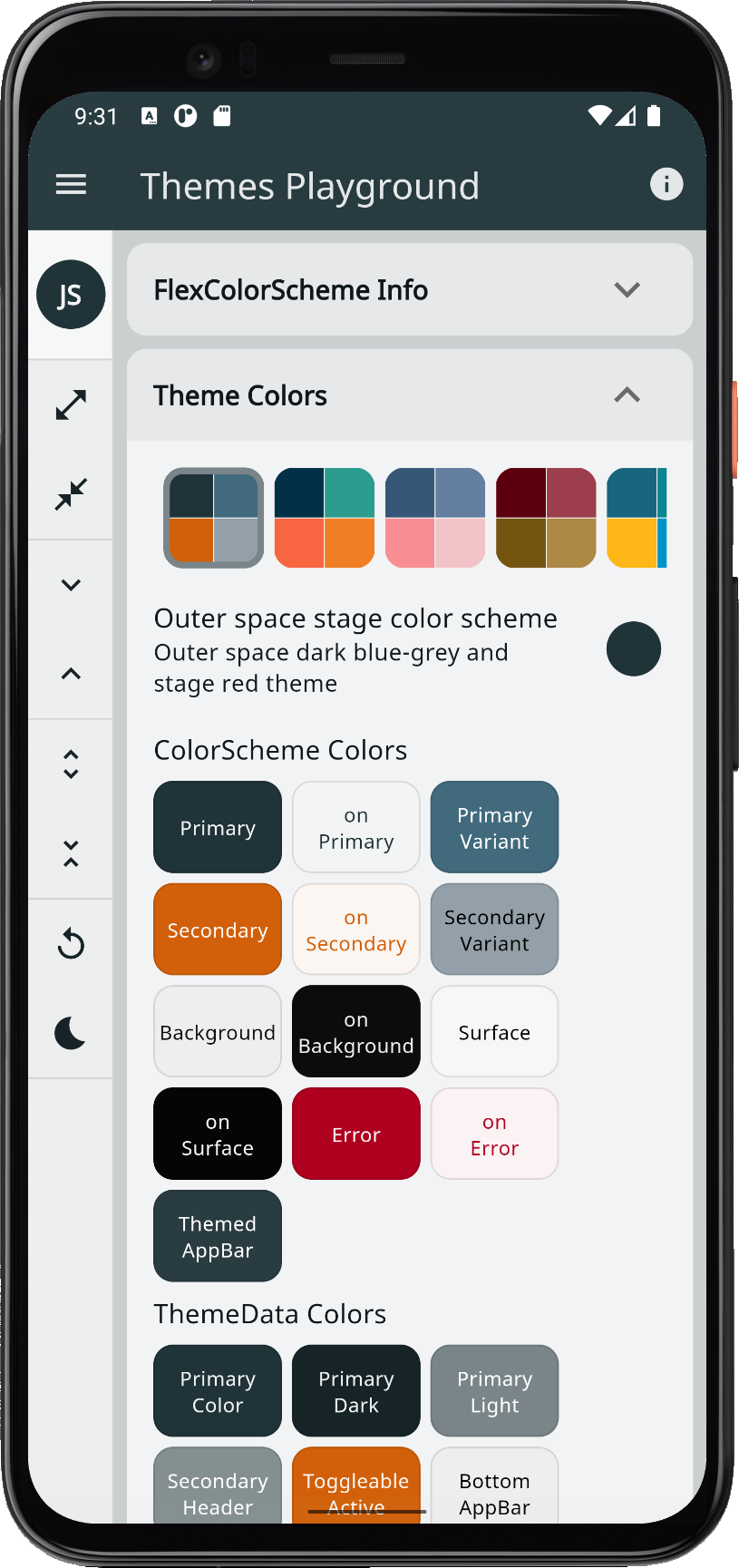 |
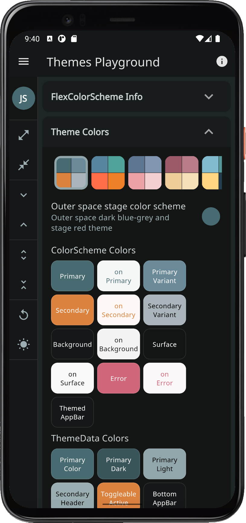 |
Metadata
Publisher
Weekly Downloads
Metadata
A Flutter package to make and use beautiful color scheme based MaterialApp themes.
Repository (GitHub)
View/report issues
License
 unknown (license)