flutter_pannable_rating_bar 2.1.0+2  flutter_pannable_rating_bar: ^2.1.0+2 copied to clipboard
 silentcat.dev
Yet another rating bar for Flutter. But this time supported any value, not just full or half, fully customizable as well. Tap and drag gestures are all supported.

Features #
- Support any fraction value
- Customizable rating widget, the degree of customizable is really high, each widget don't have to be the same size, don't even have to use the same indication color.
- Hit test correctly, render object of each child widget is used for
hitTest, so thehitTestresult is as correct as it can be. - Make use of Flutters
Wrapwidget, that mean you can achieve any layout thatWrapsupported, propertiestextDirectionandverticalDirectionofWrapwill also be taken into consideration when painting the indicator.
Getting started #
First import the widget
import 'package:flutter_pannable_rating_bar/flutter_pannable_rating_bar.dart';
Usage #
The widget itself is completely Stateless, that mean you can manipulate any value that the callback
provided and use it as the value for PannableRatingBar.
Just rebuild with the value provided in onChanged call back, and it will be correctly distributed for each rate widget respectively.

double rating = 0.0;

PannableRatingBar(
  rate: rating,
  items: List.generate(5, (index) =>
    const RatingWidget(
      selectedColor: Colors.yellow,
      unSelectedColor: Colors.grey,
      child: Icon(
        Icons.star,
        size: 48,
      ),
    )),
  onChanged: (value) {
    setState(() {
      rating = value;
    });
  },
)
Use your own widget as the rating widget. They don't have to be the same size, color, or anything, fully customizable.

double rating = 0.0;

PannableRatingBar(
  rate: rating,
  onChanged: (value) {
    setState(() {
      rating = value;
    });
  },
  items: const [
    RatingWidget(
      selectedColor: Colors.yellow,
      unSelectedColor: Colors.grey,
      child: Icon(
        Icons.star,
        size: 48,
      ),
    ),
    RatingWidget(
      selectedColor: Colors.blue,
      unSelectedColor: Colors.red,
      child: Icon(
        Icons.ac_unit,
        size: 48,
      ),
    ),
    RatingWidget(
      selectedColor: Colors.purple,
      unSelectedColor: Colors.amber,
      child: Icon(
        Icons.access_time_filled,
        size: 48,
      ),
    ),
    RatingWidget(
      selectedColor: Colors.cyanAccent,
      unSelectedColor: Colors.grey,
      child: Icon(
        Icons.abc,
        size: 48,
      ),
    ),
    RatingWidget(
      selectedColor: Colors.tealAccent,
      unSelectedColor: Colors.purple,
      child: Icon(
        Icons.accessibility_new_sharp,
        size: 48,
      ),
    ),
  ],
)
The layout algorithm is of the Flutter built-in Wrap widget, so any layout that can be achieved
with wrap can also be achieved with this widget. Properties like textDirection and
verticalDirection will also be taken into consideration when painting indicators.

double rating = 0.0;

PannableRatingBar.builder(
  rate: rating,
  alignment: WrapAlignment.center,
  spacing: 20,
  runSpacing: 10,
  itemCount: 20,
  direction: Axis.vertical,
  itemBuilder: (context, index) {
    return const RatingWidget(
      selectedColor: Colors.yellow,
      unSelectedColor: Colors.grey,
      child: Icon(
        Icons.star,
        size: 48,
      ),
    );
  },
  onChanged: (value) {
    setState(() {
      rating = value;
    });
  },
)
Switch the properties for something else depend on the rating value.
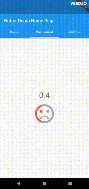
double rating = 0;

PannableRatingBar(
    rate: rating,
    spacing: 20,
    onChanged: (value){
      setState((){
        rating = value;
      });
    },
    items: [
      RatingWidget(
        selectedColor: rating <= 0.5 ? Colors.red : Colors.green,
        unSelectedColor: Colors.grey,
        child: AnimatedSwitcher(
          duration: const Duration(milliseconds: 300),
          child: rating <= 0.5
              ? const Icon(
                  Icons.sentiment_very_dissatisfied,
                  key: ValueKey("sad"),
                  size: 100,
                )
              : const Icon(
                  Icons.sentiment_satisfied,
                  key: ValueKey("happy"),
                  size: 100,
                ),
        ),
      ),
    ],
),
Additional information #
Have any idea to improve it? Just raise an issue in the repo!
Metadata
Publisher
Weekly Downloads
Metadata
Yet another rating bar for Flutter. But this time supported any value, not just full or half, fully customizable as well. Tap and drag gestures are all supported.
Repository (GitHub)
View/report issues
License
 unknown (license)