flutter_pannable_rating_bar 2.3.0+2  flutter_pannable_rating_bar: ^2.3.0+2 copied to clipboard
 silentcat.dev
Introducing a versatile and customizable rating bar for Flutter. This bar stands out from others with its ability to select any value, not just full or half ratings, and smooth support for both tap an [...]

PannableRatingBar #
Introducing a new and improved rating bar for Flutter, offering versatility and full customization. Unlike other rating bars, this one allows for any value to be selected, not just full or half ratings when interacted. Both tap and drag gestures are seamlessly supported, providing a smooth user experience.
Features #
- Offers fractional values for rating
- High degree of customization for the rating widgets, which can be of different sizes, shapes, and colors.
- Precise hit testing, as the child widget's render object is utilized to determine the results.
- Allows for filtering gestures with either tapOnly or dragAndTap options.
- Built on Flutter's Wrap widget, offering a variety of supported layouts, including consideration of Wrap properties such as textDirection and verticalDirection when painting the indicators.
Getting started #
First import the widget
import 'package:flutter_pannable_rating_bar/flutter_pannable_rating_bar.dart';
Usage #
This widget is stateless and highly flexible, allowing you to easily manipulate values and
customize the display of the PannableRatingBar. Simply rebuild the widget with the value provided
in the onChanged callback and the widget will automatically adjust the rating distribution across
each rating widget.

double rating = 0.0;

PannableRatingBar(
  rate: rating,
  items: List.generate(5, (index) =>
    const RatingWidget(
      selectedColor: Colors.yellow,
      unSelectedColor: Colors.grey,
      child: Icon(
        Icons.star,
        size: 48,
      ),
    )),
  onChanged: (value) {
    setState(() {
      rating = value;
    });
  },
)
Utilize your own custom widgets as the rating indicators. With complete customization freedom, they don't have to be uniform in size, color, or any other aspect.

double rating = 0.0;

PannableRatingBar(
  rate: rating,
  onChanged: (value) {
    setState(() {
      rating = value;
    });
  },
  items: const [
    RatingWidget(
      selectedColor: Colors.yellow,
      unSelectedColor: Colors.grey,
      child: Icon(
        Icons.star,
        size: 48,
      ),
    ),
    RatingWidget(
      selectedColor: Colors.blue,
      unSelectedColor: Colors.red,
      child: Icon(
        Icons.ac_unit,
        size: 48,
      ),
    ),
    RatingWidget(
      selectedColor: Colors.purple,
      unSelectedColor: Colors.amber,
      child: Icon(
        Icons.access_time_filled,
        size: 48,
      ),
    ),
    RatingWidget(
      selectedColor: Colors.cyanAccent,
      unSelectedColor: Colors.grey,
      child: Icon(
        Icons.abc,
        size: 48,
      ),
    ),
    RatingWidget(
      selectedColor: Colors.tealAccent,
      unSelectedColor: Colors.purple,
      child: Icon(
        Icons.accessibility_new_sharp,
        size: 48,
      ),
    ),
  ],
)
This widget utilizes the layout capabilities of Flutter's built-in Wrap widget, allowing for a wide
range of possible layouts to be achieved. The properties of the Wrap widget, such as textDirection
and verticalDirection, are also considered when painting the indicators, giving you even greater
control over the final look and feel of the rating bar.

double rating = 0.0;

PannableRatingBar.builder(
  rate: rating,
  alignment: WrapAlignment.center,
  spacing: 20,
  runSpacing: 10,
  itemCount: 20,
  direction: Axis.vertical,
  itemBuilder: (context, index) {
    return const RatingWidget(
      selectedColor: Colors.yellow,
      unSelectedColor: Colors.grey,
      child: Icon(
        Icons.star,
        size: 48,
      ),
    );
  },
  onChanged: (value) {
    setState(() {
      rating = value;
    });
  },
)
Customize the appearance of the rating indicators based on their values.
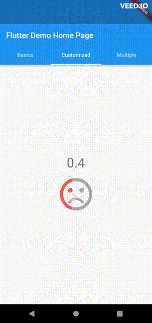
double rating = 0;

PannableRatingBar(
    rate: rating,
    spacing: 20,
    onChanged: (value){
      setState((){
        rating = value;
      });
    },
    items: [
      RatingWidget(
        selectedColor: rating <= 0.5 ? Colors.red : Colors.green,
        unSelectedColor: Colors.grey,
        child: AnimatedSwitcher(
          duration: const Duration(milliseconds: 300),
          child: rating <= 0.5
              ? const Icon(
                  Icons.sentiment_very_dissatisfied,
                  key: ValueKey("sad"),
                  size: 100,
                )
              : const Icon(
                  Icons.sentiment_satisfied,
                  key: ValueKey("happy"),
                  size: 100,
                ),
        ),
      ),
    ],
),
Additional information #
Have any idea to improve it? Just raise an issue in the repo!
Metadata
Publisher
Weekly Downloads
Metadata
Introducing a versatile and customizable rating bar for Flutter. This bar stands out from others with its ability to select any value, not just full or half ratings, and smooth support for both tap and drag gestures.
Repository (GitHub)
View/report issues
License
 unknown (license)