flutter_screen_lock 5.0.12  flutter_screen_lock: ^5.0.12 copied to clipboard
 incrementleaf.net
Provides the ability to lock the screen on ios and android. Biometric authentication can be used in addition to passcode.
Flutter Screen Lock #
This Flutter plugin provides an feature for screen lock. Enter your passcode to unlock the screen. You can also use biometric authentication as an option.
Landscape view #
4.x to 5 migration #
Change to the next import only.
import 'package:flutter_screen_lock/flutter_screen_lock.dart';
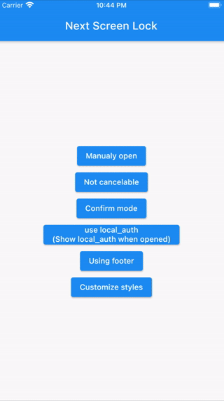
Features #
- By the length of the character count
- You can change
CancelandDeletewidget - Optimizes the UI for device size and orientation
- You can disable cancellation
- You can use biometrics (local_auth plugin)
- Biometrics can be displayed on first launch
- Unlocked callback
- You can specify a mismatch event.
- Limit the maximum number of retries
Usage #
You can easily lock the screen with the following code.
To unlock, enter correctString.
Simple #
If you give the same input as correctString, it will automatically close the screen.
import 'package:flutter_screen_lock/flutter_screen_lock.dart';

screenLock(
  context: context,
  correctString: '1234',
);
Change digits #
Provides a screen lock that cannot be canceled.
import 'package:flutter_screen_lock/flutter_screen_lock.dart';

screenLock(
  context: context,
  correctString: '1234',
  canCancel: false,
);
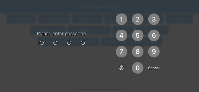
Confirmation screen #
You can display the confirmation screen and get the first input with didConfirmed if the first and second inputs match.
import 'package:flutter_screen_lock/flutter_screen_lock.dart';

screenLock(
  context: context,
  correctString: '',
  confirmation: true,
  didConfirmed: (matchedText) {
    print(matchedText);
  },
);
Control the confirmation state #
import 'package:flutter_screen_lock/flutter_screen_lock.dart';

final inputController = InputController();

screenLock(
  context: context,
  correctString: '',
  confirmation: true,
  inputController: inputController,
);

// Release the confirmation state at any event.
inputController.unsetConfirmed();
Use local_auth #
Add the local_auth package to pubspec.yml.
https://pub.dev/packages/local_auth
It includes an example that calls biometrics as soon as screenLock is displayed in didOpened.
import 'package:flutter_screen_lock/flutter_screen_lock.dart';
import 'package:local_auth/local_auth.dart';
import 'package:flutter/material.dart';

/// Method extraction to call by initial display and custom buttons.
Future<void> localAuth(BuildContext context) async {
  final localAuth = LocalAuthentication();
  final didAuthenticate = await localAuth.authenticateWithBiometrics(
      localizedReason: 'Please authenticate');
  if (didAuthenticate) {
    Navigator.pop(context);
  }
}

screenLock(
  context: context,
  correctString: '1234',
  customizedButtonChild: Icon(
    Icons.fingerprint,
  ),
  customizedButtonTap: () async {
    await localAuth(context);
  },
  didOpened: () async {
    await localAuth(context);
  },
);
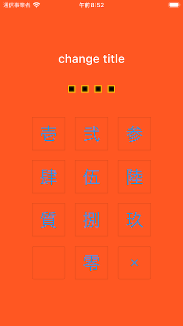
Full customize #
import 'package:flutter/material.dart';
import 'package:flutter_screen_lock/flutter_screen_lock.dart';

screenLock(
  context: context,
  title: Text('change title'),
  confirmTitle: Text('change confirm title'),
  correctString: '1234',
  confirmation: true,
  screenLockConfig: ScreenLockConfig(
    backgroundColor: Colors.deepOrange,
  ),
  secretsConfig: SecretsConfig(
    spacing: 15, // or spacingRatio
    padding: const EdgeInsets.all(40),
    secretConfig: SecretConfig(
      borderColor: Colors.amber,
      borderSize: 2.0,
      disabledColor: Colors.black,
      enabledColor: Colors.amber,
      height: 15,
      width: 15,
      build: (context, {config, enabled}) {
        return SizedBox(
          child: Container(
            decoration: BoxDecoration(
              shape: BoxShape.rectangle,
              color: enabled
                  ? config.enabledColor
                  : config.disabledColor,
              border: Border.all(
                width: config.borderSize,
                color: config.borderColor,
              ),
            ),
            padding: EdgeInsets.all(10),
            width: config.width,
            height: config.height,
          ),
          width: config.width,
          height: config.height,
        );
      },
    ),
  ),
  inputButtonConfig: InputButtonConfig(
    textStyle:
        InputButtonConfig.getDefaultTextStyle(context).copyWith(
      color: Colors.orange,
      fontWeight: FontWeight.bold,
    ),
    buttonStyle: OutlinedButton.styleFrom(
      shape: RoundedRectangleBorder(),
      backgroundColor: Colors.deepOrange,
    ),
  ),
  cancelButton: const Icon(Icons.close),
  deleteButton: const Icon(Icons.delete),
);
API References #
screenLock / ScreenLock API #
| Property | Type | Default | Description |
|---|---|---|---|
| context | BuildContext | (Required) [screenLock] only | |
| correctString | String | (Required) Input correct String If [confirmation] is true, it will be ignored, so set it to any string or empty. |
|
| screenLockConfig | ScreenLockConfig | ScreenLockConfig() | Refer to the API of ScreenLockConfig |
| secretsConfig | SecretsConfig | SecretsConfig() | Refer to the API of SecretsConfig |
| inputButtonConfig | InputButtonConfig | InputButtonConfig() | Refer to the API of InputButtonConfig |
| canCancel | bool | true | true is show cancel button. (Default: true) |
| confirmation | bool | Make sure the first and second inputs are the same. | |
| digits | int | Set the maximum number of characters to enter when [confirmation] is true. |
|
| maxRetries | int | 0 | 0 is unlimited. For example, if it is set to 1, didMaxRetries will be called on the first failure. |
| retryDelay | Duration | 0 | Delay until we can retry. Duration.zero is no delay. |
| delayChild | Widget | Specify the widget during input invalidation by retry delay. | |
| didUnlocked | void Function() | Called if the value matches the correctString. | |
| didError | void Function(int retries) | Called if the value does not match the correctString. | |
| didMaxRetries | void Function(int retries) | Events that have reached the maximum number of attempts. | |
| didOpened | void Function() | For example, when you want to perform biometric authentication. [screenLock] only | |
| didConfirmed | void Function(String matchedText) | Called when the first and second inputs match during confirmation. It is possible to receive the matched text as an argument. |
|
| customizedButtonTap | Future<void> Function() | Tapped for left side lower button. | |
| customizedButtonChild | Widget | Child for bottom left side button. | |
| footer | Widget | Add a Widget to the footer. | |
| cancelButton | Widget | Change the child widget for the cancel button. | |
| deleteButton | Widget | Change the child widget for the delete button. | |
| title | Widget | HeadingTitle(text: 'Please enter passcode.') | Change the title widget. |
| confirmTitle | Widget | HeadingTitle(text: 'Please enter confirm passcode.') | Change the confirm title widget. |
| inputController | InputController | Control the confirmation state change on the outside. | |
| withBlur | bool | Blur the background | |
| secretsBuilder | Function(SecretsConfig, int, Stream | Function to create a secrete with its own animation |
ScreenLockConfig API #
| Property | Type | Default | Description |
|---|---|---|---|
| backgroundColor | Color | Specifies the background color of the screen. By default, themeData will be set. | |
| themeData | ThemeData | ScreenLockConfig.defaultThemeData |
SecretsConfig API #
| Property | Type | Default | Description |
|---|---|---|---|
| spacing | double | Absolute space between secret widgets. If specified together with spacingRatio, this will take precedence. |
|
| spacingRatio | double | 0.05 | Space ratio between secret widgets. |
| padding | EdgeInsetsGeometry | EdgeInsets.only(top: 20, bottom: 50) | padding of Secrets Widget. |
| secretConfig | SecretConfig | SecretConfig() | Refer to the API of SecretConfig |
SecretConfig API #
| Property | Type | Default | Description |
|---|---|---|---|
| width | double | 16 | Widget width. |
| height | double | 16 | Widget height. |
| borderSize | double | 1.0 | border size. |
| borderColor | Color | Color(0xFFFFFFFF) | border color. |
| enabledColor | Color | Color(0xFFFFFFFF) | Fill color when input is active. |
| disabledColor | Color | Color(0xFFFFFFFF) | Fill color for unentered. |
InputButtonConfig API #
| Property | Type | Default | Description |
|---|---|---|---|
| height | double | Button height. | |
| width | double | Button width. | |
| autoSize | bool | true | Automatically adjust the size of the square to fit the orientation of the device. |
| inputStrings | List<String> | ['0','1','2','3','4','5','6','7','8','9'] |
A string to be matched against correctString. |
| displayStrings | List<String> | ['0','1','2','3','4','5','6','7','8','9'] |
The string to be displayed on the screen. |
| style | ButtonStyle | It is recommended that you use [OutlinedButton.styleFrom()] to change it. | |
| textStyle | TextStyle | Changes the text style of the button. | |
| clearOnLongPressed | bool | false | Clear input chars on long pressed. |
Apps I use #
TimeKey
Back me up! #

Metadata
Publisher
Weekly Downloads
Metadata
Provides the ability to lock the screen on ios and android. Biometric authentication can be used in addition to passcode.
Repository (GitHub)
View/report issues
Documentation
License
 MIT (license)