flutter_toggle_tab 1.5.1  flutter_toggle_tab: ^1.5.1 copied to clipboard
 lazycatlabs.com
Library to create Beautiful and Customized Toggle Tab Widget on Flutter
Flutter Tab Toggle #

A Beautiful and Simple Toggle Tab widget. It can be fully customized with desired icons, width, colors, text, corner radius, etc. It also maintains selection state.
Getting Started #
In the pubspec.yaml of your flutter project, add the following dependency:
dependencies:
  flutter_toggle_tab: "^latestVersion"
Import it:
import 'package:flutter_toggle_tab/flutter_toggle_tab.dart';
Usage Examples #
Basic tab/toggle switch #

// Here default theme colors are used for activeBgColor, activeFgColor, inactiveBgColor and inactiveFgColor
FlutterToggleTab
(
  width: 90, // width in percent
  borderRadius: 30,
  height: 50,
  selectedIndex: _tabTextIndexSelected,
  selectedBackgroundColors: [Colors.blue, Colors.blueAccent],
  selectedTextStyle: TextStyle(
  color: Colors.white,
  fontSize: 18,
  fontWeight: FontWeight.w700),
  unSelectedTextStyle: TextStyle(
  color: Colors.black87,
  fontSize: 14,
  fontWeight: FontWeight.w500),
  dataTabs: _listTextTabToggle,
  selectedLabelIndex: (index) {
    setState(() {
        _tabTextIndexSelected = index;
    });
  },
  isScroll:false,
)
Basic tab/toggle switch with Custom Counter Widget #

// Here default theme colors are used for activeBgColor, activeFgColor, inactiveBgColor and inactiveFgColor
FlutterToggleTab
(
  width: 90, // width in percent
  borderRadius: 30,
  height: 50,
  selectedIndex: _tabTextIndexSelected,
  selectedBackgroundColors: [Colors.blue, Colors.blueAccent],
  selectedTextStyle: TextStyle(
  color: Colors.white,
  fontSize: 18,
  fontWeight: FontWeight.w700),
  unSelectedTextStyle: TextStyle(
  color: Colors.black87,
  fontSize: 14,
  fontWeight: FontWeight.w500),
  dataTabs: _listTextTabToggleCounter,
  selectedLabelIndex: (index) {
    setState(() {
        _tabTextIndexSelected = index;
    });
  },
  isScroll:false,
)
Basic tab/toggle switch with Icon #
FlutterToggleTab
(
  width: 50,
  borderRadius: 15,
  selectedTextStyle: TextStyle(
  color: Colors.white,
  fontSize: 18,
  fontWeight: FontWeight.w600),
  unSelectedTextStyle: TextStyle(
  color: Colors.blue,
  fontSize: 14,
  fontWeight: FontWeight.w400),
  dataTabs: _listGenderText,
  selectedIndex: _tabTextIconIndexSelected,
  selectedLabelIndex: (index) {
    setState(() {
      _tabTextIconIndexSelected = index;
    });
  },
)
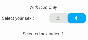
Basic tab/toggle switch with Icon Only and add margin on selected item #

FlutterToggleTab
(
  width: 40,
  borderRadius: 15,
  selectedIndex: _tabIconIndexSelected,
  selectedTextStyle: TextStyle(
  color: Colors.white,
  fontSize: 18,
  fontWeight: FontWeight.w600),
  unSelectedTextStyle: TextStyle(
  color: Colors.grey,
  fontSize: 14,
  fontWeight: FontWeight.w400),
  dataTabs: _listIconTabToggle,
  selectedLabelIndex: (index) {
    setState(() {
      _tabIconIndexSelected = index;
    });
  },
  marginSelected: EdgeInsets.symmetric(horizontal: 4,vertical:4),
)
Update selected tab Programmatically #
FlutterToggleTab
(
  width: 90,
  borderRadius: 15,
  selectedIndex: _tabSelectedIndexSelected,
  selectedTextStyle: TextStyle(
  color: Colors.white,
  fontSize: 18,
  fontWeight: FontWeight.w600),
  unSelectedTextStyle: TextStyle(
  color: Colors.grey,
  fontSize: 14,
  fontWeight: FontWeight.w400),
  dataTabs: _listTextSelectedToggle,
  selectedLabelIndex: (index) {
    setState(() {
      _tabSelectedIndexSelected = index;
    });
  },
)
Available Parameters #
| Param | isRequired |
|---|---|
| List<DataTab> dataTabs | Yes |
| Function(int) selectedLabelIndex | Yes |
| TextStyle selectedTextStyle default:Theme.of(context).textTheme.bodyMedium, | No |
| TextStyle unSelectedTextStyle default:Theme.of(context).textTheme.bodyMedium, | No |
| int selectedIndex (listener for index selected) see on example | Yes |
| double width (in Percent of width Screen) default: 100 | No |
| double height (double) default: 45 | No |
| double iconSize | No |
| double borderRadius (double) default 30 | No |
| List<Color> selectedBackgroundColors default : [ Theme.of(context).primaryColor] | No |
| List<Color> unSelectedBackgroundColors default [ Color(0xffe0e0e0)] | No |
| Alignment begin default : Alignment.topCenter | No |
| Alignment end default : Alignment.bottomCenter | No |
| bool isScroll default : true | No |
| EdgeInsets marginSelected default : EdgeInsets.zero | No |
| bool isShadowEnable default : true | No |
| bool isInnerShadowEnable default : true | No |
|
|
Buy me coffee if you love my works ☕️
Metadata
114
likes
150
points
6.98k
downloads
Publisher
Weekly Downloads
Metadata
Library to create Beautiful and Customized Toggle Tab Widget on Flutter
Documentation
License
 MIT (license)