multi_select_flutter 1.0.6  multi_select_flutter: ^1.0.6 copied to clipboard
A flexible multi-select package for Flutter. Make multi-select widgets the way you want.
Multi Select Flutter #

Multi Select Flutter is a package for easily creating multi-select widgets in a variety of ways.

Features #
- Can use MultiSelectFormField for use with validators and other FormField methods.
- Neutral default design that can be altered to your heart's content.
- Easily switch the MultiSelectField's
dialogTypefrom LIST to CHIP. - Make your multi select
searchablefor large lists. - Separate widget for MultiSelectChipDisplay that has the ability to delete from the selected items list when a chip item is tapped.
- Separate widgets for MultiSelectListDialog / MultiSelectChipDialog that you can simply use in the builder of showDialog(), and can be triggered with your own button.
Install #
Add this to your pubspec.yaml file:
dependencies:
  multi_select_flutter: ^1.0.6
Usage #
MultiSelectListDialog / MultiSelectChipDialog
These widgets can be used in the builder of showDialog().
  void _showMultiSelectDialog(BuildContext context) async {
    _selectedAnimals = await showDialog(
      context: context,
      builder: (ctx) {
        return MultiSelectListDialog(
          items: _items.map((item) =>
            MultiSelectItem(item, item.name)).toList(),
          initialSelectedItems: _selectedAnimals,
        );
      },
    );
  }
MultiSelectChipDisplay
This widget can be used by itself, alongside one of the dialogs, or it can be specified as a parameter of MultiSelectField / MultiSelectFormField.
To use this widget effectively, make sure to set the state when the list of selected items is changed.
You can also remove items from the source list in the onTap function.
List<String> _selectedAnimals = [];

MultiSelectChipDisplay(
  items: _selectedAnimals.map((e) => MultiSelectItem(e, e)).toList(),
  onTap: (value) {
    setState(() {
      _selectedAnimals.remove(value);
    });
  },
),
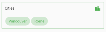
Note that when using the chipDisplay parameter as part of a MultiSelectField or MultiSelectFormField, the MultiSelectChipDisplay still renders outside the BoxDecoration of the field as seen here:
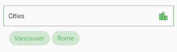
If you want to encapsulate the MultiSelectChipDisplay, wrap the MultiSelectField in a Container and apply the decoration to that instead:
Container(
	decoration: BoxDecoration(...),
	child: MultiSelectField(
	  items: _items,
	  chipDisplay: MultiSelectChipDisplay(...),
  ),
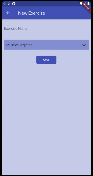
MultiSelectField
MultiSelectField provides a button which opens the dialog. To save the values from the dialog using this widget, an onConfirm(values) function is provided.
MultiSelectField(
  items: _animals.map((e) => MultiSelectItem(e, e.name)).toList(),
  title: "Animals",
  buttonText: "Favorite Animals"
  dialogType: MultiSelectDialogType.CHIP,
  searchable: true,
  textStyle: TextStyle(fontSize: 20),
  decoration: BoxDecoration(
    color: Theme.of(context).primaryColor.withOpacity(.4),
    border: Border.all(color: Theme.of(context).primaryColor),
  ),
  onConfirm: (results) {
    setState(() {
      _selectedAnimals = results;
    });
  },
  chipDisplay: MultiSelectChipDisplay(
    items: _selectedAnimals.map((e) => MultiSelectItem(e, e)).toList(),
  ),
),
MultiSelectFormField
MultiSelectFormField is the FormField version of MultiSelectField. You can put it into a form and make use of FormField parameters such as validator and onSaved.
It comes with a default bottom-border that can be overriden with the decoration parameter.
Form(
  child: MultiSelectFormField(
    items: _animals.map((e) => MultiSelectItem(e, e.name)).toList(),
    key: _formFieldKey,
    validator: (value) {
      if (value == null || value.isEmpty) {
        return "Required";
      }
      return "";
    },
    onConfirm: (values) {
      setState(() {
        _selectedAnimals = values;
        _formFieldKey.currentState.validate();
      });
    },
    chipDisplay: MultiSelectChipDisplay(
      items: _selectedAnimals.map((e) => MultiSelectItem(e, e)).toList(),
    ),
  ),
),
Constructors #
MultiSelectListDialog / MultiSelectChipDialog
| Parameter | Type | Usage |
|---|---|---|
confirmText |
String | Specifies the confirm button text. |
cancelText |
String | Specifies the cancel button text. |
initialSelectedItems |
List<dynamic> | List of selected values. Required to retain values when re-opening the dialog. |
items |
List<MultiSelectItem> | The source list of options to select |
onSelectionChanged |
Function(List<dynamic>) | Fires when an item is selected or unselected. |
onConfirm |
Function(List<dynamic>) | Fires when the confirm button is pressed. |
searchable |
bool | Toggle search functionality within the dialog. |
title |
String | The title that is displayed at the top of the dialog. |
MultiSelectChipDisplay
| Parameter | Type | Usage |
|---|---|---|
alignment |
Alignment | Change the alignment of the chips. Default is Alignment.centerLeft |
chipColor |
Color | Set the chip color. Default is primary theme color. |
decoration |
BoxDecoration | Style the Container that makes up the chip display. |
items |
List<MultiSelectItem> | The source list of selected items |
onTap |
Function(List<dynamic>) | Fires when a chip is tapped. |
textStyle |
TextStyle | Style the text on the chips. |
MultiSelectField
| Parameter | Type | Usage |
|---|---|---|
buttonText |
String | Set text that is displayed on the button. Default is "Select" |
buttonIcon |
Icon | Specify the button icon. Default is arrow_downward |
confirmText |
String | Specify the text on the confirm button. |
cancelText |
String | Specify the text on the cancel button. |
dialogType |
MultiSelectDialogType | Style the Container that makes up the chip display. |
decoration |
BoxDecoration | Style the Container that makes up the field. |
initialValue |
List<dynamic> | Set the initial values before any user interaction has occurred. Useful when MultiSelectField is being re-inserted into the widget tree (such as one inside of a BottomSheet). |
items |
List<MultiSelectItem> | The source list of selected items |
onSelectionChanged |
Function(List<dynamic>) | Fires when an item is selected or unselected. |
onConfirm |
Function(List<dynamic>) | Fires when confirm is pressed. |
searchable |
bool | Toggle search functionality within the dialog. |
title |
String | The title that is displayed at the top of the dialog. Default is "Select". |
MultiSelectFormField
MultiSelectFormField has all the parameters of MultiSelectField plus these extra parameters which come from the FormField class.
| Parameter | Type | Usage |
|---|---|---|
autovalidate |
List<MultiSelectItem> | If true, form fields will validate and update their error text immediately after every change. Default is false. |
key |
GlobalKey<FormFieldState> | Can be used to call methods like _multiSelectKey.currentState.validate() |
onSaved |
List<MultiSelectItem> | A callback that is called whenever we submit the field (usually by calling the save method on a form |
validator |
FormFieldValidator<List> | Validation. See Flutter's documentation |
Contributing #
Pull requests are welcome. For major changes, please open an issue first to discuss what you would like to change.
Metadata
Publisher
unverified uploader
Weekly Downloads
Metadata
A flexible multi-select package for Flutter. Make multi-select widgets the way you want.
Repository (GitHub)
View/report issues
Documentation
License
 BSD-2-Clause (license)