on_text_input_widget 0.0.7  on_text_input_widget: ^0.0.7 copied to clipboard
A text field that makes so many things like online, and offline searching easier.
On Text Input Widget #
A text input field with many functionalities
NOTE #
Now Material 3 theme is enabled.
Getting Started #
To use the on_text_input_widget widget in your project, follow these steps:
-
Install the widget according to the instructions on the install page
-
Add this code in your project
OnTextInputWidget()
- For better understanding follow the example
Usages of the text field #
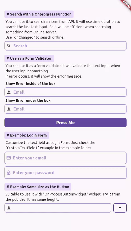
Searching operation from online or local server #
You can use it to search an item from API. It will use time duration to search the last text input. So it will be efficient when searching something from Online server. Use "onChanged" to search offline.
    OnTextInputWidget(
        hintText: "Search",
        prefixIcon: Icon(Icons.search),
        showPrefixLoadingIcon: true,
        // showSuffixLoadingIcon: true,
        onChanged: (value) {
            // Use it for offline search
        },
        onChangedProcessing: (value) async {
            // Online search operation
            await Future.delayed(const Duration(seconds: 2));
            setState(() {
                result = value;
            });
        },
    ),
Example - Searching operation from online or local server #
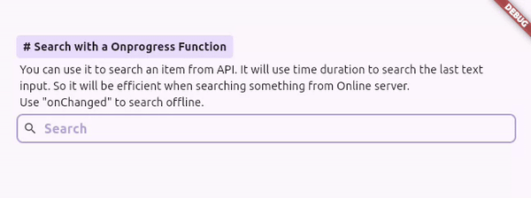
Form Validation #
You can use it as a form validator. It will validate the text input when the user input something. If error occurs, it will show the error message.
    class __Validator extends StatelessWidget {
        __Validator();
        final GlobalKey<FormState> _formKey = GlobalKey<FormState>();

        String v(String? value) {
            if (value?.isNotEmpty == true) {
                return "You entered username: $value";
            } else {
                return "Please enter your username";
            }
        }

        @override
        Widget build(BuildContext context) {
            return Form(
                key: _formKey,
                child: Column(
                    children: [
                        ______Details(
                            heading: "Use as a Form Validator",
                            text: "You can use it as a form validator. It will validate the text input when the user input something. If error occurs, it will show the error message.",
                            child: Column(
                                crossAxisAlignment: CrossAxisAlignment.start,
                                children: [
                                    ______Text("Show Error inside of the box", boldText: true),
                                    OnTextInputWidget(
                                    prefixIcon: Icon(Icons.person),
                                    hintText: "Email",
                                    validator: v,
                                    ),
                                    ______Text("Show Error under the box", boldText: true),
                                    OnTextInputWidget(
                                    prefixIcon: Icon(Icons.person),
                                    hintText: "Email",
                                    showDetailError: true, //?
                                    validator: v,
                                    ),
                                ],
                            ),
                        ),

                        // Button
                        OnProcessButtonWidget(
                            onDone: (isSuccess) {
                            _formKey.currentState?.validate();
                            },
                            child: Text("Press Me"),
                        ),

                        ______Space(),
                        ______Space(),
                    ],
                ),
            );
        }
    }
Example - Form Validation #
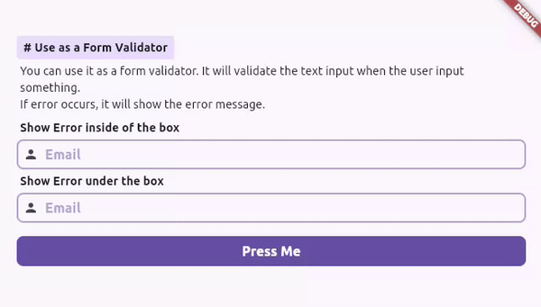
Login Form #
To add login form
Column(
    children: [
        // Username field
        OnTextInputWidgetUserField(
            keyboardType: TextInputType.emailAddress,
            hintText: "Enter your email",
            svg: "lib/assets/icons/message_icon.svg",
        ),
        ______Space(),
        // Password Field
        OnTextInputWidgetUserField(
            obscureText: true,
            keyboardType: TextInputType.visiblePassword,
            hintText: "Enter your password",
            svg: "lib/assets/icons/lock_icon.svg",
        ),
    ],
),
Example - Login Form #
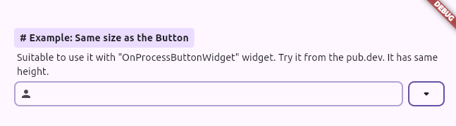
Same size as the Button #
Suitable to use it with "OnProcessButtonWidget" widget. Try it from the pub.dev. It has same height.
    Row(
        children: [
            // Input Field
            Flexible(
                child: OnTextInputWidget(
                    prefixIcon: Icon(Icons.person),
                ),
            ),
            ______Space(),

            // Button
            OnProcessButtonWidget(
                backgroundColor: Colors.transparent,
                border: Border.all(
                    width: 2,
                    color: Theme.of(context).colorScheme.primary,
                    strokeAlign: BorderSide.strokeAlignCenter,
                ),
                child: Icon(Icons.arrow_drop_down_rounded),
            ),
        ],
    ),
Example - Same size as the Button #
And many more. #
Metadata

Publisher
unverified uploader
Weekly Downloads
Metadata
A text field that makes so many things like online, and offline searching easier.
Topics
Documentation
License
 BSD-3-Clause (license)