otp_pin_field 1.2.0  otp_pin_field: ^1.2.0 copied to clipboard
A flutter package which will help you to generate pin code fields with beautiful design and animations. Can be useful for OTP or pin code inputs

otp_pin_field #
A flutter package which will help you to generate pin code fields with beautiful design and animations. It's a beautiful and highly customizable Flutter widget for entering pin code. Can be useful for OTP or pin code inputs.
Created by Shivam Mishra @shivbo96
Usage #
Use this package as a library #
- Depend on it Add this to your package's pubspec.yaml file:
dependencies:
  otp_pin_field: <VERSION>
- Install it You can install packages from the command line: with Flutter:
$ flutter packages get
Alternatively, your editor might support flutter packages get. Check the docs for your editor to learn more.
- Import it Now in your Dart code, you can use:
import 'package:otp_pin_field/otp_pin.dart';
Properties #
| name | type | default | description |
|---|---|---|---|
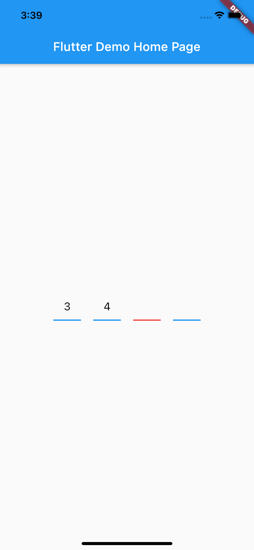
| fieldCount | int | 4 | The total length of pin number & the number of pin boxes. |
| highlightBorder | bool | true | highlight the focused pin box. |
| activeFieldBorderColor | Color | Colors.black | Set color of the focused pin box. |
| activeFieldBackgroundColor | Color | Colors.transparent | Set background color of the focused pin box. |
| defaultFieldBorderColor | Color | Colors.black45 | Set color of the unfocused pin box. |
| defaultFieldBackgroundColor | Color | Colors.transparent | Set background color of the unfocused pin box. |
| fieldPadding | double | 20.0 | Set padding for pin box. |
| fieldBorderRadius | double | 2.0 | Set border radius for pin box. |
| fieldBorderWidth | double | 2.0 | Set border width for pin box. |
| textStyle | TextStyle | TextStyle(fontSize: 18.0,color: Colors.black,) | TextStyle for styling pin characters. |
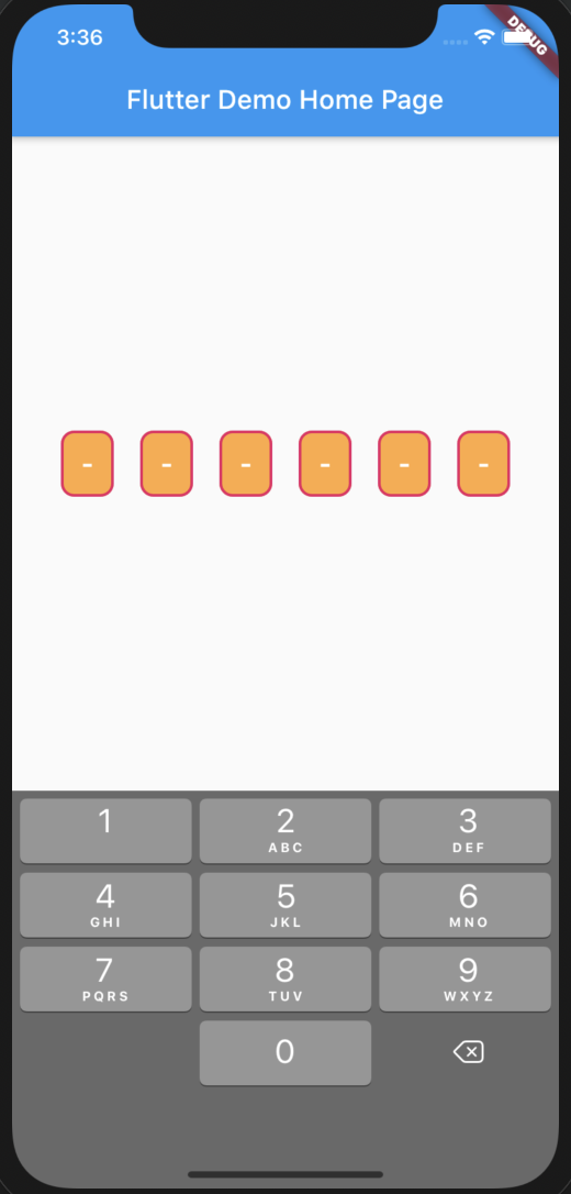
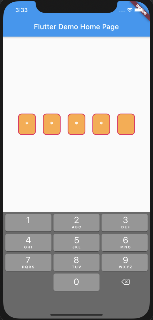
| otpPinFieldInputType | OtpPinFieldInputType | OtpPinFieldInputType.none | Want to show text of otp_pin_field(OtpPinFieldInputType.none) or not(OtpPinFieldInputType.password) or want to show some special character(OtpPinFieldInputType.custom) |
| otpPinInputCustom | String | "*" | Special character to mask the pin code. Will only work if uses otpPinFieldInputType is set to OtpPinFieldInputType.custom. |
| onSubmit | void Function(String) | Callback when the max length of pin code is reached. | |
| otpPinFieldStyle | OtpPinFieldStyle | OtpPinFieldStyle() | Customization for the individual pin boxes. Check OtpPinFieldStyle for possible options. |
| fieldHeight | double | 45.0 | Height of pin boxes. |
| fieldWidth | double | 70.0 | Width of pin boxes. |
| otpPinFieldDecoration | OtpPinFieldDecoration | OtpPinFieldDecoration.underlinedPinBoxDecoration | Predefine customization for the individual pin boxes. Check OtpPinFieldStyle for possible options and use OtpPinFieldDecoration.custom for fully customization like boarder radius,width, active and default otp_pin_field colors and etc.. |
| keyboardType | TextInputType | TextInputType.number | The type of the input keyboard |
| autofocus | bool | false | Autofocus on view entered |
| cursorColor | Color | Color.black | To give color to the cursor |
| cursorWidth | double | 2 | To give width to the cursor |
| showCursor | bool | true | To show cursor in the otp pin fields |
| mainAxisAlignment | MainAxisAlignment | MainAxisAlignment.center | Manage the spacing in the otp pin fields |
| upperChild | Widget | Container() | Widget which will show above the otp pin fields only when showCustomKeyboard is set to be true |
| middleChild | Widget | Container() | Widget which will show between the otp pin fields and Custom Keyboard only when showCustomKeyboard is set to be true |
| showCustomKeyboard | bool | false | To show custom keyboard in place default keyboard |
| customKeyboard | Widget | Widget which help you to show your own custom keyboard in place if default custom keyboard | |
| showDefaultKeyboard | bool | true | bool which manage to show default OS keyboard |
| autoFillEnable | bool | false | bool which manage to enable auto fill functionality |
Example #
/// Otp pin Controller
final _otpPinFieldController = GlobalKey<OtpPinFieldState>();
OtpPinField(
key: _otpPinFieldController, /// to clear the Otp pin Controller
onSubmit: (text) {
print('Entered pin is $text'); /// return the entered pin
},
onChange: (text) {
print('Enter on change pin is $text'); /// return the entered pin
},
/// to decorate your Otp_Pin_Field
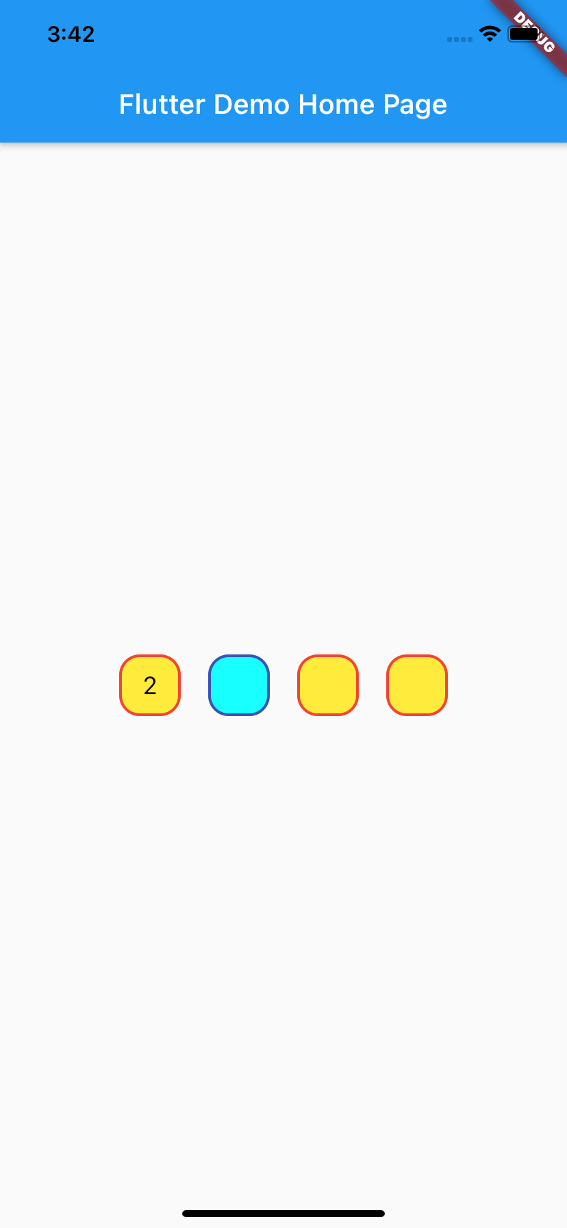
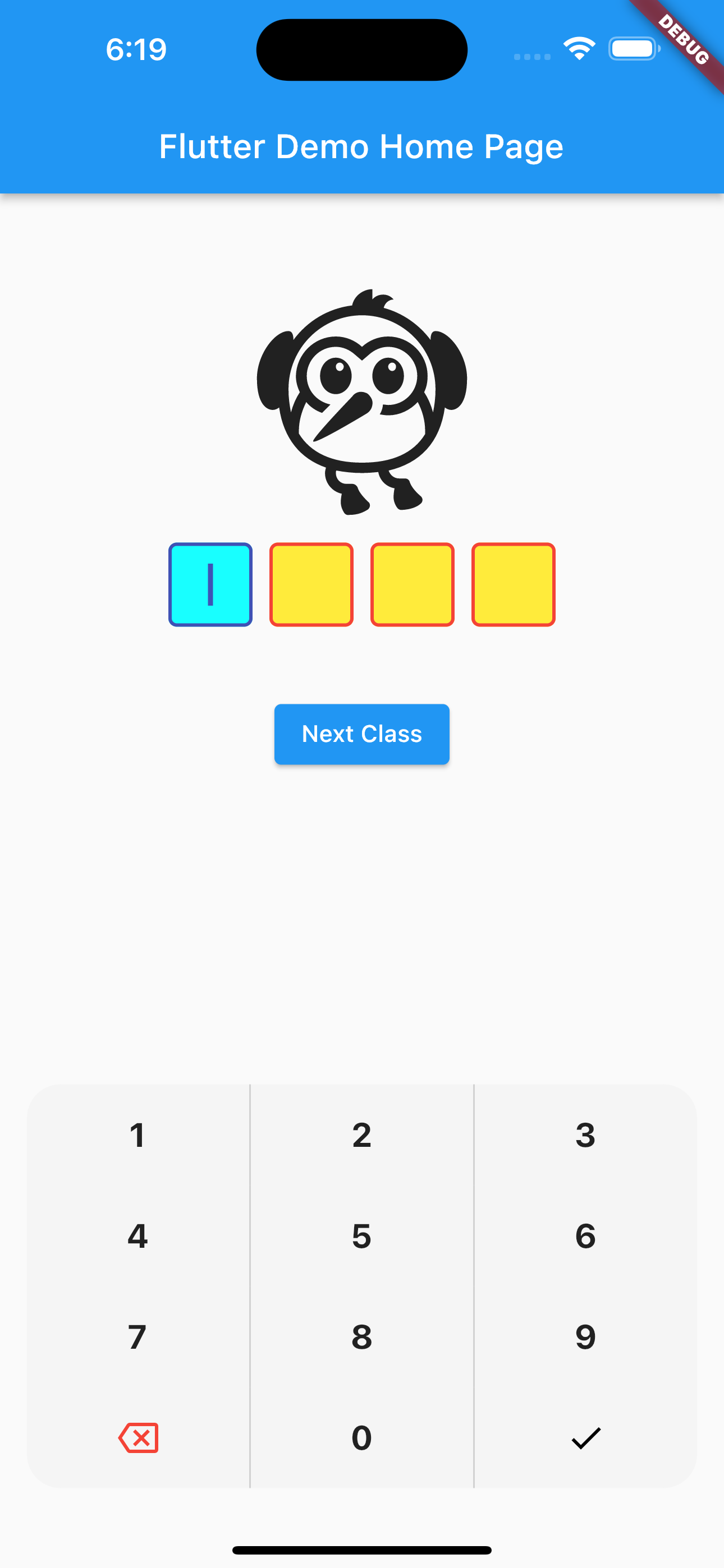
otpPinFieldStyle: OtpPinFieldStyle(
// border color for inactive/unfocused Otp_Pin_Field
defaultFieldBorderColor: Colors.red,
// border color for active/focused Otp_Pin_Field
activeFieldBorderColor: Colors.indigo,
/// Background Color for inactive/unfocused Otp_Pin_Field
defaultFieldBackgroundColor: Colors.yellow,
activeFieldBackgroundColor: Colors.cyanAccent
/// Background Color for active/focused Otp_Pin_Field
),
maxLength: 4,
/// no of pin field
showCursor: true,
/// bool to show cursor in pin field or not
cursorColor: Colors.indigo,
/// to choose cursor color
upperChild: Column(
children: [
SizedBox(height: 30),
Icon(Icons.flutter_dash_outlined, size: 150),
SizedBox(height: 20),
],
),
middleChild: Column(
children: [
SizedBox(height: 30),
ElevatedButton(
onPressed: () {
_otpPinFieldController.currentState
?.clearOtp(); // clear controller
},
child: Text("clear OTP")),
SizedBox(height: 10),
ElevatedButton(
onPressed: () => Navigator.push(context,
MaterialPageRoute(builder: (context) => NextPage())),
child: Text("Next Class")),
SizedBox(height: 30),
],
),
showCustomKeyboard: true,
///bool which manage to show custom keyboard
// customKeyboard: Container(), /// Widget which help you to show your own custom keyboard in place if default custom keyboard
// showDefaultKeyboard: true, ///bool which manage to show default OS keyboard
cursorWidth: 3,
/// to select cursor width
mainAxisAlignment: MainAxisAlignment.center,
/// place otp pin field according to yourselft
/// predefine decorate of pinField use OtpPinFieldDecoration.defaultPinBoxDecoration||OtpPinFieldDecoration.underlinedPinBoxDecoration||OtpPinFieldDecoration.roundedPinBoxDecoration
///use OtpPinFieldDecoration.custom (by using this you can make Otp_Pin_Field according to yourself like you can give fieldBorderRadius,fieldBorderWidth and etc things)
otpPinFieldDecoration:
OtpPinFieldDecoration.defaultPinBoxDecoration),
refer to example/lib/main.dart
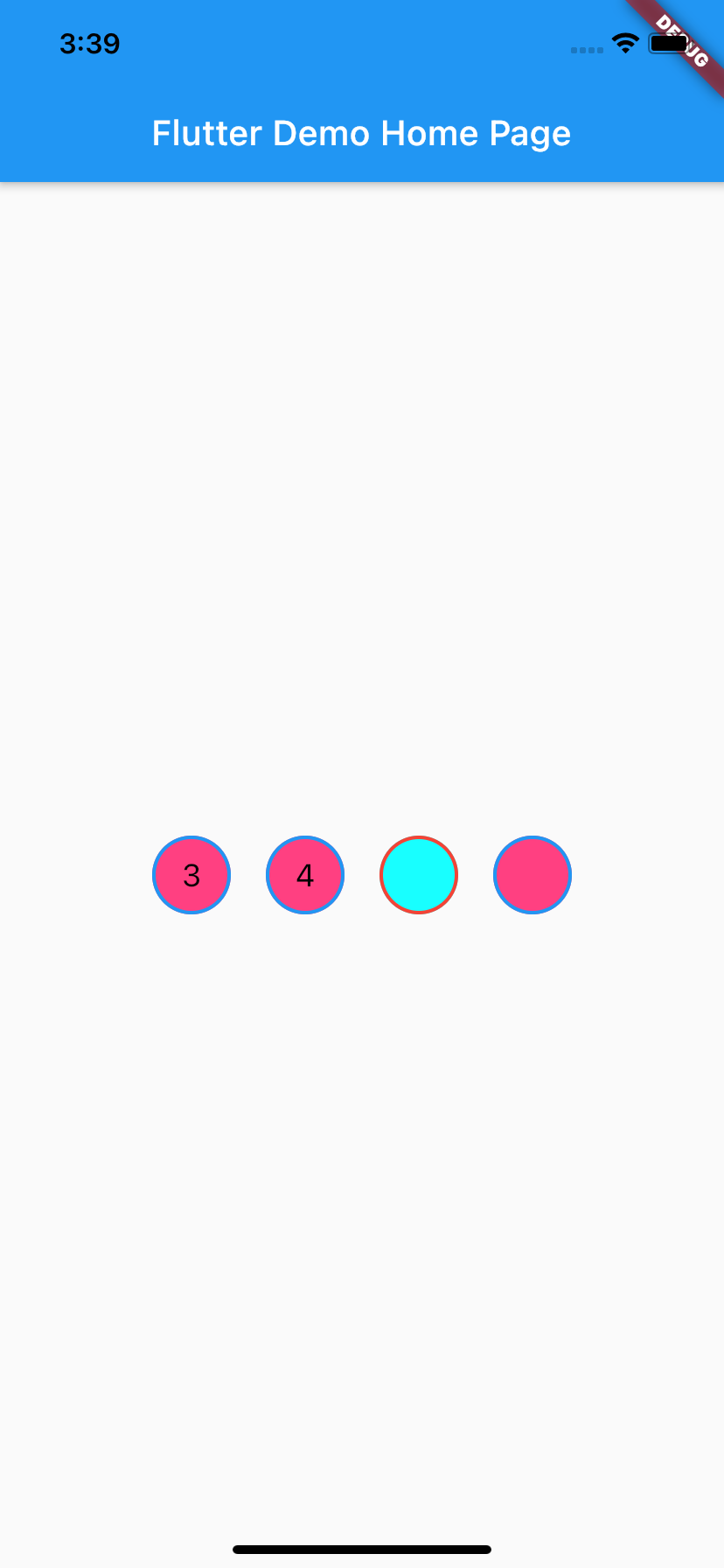
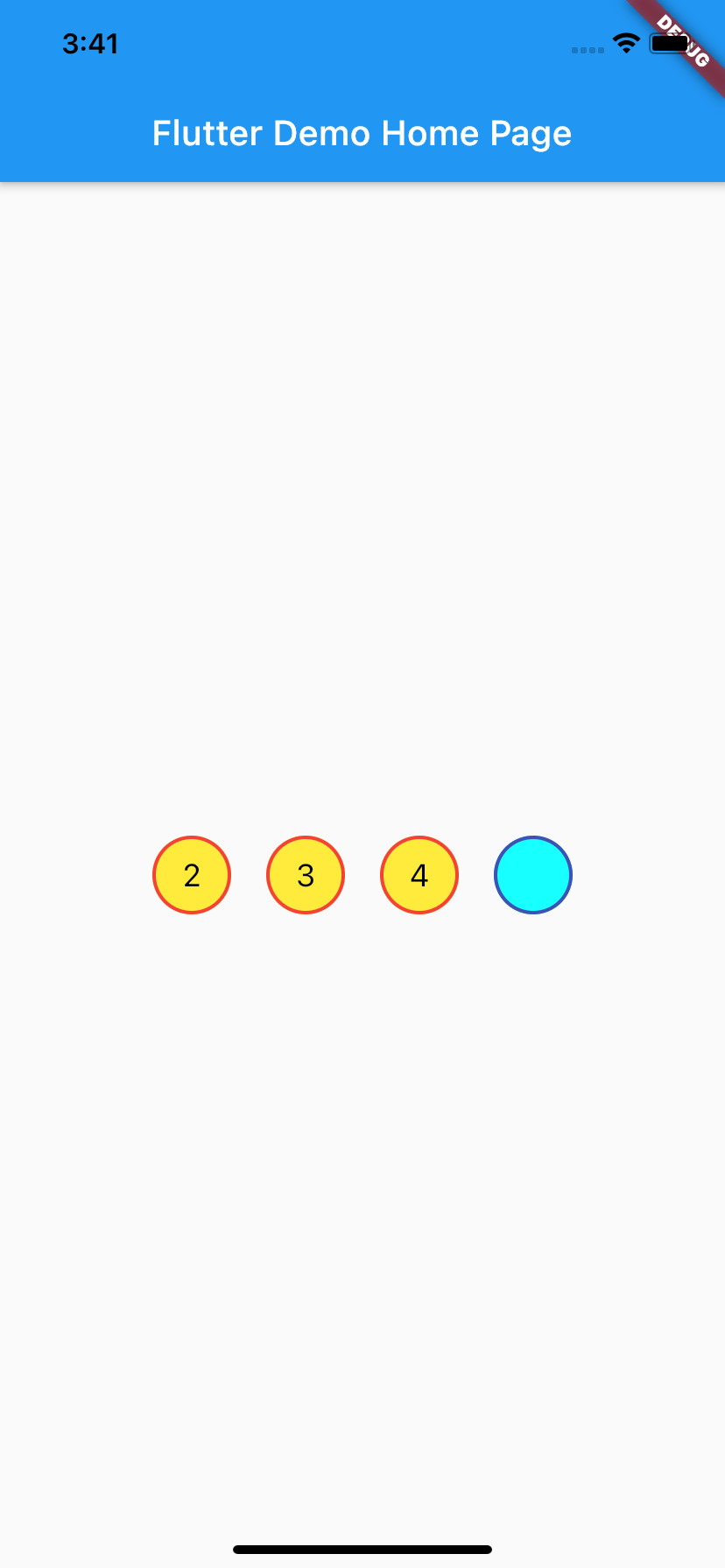
Different Shapes


More information #
Metadata
Publisher
unverified uploader
Weekly Downloads
Metadata
A flutter package which will help you to generate pin code fields with beautiful design and animations. Can be useful for OTP or pin code inputs
Repository (GitHub)
View/report issues
License
 unknown (license)
Dependencies
flutter, flutter_web_plugins, plugin_platform_interface