search_choices 1.0.7  search_choices: ^1.0.7 copied to clipboard
 jod.li
Widget to let the user search through a keyword string typed on a customizable keyboard in a single or multiple choices list presented as a dropdown in a dialog box or a menu.
search_choices #
Widget to let the user search through a keyword string typed on a customizable keyboard in a single or multiple choices list presented as a dropdown in a dialog box or a menu.
Platforms #
This widget has been successfully tested on iOS, Android and Chrome.
Examples #
The following examples are extracted from the example project available in the repository.
Gallery #
See code below.
Demonstration #
An Android demonstration is available here: https://searchchoices.jod.li/app-release.apk
Code #
Plugin usage
Add to your pubspec.yaml in the dependencies section:
search_choices:
Get packages with command:
flutter packages get
Import:
import 'package:search_choices/search_choices.dart';
Call either the single choice or the multiple choice constructor.
Single choice constructor
Search choices Widget with a single choice that opens a dialog or a menu to let the user do the selection conveniently with a search.
factory SearchChoices.single({
    Key key,
    @required List<DropdownMenuItem<T>> items,
    @required Function onChanged,
    T value,
    TextStyle style,
    dynamic searchHint,
    dynamic hint,
    dynamic disabledHint,
    dynamic icon = const Icon(Icons.arrow_drop_down),
    dynamic underline,
    dynamic doneButton,
    dynamic label,
    dynamic closeButton = "Close",
    bool displayClearIcon = true,
    Icon clearIcon = const Icon(Icons.clear),
    Color iconEnabledColor,
    Color iconDisabledColor,
    double iconSize = 24.0,
    bool isExpanded = false,
    bool isCaseSensitiveSearch = false,
    Function searchFn,
    Function onClear,
    Function selectedValueWidgetFn,
    TextInputType keyboardType = TextInputType.text,
    Function validator,
    bool assertUniqueValue = true,
    Function displayItem,
    bool dialogBox = true,
    BoxConstraints menuConstraints,
    bool readOnly: false,
    Color menuBackgroundColor,
}
)
- items with child: Widget displayed ; value: any object with .toString() used to match search keyword.
- onChanged Function with parameter: value not returning executed after the selection is done.
- value value to be preselected.
- style used for the hint if it is given is String.
- searchHint String|Widget|Function with no parameter returning String|Widget displayed at the top of the search dialog box.
- hint String|Widget|Function with no parameter returning String|Widget displayed before any value is selected or after the selection is cleared.
- disabledHint String|Widget|Function with no parameter returning String|Widget displayed instead of hint when the widget is displayed.
- icon String|Widget|Function with parameter: value returning String|Widget displayed next to the selected item or the hint if none.
- underline String|Widget|Function with parameter: value returning String|Widget displayed below the selected item or the hint if none.
- doneButton String|Widget|Function with parameter: value returning String|Widget displayed at the top of the search dialog box.
- label String|Widget|Function with parameter: value returning String|Widget displayed above the selected item or the hint if none.
- closeButton String|Widget|Function with parameter: value returning String|Widget displayed at the bottom of the search dialog box.
- displayClearIcon whether or not to display an icon to clear the selected value.
- clearIcon Icon to be used for clearing the selected value.
- iconEnabledColor Color to be used for enabled icons.
- iconDisabledColor Color to be used for disabled icons.
- iconSize for the icons next to the selected value (icon and clearIcon).
- isExpanded can be necessary to avoid pixel overflows (zebra symptom).
- isCaseSensitiveSearch only used when searchFn is not specified.
- searchFn Function with parameters: keyword, items returning List
- onClear Function with no parameter not returning executed when the clear icon is tapped.
- selectedValueWidgetFn Function with parameter: item returning Widget to be used to display the selected value.
- keyboardType used for the search.
- validator Function with parameter: value returning String displayed below selected value when not valid and null when valid.
- assertUniqueValue whether to run a consistency check of the list of items.
- displayItem Function with parameters: item, selected returning Widget to be displayed in the search list.
- dialogBox whether the search should be displayed as a dialog box or as a menu below the selected value if any.
- menuConstraints BoxConstraints used to define the zone where to display the search menu. Example: BoxConstraints.tight(Size.fromHeight(250)) . Not to be used for dialogBox = true.
- readOnly bool whether to let the user choose the value to select or just present the selected value if any.
- menuBackgroundColor Color background color of the menu whether in dialog box or menu mode.
Multiple choice constructor
Search choices Widget with a multiple choice that opens a dialog or a menu to let the user do the selection conveniently with a search.
SearchChoices<T>.multiple(
{
    Key key,
    @required List<DropdownMenuItem<T>> items,
    @required Function onChanged,
    List<int> selectedItems: const [],
    TextStyle style,
    dynamic searchHint,
    dynamic hint,
    dynamic disabledHint,
    dynamic icon: const Icon(Icons.arrow_drop_down),
    dynamic underline,
    dynamic doneButton: "Done",
    dynamic label,
    dynamic closeButton: "Close",
    bool displayClearIcon: true,
    Icon clearIcon: const Icon(Icons.clear),
    Color iconEnabledColor,
    Color iconDisabledColor,
    double iconSize: 24.0,
    bool isExpanded: false,
    bool isCaseSensitiveSearch: false,
    Function searchFn,
    Function onClear,
    Function selectedValueWidgetFn,
    TextInputType keyboardType: TextInputType.text,
    Function validator,
    Function displayItem,
    bool dialogBox: true,
    BoxConstraints menuConstraints,
    bool readOnly: false,
    Color menuBackgroundColor,
}
)
- items with child: Widget displayed ; value: any object with .toString() used to match search keyword.
- onChanged Function with parameter: selectedItems not returning executed after the selection is done.
- selectedItems indexes of items to be preselected.
- style used for the hint if it is given is String.
- searchHint String|Widget|Function with no parameter returning String|Widget displayed at the top of the search dialog box.
- hint String|Widget|Function with no parameter returning String|Widget displayed before any value is selected or after the selection is cleared.
- disabledHint String|Widget|Function with no parameter returning String|Widget displayed instead of hint when the widget is displayed.
- icon String|Widget|Function with parameter: selectedItems returning String|Widget displayed next to the selected items or the hint if none.
- underline String|Widget|Function with parameter: selectedItems returning String|Widget displayed below the selected items or the hint if none.
- doneButton String|Widget|Function with parameter: selectedItems returning String|Widget displayed at the top of the search dialog box. Cannot be null in multiple selection mode.
- label String|Widget|Function with parameter: selectedItems returning String|Widget displayed above the selected items or the hint if none.
- closeButton String|Widget|Function with parameter: selectedItems returning String|Widget displayed at the bottom of the search dialog box.
- displayClearIcon whether or not to display an icon to clear the selected values.
- clearIcon Icon to be used for clearing the selected values.
- iconEnabledColor Color to be used for enabled icons.
- iconDisabledColor Color to be used for disabled icons.
- iconSize for the icons next to the selected values (icon and clearIcon).
- isExpanded can be necessary to avoid pixel overflows (zebra symptom).
- isCaseSensitiveSearch only used when searchFn is not specified.
- searchFn Function with parameters: keyword, items returning List
- onClear Function with no parameter not returning executed when the clear icon is tapped.
- selectedValueWidgetFn Function with parameter: item returning Widget to be used to display the selected values.
- keyboardType used for the search.
- validator Function with parameter: selectedItems returning String displayed below selected values when not valid and null when valid.
- displayItem Function with parameters: item, selected returning Widget to be displayed in the search list.
- dialogBox whether the search should be displayed as a dialog box or as a menu below the selected values if any.
- menuConstraints BoxConstraints used to define the zone where to display the search menu. Example: BoxConstraints.tight(Size.fromHeight(250)) . Not to be used for dialogBox = true.
- readOnly bool whether to let the user choose the value to select or just present the selected value if any.
- menuBackgroundColor Color background color of the menu whether in dialog box or menu mode.
Example app usage
Clone repository:
git clone https://github.com/lcuis/search_choices.git
Go to plugin folder:
cd search_choices
Optionally enable web:
flutter config --enable-web
Create project:
flutter create .
To run automated tests:
flutter test
Optionally generate documentation:
pub global activate dartdoc
dartdoc
Go to example app folder:
cd example
To run web:
run -d chrome
To build web to folder build/web:
flutter build web
To run on a connected device:
flutter run
To build Android app to build/app/outputs/apk/release/app-release.apk:
flutter build apk
To build iOS app on Mac:
flutter build ios
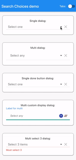
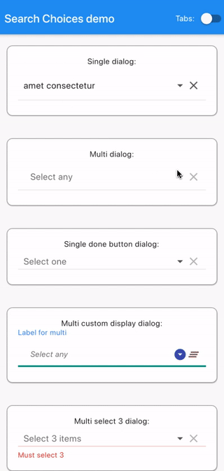
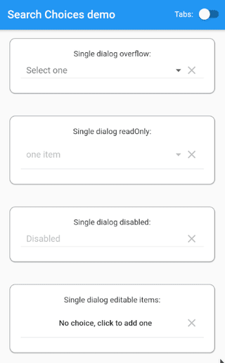
Single dialog
      SearchChoices.single(
        items: items,
        value: selectedValue,
        hint: "Select one",
        searchHint: "Select one",
        onChanged: (value) {
          setState(() {
            selectedValue = value;
          });
        },
        isExpanded: true,
      ),
Multi dialog
      SearchChoices.multiple(
        items: items,
        selectedItems: selectedItems,
        hint: Padding(
          padding: const EdgeInsets.all(12.0),
          child: Text("Select any"),
        ),
        searchHint: "Select any",
        onChanged: (value) {
          setState(() {
            selectedItems = value;
          });
        },
        closeButton: (selectedItems) {
          return (selectedItems.isNotEmpty
              ? "Save ${selectedItems.length == 1 ? '"' + items[selectedItems.first].value.toString() + '"' : '(' + selectedItems.length.toString() + ')'}"
              : "Save without selection");
        },
        isExpanded: true,
      ),
Single done button dialog
      SearchChoices.single(
        items: items,
        value: selectedValue,
        hint: "Select one",
        searchHint: "Select one",
        onChanged: (value) {
          setState(() {
            selectedValue = value;
          });
        },
        doneButton: "Done",
        displayItem: (item, selected) {
          return (Row(children: [
            selected
                ? Icon(
                    Icons.radio_button_checked,
                    color: Colors.grey,
                  )
                : Icon(
                    Icons.radio_button_unchecked,
                    color: Colors.grey,
                  ),
            SizedBox(width: 7),
            Expanded(
              child: item,
            ),
          ]));
        },
        isExpanded: true,
      ),
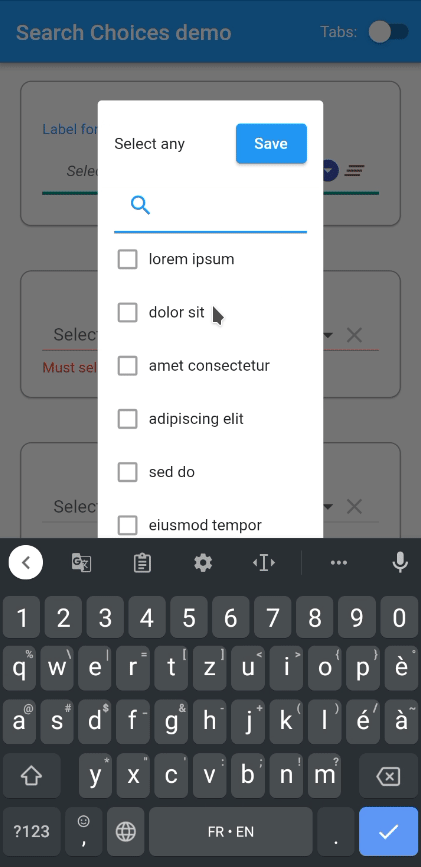
Multi custom display dialog
      SearchChoices.multiple(
        items: items,
        selectedItems: selectedItems,
        hint: Padding(
          padding: const EdgeInsets.all(12.0),
          child: Text("Select any"),
        ),
        searchHint: "Select any",
        onChanged: (value) {
          setState(() {
            selectedItems = value;
          });
        },
        displayItem: (item, selected) {
          return (Row(children: [
            selected
                ? Icon(
                    Icons.check,
                    color: Colors.green,
                  )
                : Icon(
                    Icons.check_box_outline_blank,
                    color: Colors.grey,
                  ),
            SizedBox(width: 7),
            Expanded(
              child: item,
            ),
          ]));
        },
        selectedValueWidgetFn: (item) {
          return (Center(
              child: Card(
                  shape: RoundedRectangleBorder(
                    borderRadius: BorderRadius.circular(10),
                    side: BorderSide(
                      color: Colors.brown,
                      width: 0.5,
                    ),
                  ),
                  margin: EdgeInsets.all(12),
                  child: Padding(
                    padding: const EdgeInsets.all(8),
                    child: Text(item.toString()),
                  ))));
        },
        doneButton: (selectedItemsDone, doneContext) {
          return (RaisedButton(
              onPressed: () {
                Navigator.pop(doneContext);
                setState(() {});
              },
              child: Text("Save")));
        },
        closeButton: null,
        style: TextStyle(fontStyle: FontStyle.italic),
        searchFn: (String keyword, items) {
          List<int> ret = List<int>();
          if (keyword != null && items != null && keyword.isNotEmpty) {
            keyword.split(" ").forEach((k) {
              int i = 0;
              items.forEach((item) {
                if (k.isNotEmpty &&
                    (item.value
                        .toString()
                        .toLowerCase()
                        .contains(k.toLowerCase()))) {
                  ret.add(i);
                }
                i++;
              });
            });
          }
          if (keyword.isEmpty) {
            ret = Iterable<int>.generate(items.length).toList();
          }
          return (ret);
        },
        clearIcon: Icon(Icons.clear_all),
        icon: Icon(Icons.arrow_drop_down_circle),
        label: "Label for multi",
        underline: Container(
          height: 1.0,
          decoration: BoxDecoration(
              border:
                  Border(bottom: BorderSide(color: Colors.teal, width: 3.0))),
        ),
        iconDisabledColor: Colors.brown,
        iconEnabledColor: Colors.indigo,
        isExpanded: true,
      ),
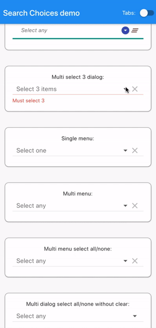
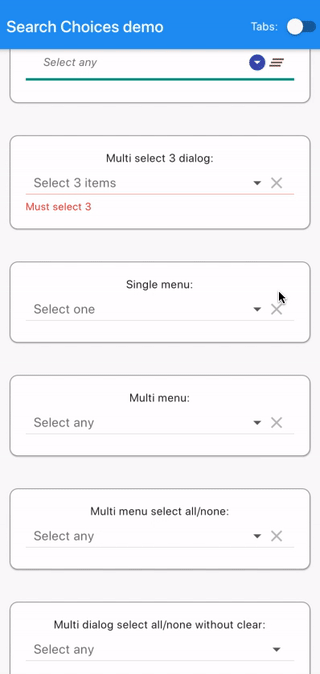
Multi select 3 dialog
      SearchChoices.multiple(
        items: items,
        selectedItems: selectedItems,
        hint: "Select 3 items",
        searchHint: "Select 3",
        validator: (selectedItemsForValidator) {
          if (selectedItemsForValidator.length != 3) {
            return ("Must select 3");
          }
          return (null);
        },
        onChanged: (value) {
          setState(() {
            selectedItems = value;
          });
        },
        doneButton: (selectedItemsDone, doneContext) {
          return (RaisedButton(
              onPressed: selectedItemsDone.length != 3
                  ? null
                  : () {
                      Navigator.pop(doneContext);
                      setState(() {});
                    },
              child: Text("Save")));
        },
        closeButton: (selectedItems) {
          return (selectedItems.length == 3 ? "Ok" : null);
        },
        isExpanded: true,
      ),
Single menu
      SearchChoices.single(
        items: items,
        value: selectedValue,
        hint: "Select one",
        searchHint: null,
        onChanged: (value) {
          setState(() {
            selectedValue = value;
          });
        },
        dialogBox: false,
        isExpanded: true,
        menuConstraints: BoxConstraints.tight(Size.fromHeight(350)),
      ),
Multi menu
      SearchChoices.multiple(
        items: items,
        selectedItems: selectedItems,
        hint: "Select any",
        searchHint: "",
        doneButton: "Close",
        closeButton: SizedBox.shrink(),
        onChanged: (value) {
          setState(() {
            selectedItems = value;
          });
        },
        dialogBox: false,
        isExpanded: true,
        menuConstraints: BoxConstraints.tight(Size.fromHeight(350)),
      ),
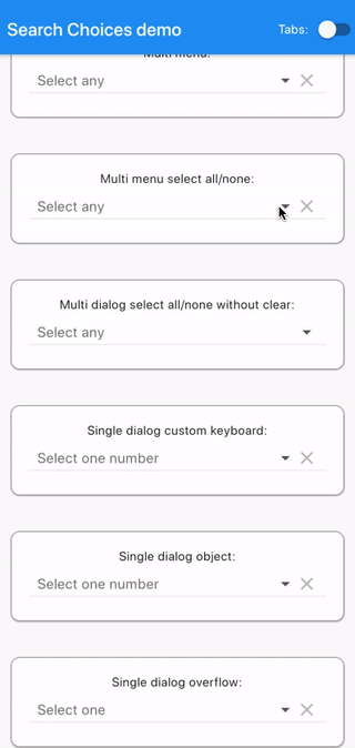
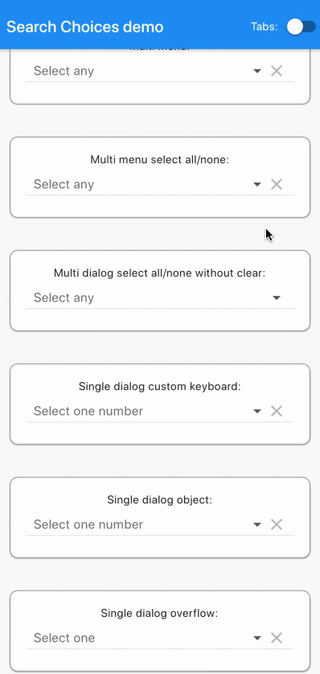
Multi menu select all/none
      SearchChoices.multiple(
        items: items,
        selectedItems: selectedItems,
        hint: "Select any",
        searchHint: "Select any",
        onChanged: (value) {
          setState(() {
            selectedItems = value;
          });
        },
        dialogBox: false,
        closeButton: (selectedItemsClose) {
          return Row(
            mainAxisAlignment: MainAxisAlignment.spaceBetween,
            children: <Widget>[
              RaisedButton(
                  onPressed: () {
                    setState(() {
                      selectedItemsClose.clear();
                      selectedItemsClose.addAll(
                          Iterable<int>.generate(items.length).toList());
                    });
                  },
                  child: Text("Select all")),
              RaisedButton(
                  onPressed: () {
                    setState(() {
                      selectedItemsClose.clear();
                    });
                  },
                  child: Text("Select none")),
            ],
          );
        },
        isExpanded: true,
        menuConstraints: BoxConstraints.tight(Size.fromHeight(350)),
      ),
Multi dialog select all/none without clear
      SearchChoices.multiple(
        items: items,
        selectedItems: selectedItems,
        hint: "Select any",
        searchHint: "Select any",
        displayClearIcon: false,
        onChanged: (value) {
          setState(() {
            selectedItems = value;
          });
        },
        dialogBox: true,
        closeButton: (selectedItemsClose) {
          return Row(
            mainAxisAlignment: MainAxisAlignment.spaceBetween,
            children: <Widget>[
              RaisedButton(
                  onPressed: () {
                    setState(() {
                      selectedItemsClose.clear();
                      selectedItemsClose.addAll(
                          Iterable<int>.generate(items.length).toList());
                    });
                  },
                  child: Text("Select all")),
              RaisedButton(
                  onPressed: () {
                    setState(() {
                      selectedItemsClose.clear();
                    });
                  },
                  child: Text("Select none")),
            ],
          );
        },
        isExpanded: true,
      ),
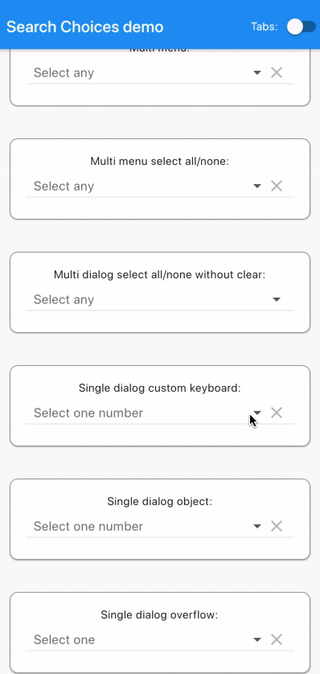
Single dialog custom keyboard
      SearchChoices.single(
        items: Iterable<int>.generate(20).toList().map((i) {
          return (DropdownMenuItem(
            child: Text(i.toString()),
            value: i.toString(),
          ));
        }).toList(),
        value: selectedValue,
        hint: "Select one number",
        searchHint: "Select one number",
        onChanged: (value) {
          setState(() {
            selectedValue = value;
          });
        },
        dialogBox: true,
        keyboardType: TextInputType.number,
        isExpanded: true,
      ),
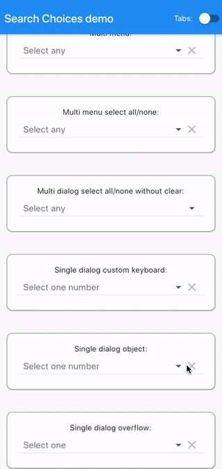
Single dialog object
      SearchChoices.single(
        items: ExampleNumber.list.map((exNum) {
          return (DropdownMenuItem(
              child: Text(exNum.numberString), value: exNum));
        }).toList(),
        value: selectedNumber,
        hint: "Select one number",
        searchHint: "Select one number",
        onChanged: (value) {
          setState(() {
            selectedNumber = value;
          });
        },
        dialogBox: true,
        isExpanded: true,
      ),
Single dialog overflow
      SearchChoices.single(
        items: [
          DropdownMenuItem(
            child: Text(
                "way too long text for a smartphone at least one that goes in a normal sized pair of trousers but maybe not for a gigantic screen like there is one at my cousin's home in a very remote country where I
wouldn't want to go right now"),
            value:
                "way too long text for a smartphone at least one that goes in a normal sized pair of trousers but maybe not for a gigantic screen like there is one at my cousin's home in a very remote country where I
wouldn't want to go right now",
          )
        ],
        value: "",
        hint: "Select one",
        searchHint: "Select one",
        onChanged: (value) {
          setState(() {
            selectedValue = value;
          });
        },
        dialogBox: true,
        isExpanded: true,
      ),
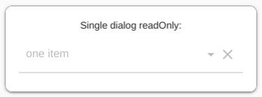
Single dialog readOnly
      SearchChoices.single(
        items: [
          DropdownMenuItem(
            child: Text(
                "one item"),
            value:
            "one item",
          )
        ],
        value: "one item",
        hint: "Select one",
        searchHint: "Select one",
        disabledHint: "Disabled",
        onChanged: (value) {
          setState(() {
            selectedValue = value;
          });
        },
        dialogBox: true,
        isExpanded: true,
        readOnly: true,
      ),
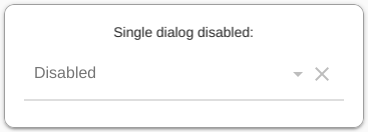
Single dialog disabled
      SearchChoices.single(
        items: [
          DropdownMenuItem(
            child: Text(
                "one item"),
            value:
            "one item",
          )
        ],
        value: "one item",
        hint: "Select one",
        searchHint: "Select one",
        disabledHint: "Disabled",
        onChanged: null,
        dialogBox: true,
        isExpanded: true,
      ),
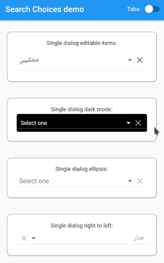
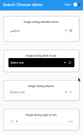
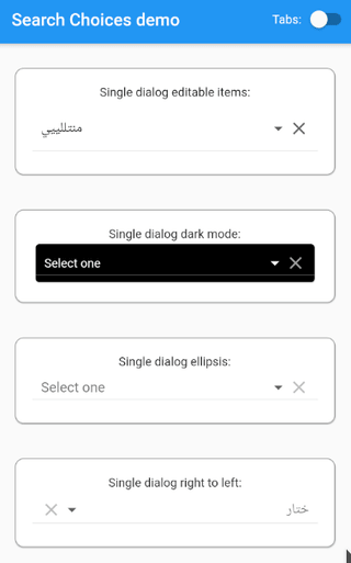
Single dialog editable items
This example lets the user add items to the list of choices. This leads to a growing list of choices.
    input = TextFormField(
      validator: (value) {
        return (value.length < 6 ? "must be at least 6 characters long" : null);
      },
      initialValue: inputString,
      onChanged: (value) {
        inputString = value;
      },
      autofocus: true,
    );
...
  addItemDialog() async {
    return await showDialog(
      context: MyApp.navKey.currentState.overlay.context,
      builder: (BuildContext alertContext) {
        return (AlertDialog(
          title: Text("Add an item"),
          content: Form(
            key: _formKey,
            child: Column(
              mainAxisSize: MainAxisSize.min,
              children: <Widget>[
                input,
                FlatButton(
                  onPressed: () {
                    if (_formKey.currentState.validate()) {
                      setState(() {
                        editableItems.add(DropdownMenuItem(
                          child: Text(inputString),
                          value: inputString,
                        ));
                      });
                      Navigator.pop(alertContext, inputString);
                    }
                  },
                  child: Text("Ok"),
                ),
                FlatButton(
                  onPressed: () {
                    Navigator.pop(alertContext, null);
                  },
                  child: Text("Cancel"),
                ),
              ],
            ),
          ),
        ));
      },
    );
  }
...
      SearchChoices.single(
        items: editableItems,
        value: selectedValue,
        hint: "Select one",
        searchHint: "Select one",
        disabledHint: (Function updateParent) {
          return (FlatButton(
            onPressed: () {
              addItemDialog().then((value) async {
                updateParent(value);
              });
            },
            child: Text("No choice, click to add one"),
          ));
        },
        closeButton:
            (String value, BuildContext closeContext, Function updateParent) {
          return (editableItems.length >= 100
              ? "Close"
              : FlatButton(
                  onPressed: () {
                    addItemDialog().then((value) async {
                      if (value != null &&
                          editableItems.indexWhere(
                                  (element) => element.value == value) !=
                              -1) {
                        Navigator.pop(
                            MyApp.navKey.currentState.overlay.context);
                        updateParent(value);
                      }
                    });
                  },
                  child: Text("Add and select item"),
                ));
        },
        onChanged: (value) {
          setState(() {
            if (!(value is NotGiven)) {
              selectedValue = value;
            }
          });
        },
        displayItem: (item, selected, Function updateParent) {
          return (Row(children: [
            selected
                ? Icon(
                    Icons.check,
                    color: Colors.green,
                  )
                : Icon(
                    Icons.check_box_outline_blank,
                    color: Colors.transparent,
                  ),
            SizedBox(width: 7),
            Expanded(
              child: item,
            ),
            IconButton(
              icon: Icon(
                Icons.delete,
                color: Colors.red,
              ),
              onPressed: () {
                editableItems.removeWhere((element) => item == element);
                updateParent(null);
                setState(() {});
              },
            ),
          ]));
        },
        dialogBox: true,
        isExpanded: true,
        doneButton: "Done",
      ),
Single dialog dark mode #
          Card(
            color: Colors.black,
            child: SearchChoices.single(
              items: items.map((item) {
                return (DropdownMenuItem(
                  child: Text(
                    item.value,
                    style: TextStyle(color: Colors.white),
                  ),
                  value: item.value,
                ));
              }).toList(),
              value: selectedValue,
              hint: Text(
                "Select one",
                style: TextStyle(color: Colors.white),
              ),
              searchHint: Text(
                "Select one",
                style: TextStyle(color: Colors.white),
              ),
              style: TextStyle(color: Colors.white, backgroundColor: Colors.black),
              closeButton: FlatButton(
                onPressed: () {
                  Navigator.pop(MyApp.navKey.currentState.overlay.context);
                },
                child: Text(
                  "Close",
                  style: TextStyle(color: Colors.white),
                ),
              ),
              menuBackgroundColor: Colors.black,
              iconEnabledColor: Colors.white,
              iconDisabledColor: Colors.grey,
              onChanged: (value) {
                setState(() {
                  selectedValue = value;
                });
              },
              isExpanded: true,
            ),
          ),
Single dialog ellipsis #
          SearchChoices.single(
            items: [
              DropdownMenuItem(
                child: Text(
                  "way too long text for a smartphone at least one that goes in a normal sized pair of trousers but maybe not for a gigantic screen like there is one at my cousin's home in a very remote country where I wouldn't want to go right now",
                  overflow: TextOverflow.ellipsis,
                ),
                value:
                    "way too long text for a smartphone at least one that goes in a normal sized pair of trousers but maybe not for a gigantic screen like there is one at my cousin's home in a very remote country where I wouldn't want to go right now",
              )
            ],
            value: "",
            hint: "Select one",
            searchHint: "Select one",
            onChanged: (value) {
              setState(() {
                selectedValue = value;
              });
            },
            selectedValueWidgetFn: (item) {
              return (Text(
                item,
                overflow: TextOverflow.ellipsis,
              ));
            },
            dialogBox: true,
            isExpanded: true,
          ),
Single dialog right to left #
SearchChoices.single(
items: ["طنجة", "فاس", "أكادير", "تزنيت", "آكــلــو", "سيدي بيبي"]
.map<DropdownMenuItem<String>>((string) {
return (DropdownMenuItem<String>(
child: Text(
string,
textDirection: TextDirection.rtl,
),
value: string,
));
}).toList(),
value: selectedValue,
hint: Text(
"ختار",
textDirection: TextDirection.rtl,
),
searchHint: Text(
"ختار",
textDirection: TextDirection.rtl,
),
closeButton: FlatButton(
onPressed: () {
Navigator.pop(MyApp.navKey.currentState.overlay.context);
},
child: Text(
"سدّ",
textDirection: TextDirection.rtl,
),
),
onChanged: (value) {
setState(() {
selectedValue = value;
});
},
isExpanded: true,
rightToLeft: true,
displayItem: (item, selected) {
return (Row(textDirection: TextDirection.rtl, children: [
selected
? Icon(
Icons.radio_button_checked,
color: Colors.grey,
)
: Icon(
Icons.radio_button_unchecked,
color: Colors.grey,
),
SizedBox(width: 7),
item,
Expanded(
child: SizedBox.shrink(),
),
]));
},
selectedValueWidgetFn: (item) {
return Row(
textDirection: TextDirection.rtl,
children: <Widget>[
(Text(
item,
textDirection: TextDirection.rtl,
)),
],
);
},
),
Feature requests/comments/questions/bugs #
Feel free to log your feature requests/comments/questions/bugs here: https://github.com/lcuis/search_choices/issues
Contributions #
This solution is based on improvements done on a pull request that was probably already changing too many things to the great original repository: https://github.com/icemanbsi/searchable_dropdown/pull/11
I would be happy to merge pull request proposals provided that:
- they don't break the compilation
- they pass the automated testing
- they provide the relevant adaptations to documentation and automated testing
- they bring value
- they don't completely transform the code
- they are readable (though, I enjoy https://www.ioccc.org/ as a contest full of curiosities)
Contributions and forks are very welcome!
In your pull request, feel free to add your line in the contributors section below:
Contributors #
- (great initial project) https://github.com/icemanbsi/searchable_dropdown/pull/11
- https://github.com/lcuis
CI/CD #
Continuous integration/deployment status: 
Metadata
Publisher
Weekly Downloads
Metadata
Widget to let the user search through a keyword string typed on a customizable keyboard in a single or multiple choices list presented as a dropdown in a dialog box or a menu.
Repository (GitHub)
View/report issues
License
 unknown (license)