vyuh_widgetbook 1.2.1  vyuh_widgetbook: ^1.2.1 copied to clipboard
Widgetbook implementation for previewing the various Content Items of Vyuh features
Vyuh Framework
Build Modular, Scalable, CMS-driven Flutter Apps
Vyuh Widgetbook 📚 #
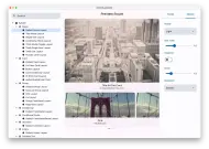
A powerful widgetbook implementation for previewing Vyuh content and components. Built on top of widgetbook, this package provides a seamless way to preview and test your Vyuh content types in isolation.

✨ Features #
- 📱 Preview content types in different sizes
- 🌓 Toggle between light and dark themes
- 🎯 Test content types in isolation
- 🔍 Navigate through features and their content types
- 🎭 Preview different layouts for each content type
📦 Installation #
dependencies:
  vyuh_widgetbook: ^1.0.0
🚀 Usage #
Create a new Flutter app and use runWidgetBook to start the widgetbook:
import 'package:flutter/widgets.dart';
import 'package:vyuh_widgetbook/vyuh_widgetbook.dart';
import 'package:vyuh_feature_system/vyuh_feature_system.dart' as system;
import 'package:feature_one/feature_one.dart' as feature1;
import 'package:feature_two/feature_two.dart' as feature2;
import 'package:feature_three/feature_three.dart' as feature3;

void main() {
  runWidgetBook(
    features: () => [
      // Add your features here
      system.feature,
      feature1.feature,
      feature2.feature,
      feature3.feature,
    ],
    // Optional: Customize themes
    lightTheme: YourThemeData.light,
    darkTheme: YourThemeData.dark,
  );
}
📚 Documentation #
For detailed documentation and guides, visit:
🤝 Contributing #
Contributions are welcome! Please read our contributing guidelines to get started.
📚 Learn More #
- Visit docs.vyuh.tech for detailed documentation
- Check out the GitHub repository for source code
- Report issues on the issue tracker
Made with ❤️ by Vyuh


