AutoInputBox Plugin
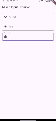
The AutoInputBox Plugin is a Flutter widget that provides an enhanced text input experience with auto-completion functionality. It dynamically filters suggestions as users type and displays them in a dropdown list, making it ideal for search fields, forms, or any text input where suggestions improve the user experience.
Features
-
Debounced Input Filtering: Ensures efficient suggestion filtering with customizable debounce time.
-
Dynamic Dropdown: Displays suggestions in an overlay that updates in real time.
-
Customizable: Fully customizable styles, input decorations, and callback options.
-
Type-Safe: Supports any object type with a display string conversion function.
Installation
Add the following dependency to your pubspec.yaml file:
dependencies:
  auto_input_box: ^1.0.0
Then, run:
flutter pub get
Usage
Here is an example of how to use the AutoInputBox in your Flutter app:
import 'package:flutter/material.dart';
import 'package:auto_input_box/auto_input_box.dart';

void main() => runApp(MyApp());

class MyApp extends StatelessWidget {
  @override
  Widget build(BuildContext context) {
    return MaterialApp(
      home: Scaffold(
        appBar: AppBar(title: Text('AutoInputBox Example')),
        body: AutoInputBoxExample(),
      ),
    );
  }
}

class AutoInputBoxExample extends StatelessWidget {
  final TextEditingController _controller = TextEditingController();

  @override
  Widget build(BuildContext context) {
    return Padding(
      padding: const EdgeInsets.all(16.0),
      child: AutoInputBox<String>(
        textEditingController: _controller,
        suggestions: [
          'Apple',
          'Banana',
          'Cherry',
          'Date',
          'Elderberry',
          'Fig',
          'Grapes',
        ],
        toDisplayString: (item) => item,
        debounceTime: 300,
        inputDecoration: InputDecoration(
          labelText: 'Enter a fruit',
          border: OutlineInputBorder(),
        ),
        onItemSelected: (item) {
          print('Selected: $item');
        },
      ),
    );
  }
}
Parameters
-
textEditingController:TextEditingController- Controller for managing the input field text. -
inputDecoration:InputDecoration- Styling and decoration for the input field. -
textStyle:TextStyle- Style for the input text. -
debounceTime:int- Debounce time (in milliseconds) for filtering suggestions. Default is300. -
suggestions:List<T>- The list of suggestions to be displayed. -
toDisplayString:String Function(T)- Function to convert suggestion objects into displayable strings. -
onItemSelected:ValueChanged<T>- Callback triggered when a suggestion is selected.
Key Features
-
Debounce Time: Prevents rapid firing of the filter logic for better performance.
-
Custom Suggestions: Supports any object type with a
toDisplayStringfunction. -
Callback on Selection: Allows integration of custom logic when a suggestion is chosen.
Customization
The plugin is highly customizable, allowing you to:
-
Change the appearance of the input field via
InputDecoration. -
Modify text style using the
textStyleparameter. -
Adjust filtering behavior with the
debounceTimeparameter. -
Use any object type for suggestions by defining how they are displayed with
toDisplayString.
License
This project is licensed under the MIT License. See the LICENSE file for details.
Contributions
Contributions are welcome! Feel free to fork the repository, create a feature branch, and submit a pull request.
Support
For issues and feature requests, please open an issue in the GitHub repository.
Enjoy seamless auto-completion with AutoInputBox Plugin! 🎉