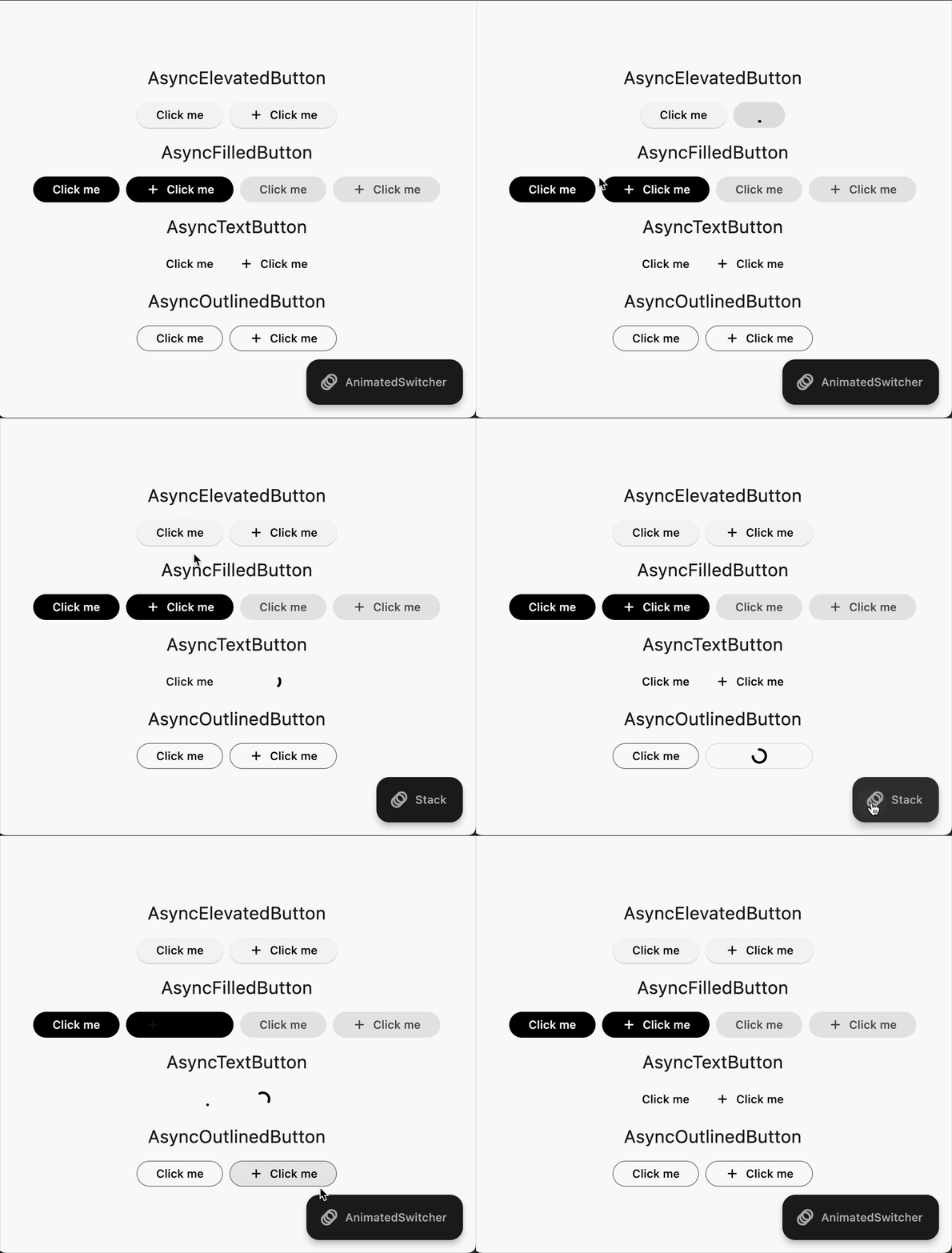
loadable_buttons
A Flutter package that provides enhanced buttons with built-in loading states and async functionality.

Features
- 🔄 Built-in loading states for:
- ElevatedButton -> AsyncElevatedButton
- FilledButton -> AsyncFilledButton
- TextButton -> AsyncTextButton
- OutlinedButton -> AsyncOutlinedButton
- ⚡ Async callback support
- 🎨 Multiple transition animations
- 🎯 Icon support with customizable alignment
- 📱 Maintains all standard properties
- ✨ Customizable loading indicators
Usage
Installation
Add the following to your pubspec.yaml or run:
flutter pub add loadable_buttons
Importing
import 'package:loadable_buttons/loadable_buttons.dart';
Basic Usage
AsyncElevatedButton(
  onPressed: () async {
    // Your async operation here
    await Future.delayed(const Duration(seconds: 2));
  },
  child: const Text('Click Me'),
);
Custom Loading Child
AsyncElevatedButton(
  onPressed: () async {
    await Future.delayed(const Duration(seconds: 2));
  },
  child: const Text('Submit'),
  loadingChild: const Text('Loading...'),
);
Transition Types
The package supports three types of transitions:
- Stack (Default) : Maintains the size of the button while loading
AsyncElevatedButton(
  // transitionType: TransitionAnimationType.stack,
  onPressed: () async => await yourAsyncFunction(),
  child: const Text('Stack Transition'),
);
- AnimatedSwitcher : Animates the size of the button while loading
AsyncElevatedButton(
  transitionType: TransitionAnimationType.animatedSwitcher,
  onPressed: () async => await yourAsyncFunction(),
  child: const Text('AnimatedSwitcher Transition'),
);
- CustomBuilder : Allows you to define your own custom transition
AsyncElevatedButton(
  transitionType: TransitionAnimationType.customBuilder,
  onPressed: () async => await yourAsyncFunction(),
  child: const Text('Custom Transition'),
  loadingChild: const Text('Loading...'),
  customBuilder: ({
    required bool loading,
    required Widget child,
    Widget? loadingChild,
  }) {
    return AnimatedSwitcher(
      duration: const Duration(milliseconds: 500),
      curve: Curves.easeInOut,
      child: loading
          ? loadingChild!
          : child,
    );
  },
);
Additional Features
- Customize animation duration
- Control minimum opacity during loading state
- Full access to ElevatedButton styling
- Manual loading state control
- Icon alignment customization
Properties
| Property | Type | Description |
|---|---|---|
onPressed |
FutureOr<void> Function()? |
The callback that is called when the button is tapped |
child |
Widget |
The primary content of the button |
loadingChild |
Widget? |
Widget to show during loading state |
loading |
bool |
Manual control of loading state |
transitionType |
TransitionAnimationType |
Type of loading animation |
animationDuration |
Duration |
Duration of the loading animation |
minimumChildOpacity |
double |
Minimum opacity of child during loading |