FolderTabBar class
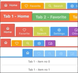
A colorful tabbar that displays a horizontal row of tabs where each tab has a color.
Typically created as the AppBar.bottom part of an AppBar and in conjunction with a TabBarView.
selectedHeight, unselectedHeight are The height of selected/unselected tabs.
Must be non-null and greated than 0.0
Default values are 40.0 and 32.0
alignment How the tabs should be placed along the main axis in the tabbar.
if null then TabAxisAlignment.center will be used
- Inheritance
-
- Object
- DiagnosticableTree
- Widget
- StatefulWidget
- FolderTabBar
Constructors
-
FolderTabBar.new({Key? key, required List<
TabItem> tabs, TabController? controller, double selectedHeight = 40.0, double unselectedHeight = 32.0, double indicatorHeight = 4.0, double topPadding = 8.0, double verticalTabPadding = 2.0, ShapeBorder tabShape = const RoundedRectangleBorder(borderRadius: BorderRadius.only(topLeft: Radius.circular(4.0), topRight: Radius.circular(4.0))), Color? labelColor, Color? unselectedLabelColor, TextStyle? labelStyle, TextStyle? unselectedLabelStyle, TabAxisAlignment alignment = TabAxisAlignment.center})
Properties
- controller → TabController?
-
This widget's selection and animation state.
final
- hashCode → int
-
The hash code for this object.
no setterinherited
- indicatorHeight → double
-
The thickness of the line that appears below the tab bar.
final
- key → Key?
-
Controls how one widget replaces another widget in the tree.
finalinherited
- labelColor → Color?
-
The color of selected tab labels.
final
- labelStyle → TextStyle?
-
The text style of the selected tab labels.
final
- runtimeType → Type
-
A representation of the runtime type of the object.
no setterinherited
-
tabs
→ List<
TabItem> -
A list of tab's infos including color and title widget.
final
- tabShape → ShapeBorder
-
Shape of a tab, default to round top-left and top-right corners
final
- topPadding → double
-
final
- unselectedLabelColor → Color?
-
The color of unselected tab labels.
final
- unselectedLabelStyle → TextStyle?
-
The text style of the unselected tab labels.
final
- verticalTabPadding → double
-
The padding added to each of the tab labels, must be non-null
Default to 2.0
final
Methods
-
createElement(
) → StatefulElement -
Creates a StatefulElement to manage this widget's location in the tree.
inherited
-
createState(
) → State< FolderTabBar> -
Creates the mutable state for this widget at a given location in the tree.
override
-
debugDescribeChildren(
) → List< DiagnosticsNode> -
Returns a list of DiagnosticsNode objects describing this node's
children.
inherited
-
debugFillProperties(
DiagnosticPropertiesBuilder properties) → void -
Add additional properties associated with the node.
inherited
-
noSuchMethod(
Invocation invocation) → dynamic -
Invoked when a nonexistent method or property is accessed.
inherited
-
toDiagnosticsNode(
{String? name, DiagnosticsTreeStyle? style}) → DiagnosticsNode -
Returns a debug representation of the object that is used by debugging
tools and by DiagnosticsNode.toStringDeep.
inherited
-
toString(
{DiagnosticLevel minLevel = DiagnosticLevel.info}) → String -
A string representation of this object.
inherited
-
toStringDeep(
{String prefixLineOne = '', String? prefixOtherLines, DiagnosticLevel minLevel = DiagnosticLevel.debug, int wrapWidth = 65}) → String -
Returns a string representation of this node and its descendants.
inherited
-
toStringShallow(
{String joiner = ', ', DiagnosticLevel minLevel = DiagnosticLevel.debug}) → String -
Returns a one-line detailed description of the object.
inherited
-
toStringShort(
) → String -
A short, textual description of this widget.
inherited
Operators
-
operator ==(
Object other) → bool -
The equality operator.
inherited