chiclet 1.0.1  chiclet: ^1.0.1 copied to clipboard
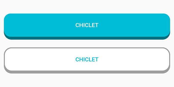
With Chiclet, you can enjoy the convenience of highly customizable island-style buttons that are similar to those found in the popular language learning app Duolingo. These buttons can be tailored to [...]
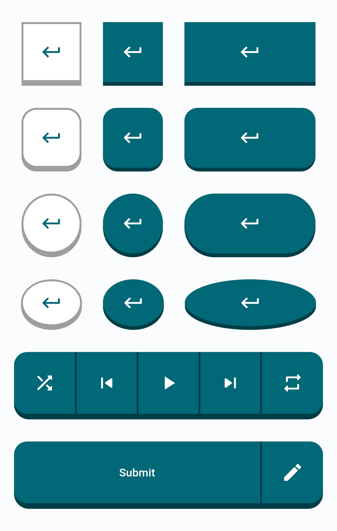
Highly customizable island-style buttons known as Chiclet.
Features #
This package provides you with highly customizable buttons known as Chiclet. Commonly seen in the language learning app Duolingo.
Getting started #
In the dependencies: section of your pubspec.yaml, add the following line:
dependencies:
  chiclet: <latest_version>
Usage #
- Import
Chicletin your main.dart.
import 'package:chiclet/chiclet.dart';
- Basic implementation:
ChicletOutlinedAnimatedButton(
  onPressed: () {},
  child: const Icon(Icons.download_rounded),
),
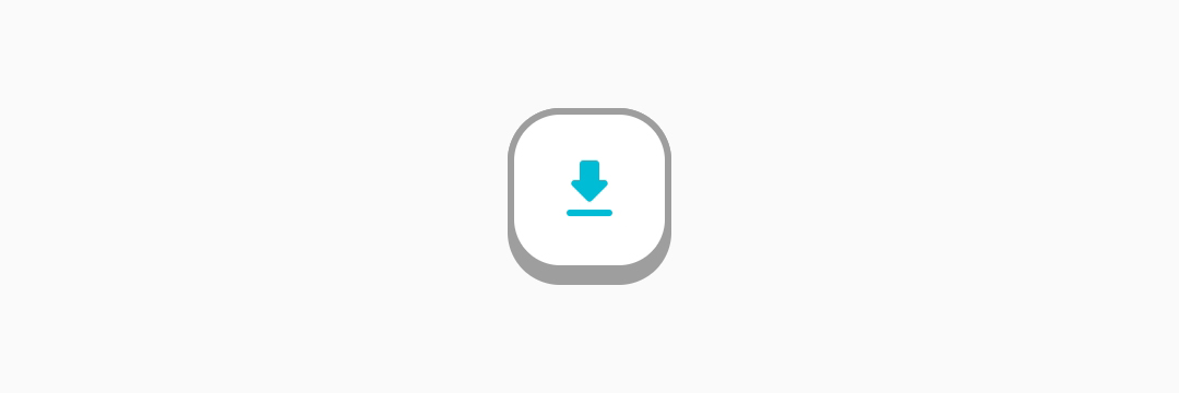
Button Types #
-
RoundedRectangle (default type):
- You can either not specify it, or write
ChicletButtonTypes.roundedRectanglein front of thebuttonTypeproperty. In either case, the result will be the same. Example:
ChicletOutlinedAnimatedButton(
  onPressed: () {},
  child: const Icon(Icons.download_rounded),
),
ChicletOutlinedAnimatedButton( onPressed: () {}, buttonType: ChicletButtonTypes.roundedRectangle, child: const Icon(Icons.download_rounded), ), - You can either not specify it, or write
-
Circle:
- You can create a circle shaped button by writing
ChicletButtonTypes.circlein front of thebuttonTypeproperty. Example:
ChicletOutlinedAnimatedButton(
  onPressed: () {},
  buttonType: ChicletButtonTypes.circle,
  child: const Icon(Icons.download_rounded),
),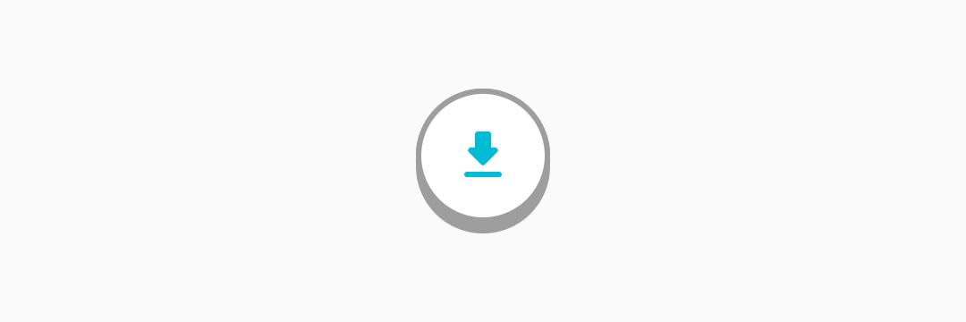
- You can create a circle shaped button by writing
-
Oval
- You can create an oval shaped button by writing
ChicletButtonTypes.circlein front of thebuttonTypeproperty. Example:
ChicletOutlinedAnimatedButton(
  onPressed: () {},
  width: 65,
  buttonType: ChicletButtonTypes.oval,
  child: const Icon(Icons.download_rounded),
),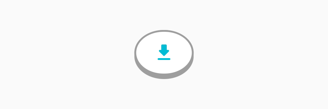
- You can create an oval shaped button by writing
You can find more examples in the /example/lib/main.dart directory.
Customizable Properties #
ChicletButton and ChicletAnimatedButton:
- padding,
- width (If not provided, it will be the same as
height), - height (default is 50),
- minimumSize,
- maximumSize,
- isPressed (default is false),
- buttonHeight (default is 4, and it applies in addition to the
height), - borderRadius (default is 16),
- buttonColor (default is
shade.900ofThemeData'sprimarySwatch, unless you provide thebackgroundColorproperty, then it will beshade.900of thebackgroundColorproperty), - foregroundColor (default is
Colors.white), - backgroundColor (default is
ThemeData'sprimarySwatch), - splashFactory (default is
NoSplash.splashFactory), - buttonType (default is
ChicletButtonTypes.roundedRectangle),
ChicletOutlinedButton and ChicletOutlinedAnimatedButton:
- padding,
- width (If not provided, it will be the same as
height), - height (default is 50),
- minimumSize,
- maximumSize,
- isPressed (default is false),
- buttonHeight (default is 4, and it applies in addition to the
height), - borderWidth (default is 2),
- borderRadius (default is 16),
- borderColor (default is
Colors.grey), - buttonColor (default is
Color.grey), - foregroundColor (default is
ThemeData'sprimarySwatch), - backgroundColor (default is
Colors.white), - splashFactory (default is
NoSplash.splashFactory), - buttonType (default is
ChicletButtonTypes.roundedRectangle),
Additional information #
Suggestions, recommendations, bug reports, and issues: DevRedStone
Metadata
Publisher
unverified uploader
Weekly Downloads
Metadata
With Chiclet, you can enjoy the convenience of highly customizable island-style buttons that are similar to those found in the popular language learning app Duolingo. These buttons can be tailored to your preferences, allowing you to fully personalize your experience.
Repository (GitHub)
View/report issues
License
 unknown (license)